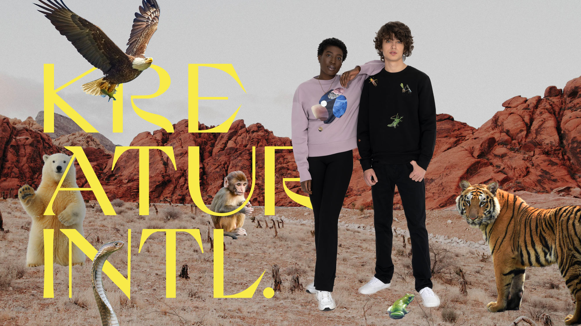
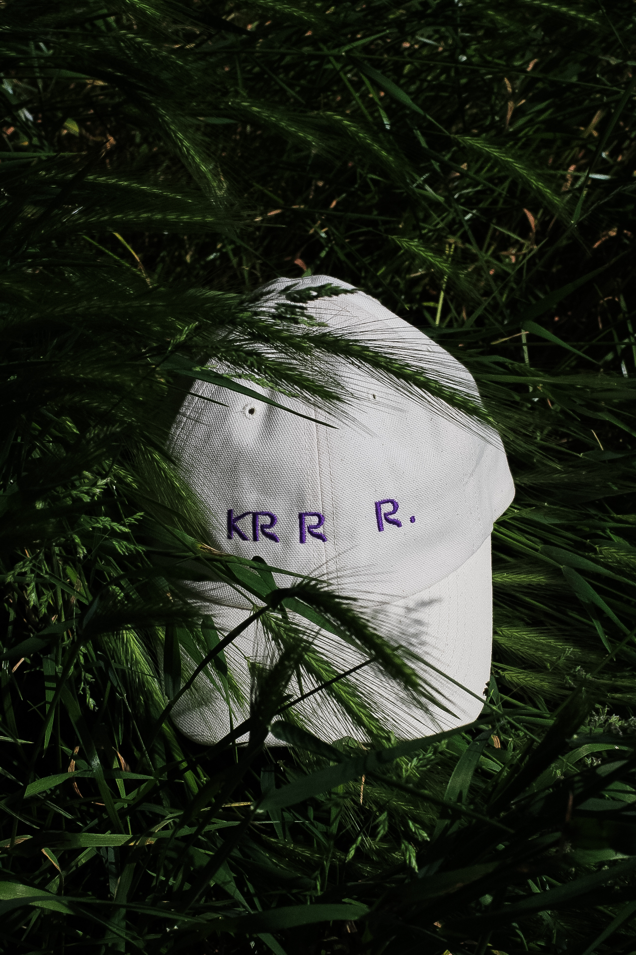
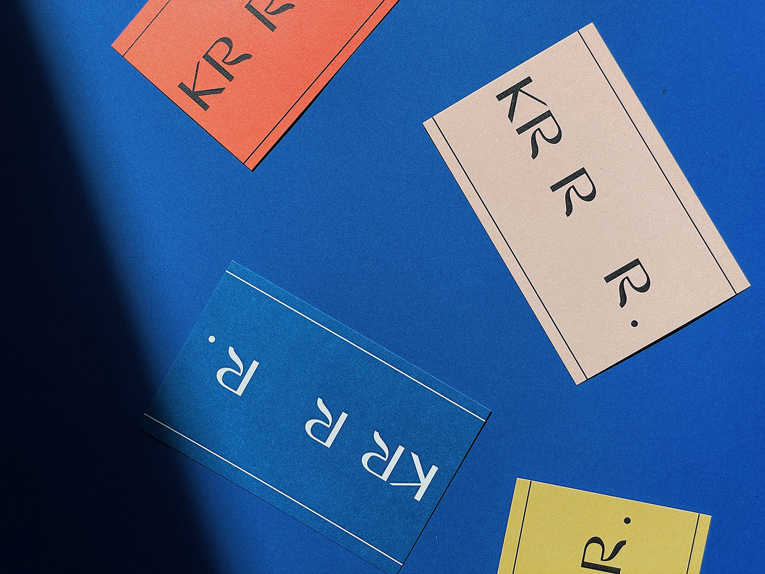
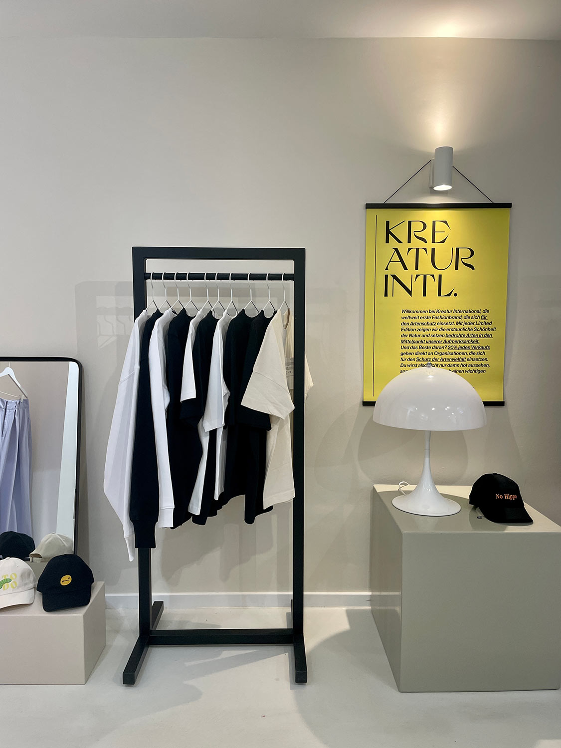
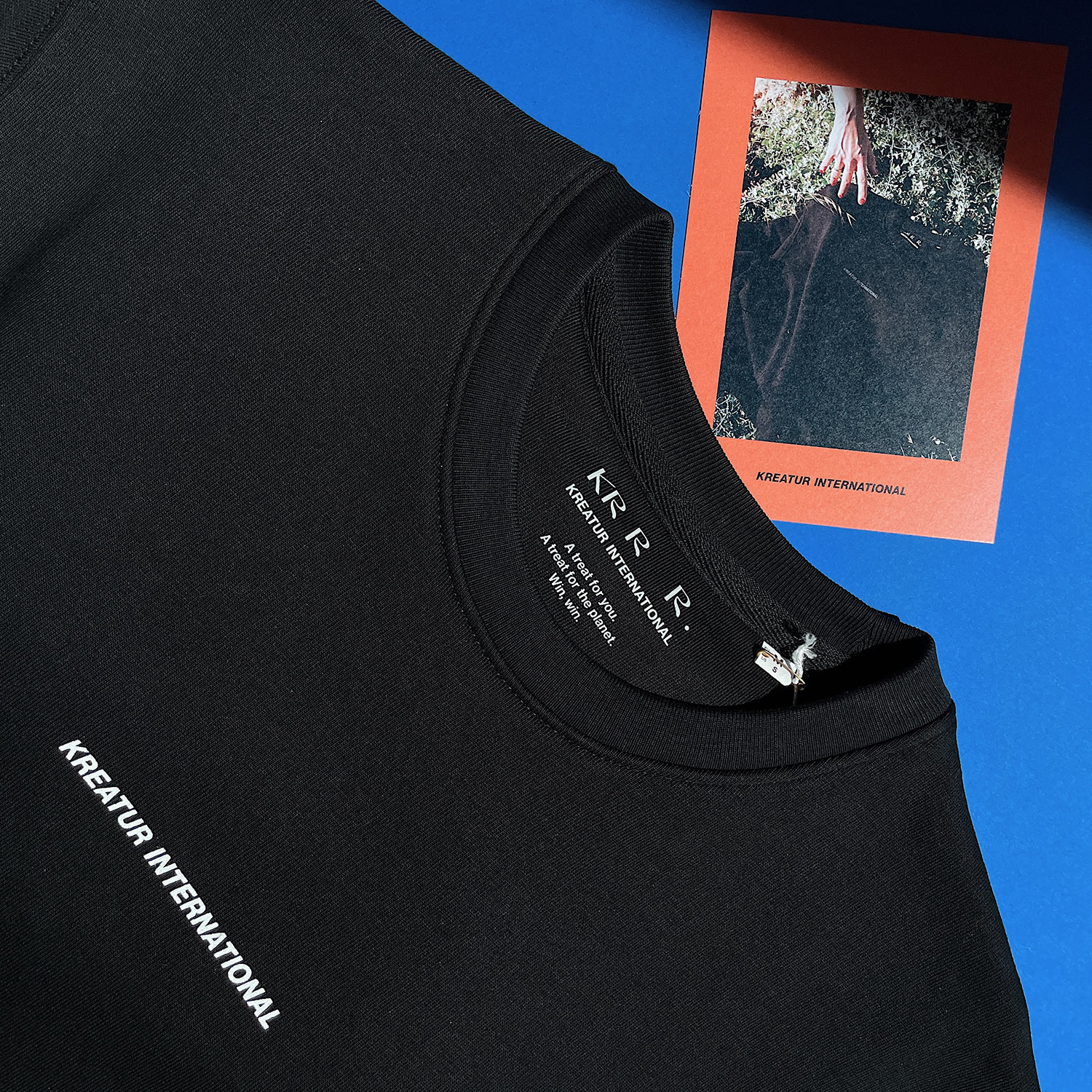
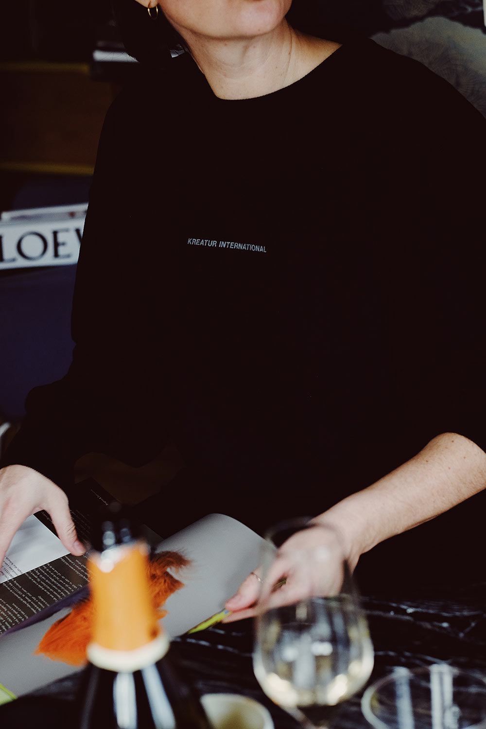
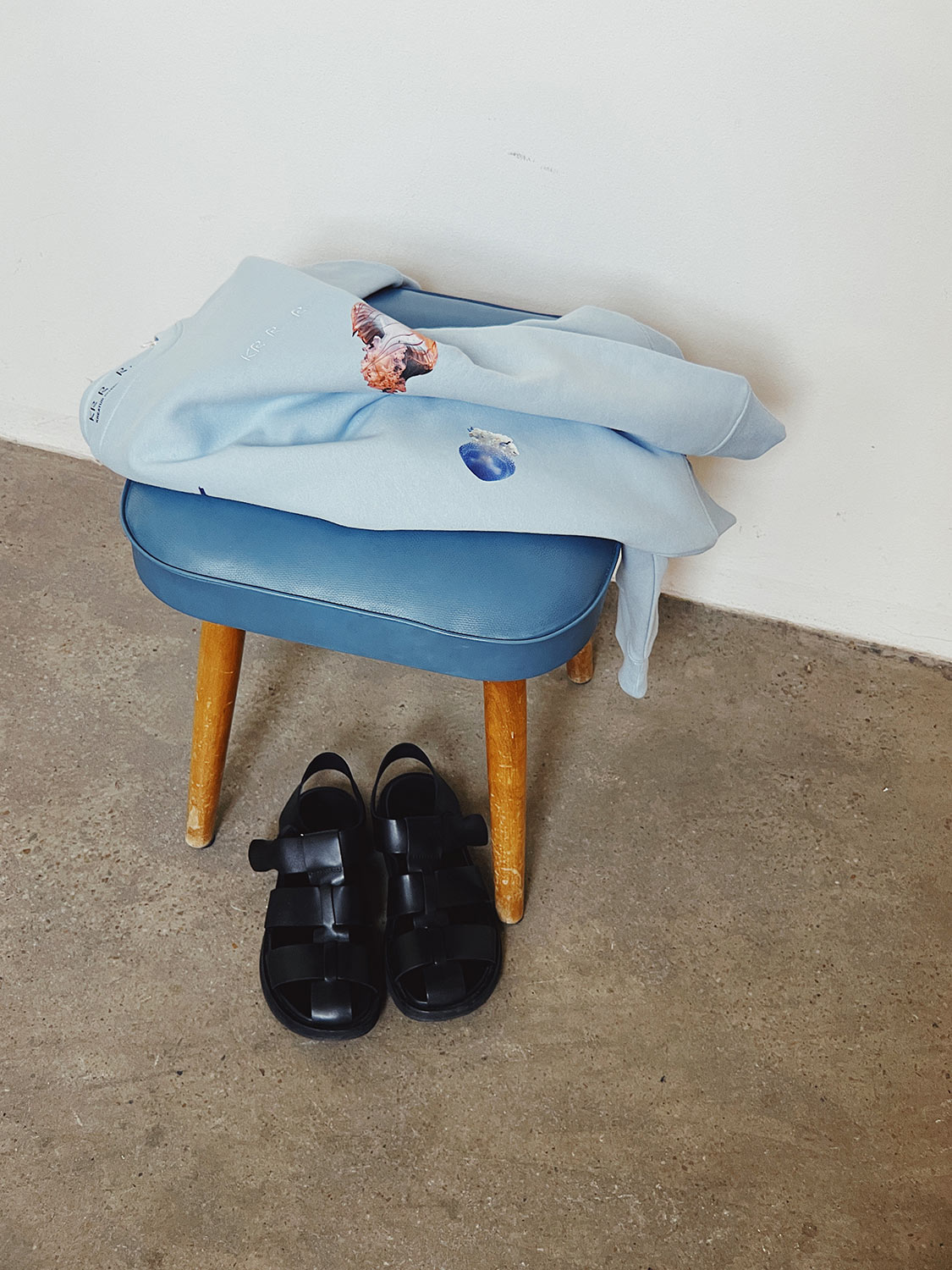
KREATUR INTERNATIONAL
year
2022
client
Kreatur International
industry
Fashion
services
Life-Centered Design
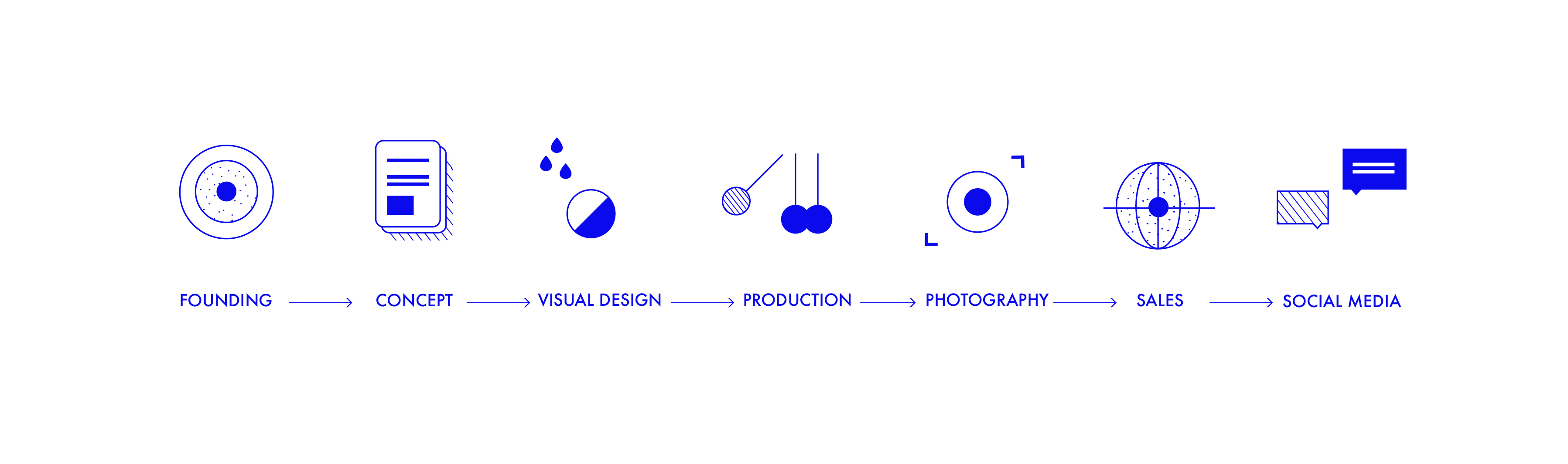
Scope
Ideation, Concept, Business Start-Up, Creative Direction, Branding, Collections, Sustainable Production, Photography, eCommerce, Social Media Campaigns, Marketing & Public Relations.
Client
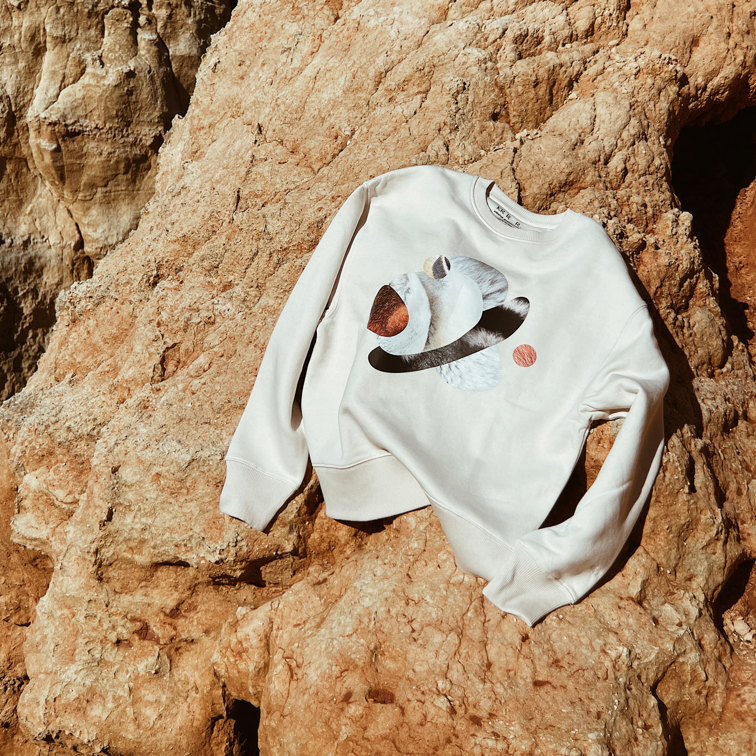
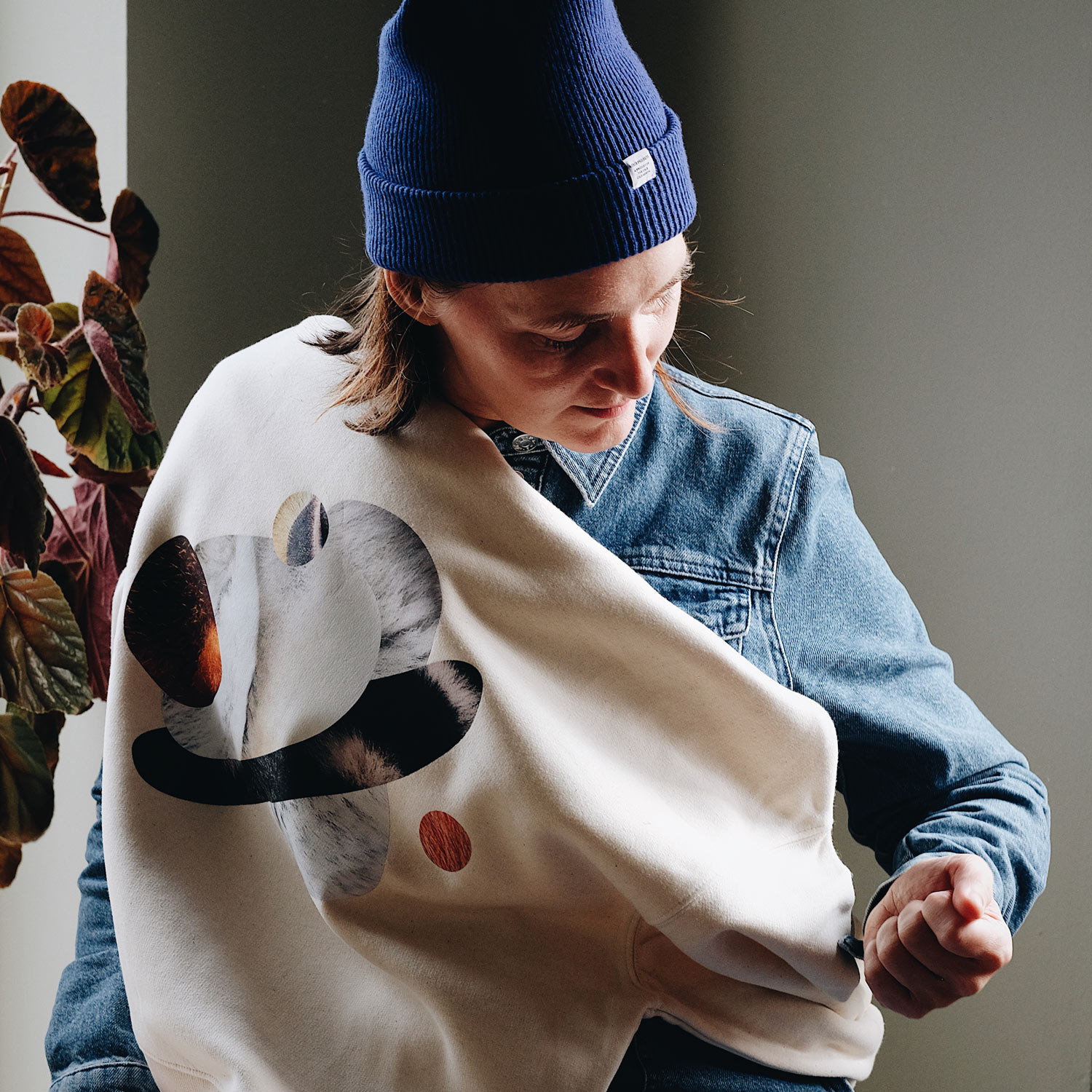
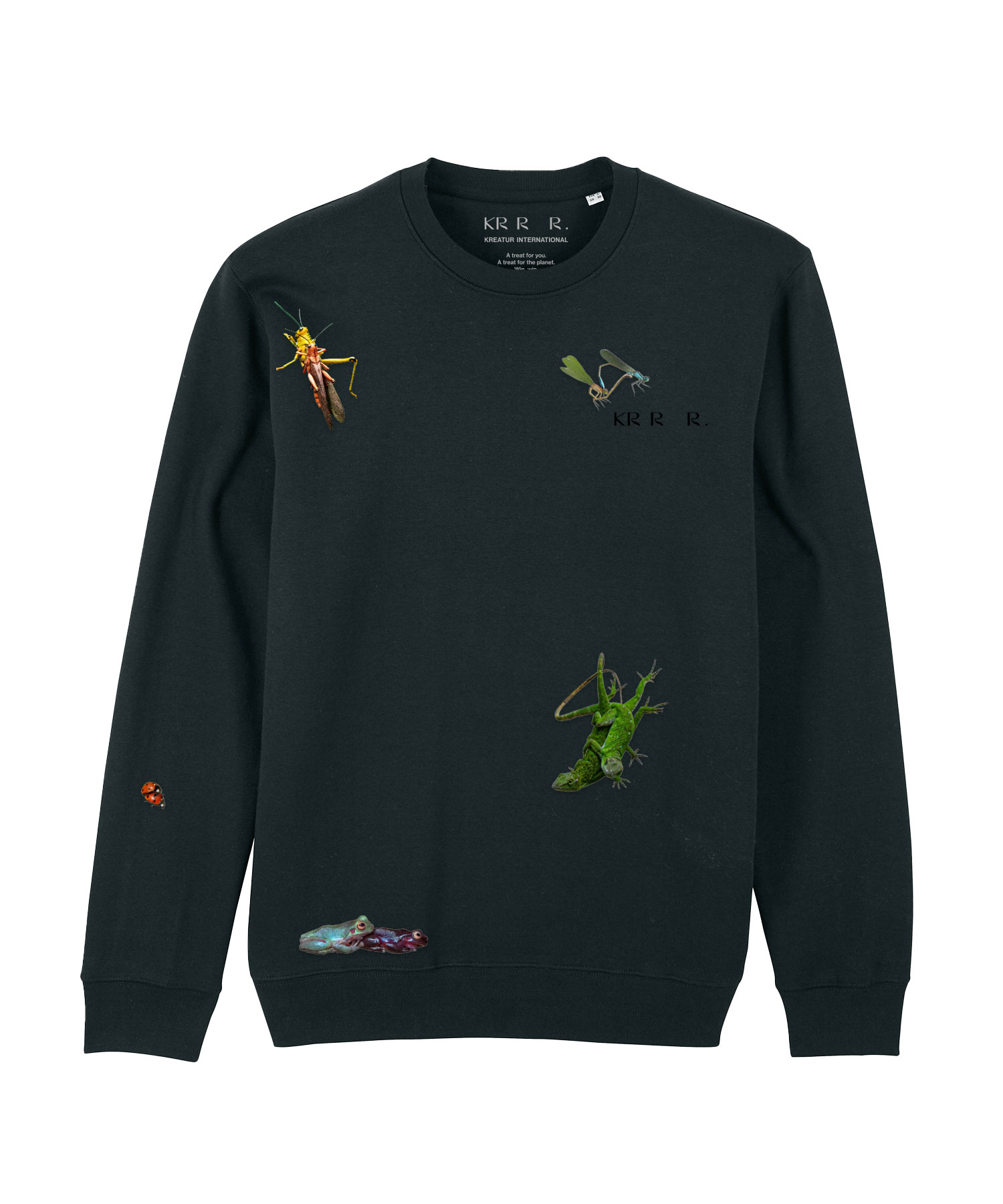
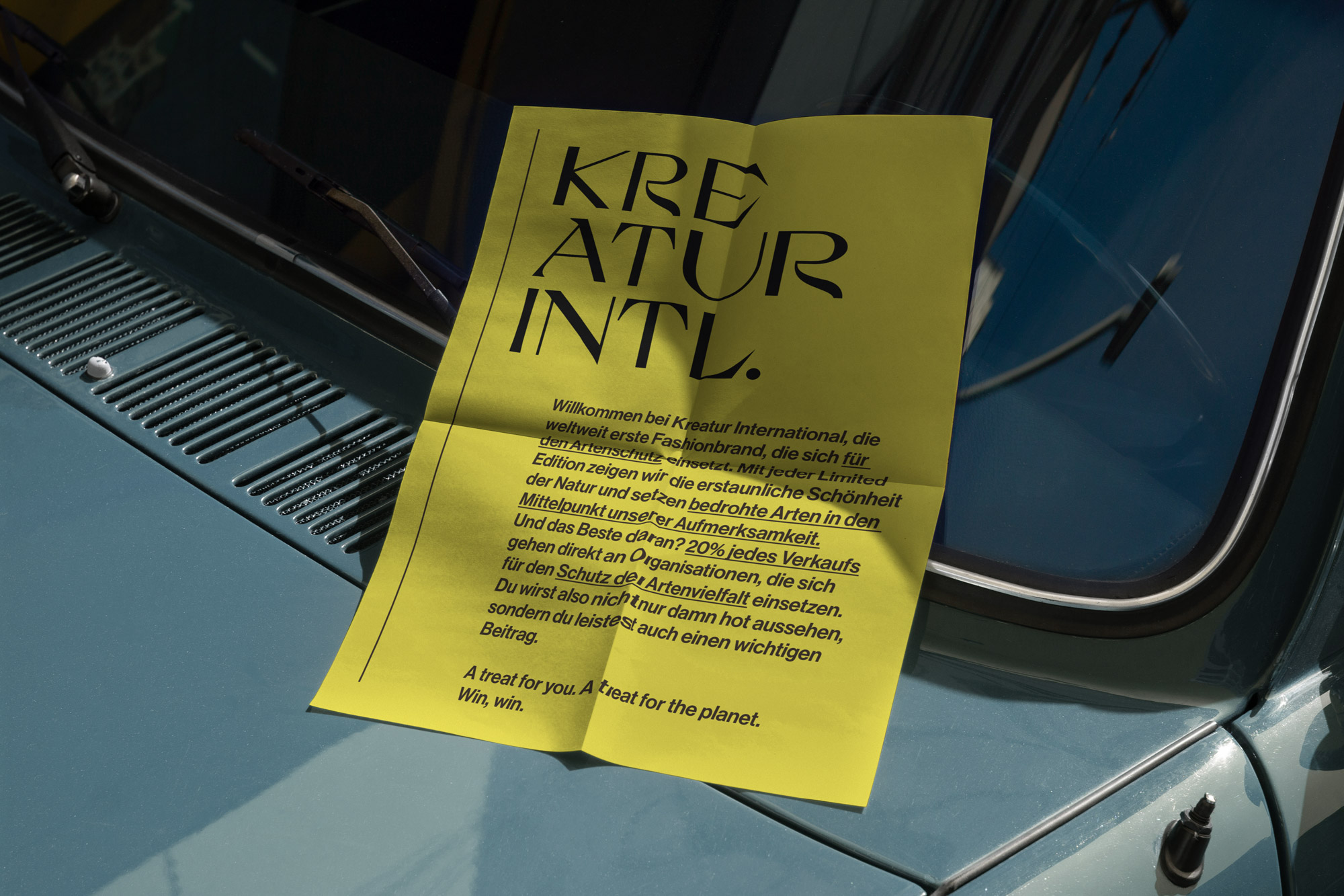
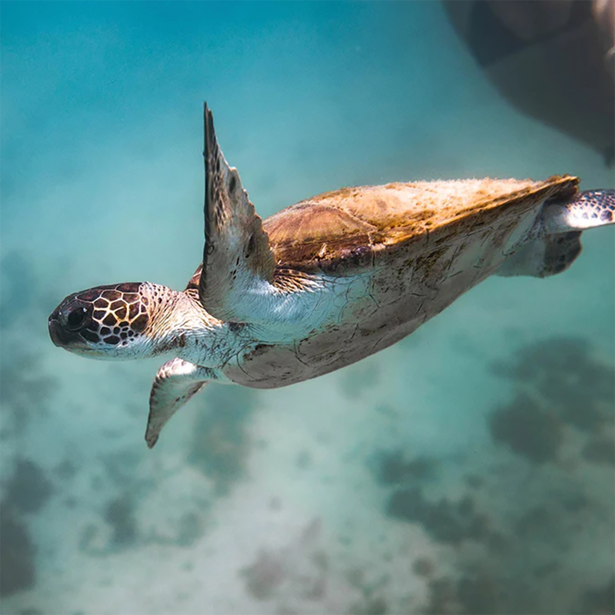
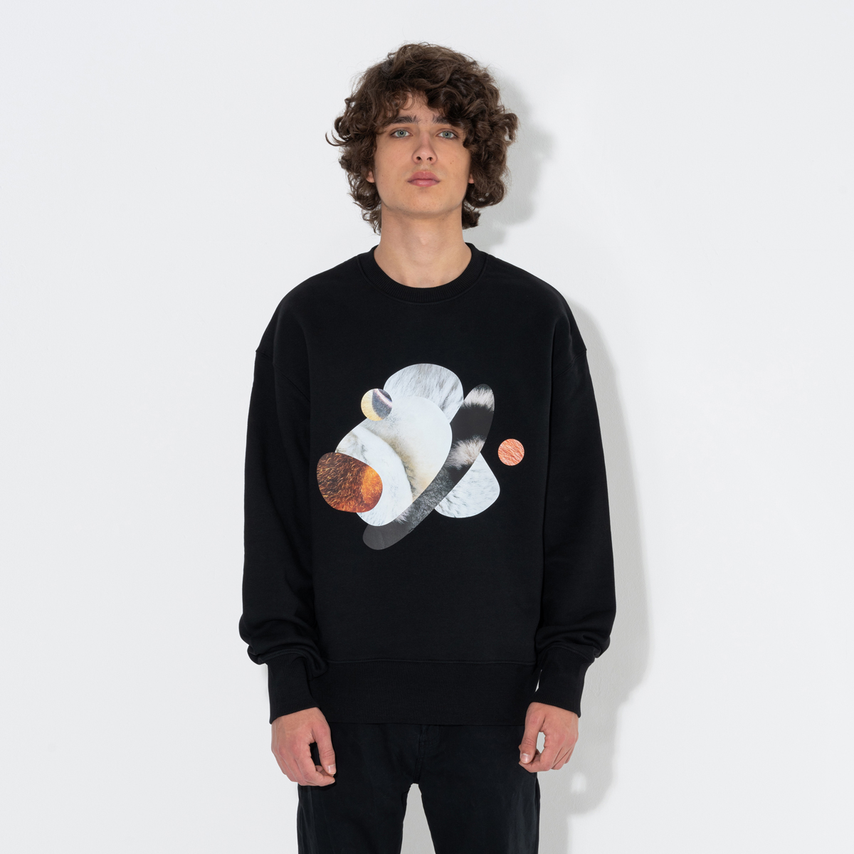
Kreatur International is ONOGRIT’s sustainable fashion label radically based on the principles of Life-Centered Design (LCD). It is the first brand dedicated to the protection of endangered species, donating 20% of its net profits to organisations that are working hard to preserve biodiversity on our planet.
challenge
Could something you wear catch people’s attention for all the right reasons while having a positive impact on the planet? We think so! That’s why we founded Kreatur International: To draw attention to the protection of biodiversity and to encourage dialogue. Because it’s time to treat the world’s species as the limited editions they are.
approach
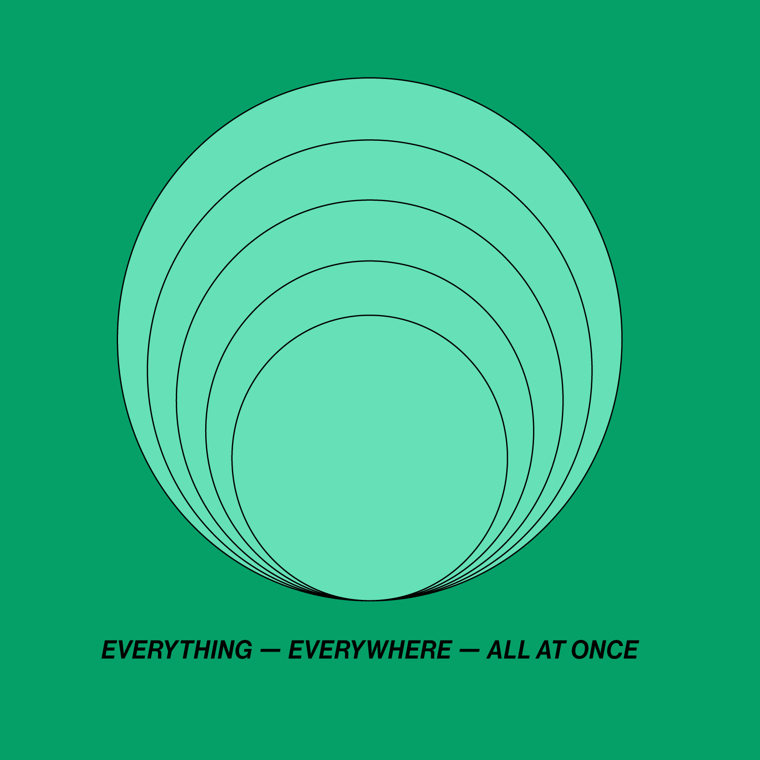
Life-Centred Design is a new approach that brings the needs of nature and life on our planet into the centre of the design process and recognises that solutions are only good solutions if they take into account the well-being of all ecosystems. Unlike traditional design methods, Life-Centered Design actively involves often forgotten stakeholders and communities in the design process to initiate positive change. It aims to create solutions that are not only environmentally friendly, but also equitable, resilient and empowering.
Proof of Concept
Is it easy to integrate a life-centred approach into a project. Hell, no! Once you get into this new perspective, you start to realise how many ridiculous circumstances we have become used to. Using packaging once and then throwing it away? Moving two tonnes of steel to get one person from A to B? Streaming series and films without knowing the CO2 emissions? Initiating change is not an easy task, because often there are no ready-made solutions to problems.
Motivation
Nevertheless, we have to change direction and can now say with certainty that it is possible. It may take a little longer at one point or another, but at the end of the day there are always alternatives. You just have to find them and sometimes invent some.


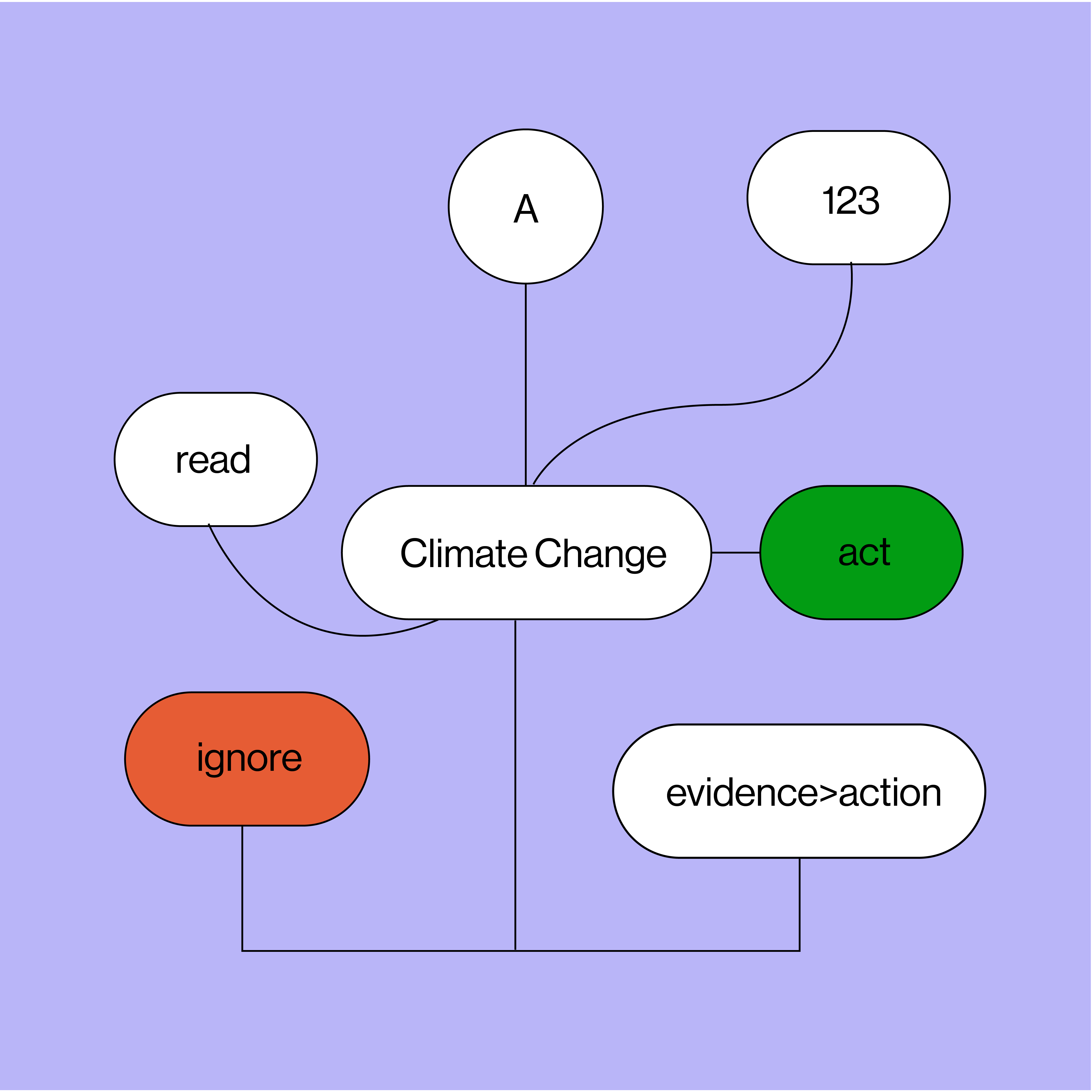
Biodiversity
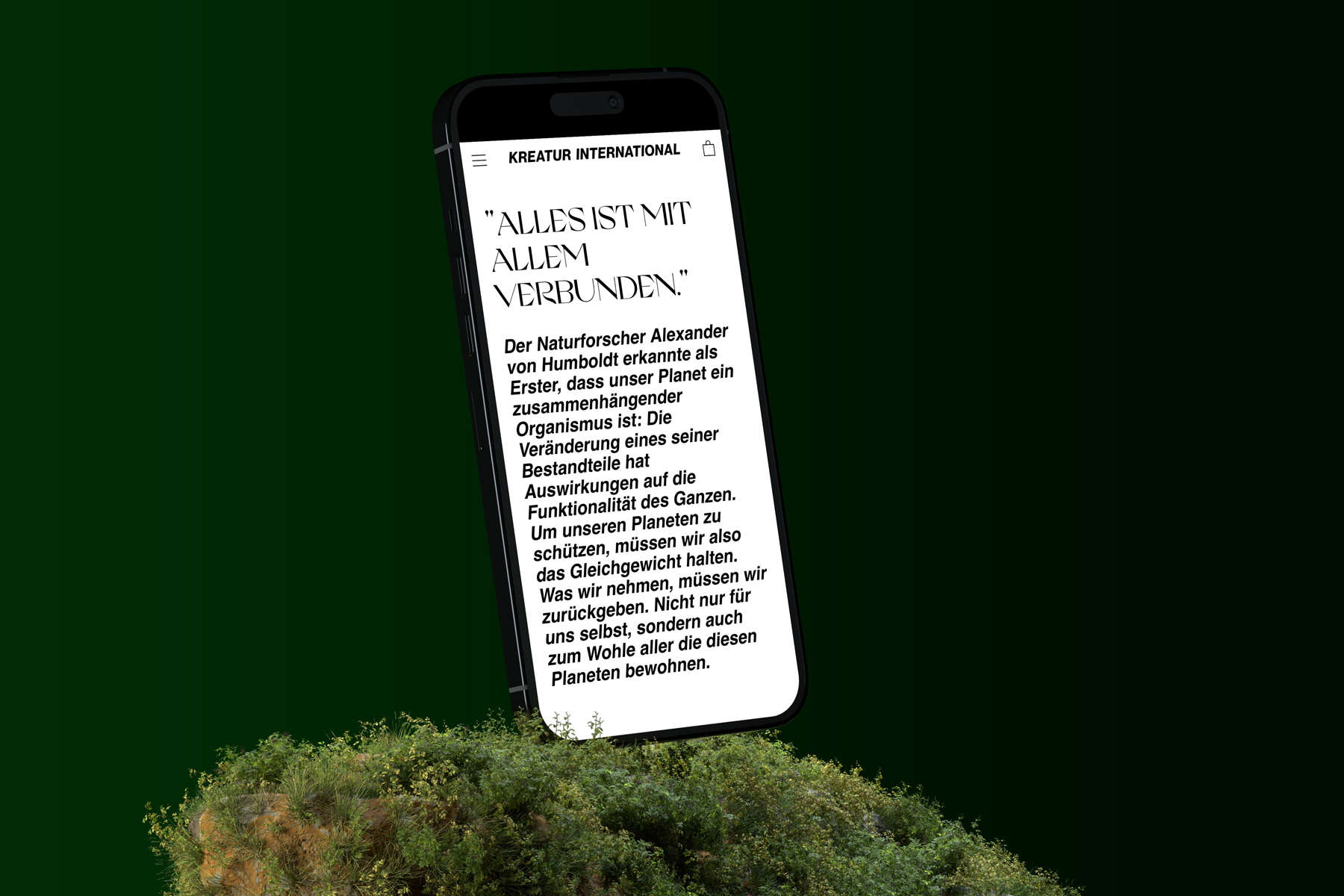
Why preserve biodiversity? Because species extinction is one of the most urgent problems of our time. And because the incredible diversity of beauty never fails to amaze. We feel the need to contribute to the conservation of this diversity and want to motivate many others to do the same.


Alexander von Humboldt
“Everything is connected to everything.”
-
SPECIES STYLE PLANET PEOPLE
-
SPECIES STYLE PLANET PEOPLE
-
SPECIES STYLE PLANET PEOPLE
-
SPECIES STYLE PLANET PEOPLE
-
SPECIES STYLE PLANET PEOPLE
-
SPECIES STYLE PLANET PEOPLE
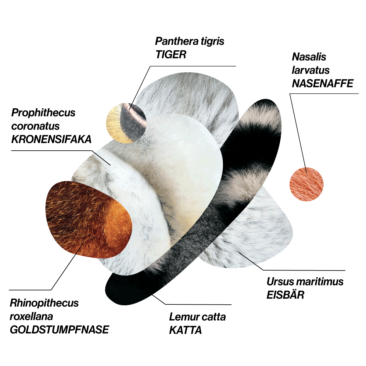
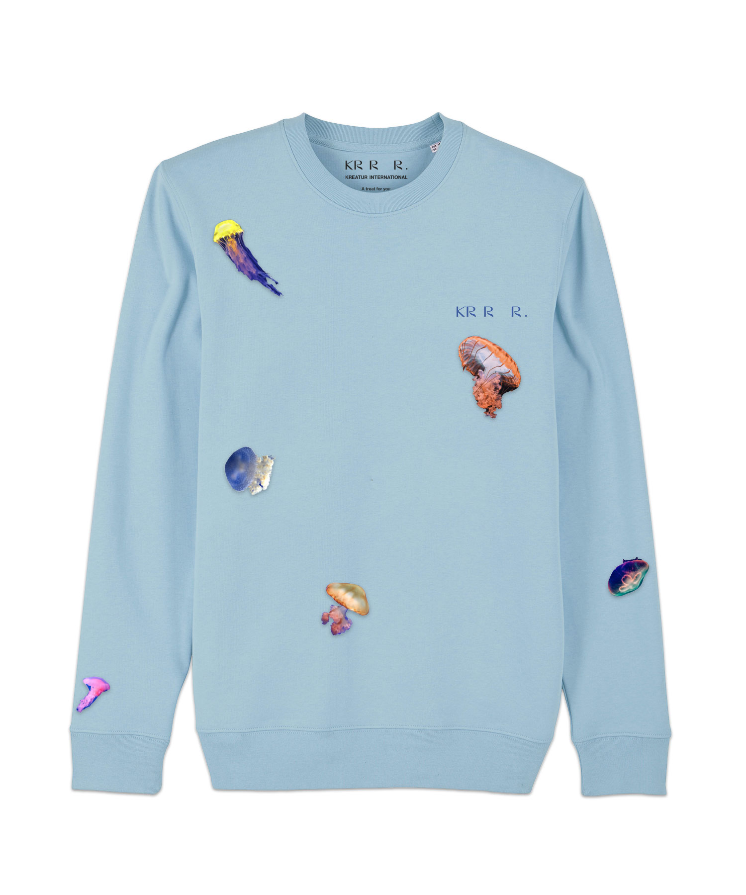
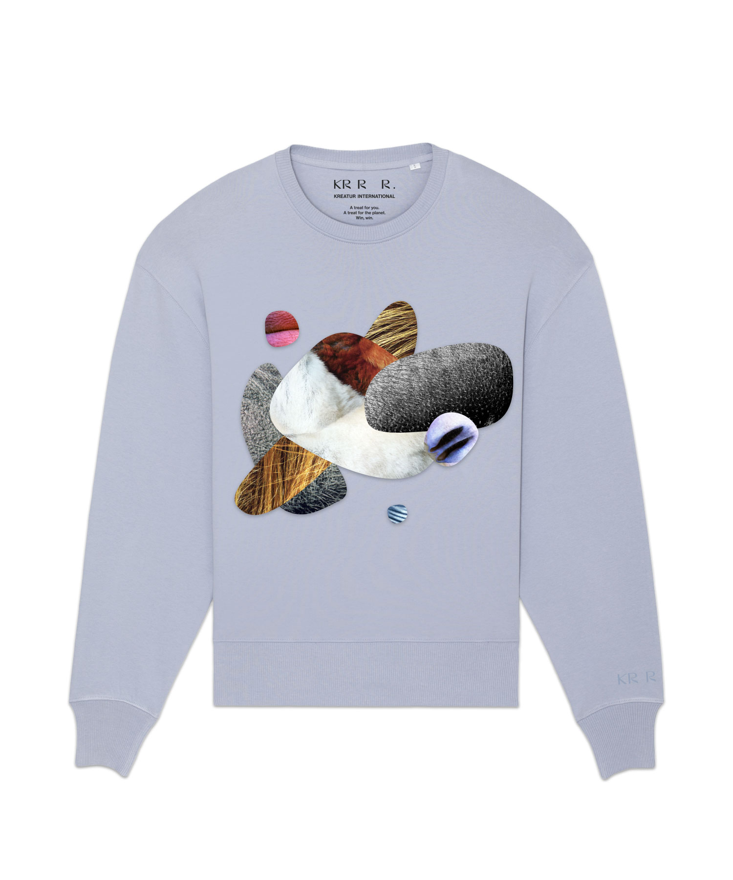
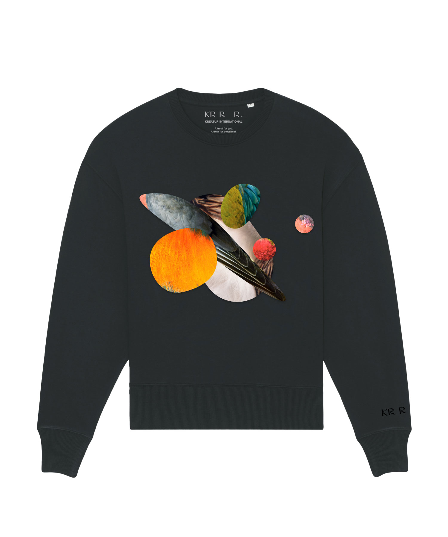
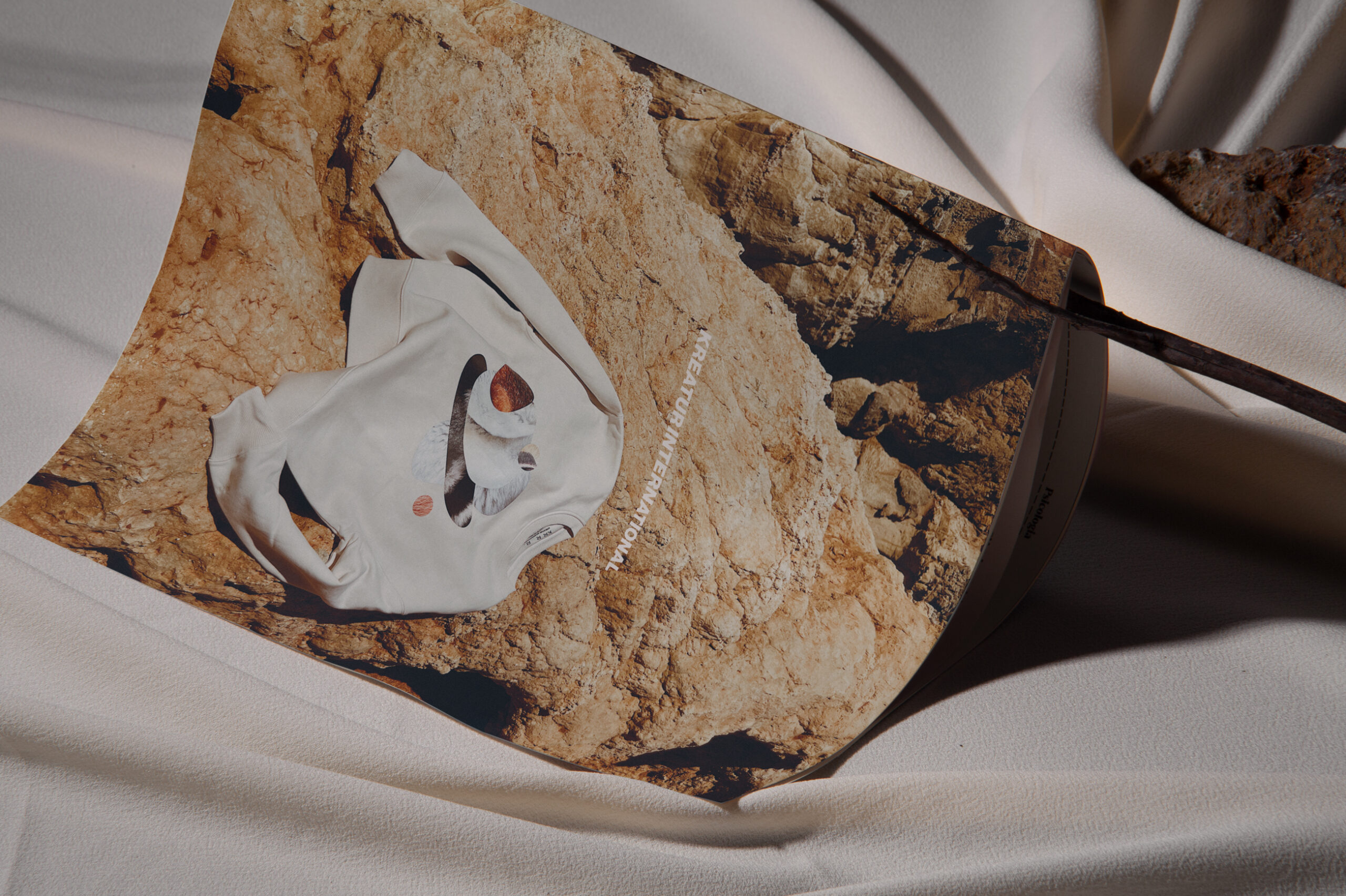
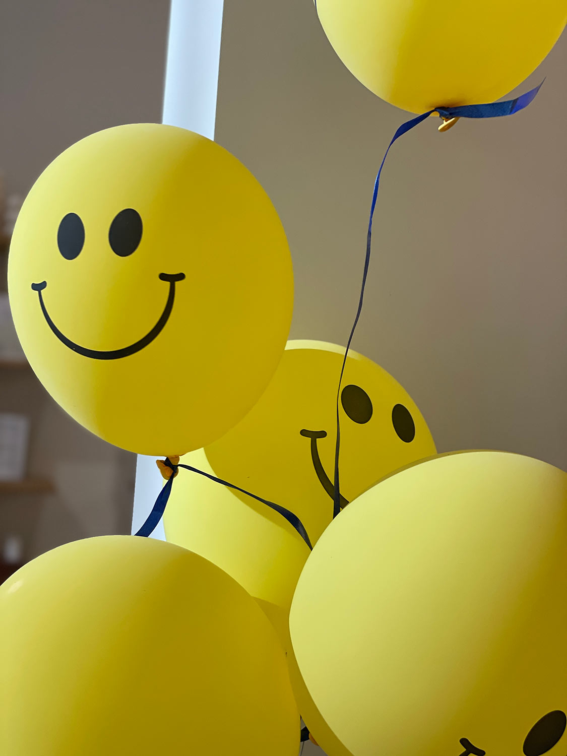
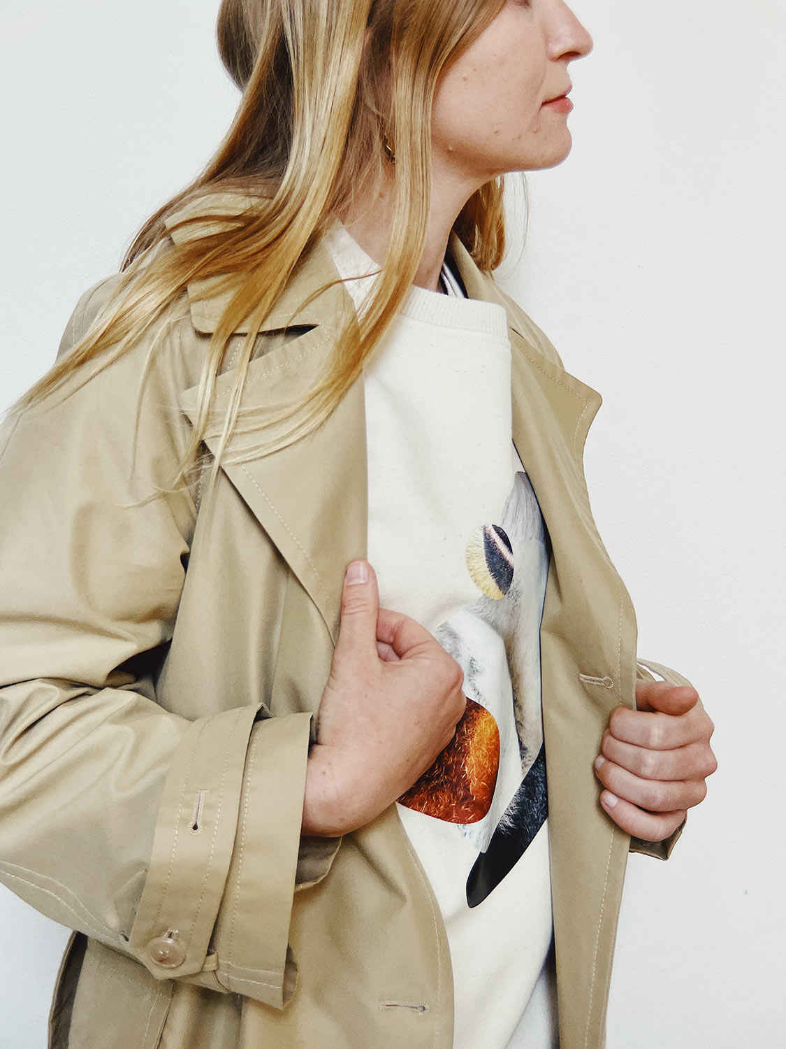
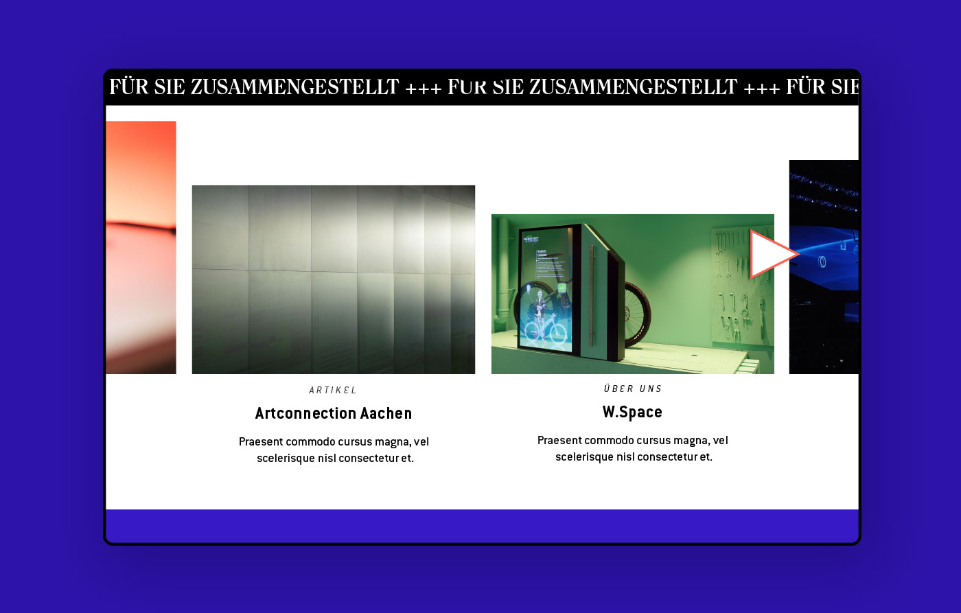
Save a creature
Our designs highlight species that are threatened by extinction. They are all on the Red List and every day the list gets longer. We want to help save these creatures – with our fashion brand that’s wild about wildlife.
Donation
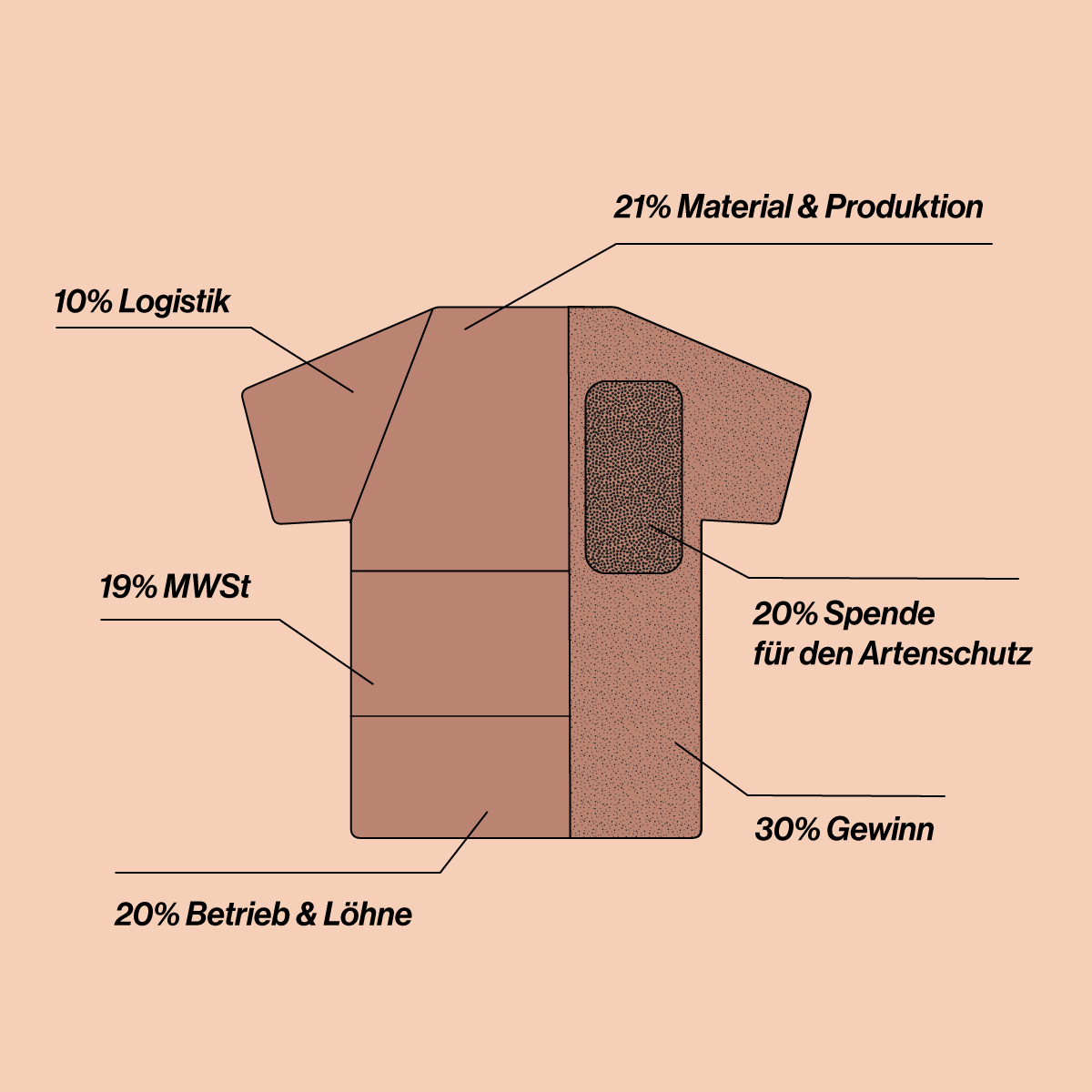
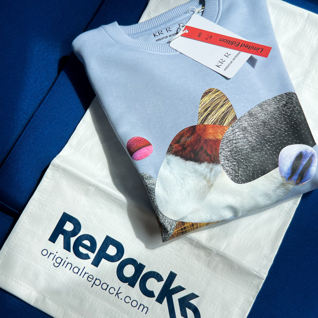
We are very serious about donating. It was indeed not easy to find a way to integrate this part of our concept transparently – until we came across Impactful after a long search. Since then, they have been our technical partner and together we ensure that with every purchase the corresponding donation goes to Pro Wildlife e.V. – an organisation that is highly committed to the protection of species and does important work in this area.

Key Facts
All materials used are sustainably produced — The finishing of our garments takes place locally — We offer waste-free shipping packaging — The conventional packaging consists of at least 50% grass (i.e. waste) and recycled paper — We try to avoid long transport routes in order to save CO2 — Our partners are all equally committed to sustainable production — We only produce in small batches to avoid waste — Our donation shares can be tracked transparently
The elephant in the room
Probably one question remains – why fashion? We wanted to create a direct connection to the issue of species extinction and what connection is more direct than the things we wear on our skin? We see fashion as a potential talk-starter and believe that it can help to raise awareness in society. An attention that is urgently needed.
Our Goal
As a creative studio, we can sharpen the vision. Bring things and issues into focus that we have forgotten on the way to growth and prosperity. A truly holistic approach also pursues the interests of those who are hardly heard. We want to create solutions that are tailored to the individual needs of many and empower our society to act as agents of change.

NEED SOME
LIFE-CENTERED DESIGN
APPROACH?
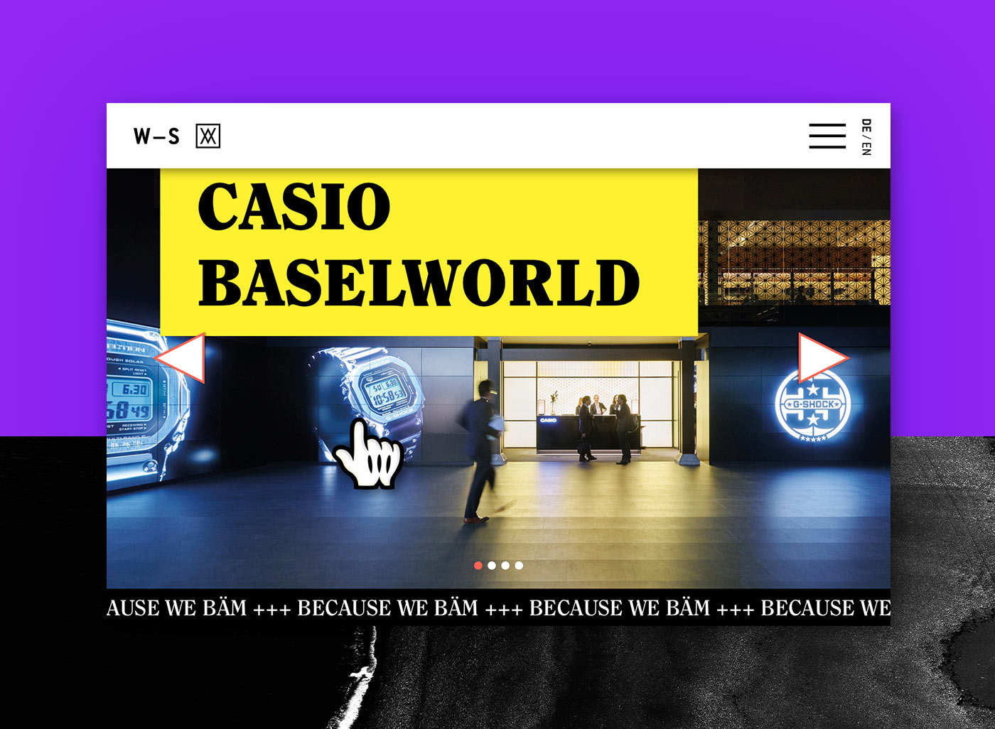
WALBERT-SCHMITZ
year
2020
client
WALBERT-SCHMITZ
industry
Brand Experience
services
UX Design
Scope
UX Design, Art Direction, Screen Design, Web Design, Design System
Client
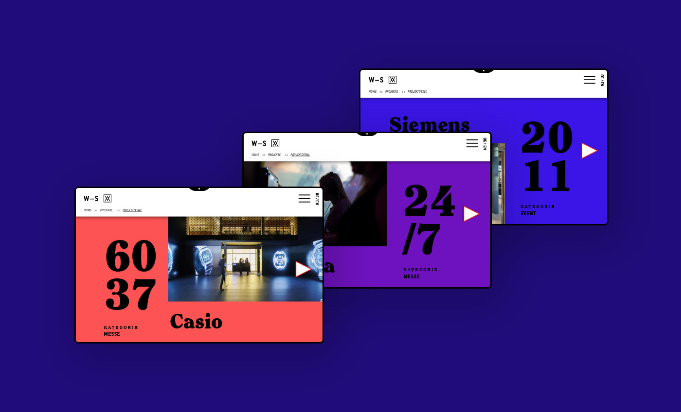
Walbert-Schmitz is an Aachen-based company for brand experiences in the fields of trade fairs and events. The briefing was a digital repositioning as a modern, experienced and exciting company with a history of over 50 years. The warm-hearted, open-minded and relaxed atmosphere in the company needed a digital equivalent.
challenge
The task sounded simple at first: Walbert-Schmitz wants to reposition itself more strongly as a creative partner and source of inspiration within the live communication industry and among customers. Everything that had been produced up to that point was sighted, reassessed and forgotten treasures were lifted. In the decision-making rounds, courage and humour had the greatest influence. When everyone at the table laughed, the proposal went on to the next round.
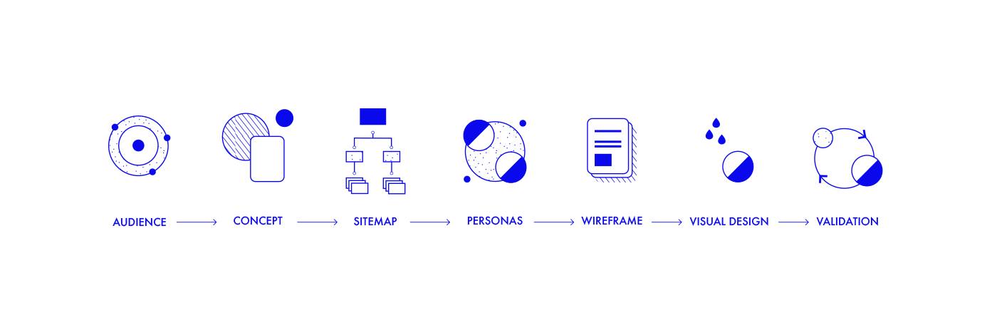
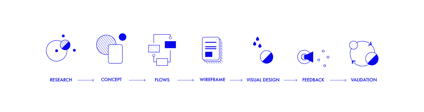
approach
In the research phase several competitors were analysed and future fields identified. It was determined that the trade fair construction industry is divided into a few high-performance agencies and traditional companies. Whereby new digital topics also bring new competitors into the industry. The following semantic analysis also looked at the company history in order to reactivate forgotten strengths. The findings from best practice research and semantic analysis were then incorporated into the concept.
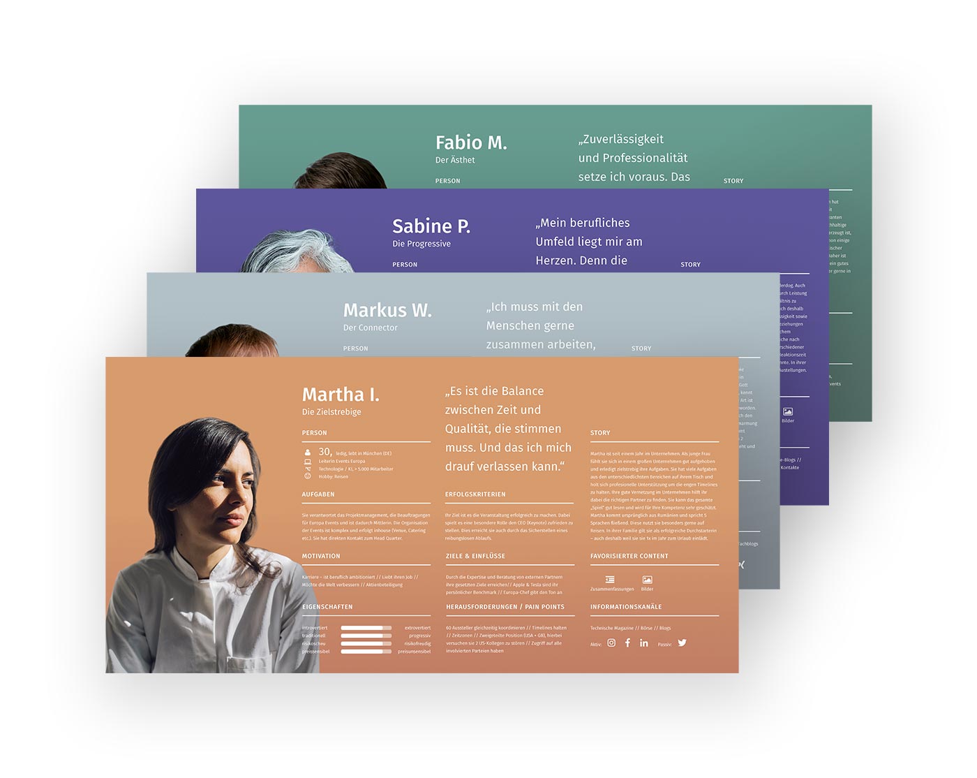
Personas
In order to clearly identify the needs and goals of different types of customers and applicants, a total of 9 personas were developed. This way an understanding of customers, applicants and antipersona was defined to ensure a clear direction.
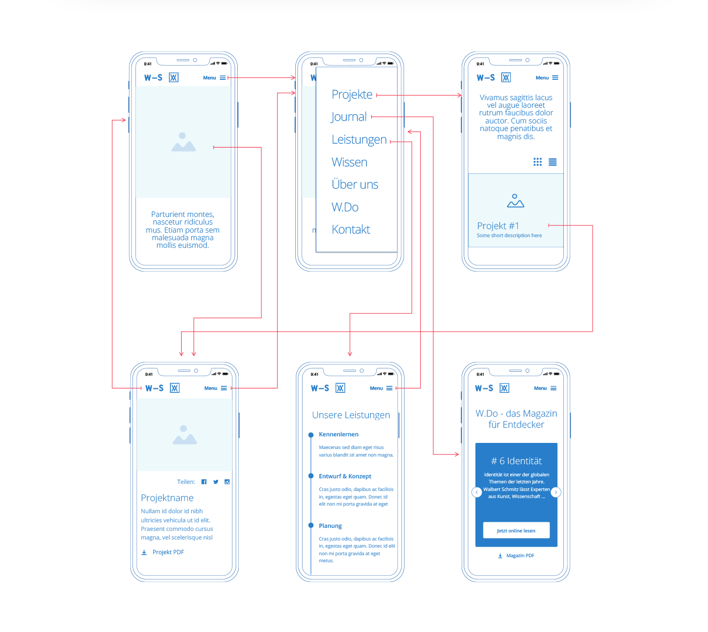
wireframes
The newly gained content was transferred to wireframes and coordinated and fine-tuned in several iteration loops with decision makers, developers and designers.
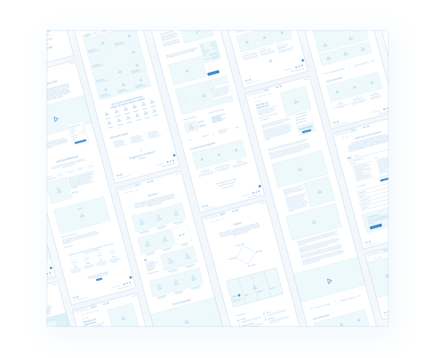
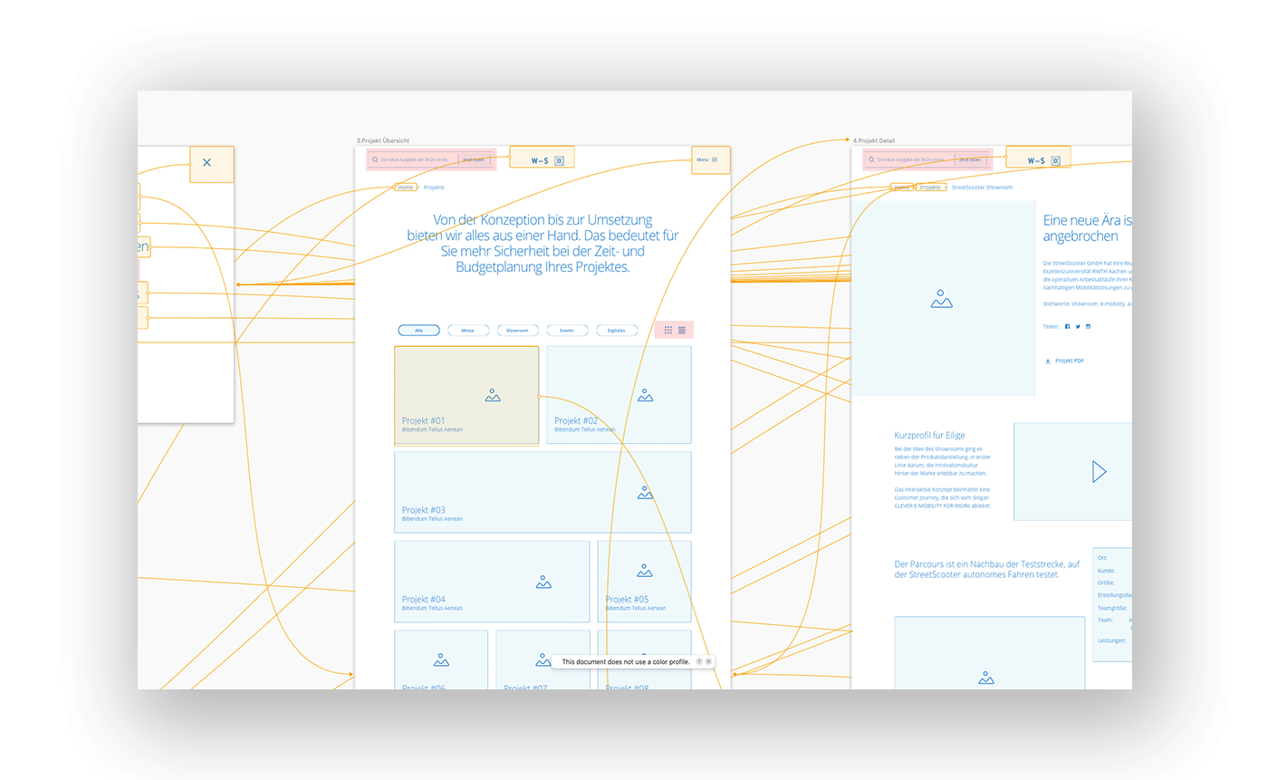
Prototypes & Flows
A new site architecture was developed and tested with prototypes. In this way, both the flow of the page and its consistency could be ensured.
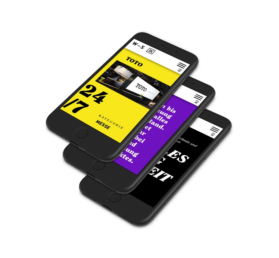
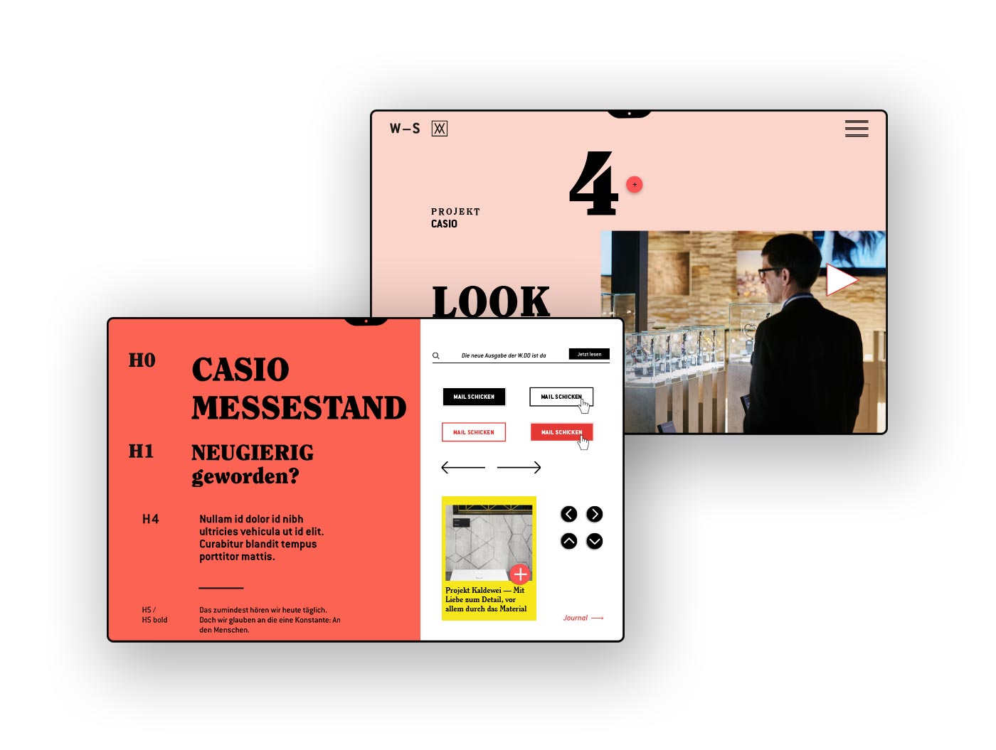
Visual Design
After approval of the detailed concept, the content was transferred to the visual design, suggestions for headlines and content were developed and a holistic experience was successively established.

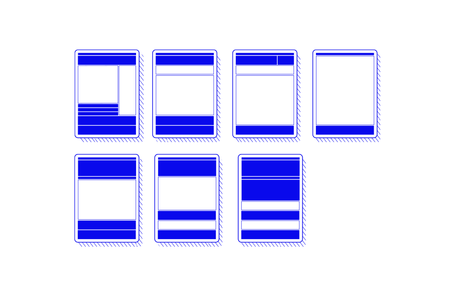
Modules
In order to ensure the greatest possible flexibility in the construction of the new website, all content has been organised in modules that can be flexibly combined with each other. Also the modules themselves offer several possibilities of expression, so that a dynamic appearance ensures an entertaining presence.
Want some UX Pros on your team?
Let’s talk!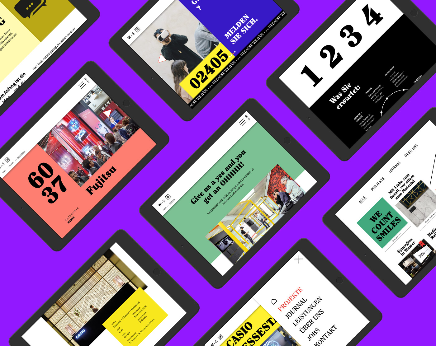
Learnings
Deciders from other areas should be regularly invited as “guest auditors”. This increases the internal acceptance of the product within the company. Courage and fun are the most underestimated values in a every process.
CREDIT SUISSE
year
2019
client
CREDIT SUISSE
industry
Banking
services
UX Design
Scope
UX Design,
Art Direction,
Screen Design,
Web Design,
Design System
Client
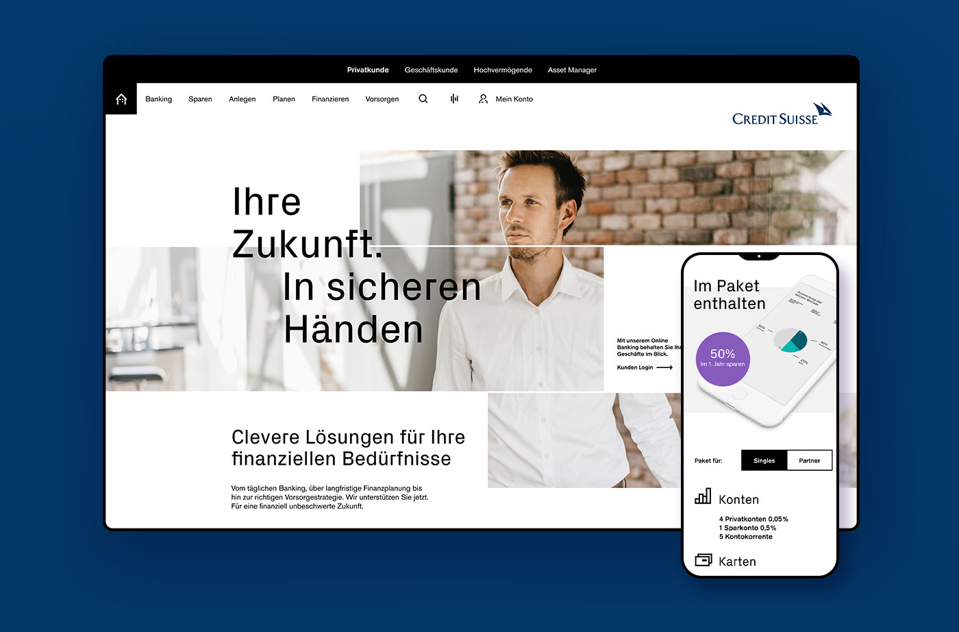
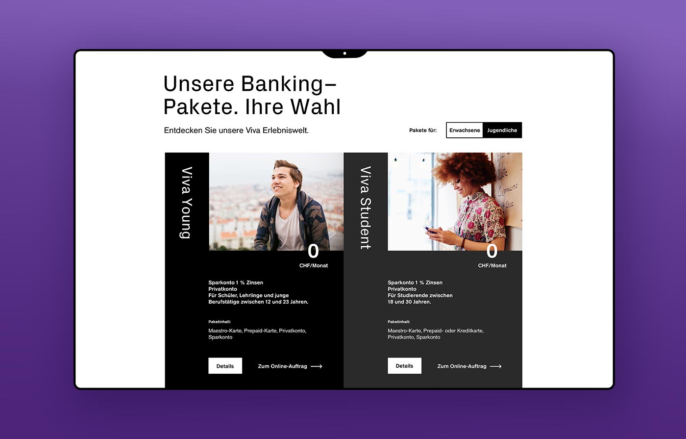
Credit Suisse Group is a financial services company headquartered in Zurich, Switzerland. It provides private clients as well as small and medium-sized companies with comprehensive financial advice on banking products.
challenge
The brief was simply formulated: “Make credit-suisse.com the best banking user experience on the market”. In order to meet the briefing, the request could therefore only be implemented through a radical user-centric approach. The customer was therefore always at the centre of all decisions.
approach
In the research phase several
competitors were analysed
and a best practice overview
was compiled. In addition, a
cross-industry research on
groundbreaking solutions was
conducted, which resulted in
a benchmark analysis.
page types
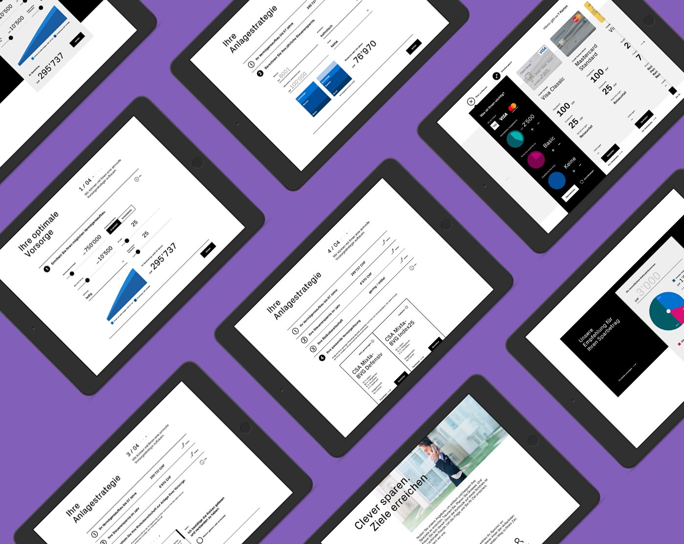
The entire Credit Suisse website had over 30 different page types, which were analyzed, standardized and simplified for the new concept.
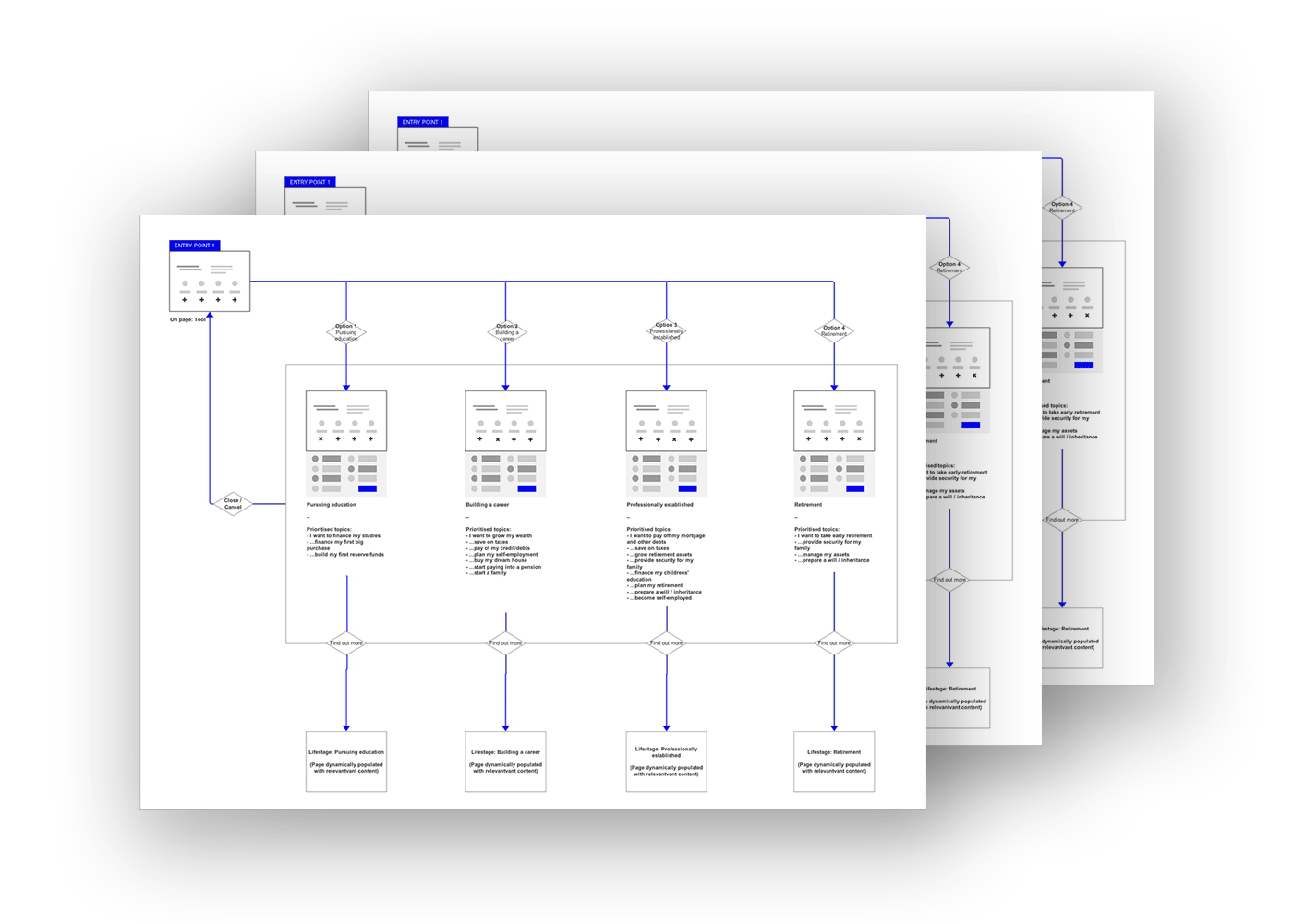
flows
The complete site architecture was also revised and flowcharts were created to check the logic and ensure consistency.
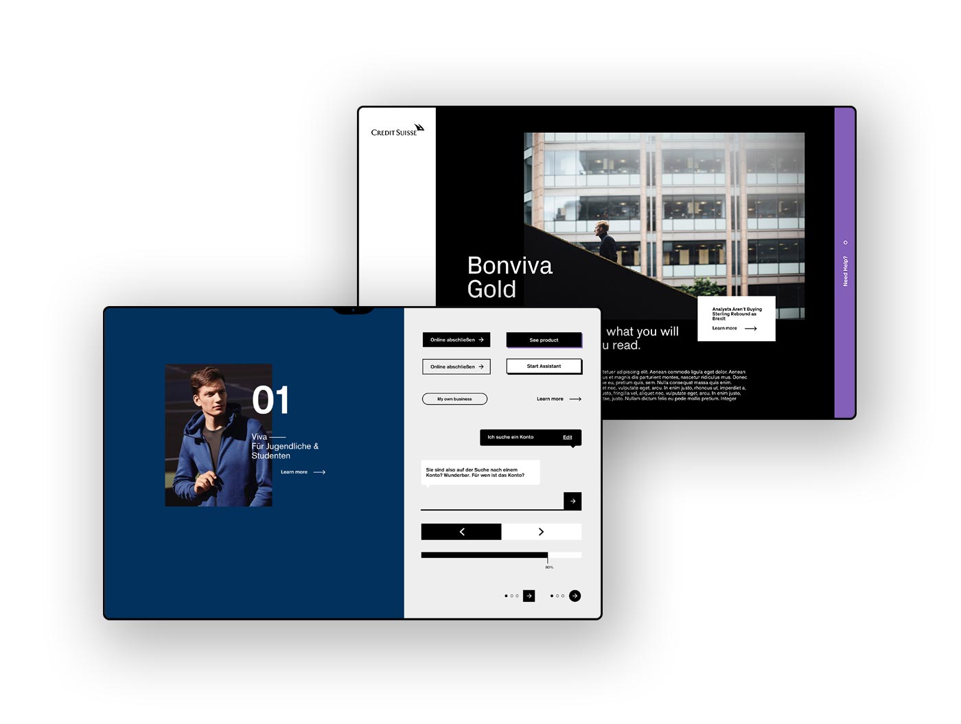
visual design
The entire Credit Suisse website had over 30 different page types, which were analyzed, standardized and simplified for the new concept.

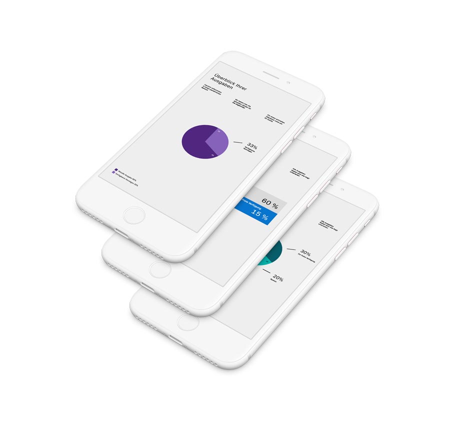
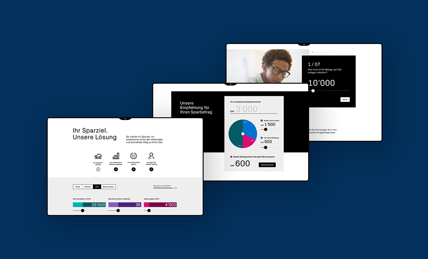
Modules and calculators
In order to offer users the best possible service, more than 25 highly complex calculation modules have been designed and significantly simplified in favour of improved user-friendliness.
DO YOU
LIKE WHAT
YOU SEE?
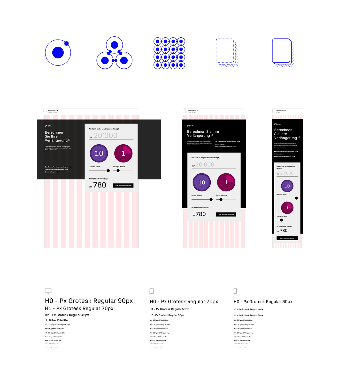
Atomic Design & Living Styleguide
Based on the current Atomic Design standard, a consistent and device-wide design system was developed. Using the web application Frontify, the new brand elements were defined and provided in a clowd-based living style guide.
Learnings
Daily coordination rounds are essential and must be scheduled Be a Human Developers must be part of the team from the beginning and provide feedback Familiarization phases with new tools must be planned