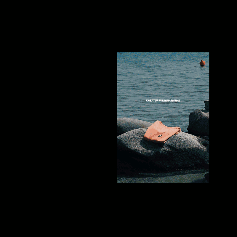
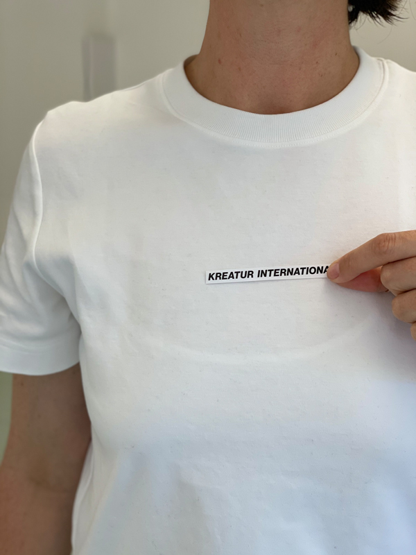
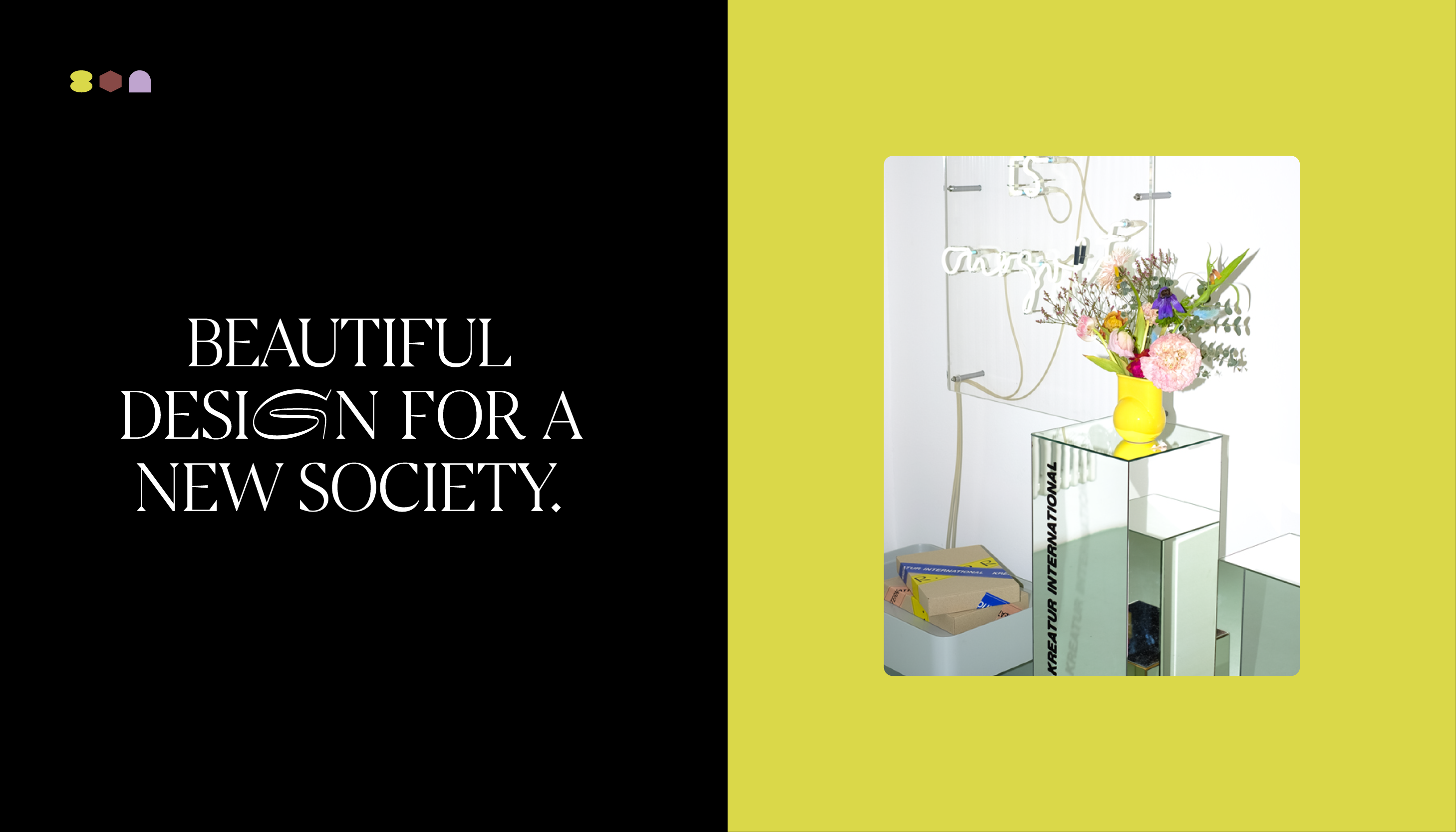
KREATUR INTERNATIONAL
year
2022
client
Kreatur International
industry
Fashion
services
Branding
scope
Naming, Conception, Branding across all platforms, Product Photography, Content Creation
CLIENT
Once upon a time, there was an idea that had been waiting patiently in ONOGRIT’s drawers for a long time – the idea for a project dedicated to the protection of biodiversity. When Corona shut down our daily lives, we knew it was time to make this project a reality.
challenge
We ourselves as customers – a curse and a blessing at the same time. No one to interfere and all options at our disposal. Where do you start and, above all, when do you stop? And yet it is the same as with client projects – once you have found the starting point, you also recognise the point when the result has reached the right maturity. And here it is.
APPROACH
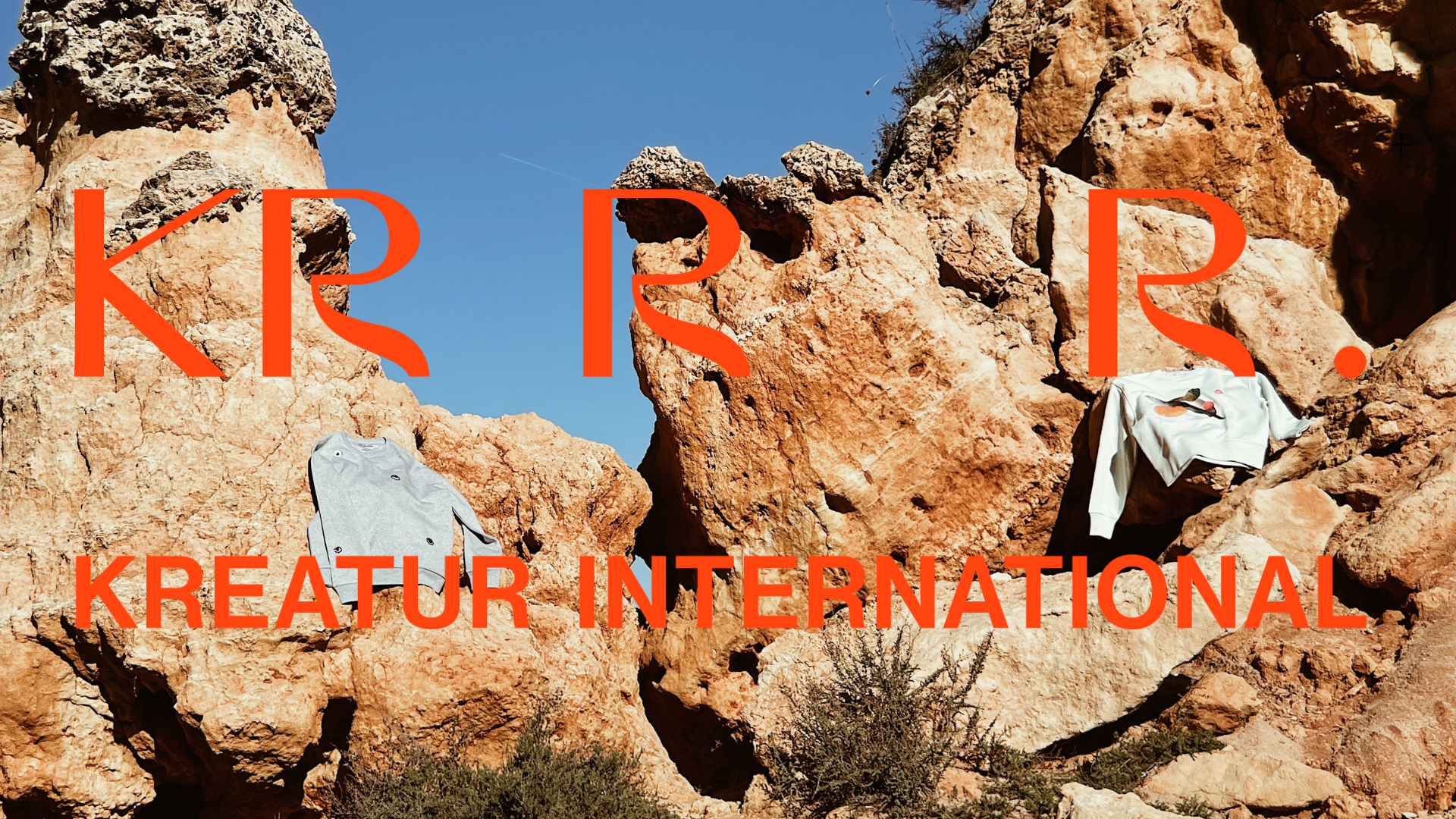
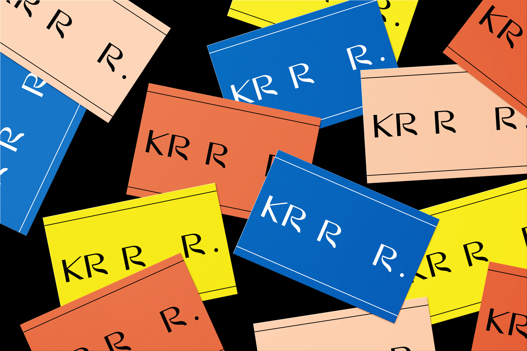
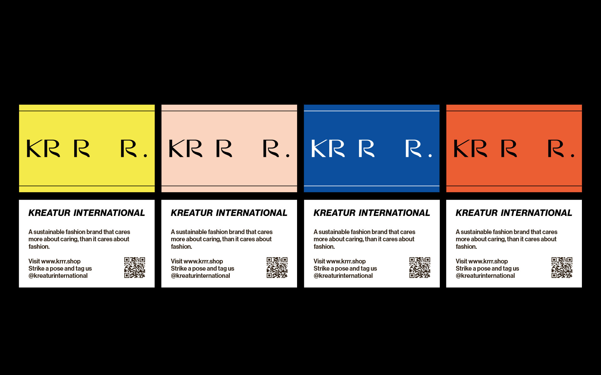
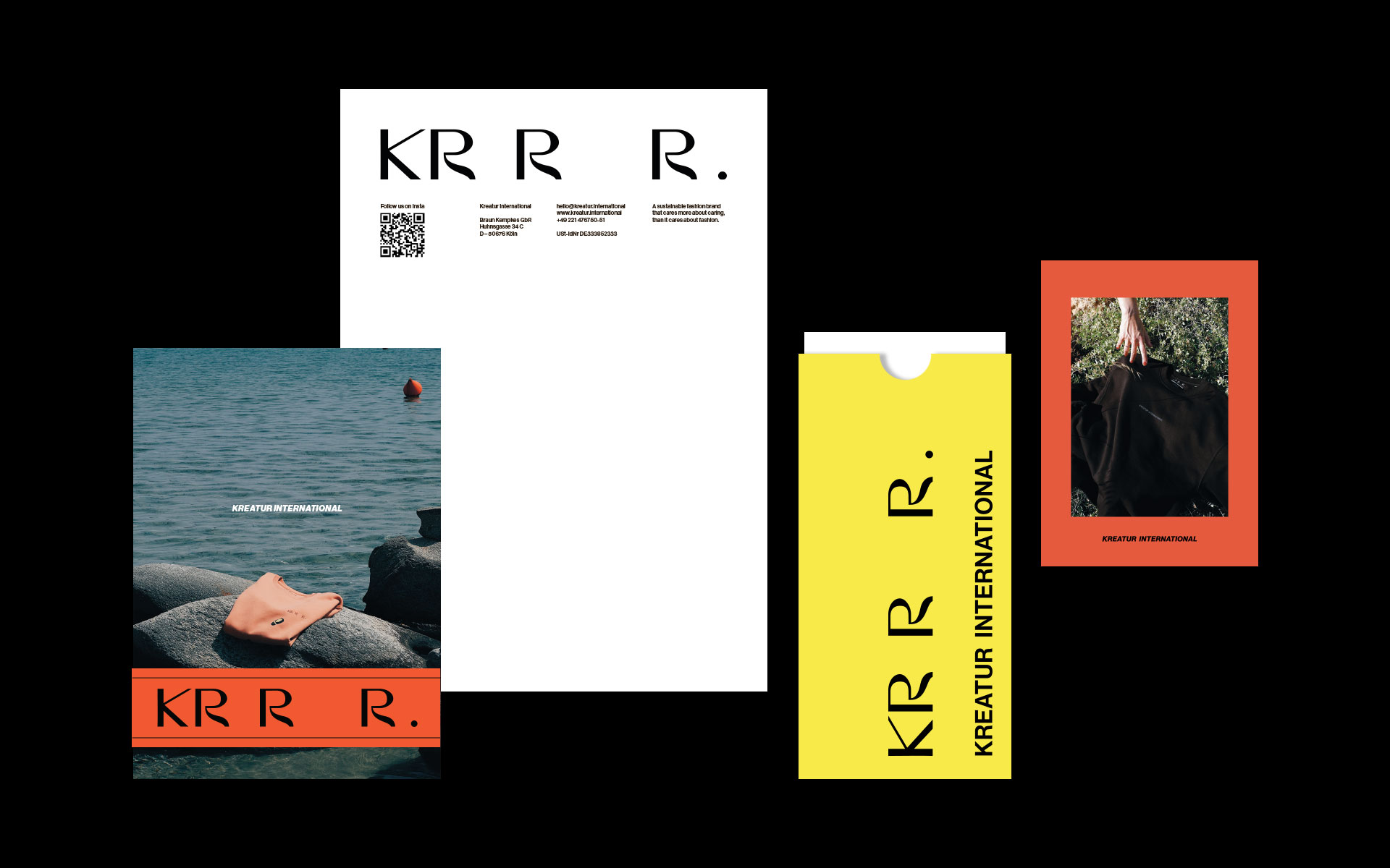
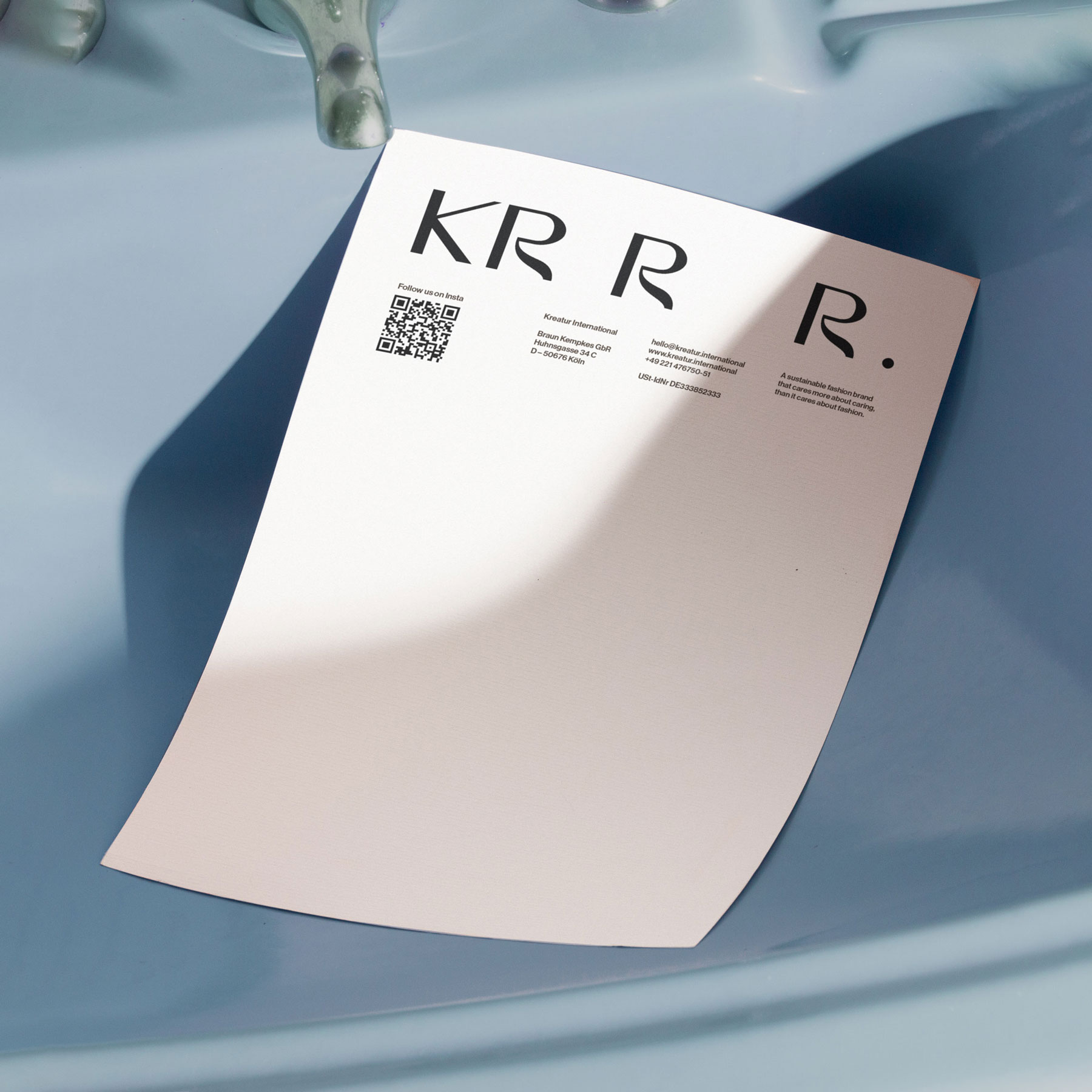
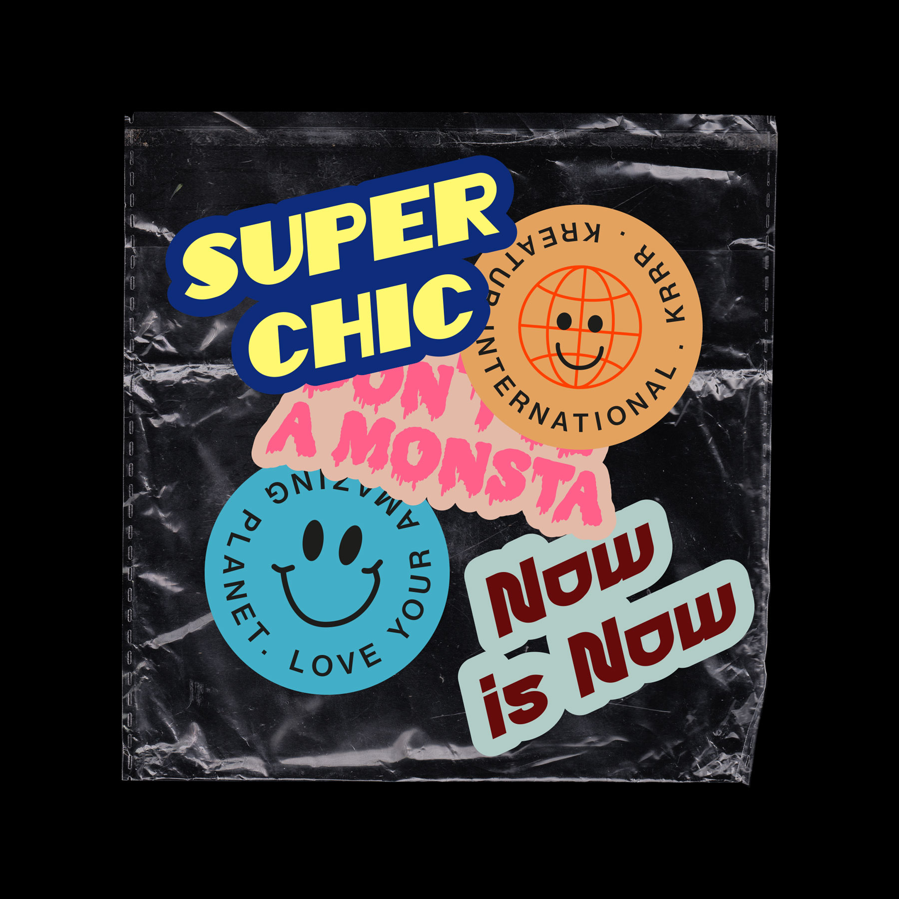
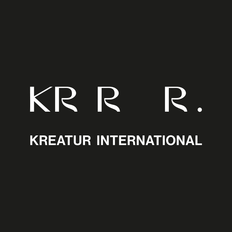
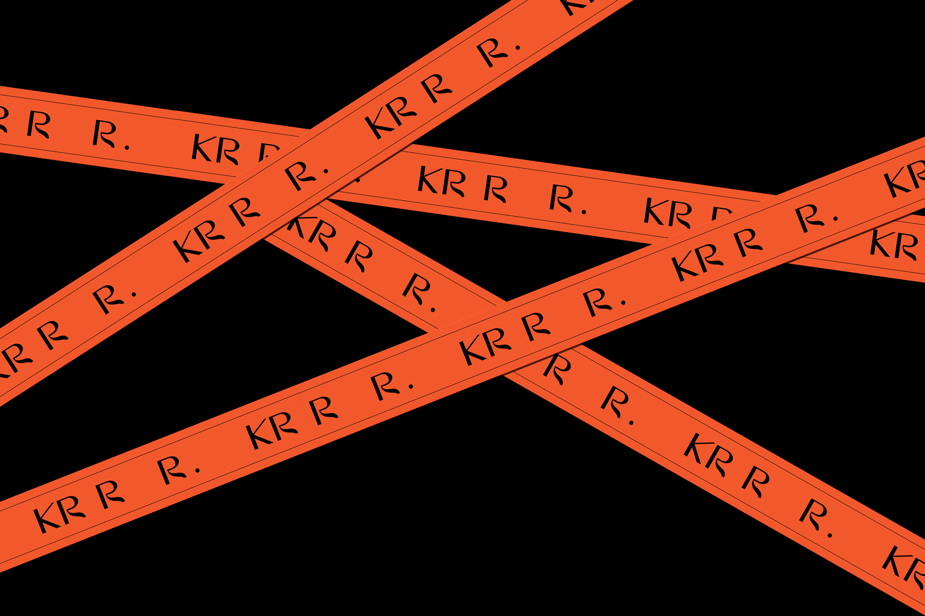
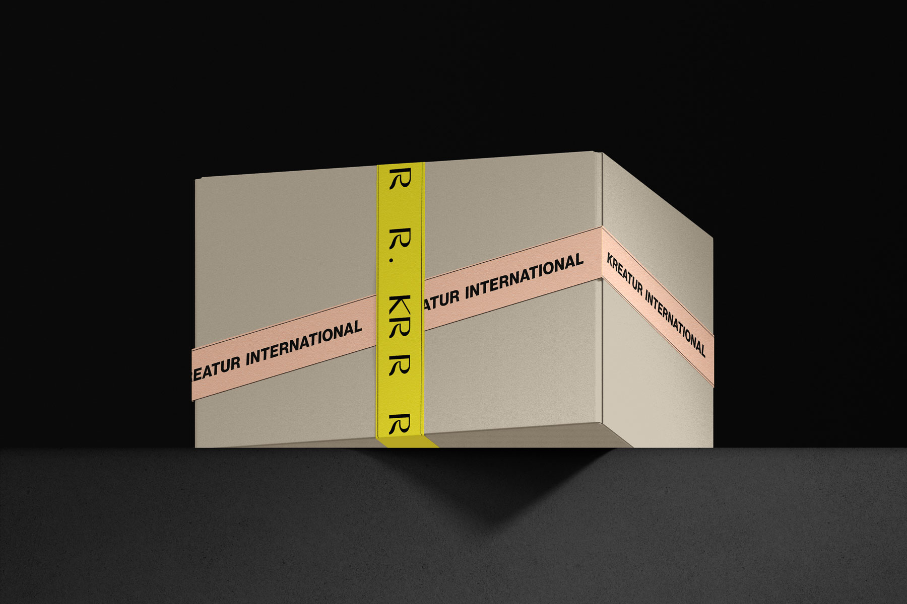
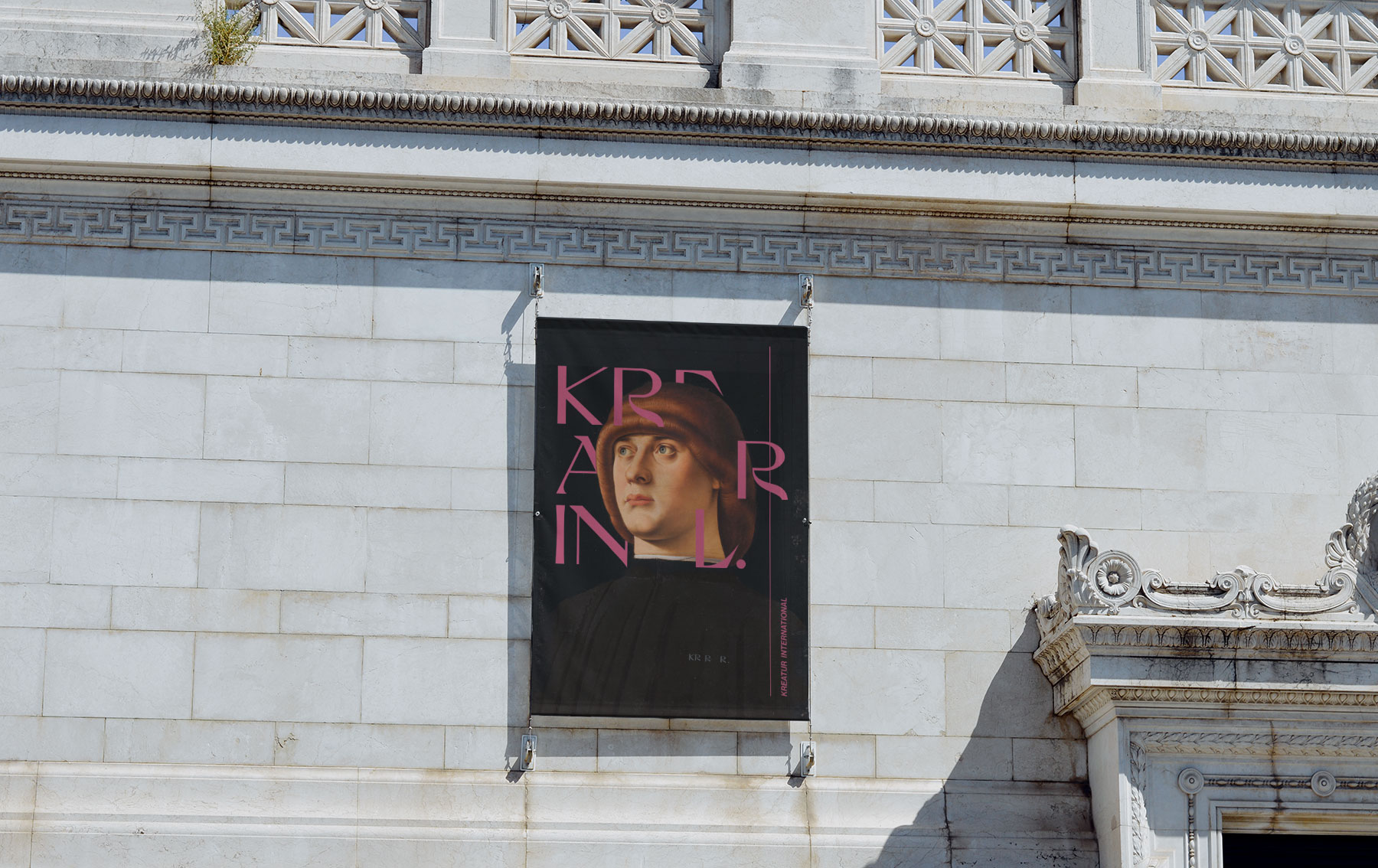
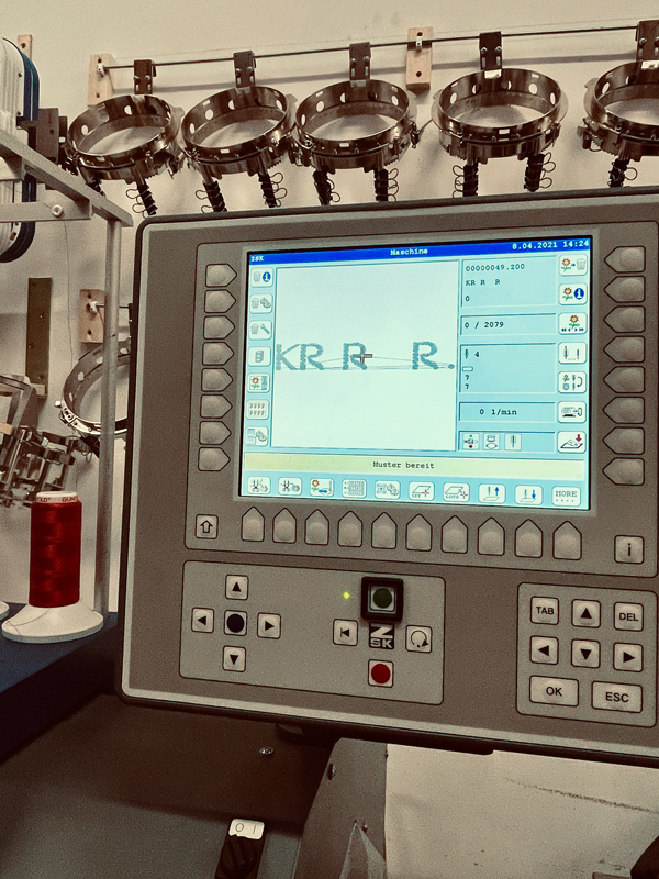
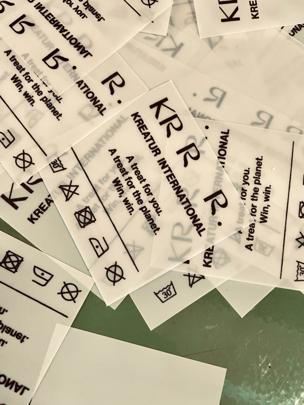
What do you call a project that addresses a global issue? And how do you create a corporate design that draws attention to the disappearance of essential elements of our ecosystem? A design that briefly irritates and at the same time arouses curiosity? This was the question that led to our name and logo. Kreatur International – a universally understandable brand that can be understood in all languages without further translation. The missing letters in the logo not only show that essential parts are missing, but also produce a sound that is rather painful when spoken out loud: KR R R. To check whether we can be satisfied with the result, we followed Otl Aicher. He once said: “A logo is a good logo if you can draw it in the sand with your big toe.” We tested it and the design passed.


Do you like what you see?
Let’s work together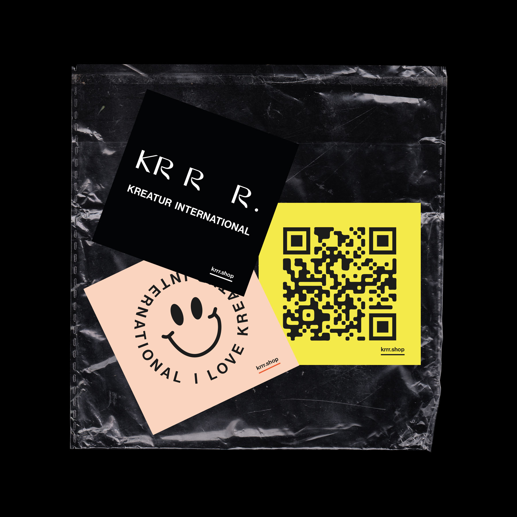
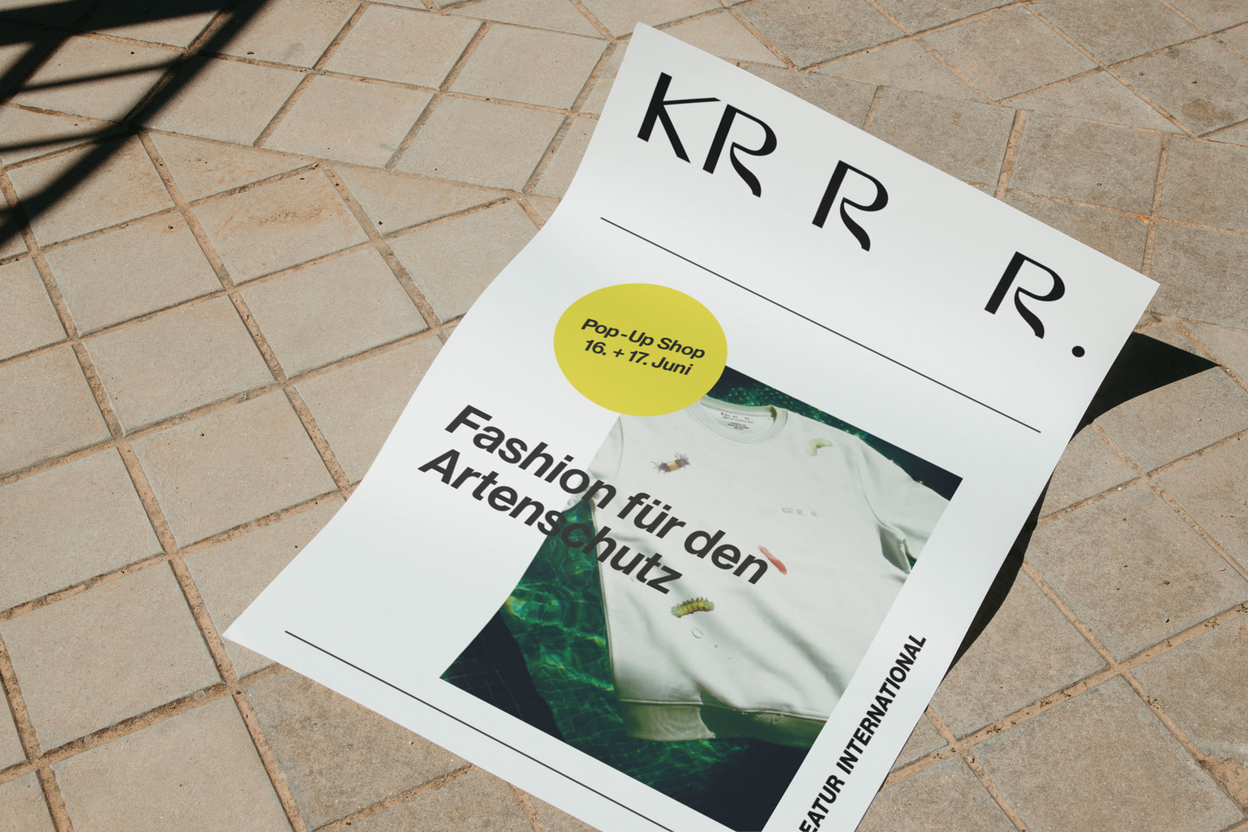


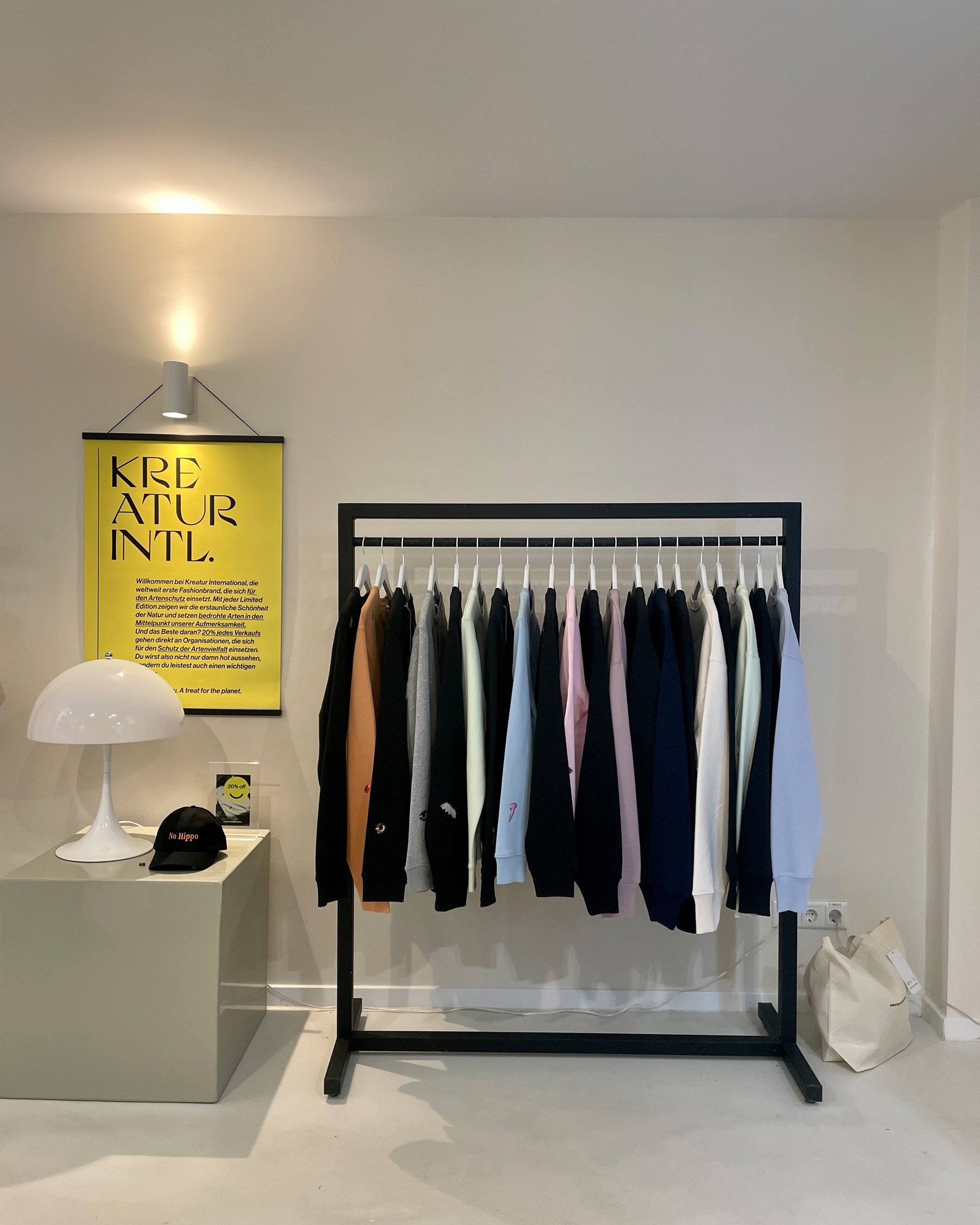
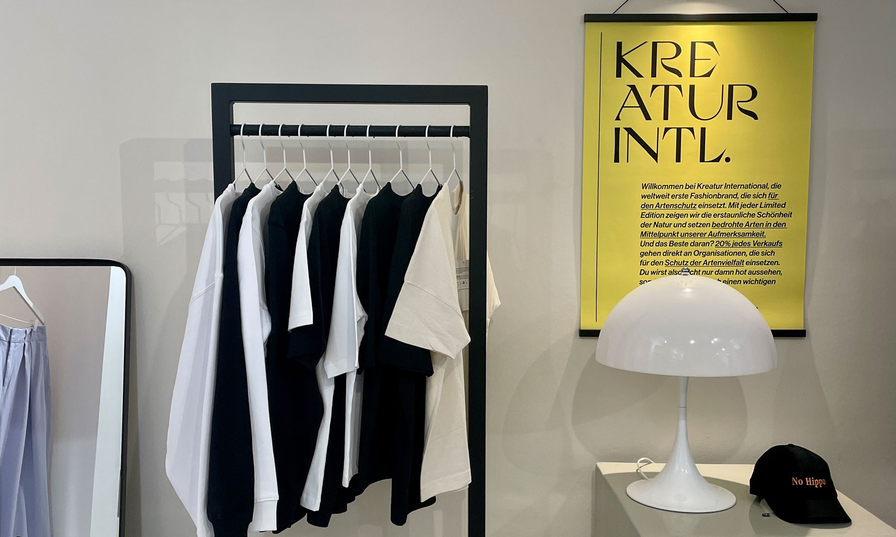
KREATUR INTERNATIONAL COLLECTION
year
2022
client
Kreatur International
industry
Fashion
services
Fashion Design
scope
Research, Research, Research, Motif design, Development, Decisions, Decisions, Sustainable production
CLIENT
Anyone who starts a fashion brand also needs a collection. To cut a long story short: That’s what we did.
challenge
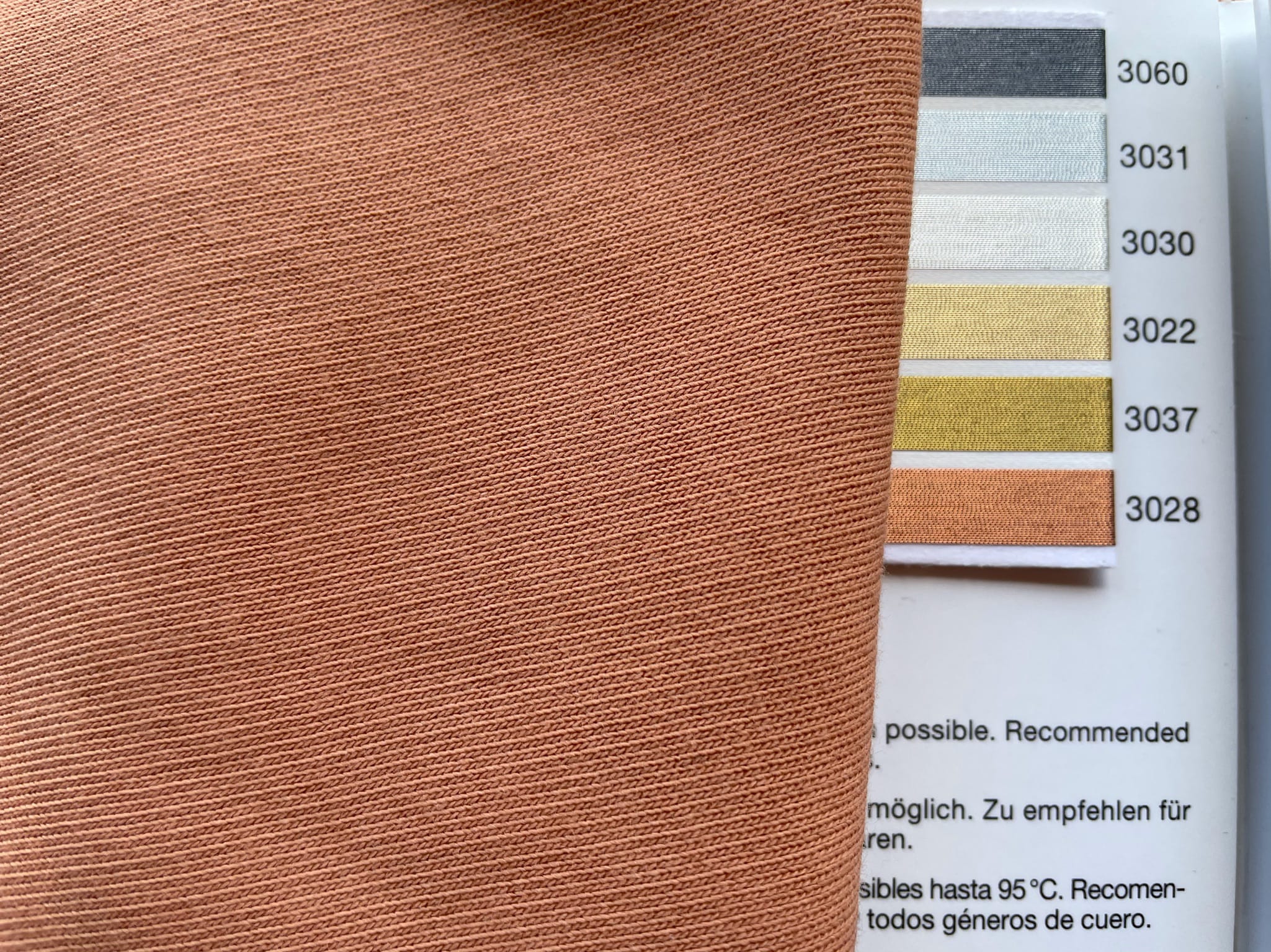
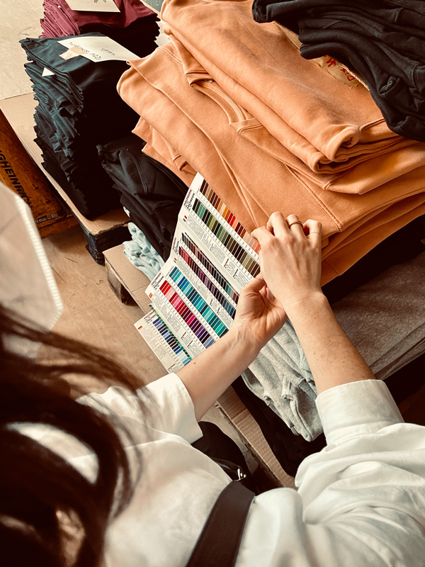
Zeros and ones and paper – that’s where we are at home. Produce clothes? No idea where and how, that was our initial situation. Of course, that’s no longer the case today. GOTS, sustainable materials, local production – all topics we familiarised ourselves with in order to realise this collection. Made from organic cotton and extra soft, they not only look fantastic (as we think) but also keep us warm and cozy. Yes, we are a little proud.
APPROACH
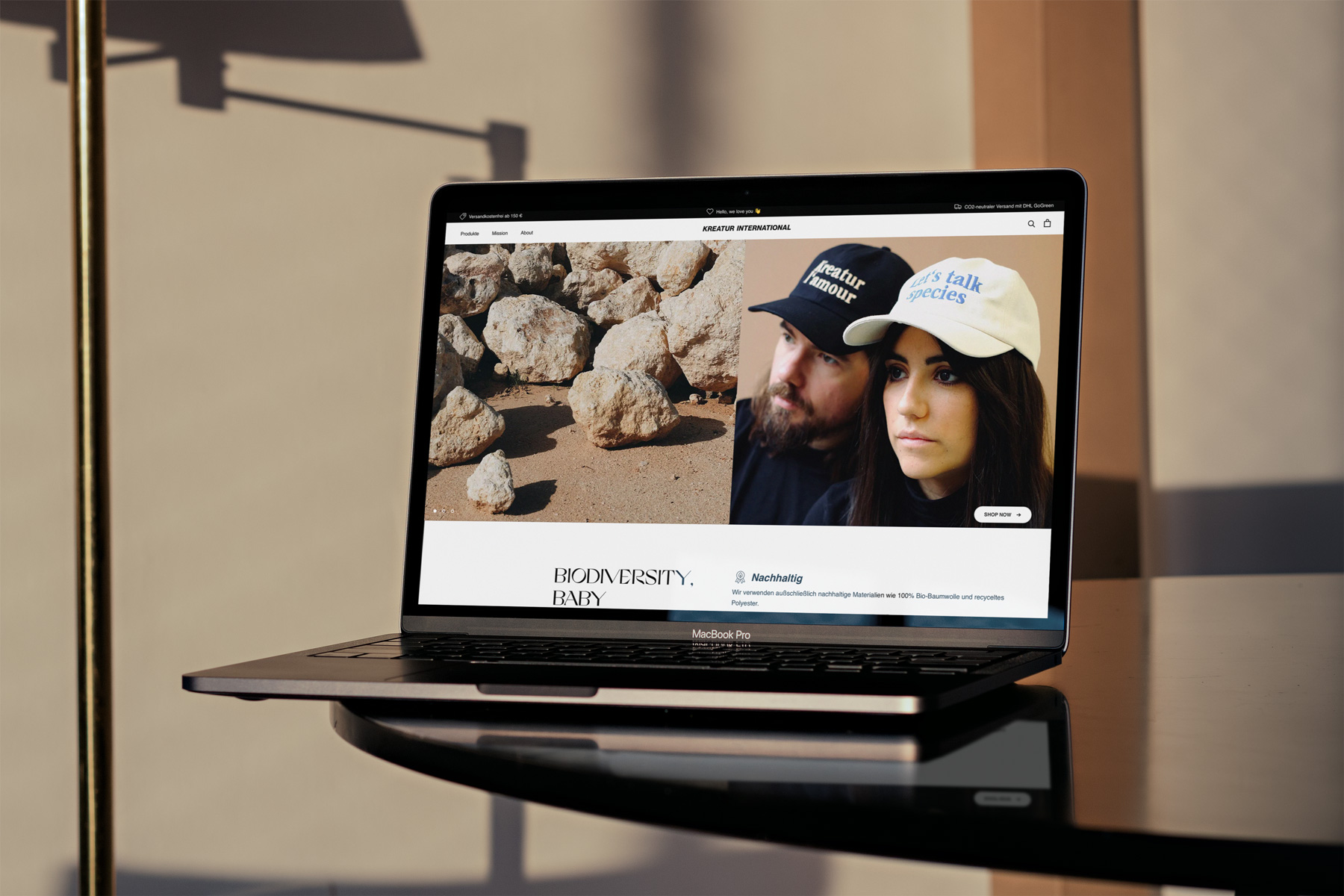
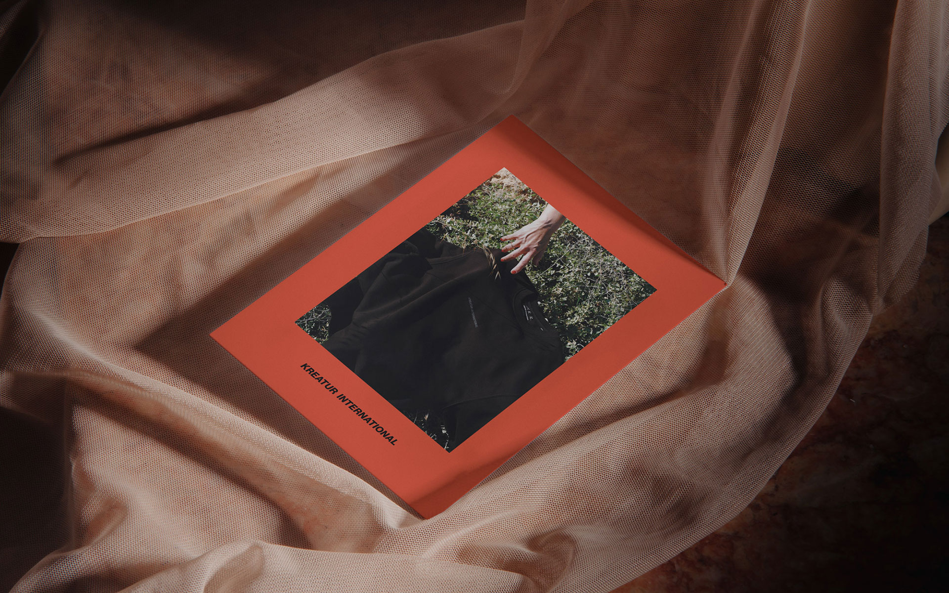
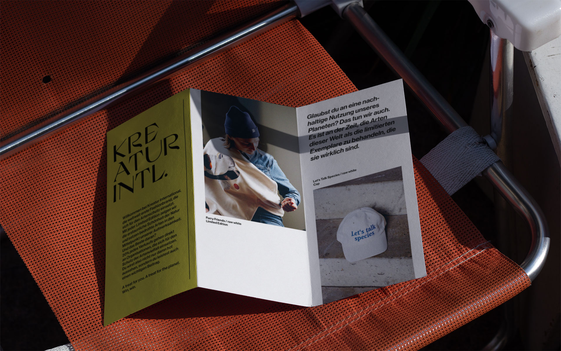
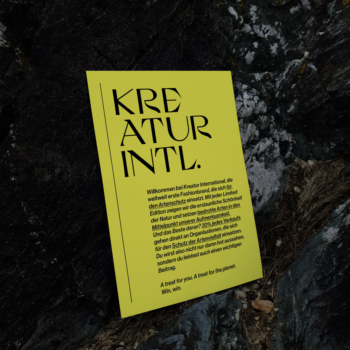
KREATUR INTERNATIONAL is the first fashion brand that brings the protection of species into the focus of the fashion industry. We want to offer endangered species a special platform that encourages conversation and is present in everyday life.
BIODIVERSITY BABY
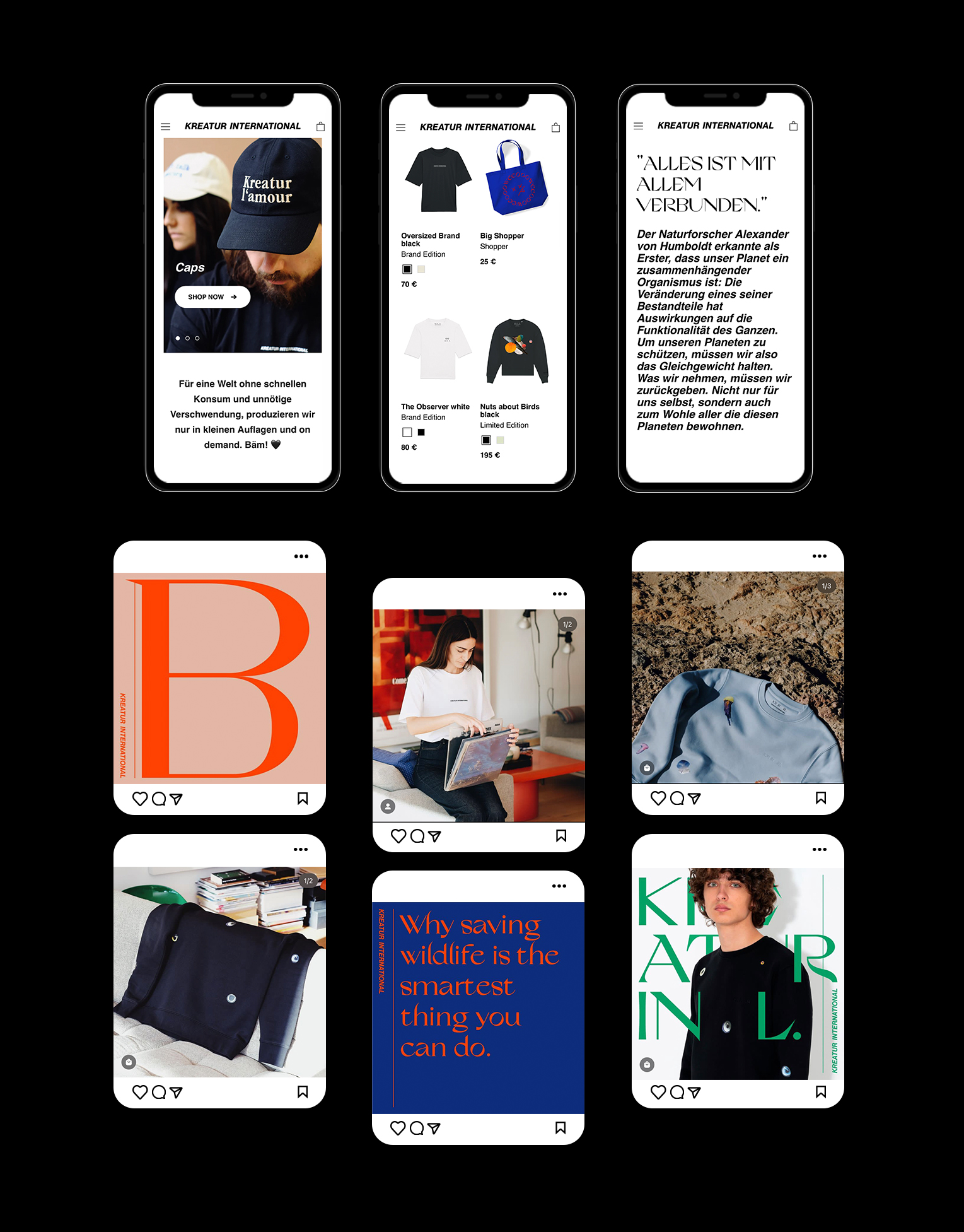
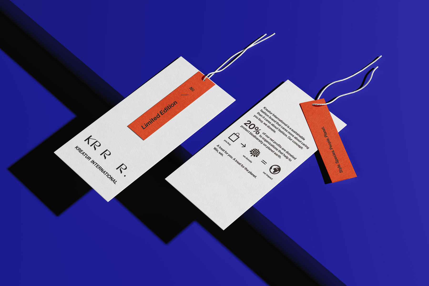
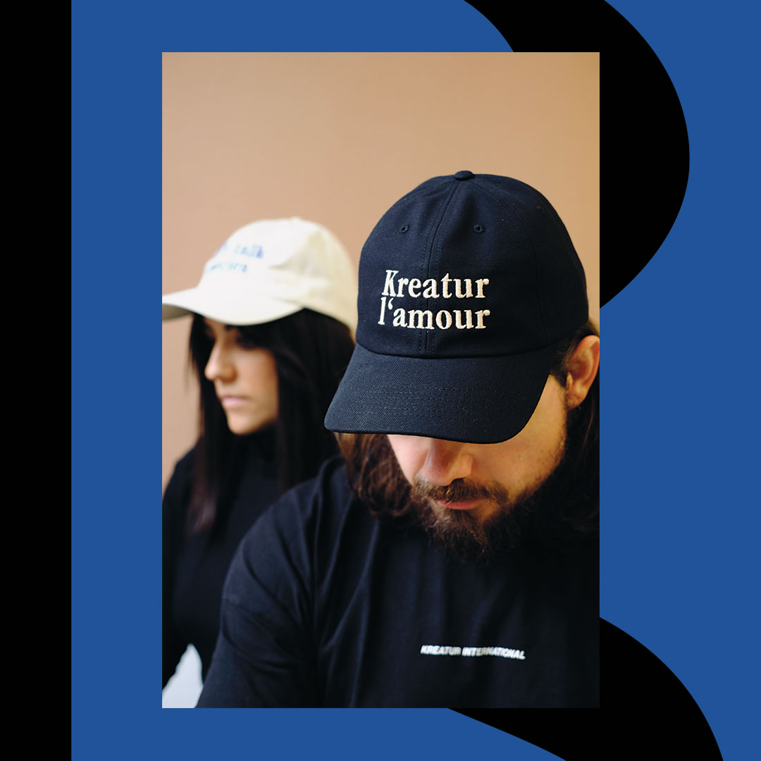
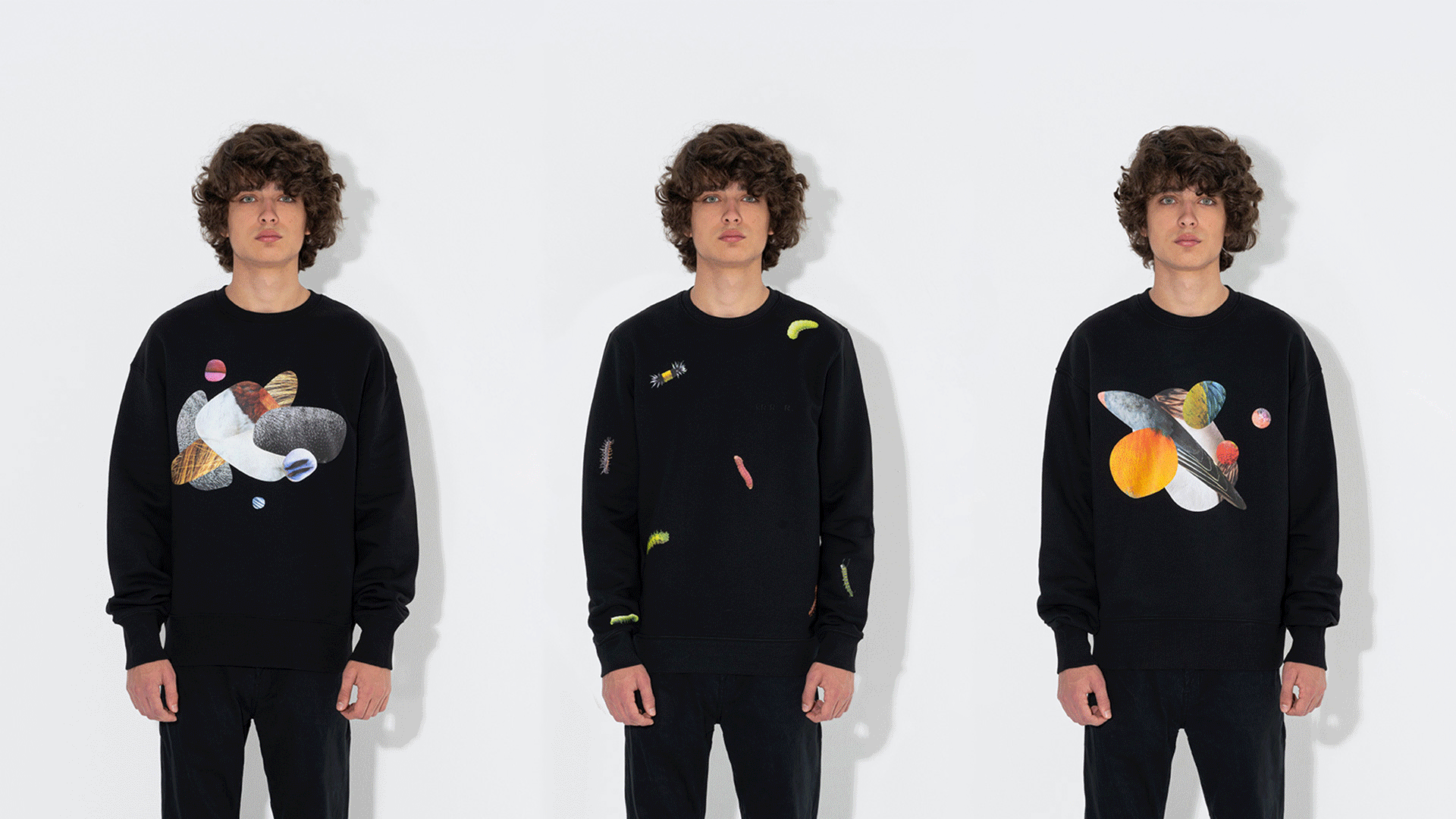
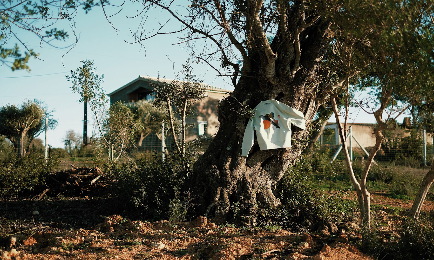
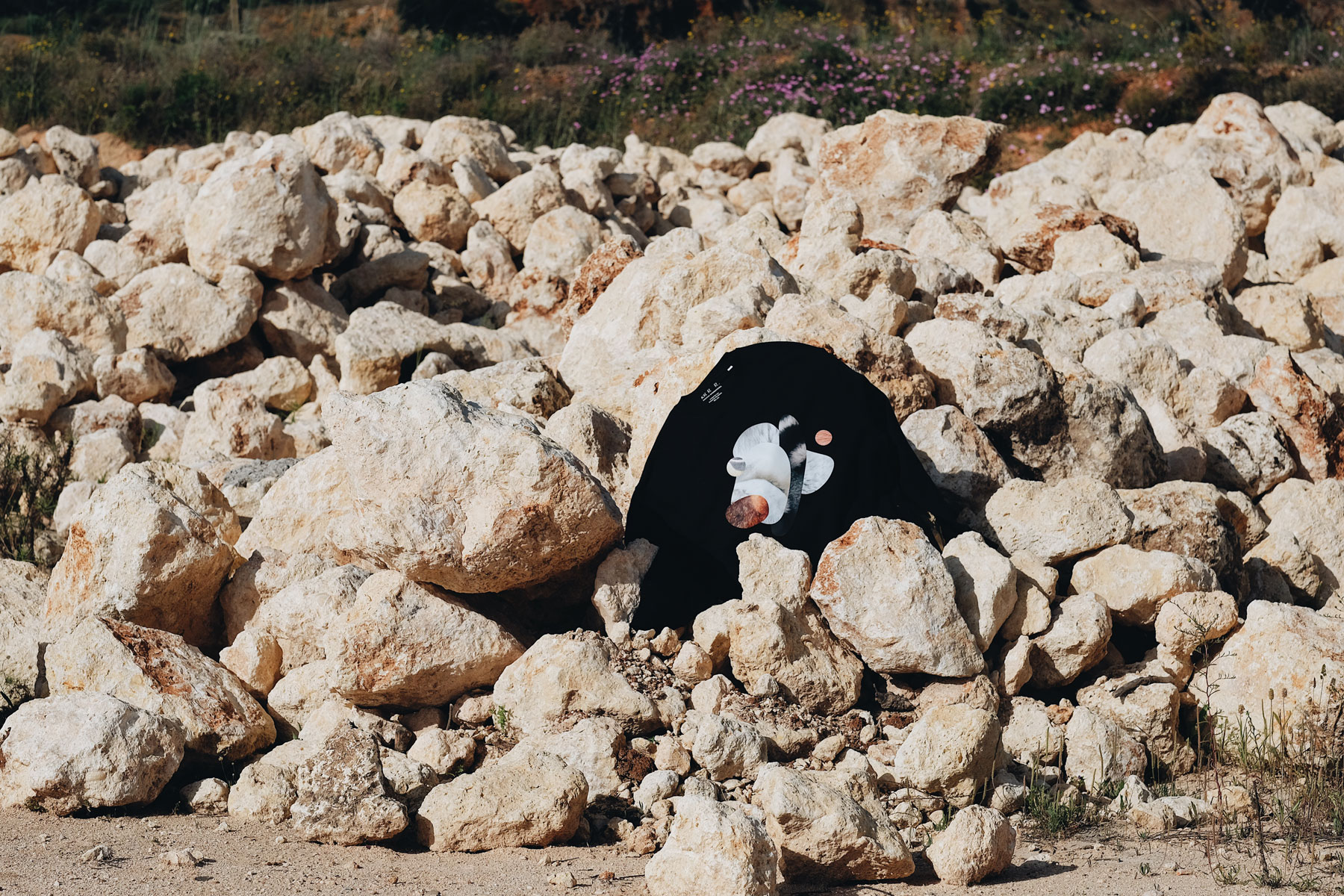
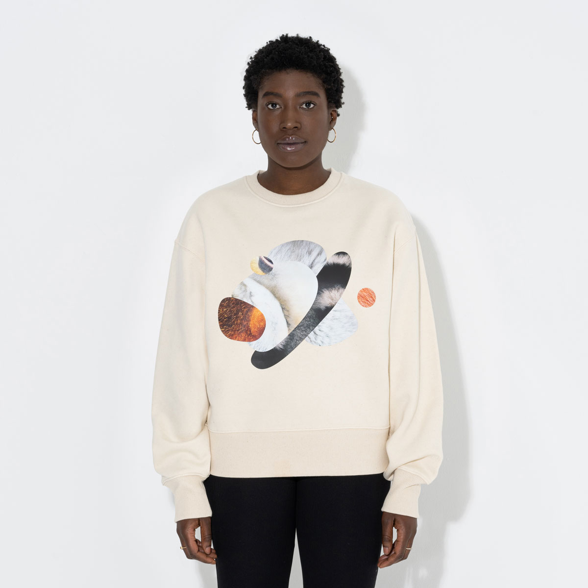
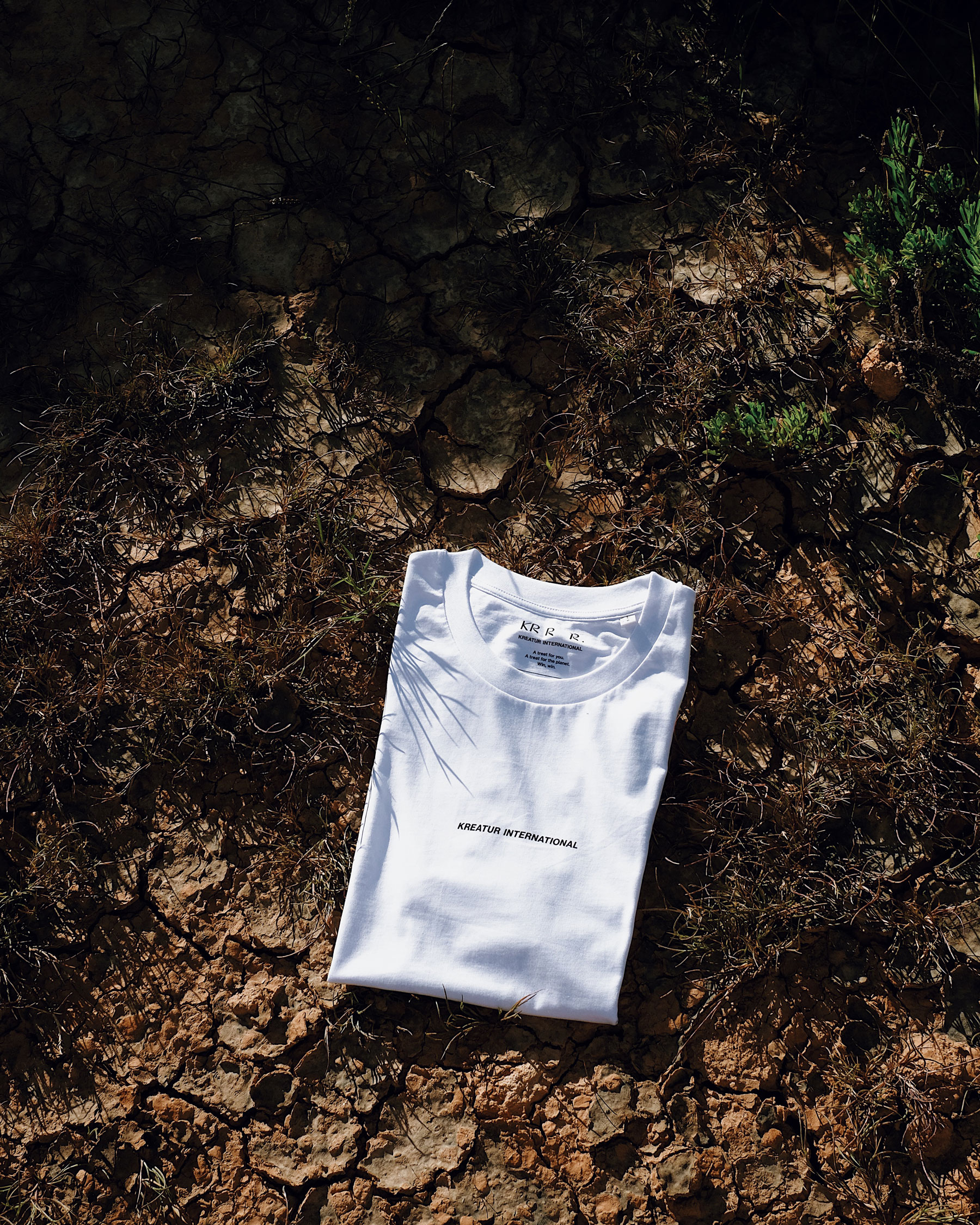
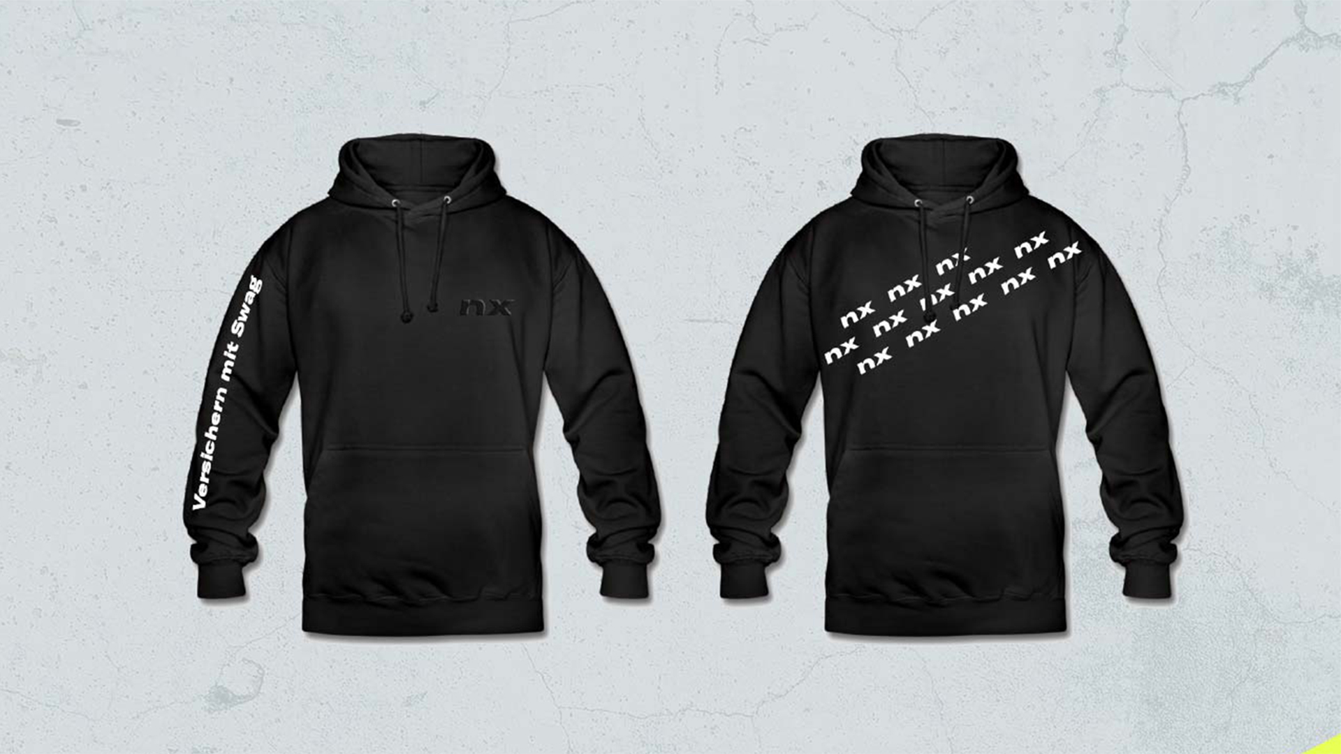
Planet first – we designed our ready-to-wear collections to support the protection of biodiversity on planet earth. Our collection includes the BRAND EDITION and the two Capsule Collections TIER and BOND, which are limited to 50 pieces per design and size. Besides shirts and sweatshirts we offer caps, beanies and shoppers.
Limited Editions
It’s time to treat our species as the limited editions they really are. That’s why our Capsule Collections BOND and TIER are strictly limited to 50 pieces per colour and size. In this way, we not only set a contrast to fast fashion, but also encourage the careful use of resources.
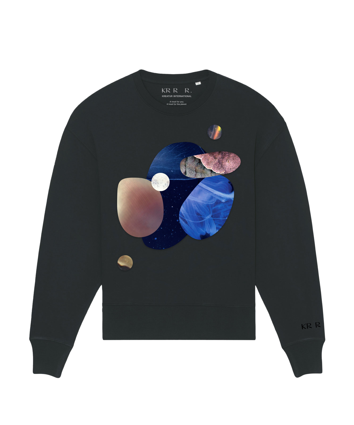
BOND EDITION
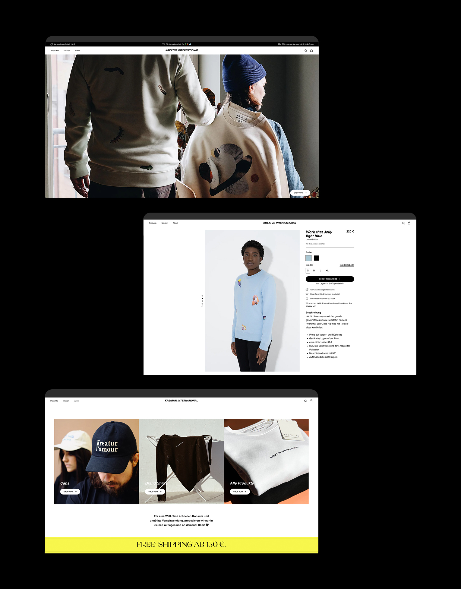
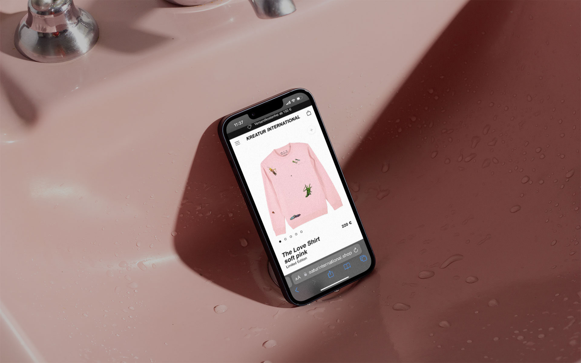
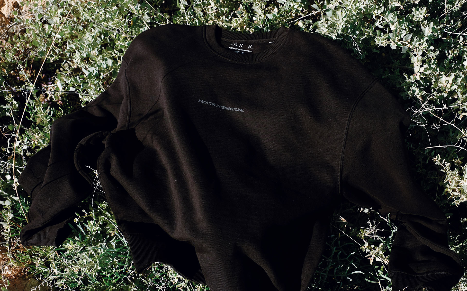
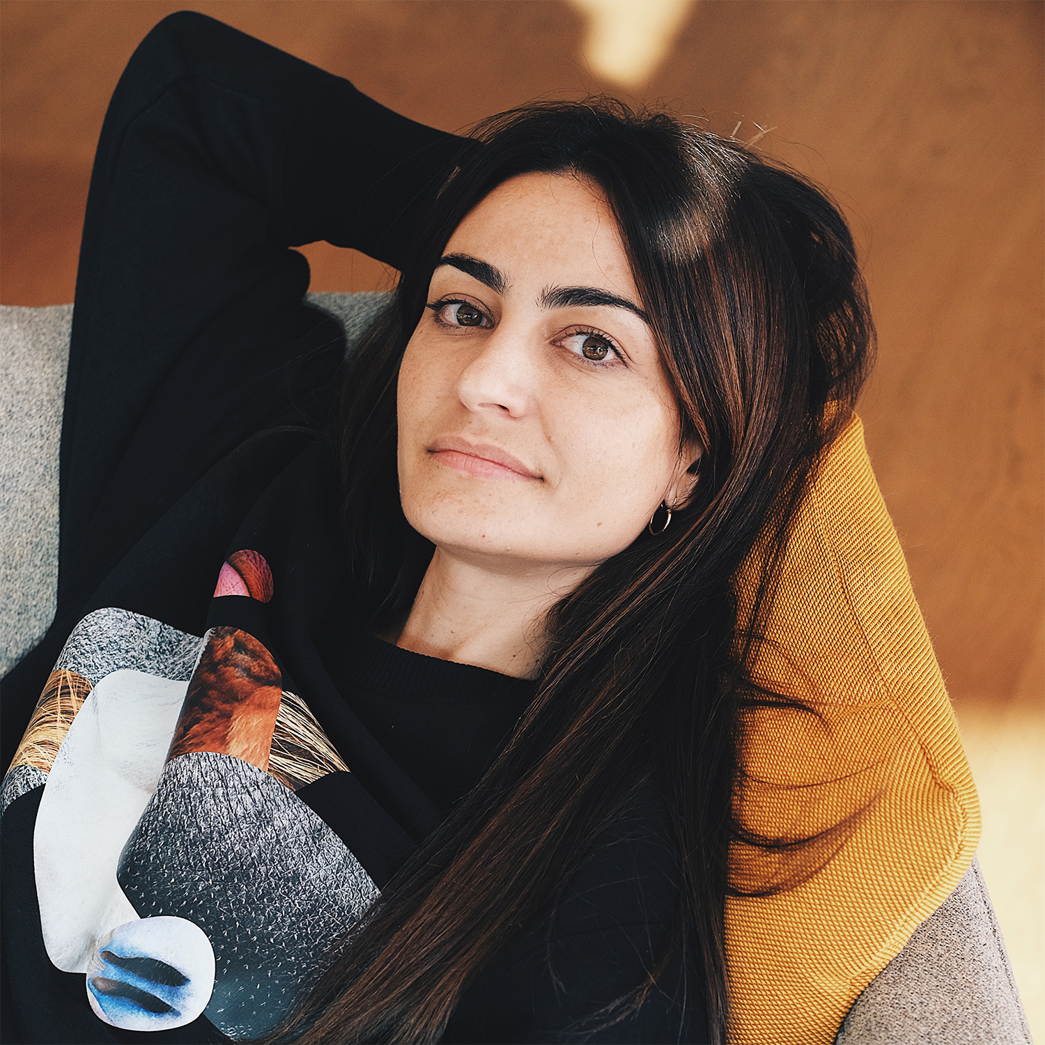
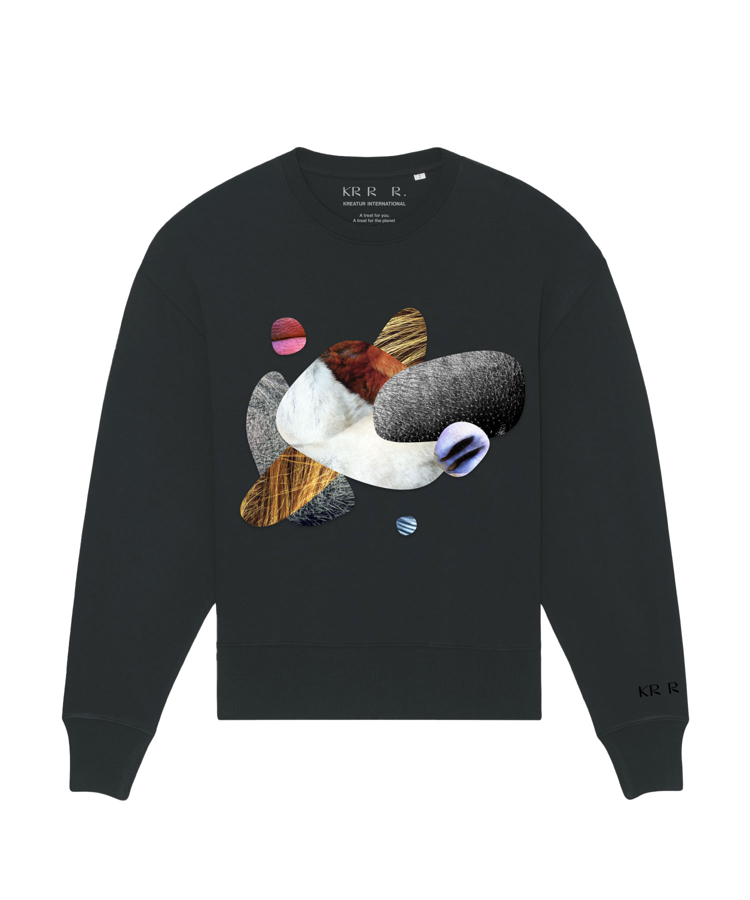
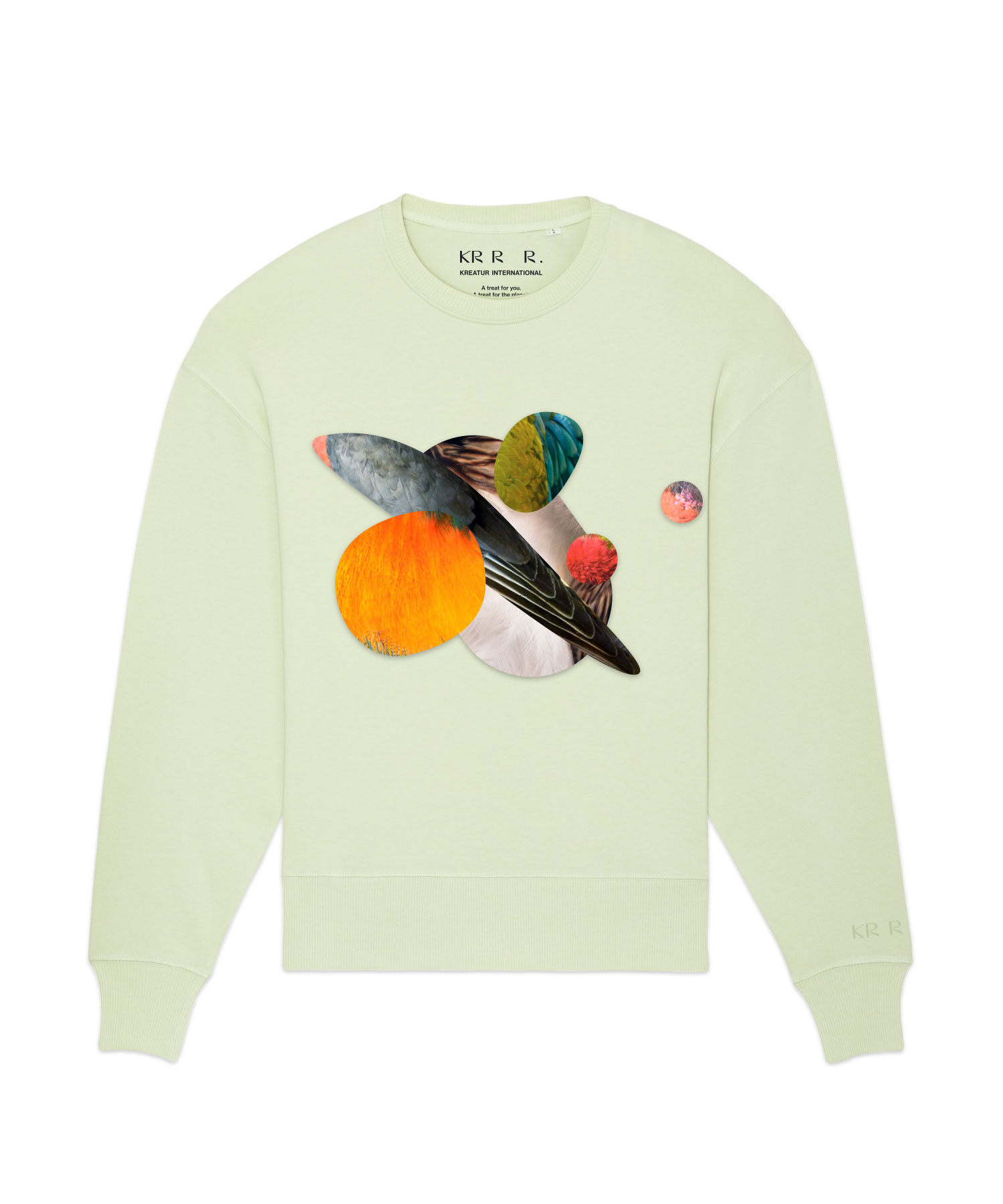
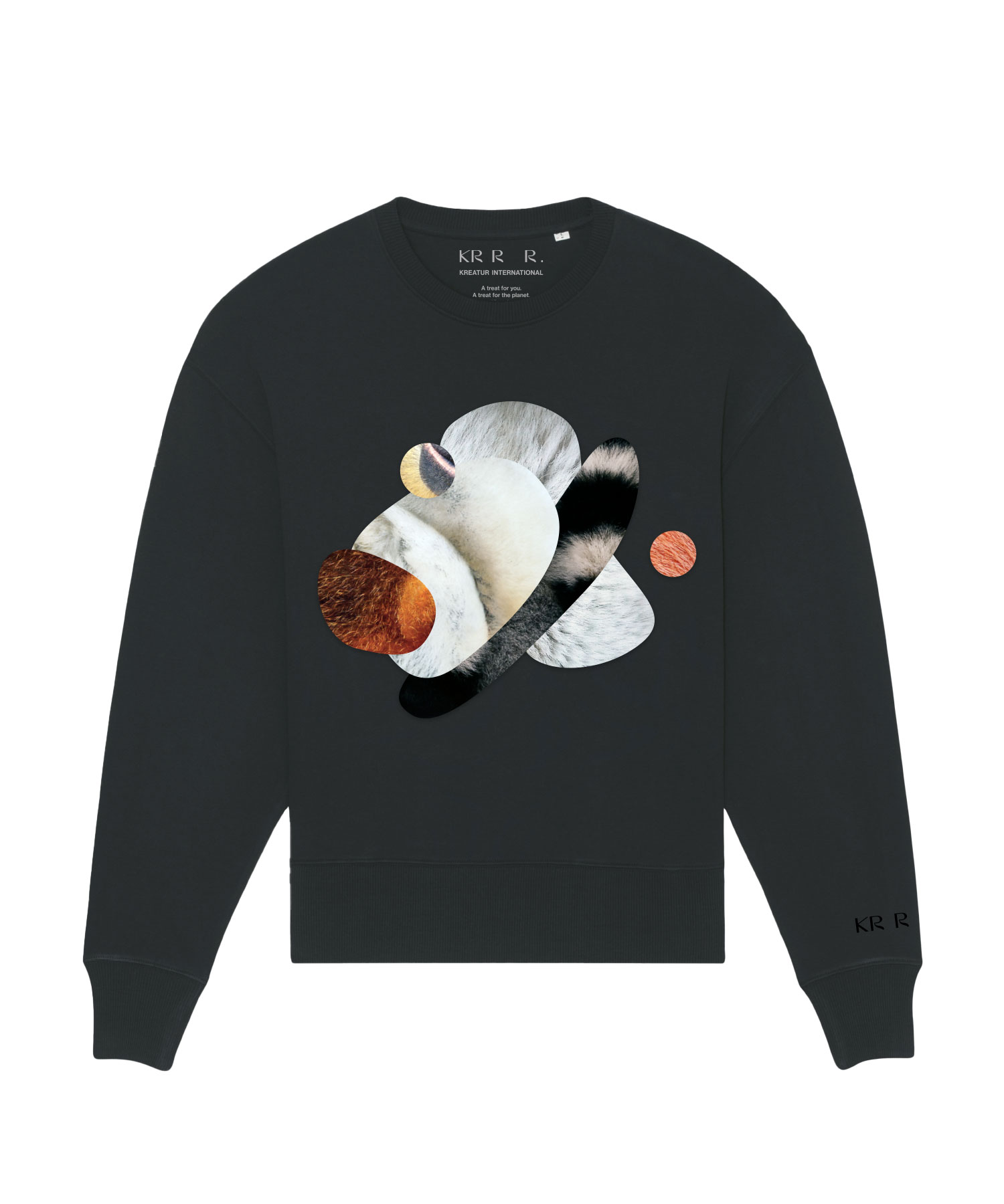
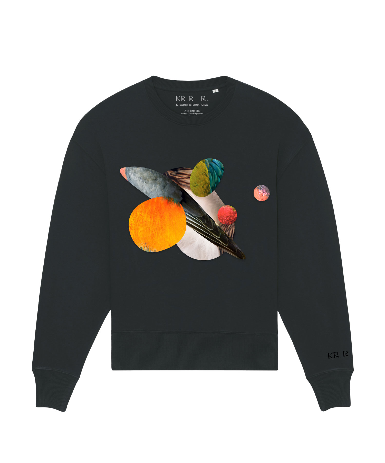
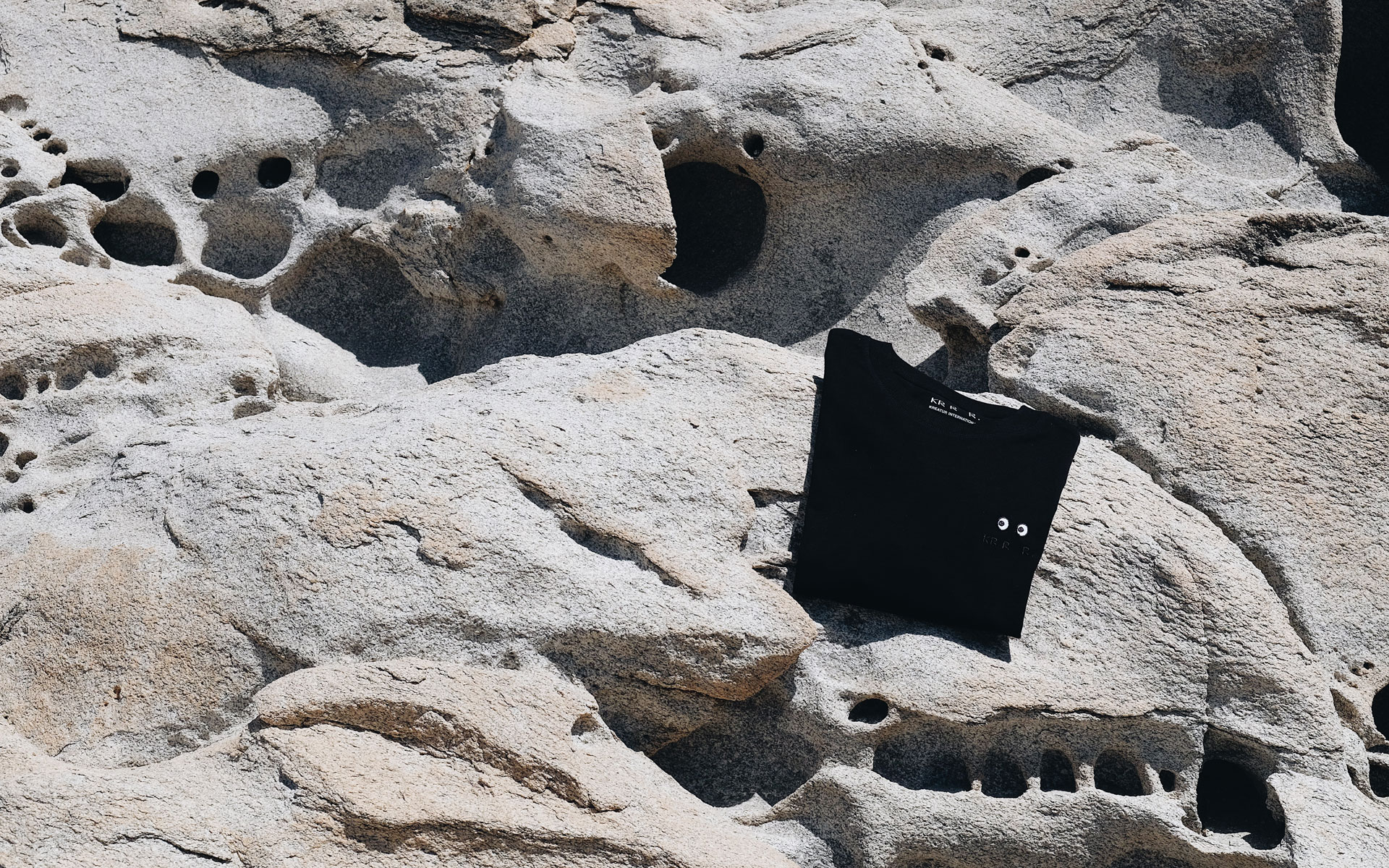
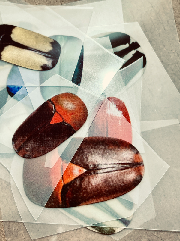
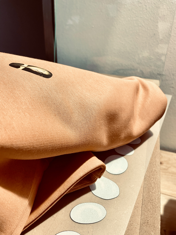
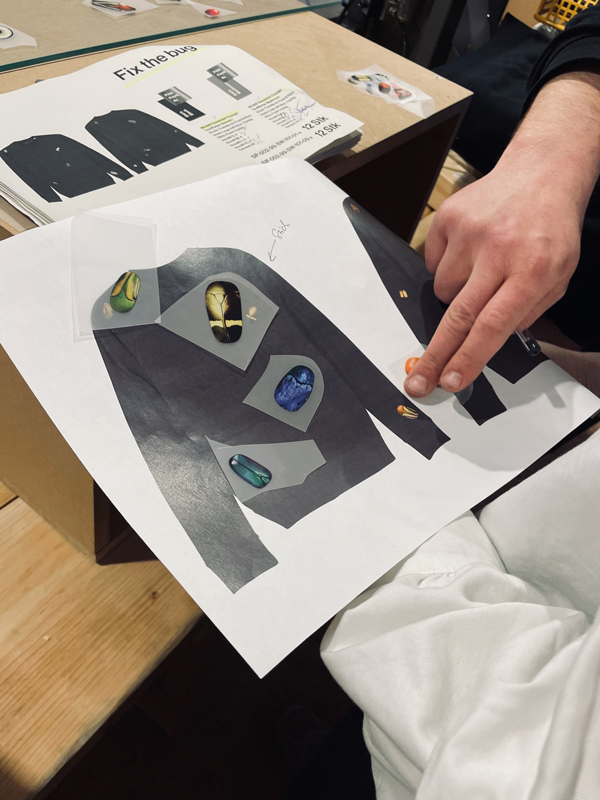
The limited BOND Edition features collages with different textures. Each individual collage is applied to the shirt by hand and locally manufactured in Cologne. A logo embroidery on the sleeve completes the finished shirt.
TIER EDITION
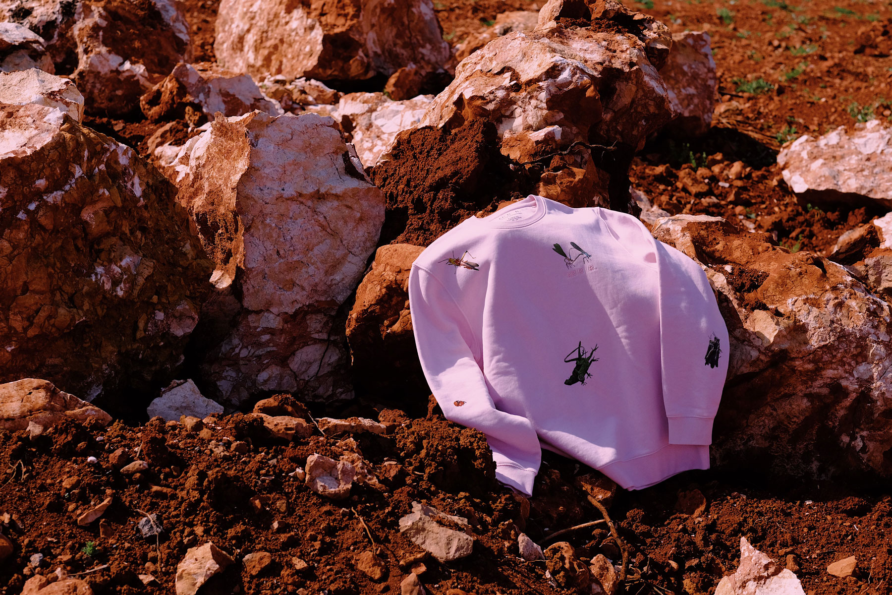
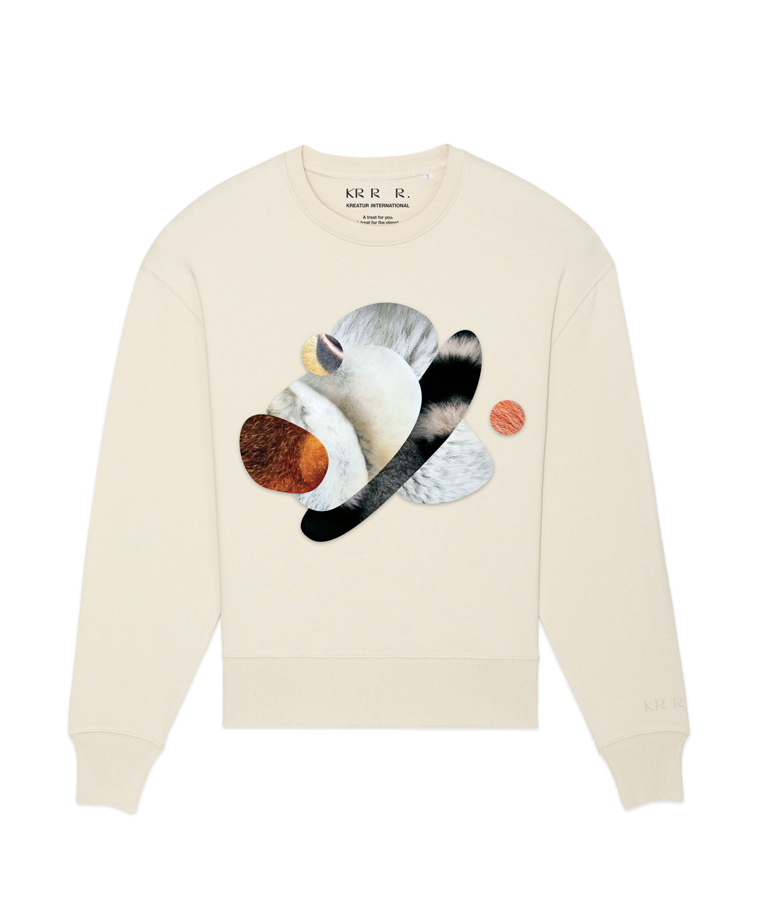
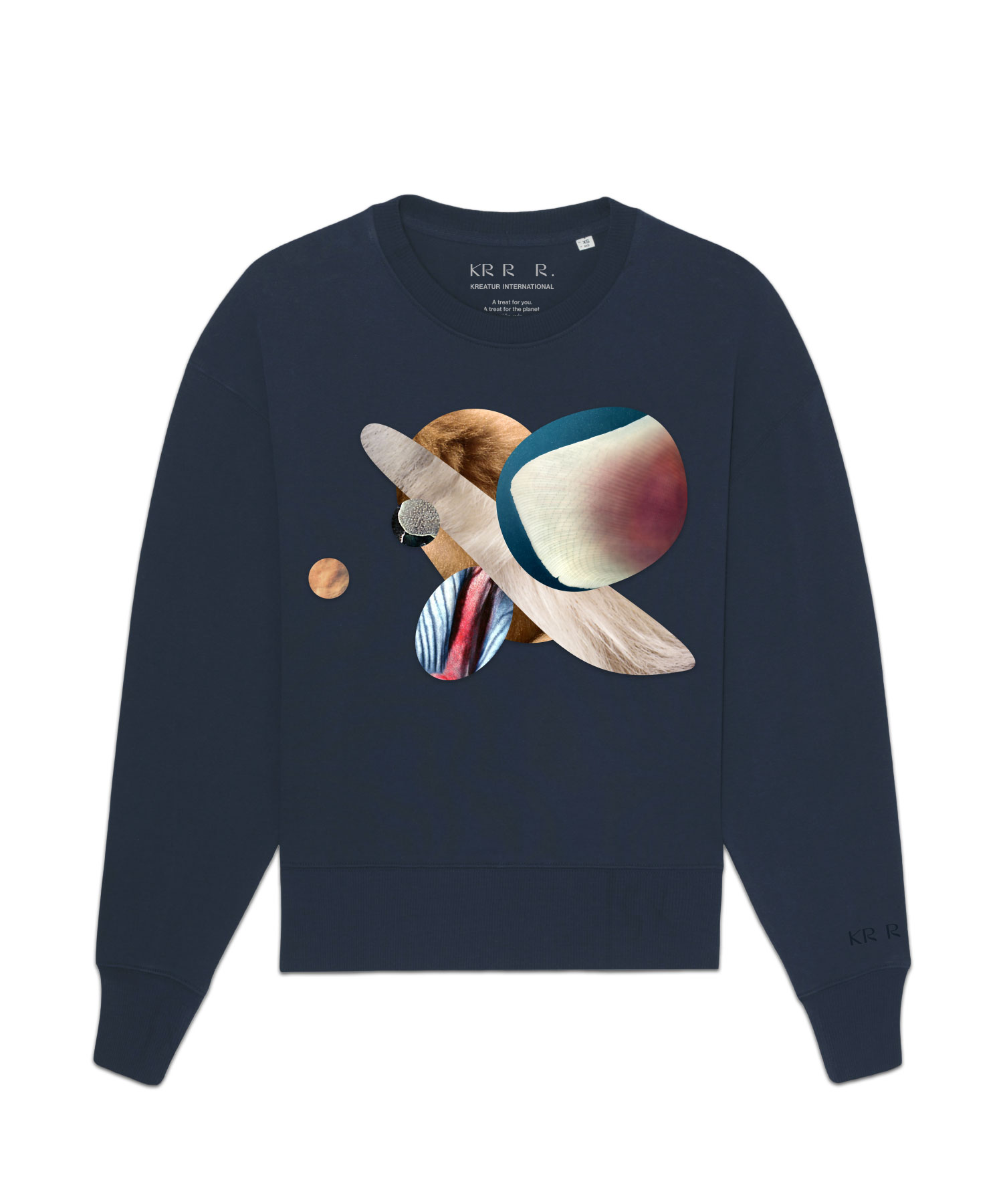
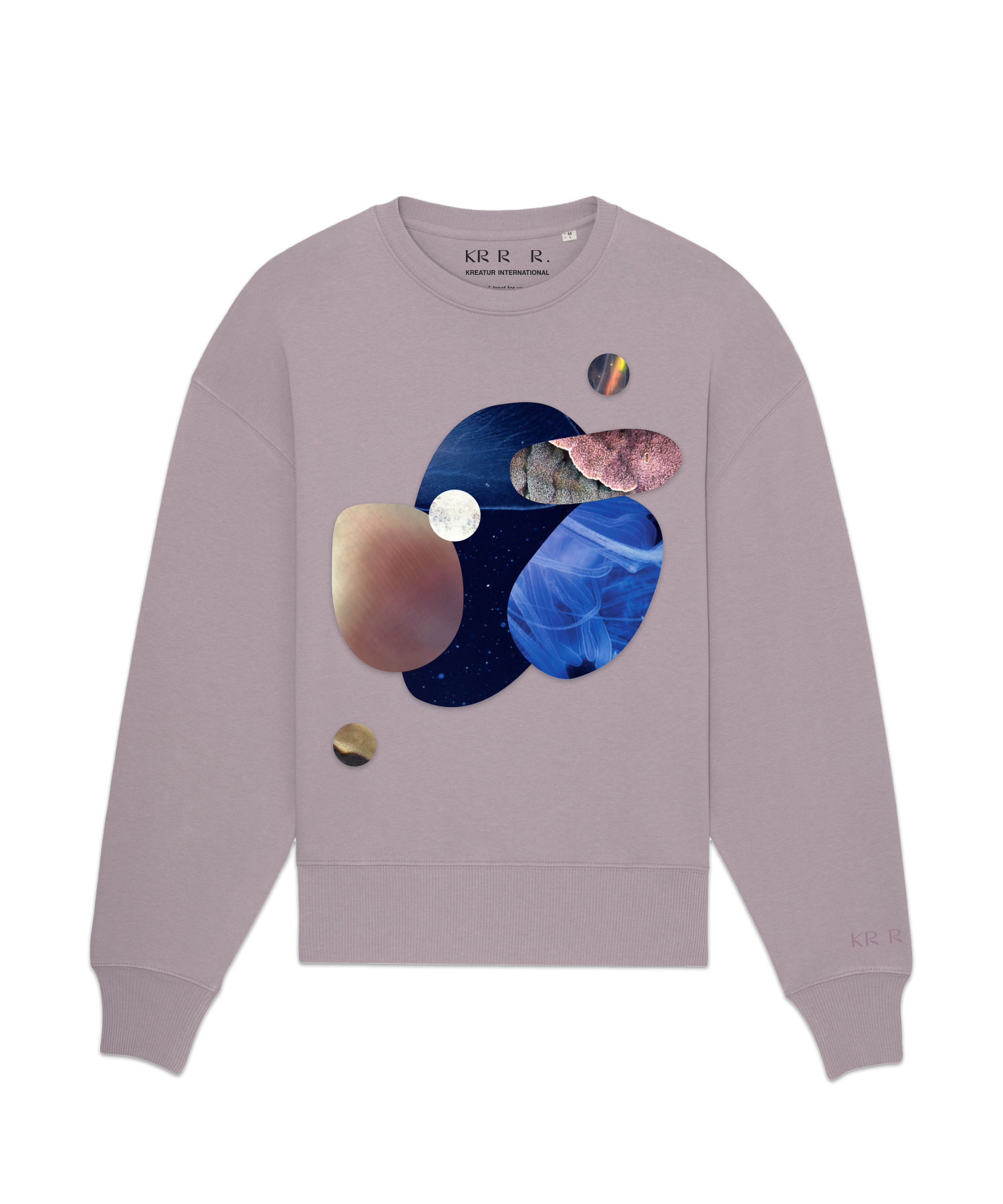
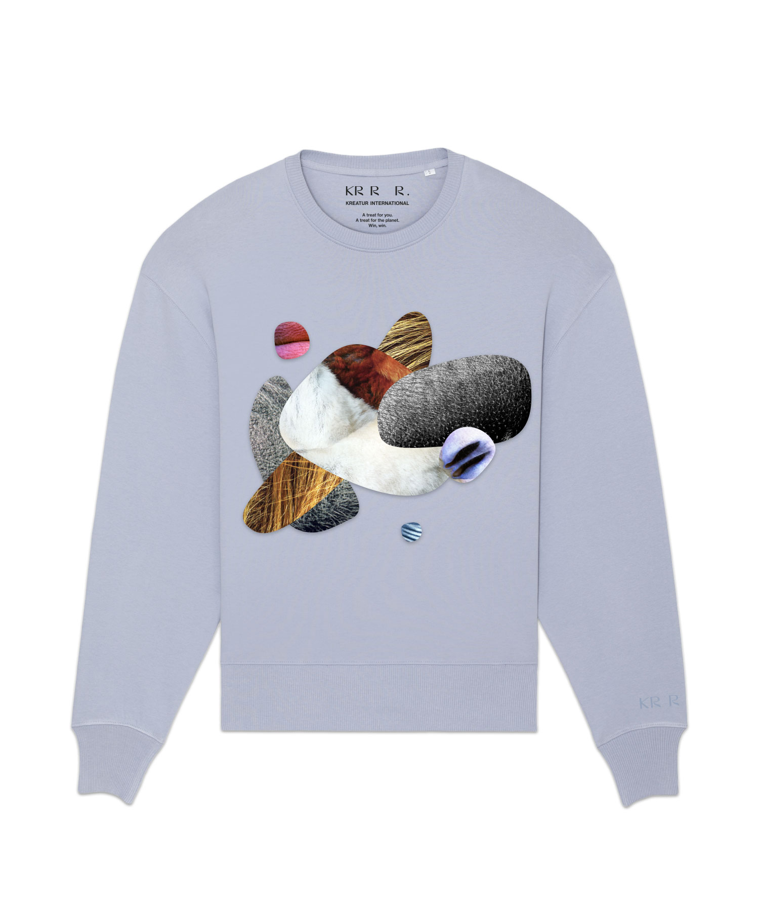
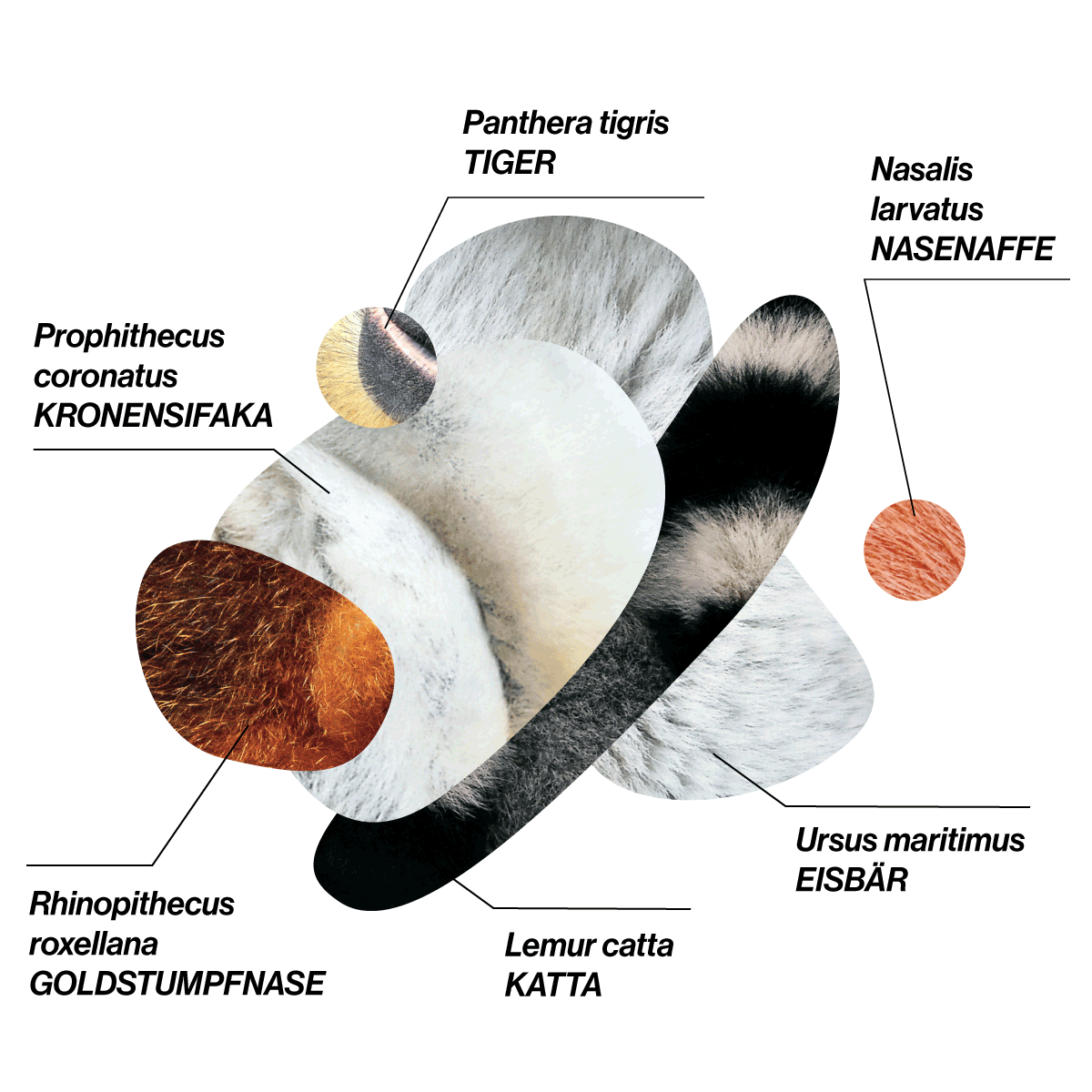
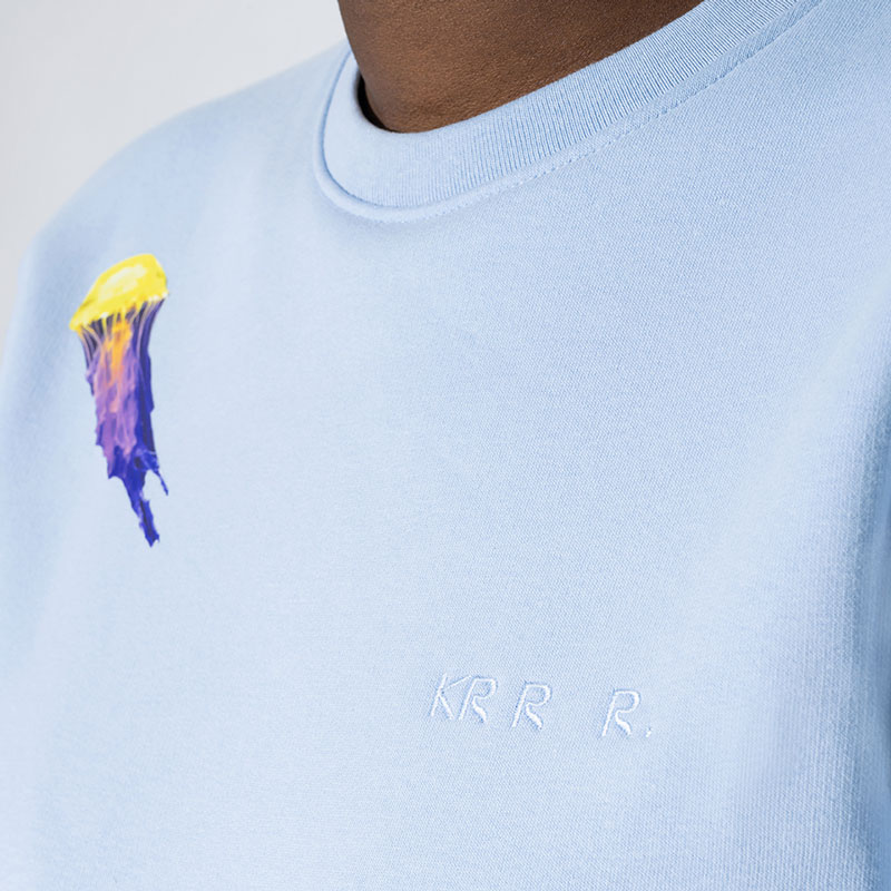
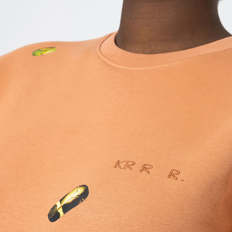
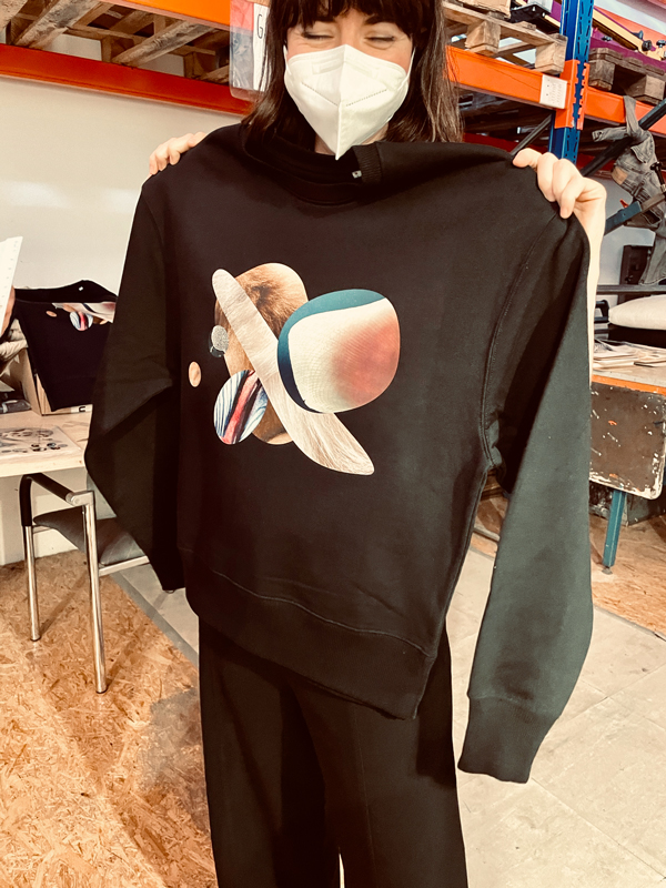
The TIER Edition is also limited to 50 pieces per size and color. Carefully placed worms, jellyfish, eyes, grasshoppers and close-ups of wild animals make the pieces real eye-catchers. From lavender, pistaccio, light pink and powder blue to classic black and white – there’s a colour for everyone. Over 15 steps are needed to finish the shirt.
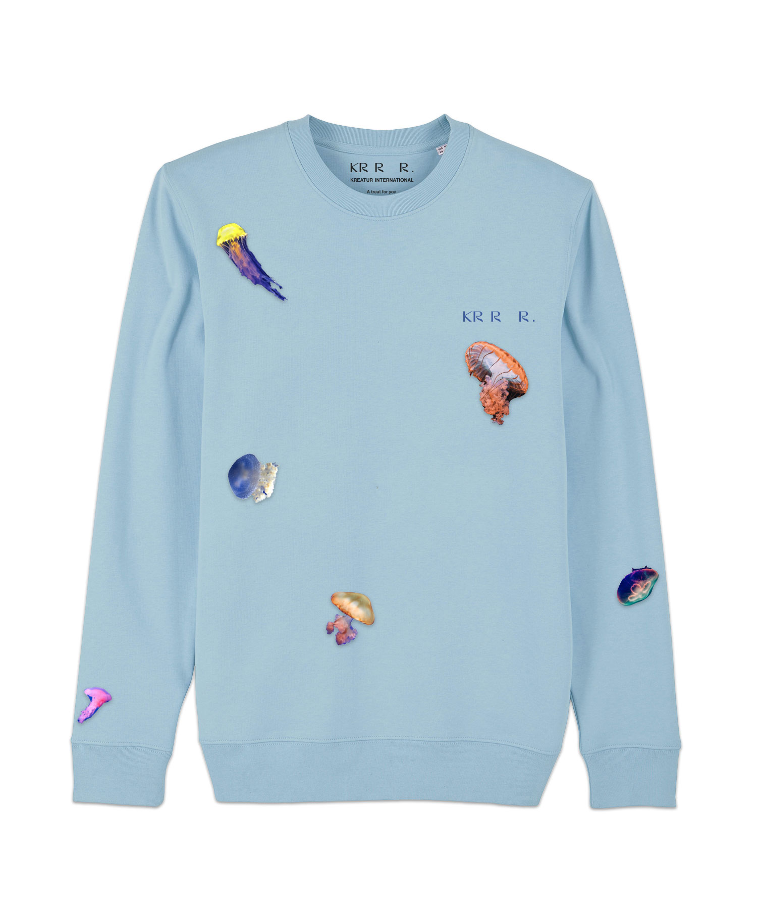
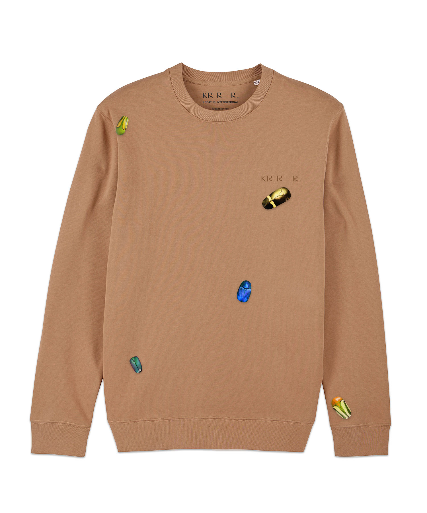
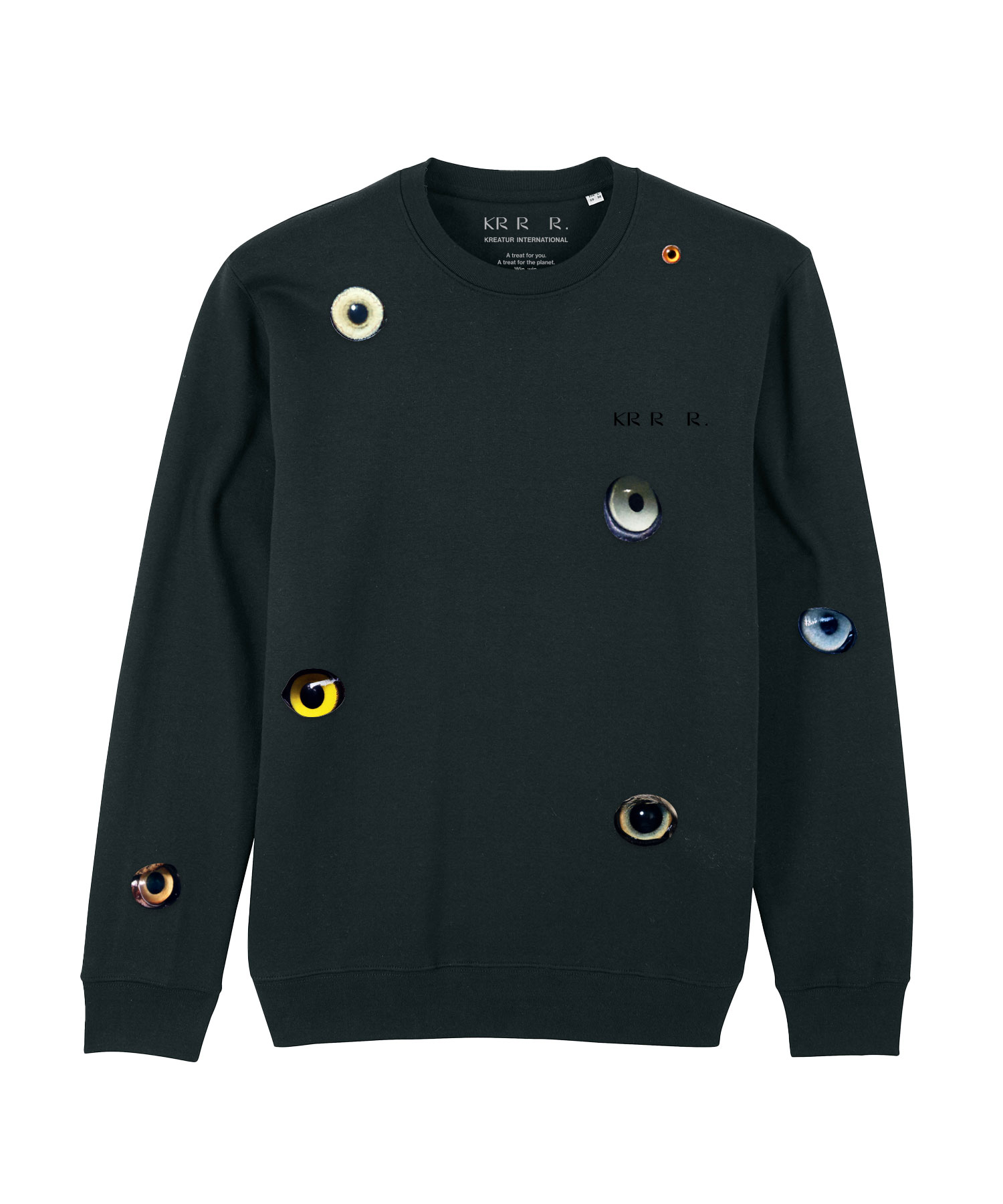
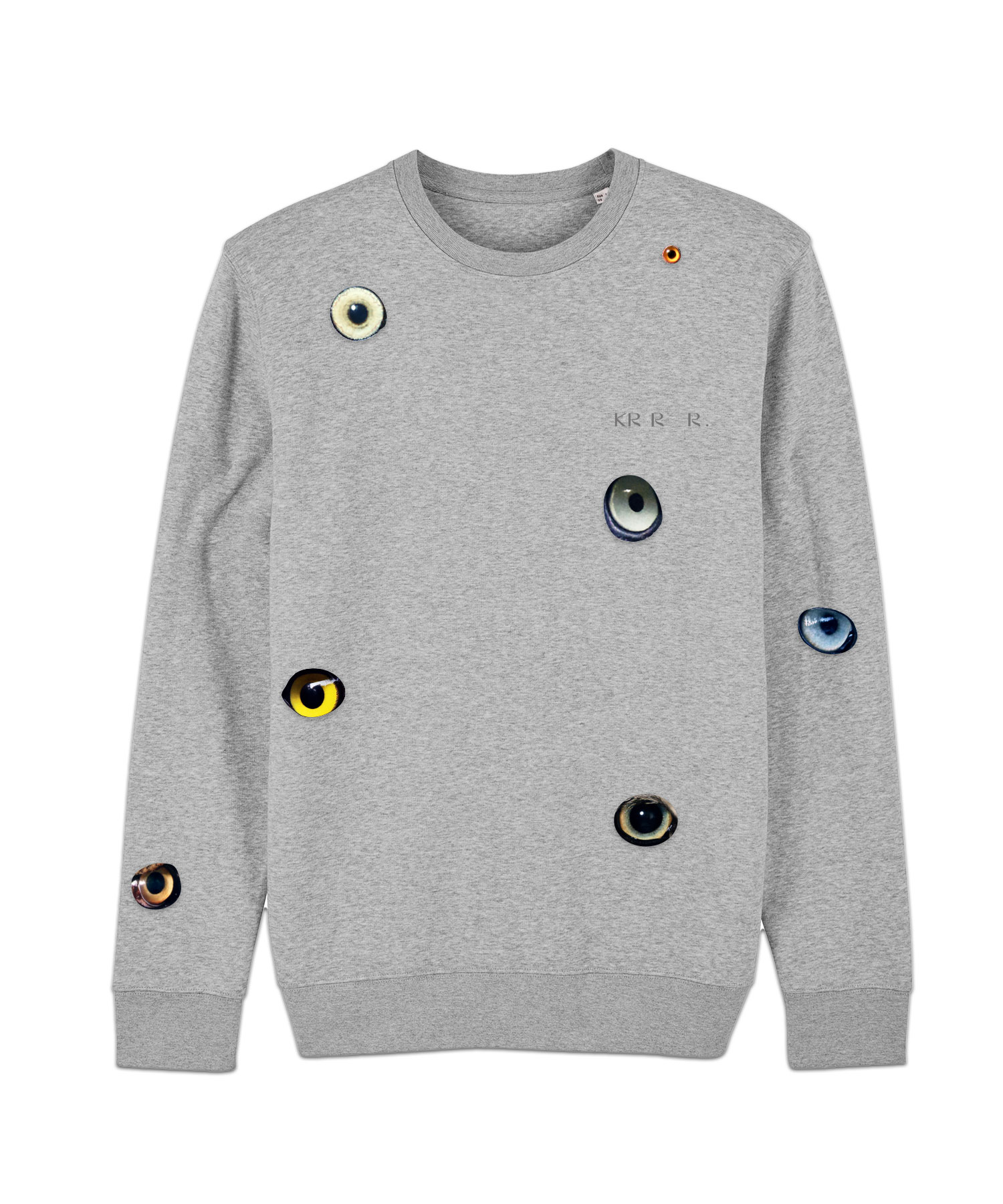
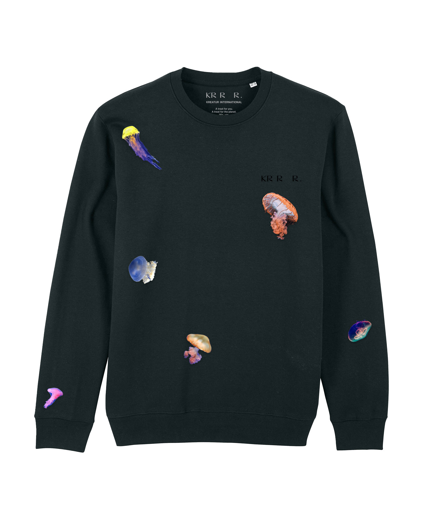
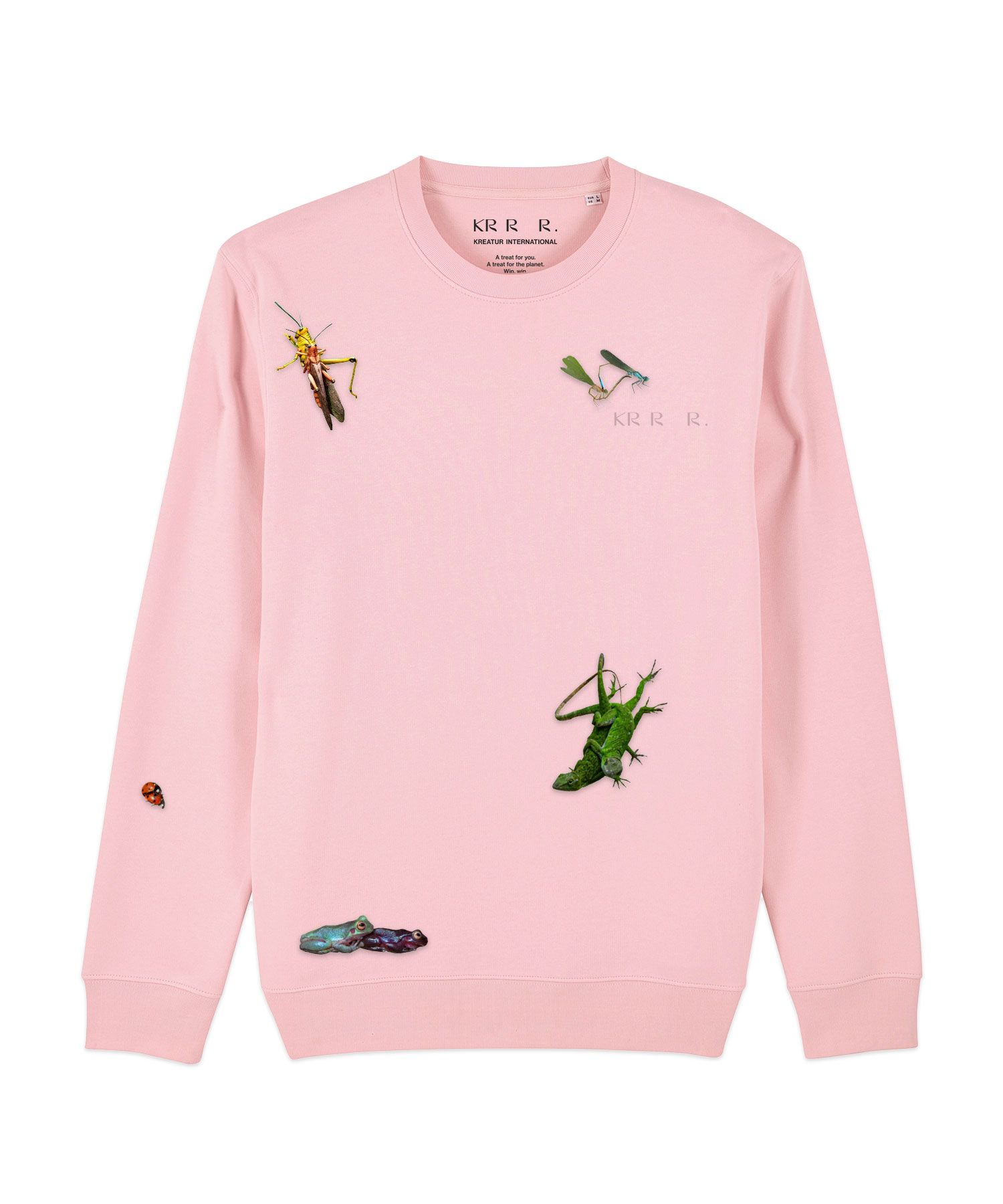
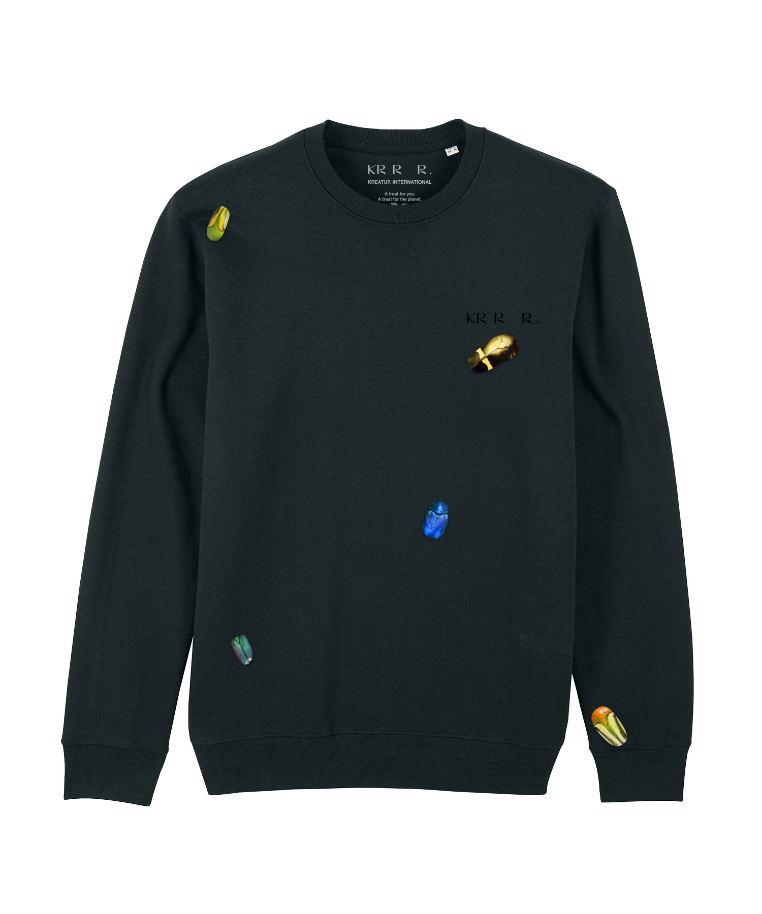
Species in the spotlight
Our designs highlight species that are threatened by extinction. They are all on the Red List and every day the list gets longer. We want to help save these creatures – with our fashion brand that’s wild about wildlife.
Do you like what you see?
Let’s work together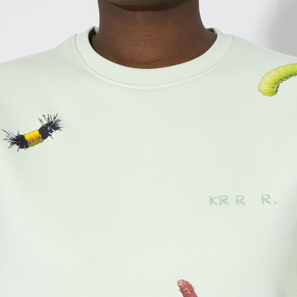

BRAND EDITION
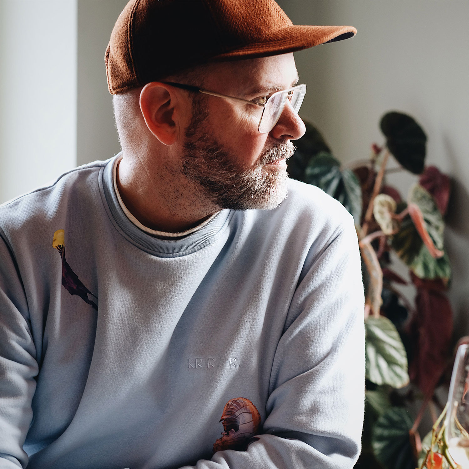
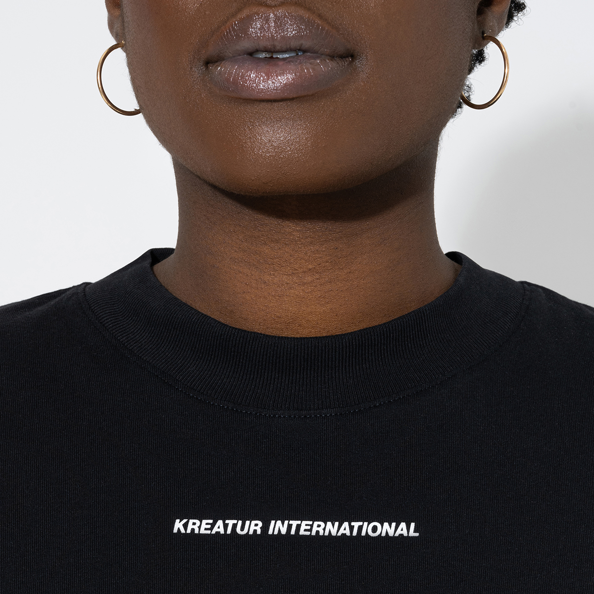
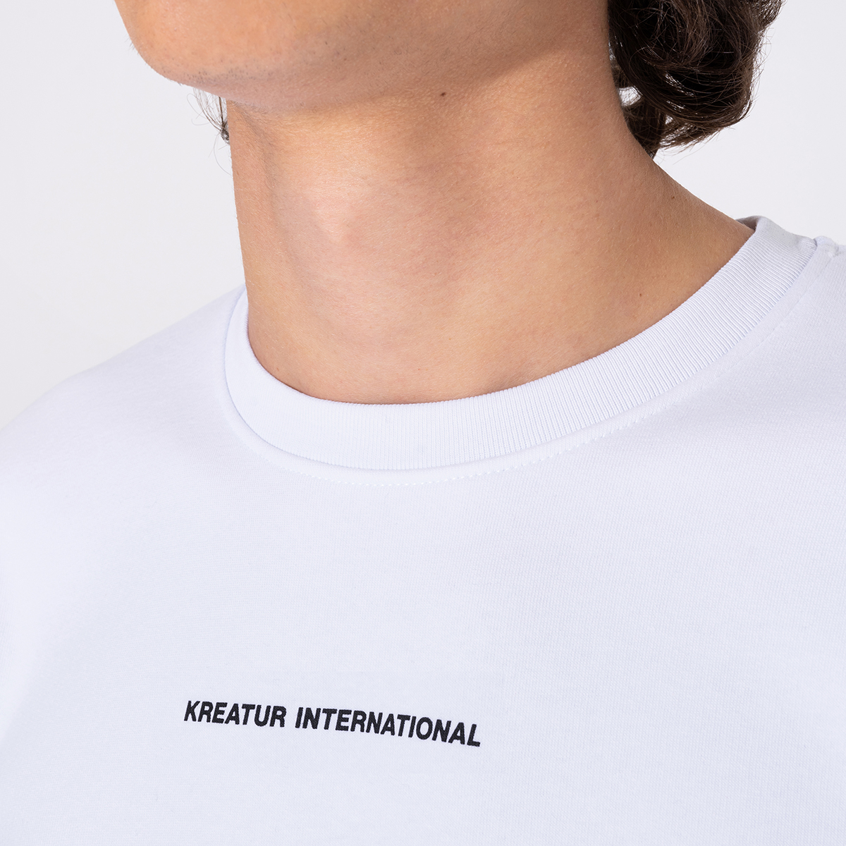
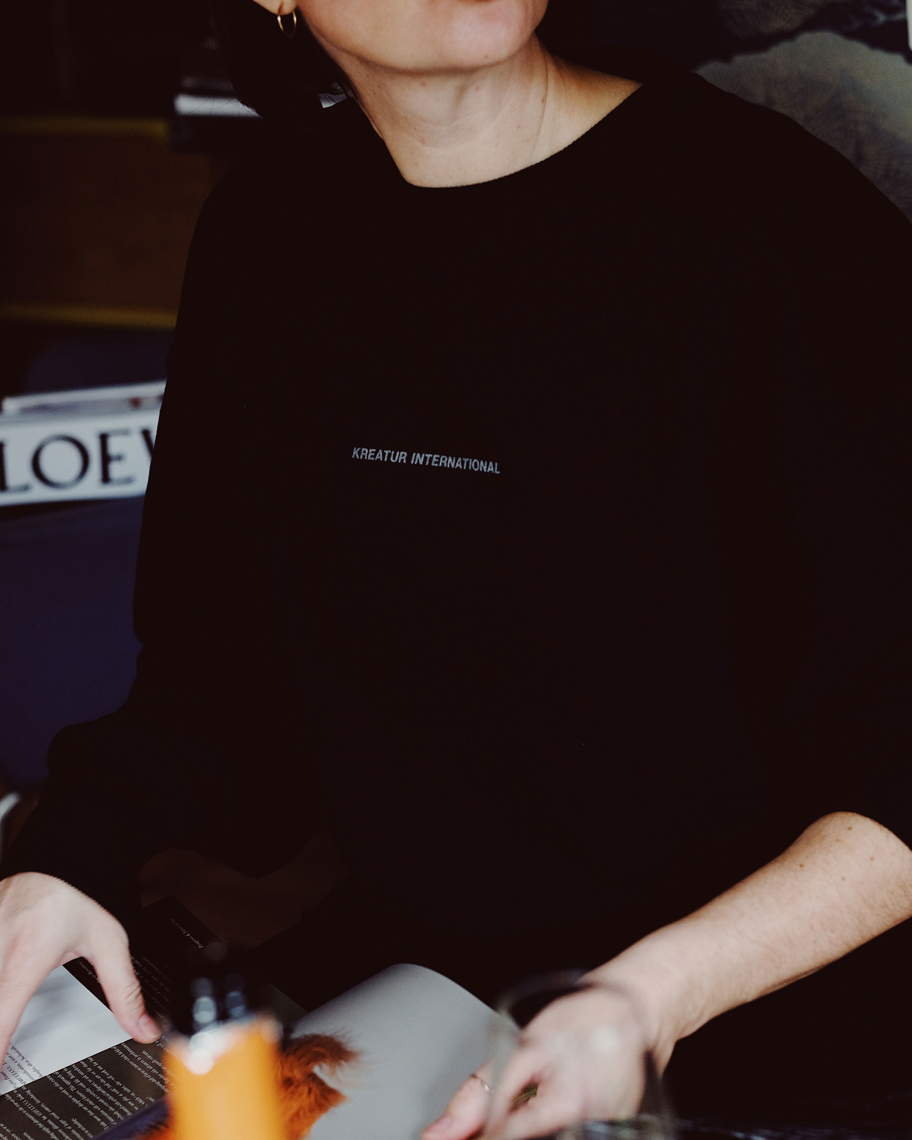
Our BRAND EDITION belongs in every casual closet – oversized fits made from high-quality organic cotton. A logo print on the chest doubles the coolness factor.
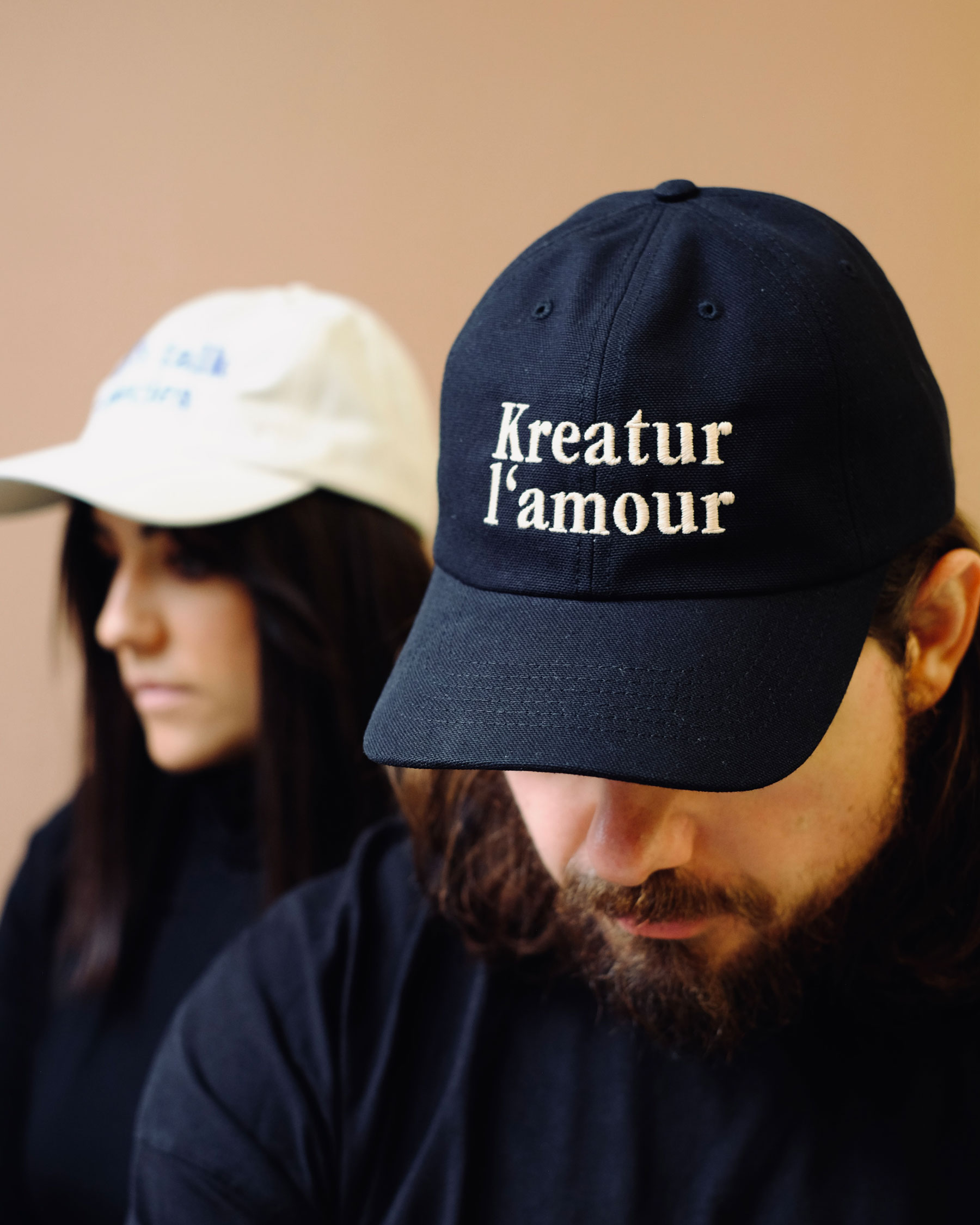
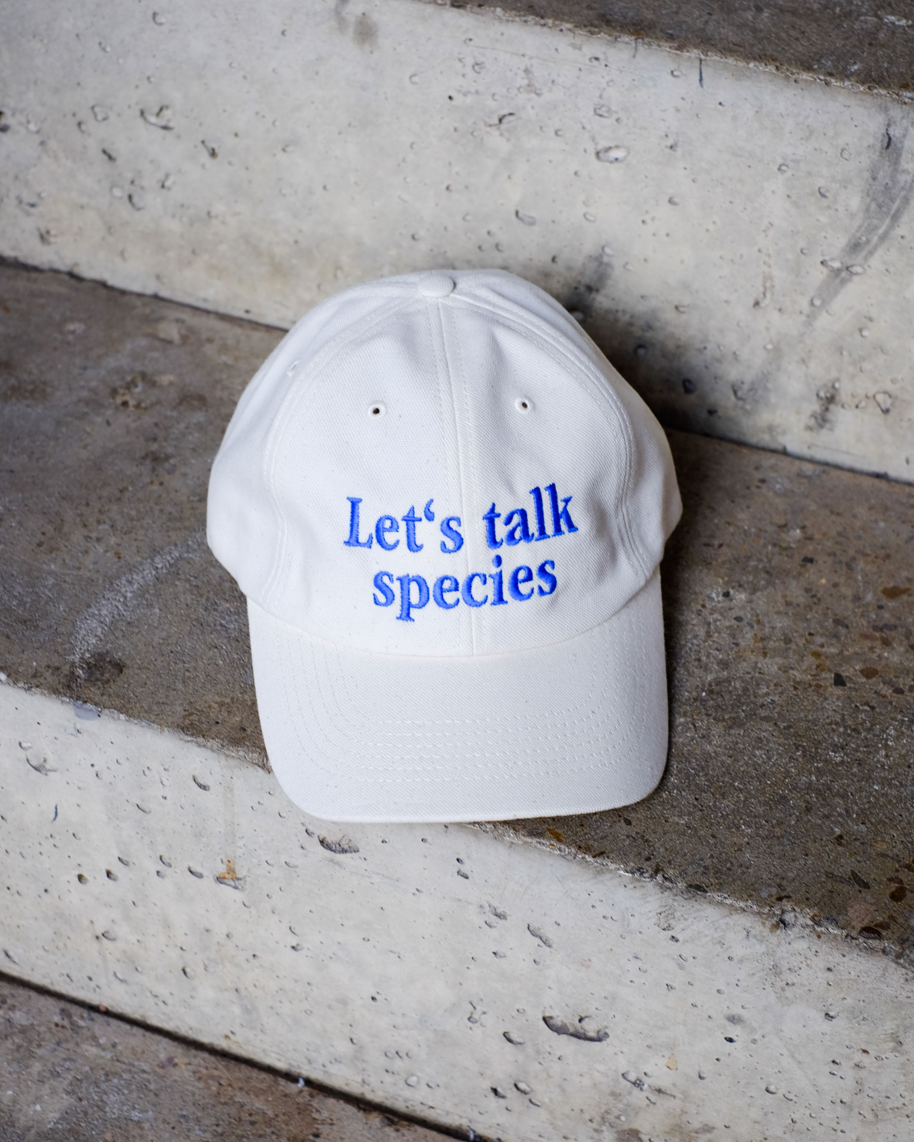
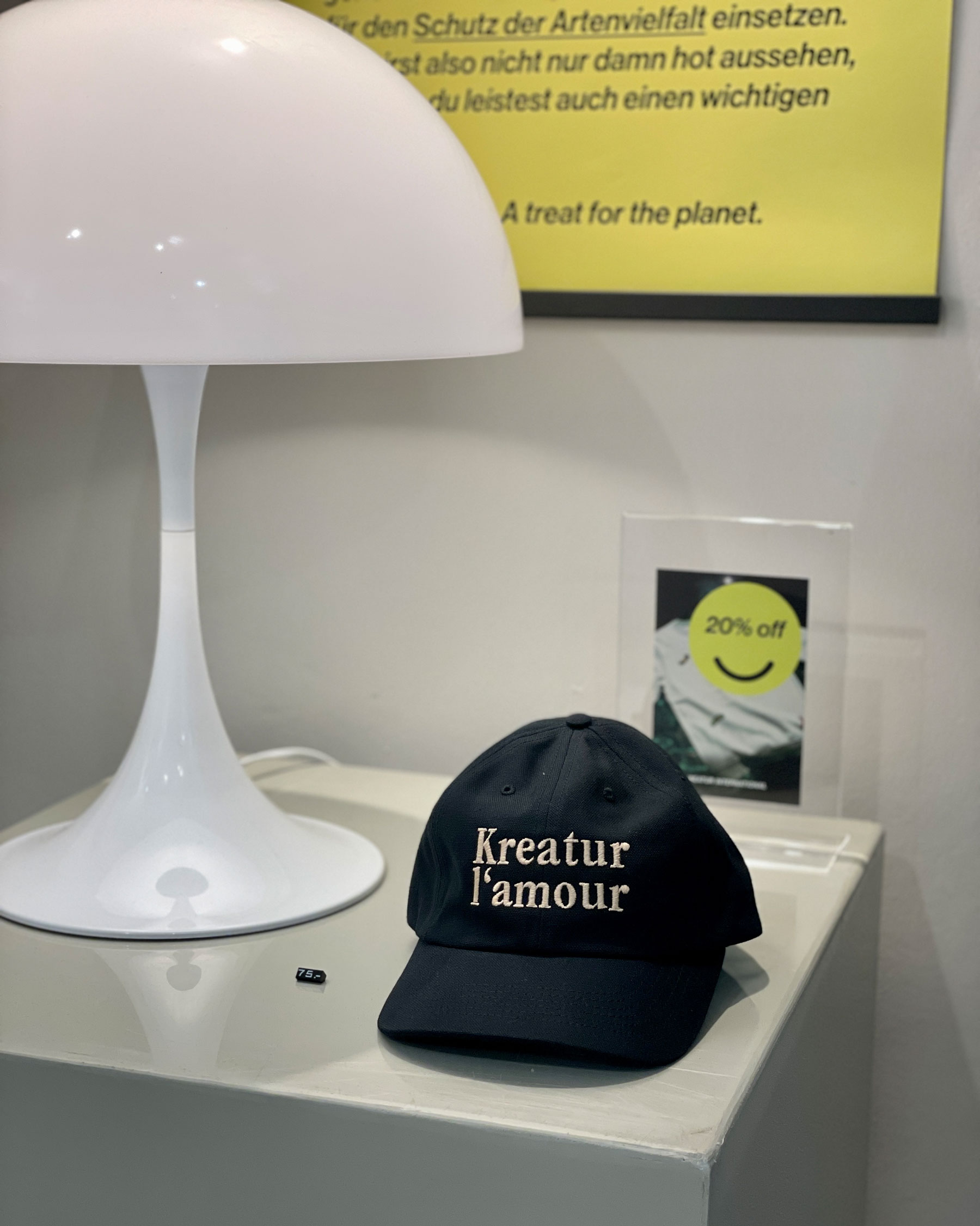
Caps
Want a cool cap? With our dad caps made of 100% organic cotton you not only ensure the thing with the coolness, but also carry the right message into the world. Wanna talk species?
Production
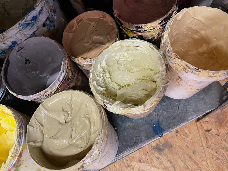
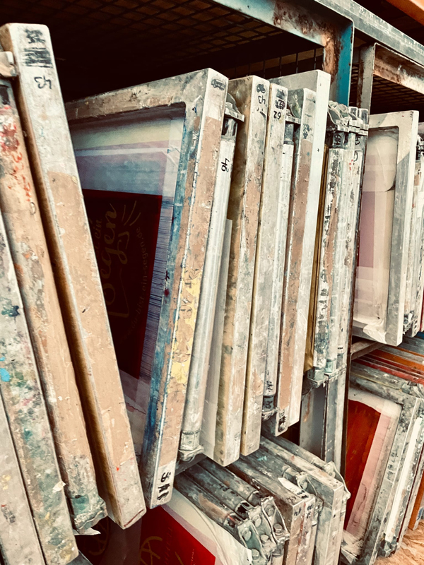
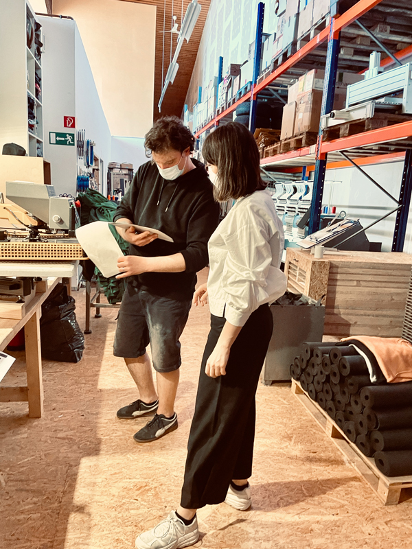
For a world without fast consumption and unnecessary waste, we produce only in small numbers and on demand. Each individual motive is printed on the shirt by hand at a local manufacturer in Cologne.
ONOGRIT WEBSITE
year
2023
client
Onogrit
industry
Design
services
Web Design
scope
Ideation, Concept, Language, UI/UX, Design System, Digital Design
CLIENT
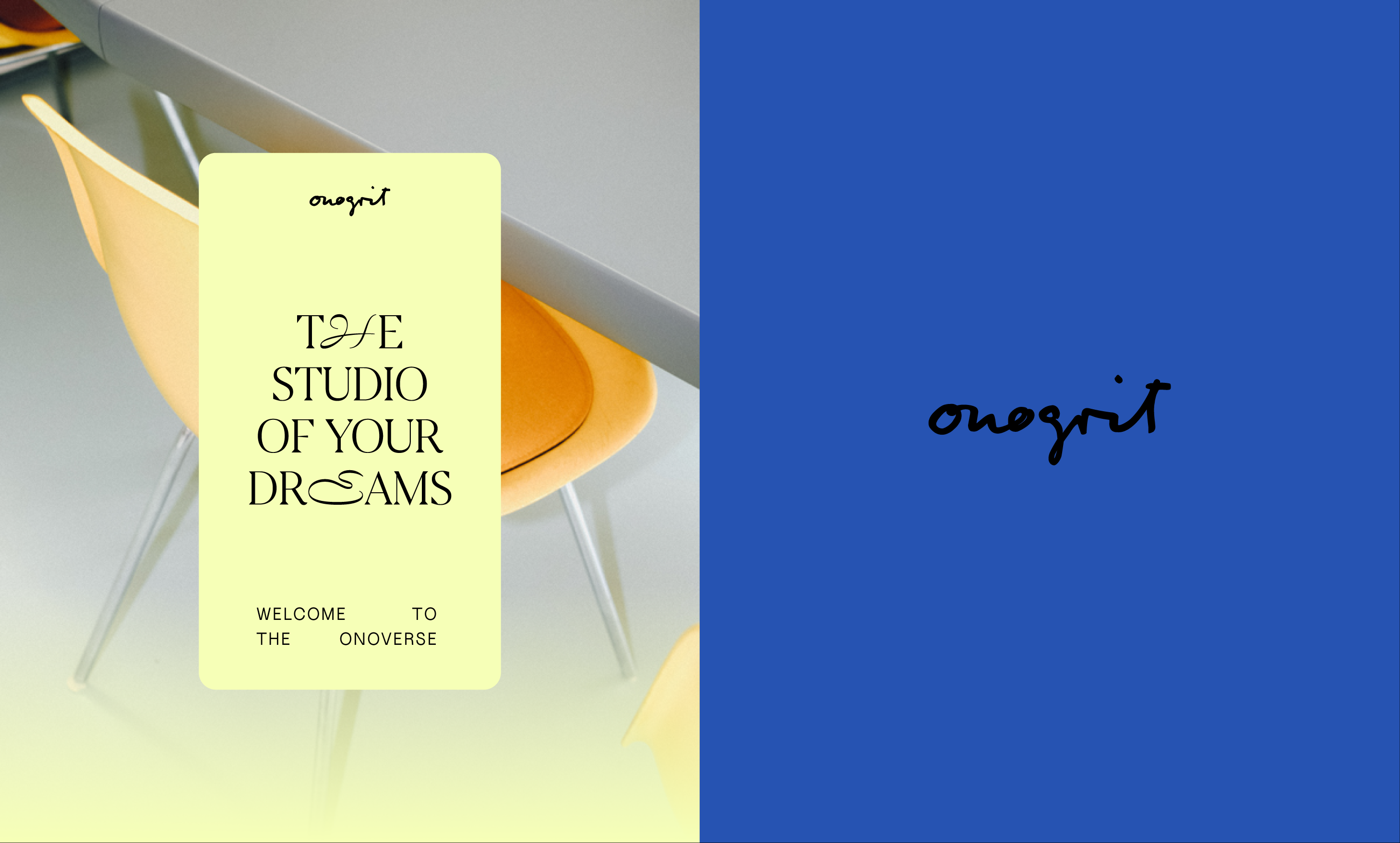
Onogrit is one of the most renowned Creative Studios in Cologne. Led by two women, it specializes in strategies and visual solutions for the world of tomorrow, designing for impact and social transformation. Onogrit is your mum’s favorite studio.
challenge
One of the most interesting challenges to do is creative self-evaluation, especially for your own Creative Studio. We formed a team between Onogrit himself and Lucas to evolve the stablished brand and create a portfolio that would not only highlight their work but their process, perspective and direction. A website that functions as visual response to Onogrit’s understanding of design, execution and work.
APPROACH
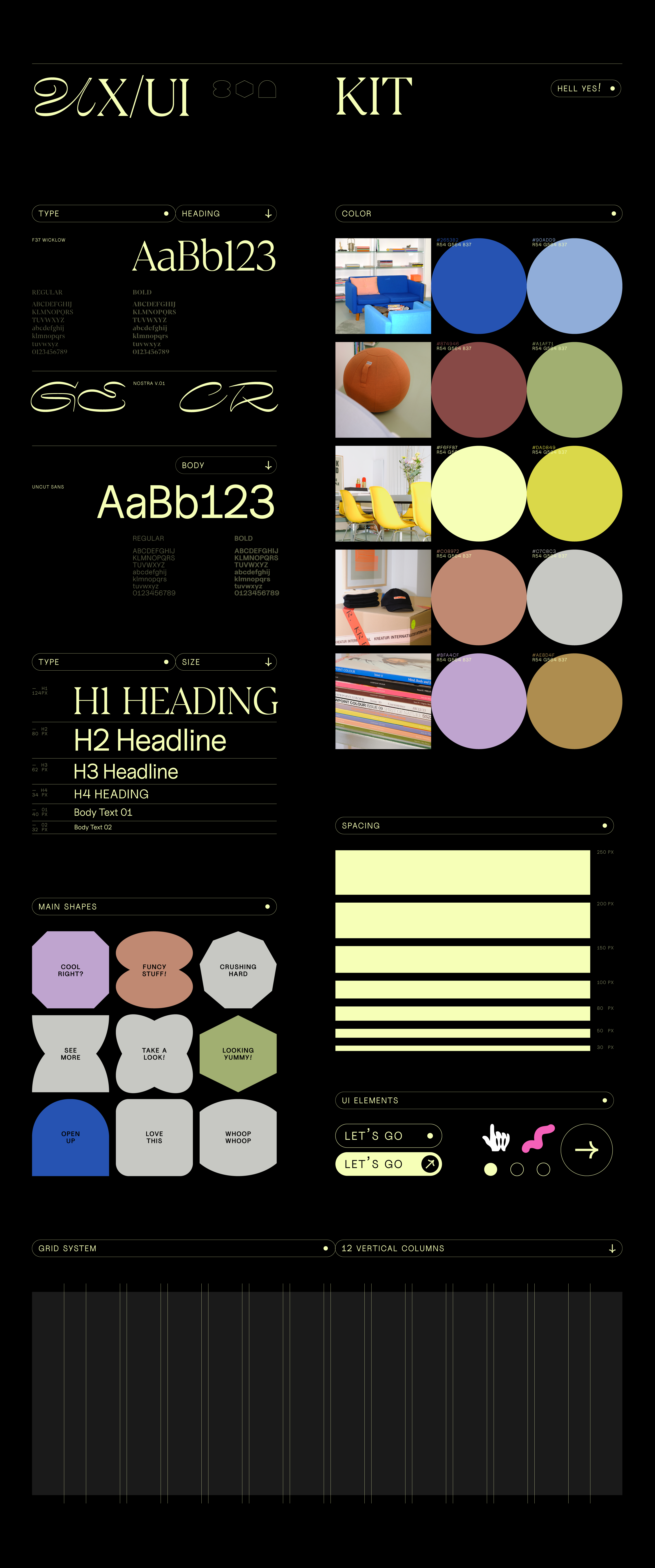
Creating a website for a design studio that serves as a visual representation of Onogrit’s understanding of design, execution, and work requires a thoughtful and strategic approach. To reflect the studio’s unique perspective on design, execution, and work Onogrit and Lucas teamed up to build a website that’s as vibrant and dynamic as their design studio! From brainstorming wild ideas to crafting a visually captivating concept, this project is all about infusing fun into every step of the process. Dive into the world of offbeat fonts, bold colors, and interactive elements as we bring Onogrit’s unique perspective on design to life. With a focus on user-friendly navigation and seamless responsiveness, this website is not just a showcase of past projects but a playground of creativity.
YOU’RE HAVING FUN?
Let’s work together
MSG
year
2023
client
MSG
industry
Printing
services
Branding
scope
Ideation, Concept, Tone, Branding, Design System, Digital Design.
CLIENT
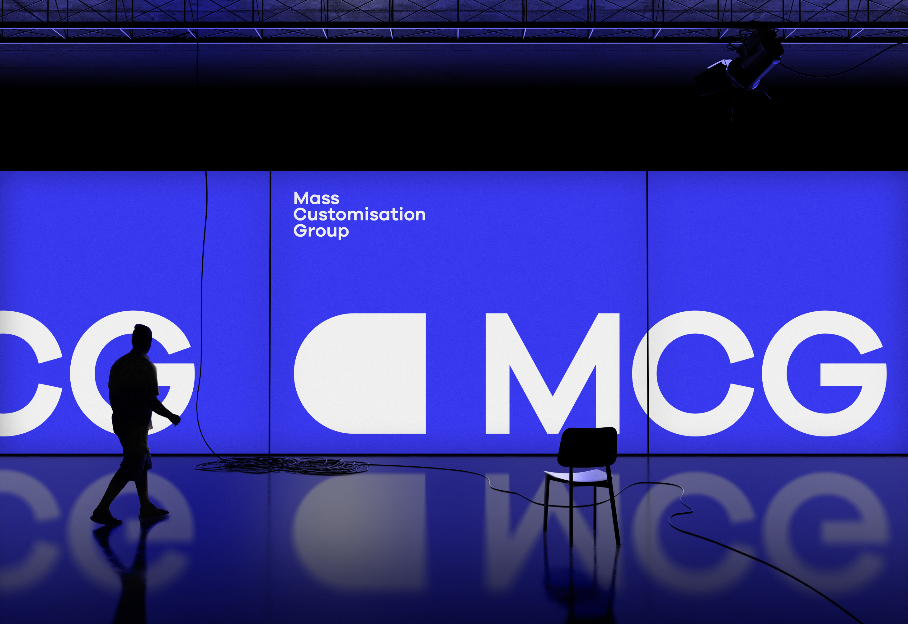
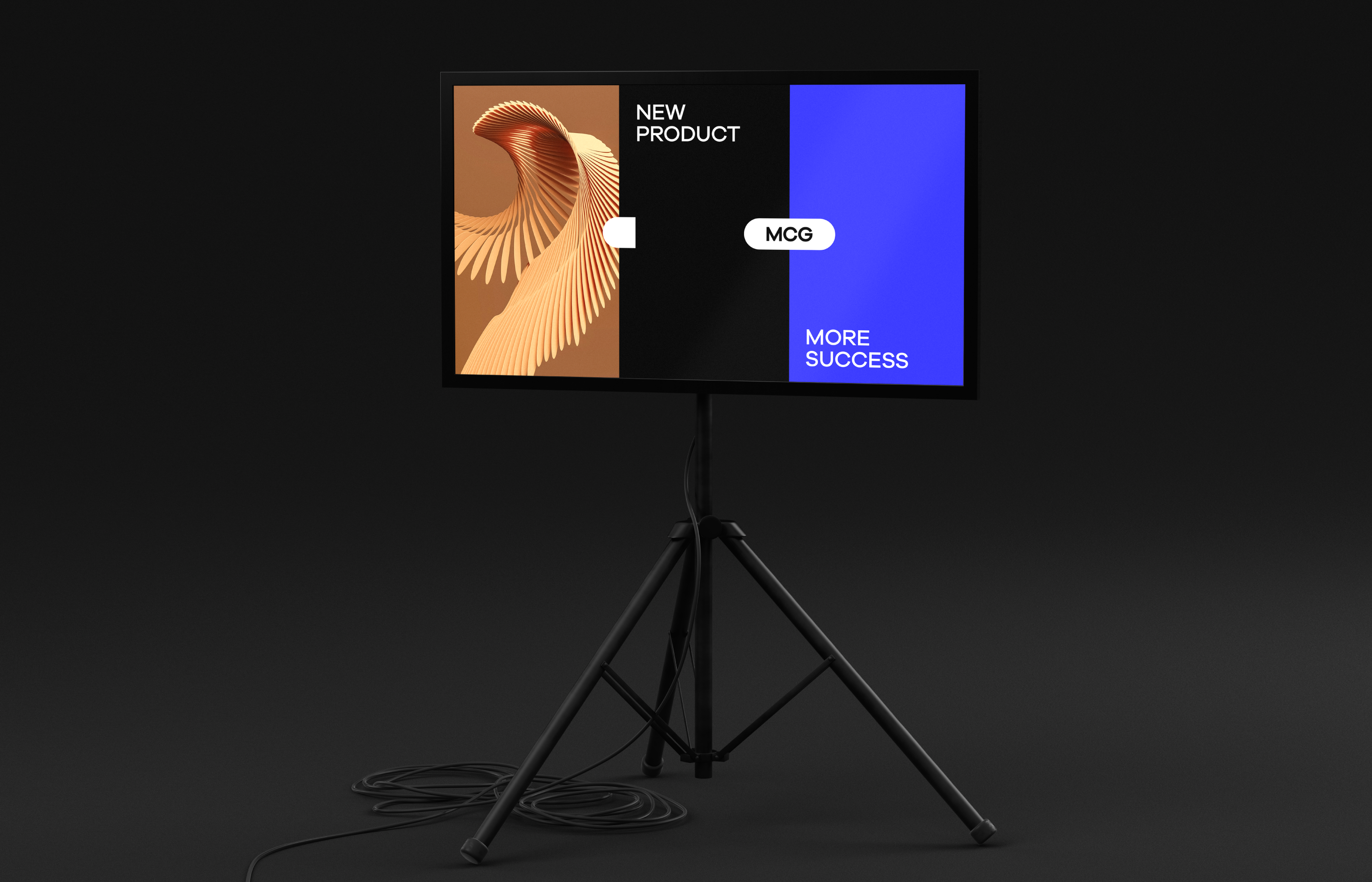
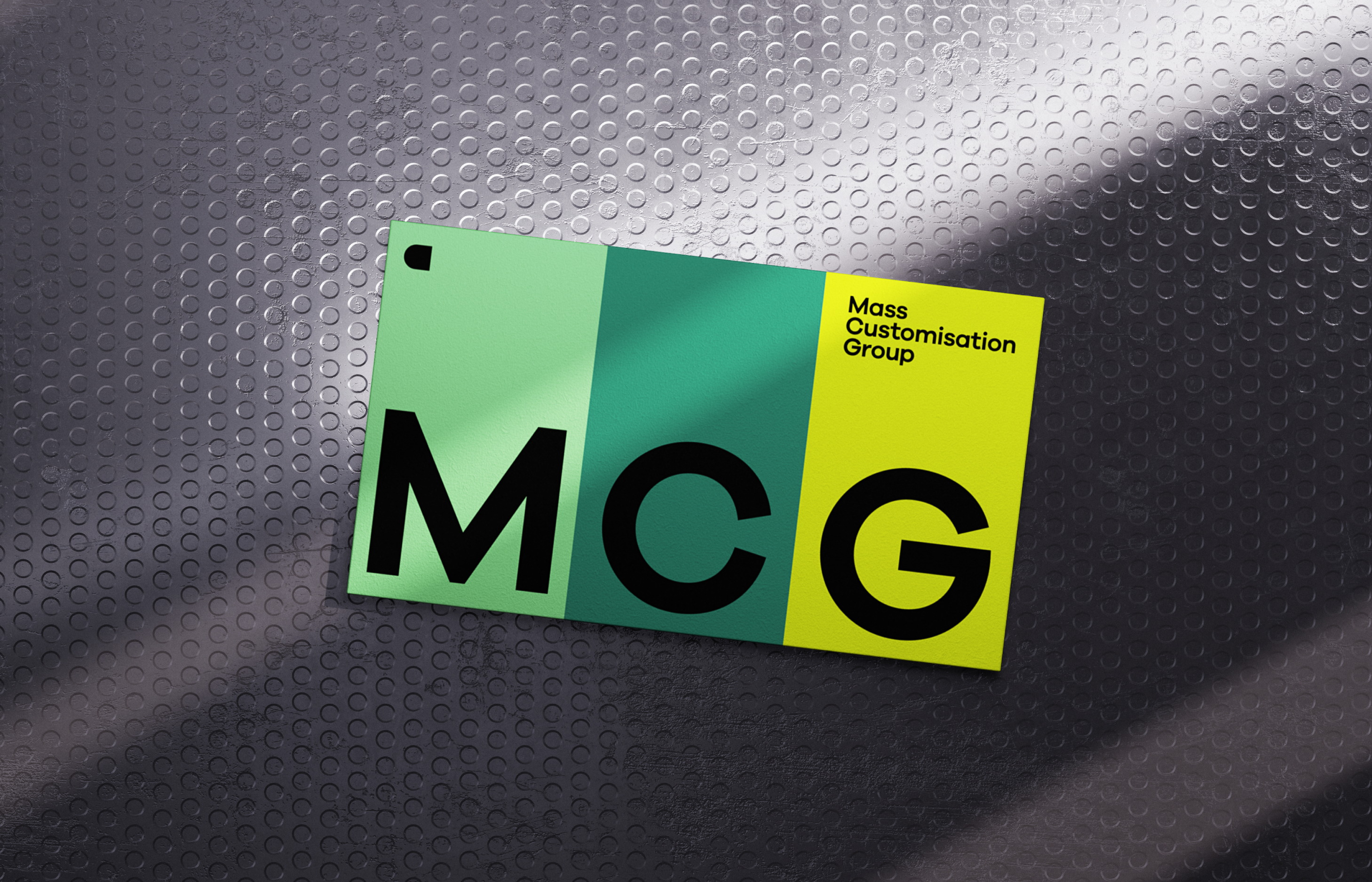
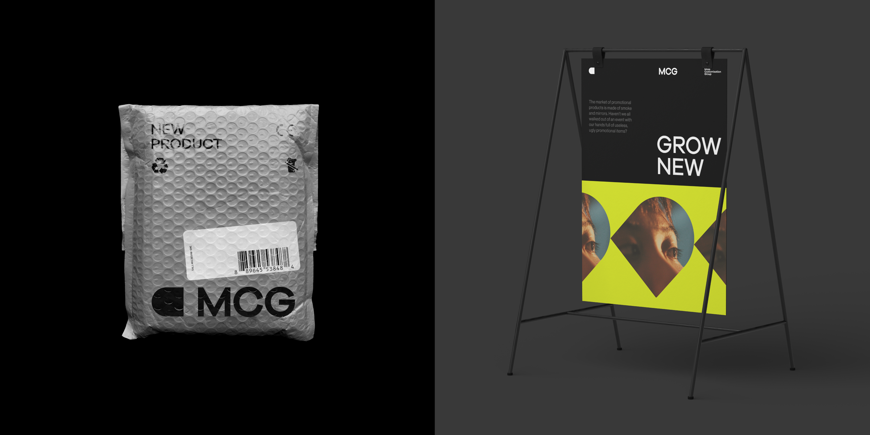
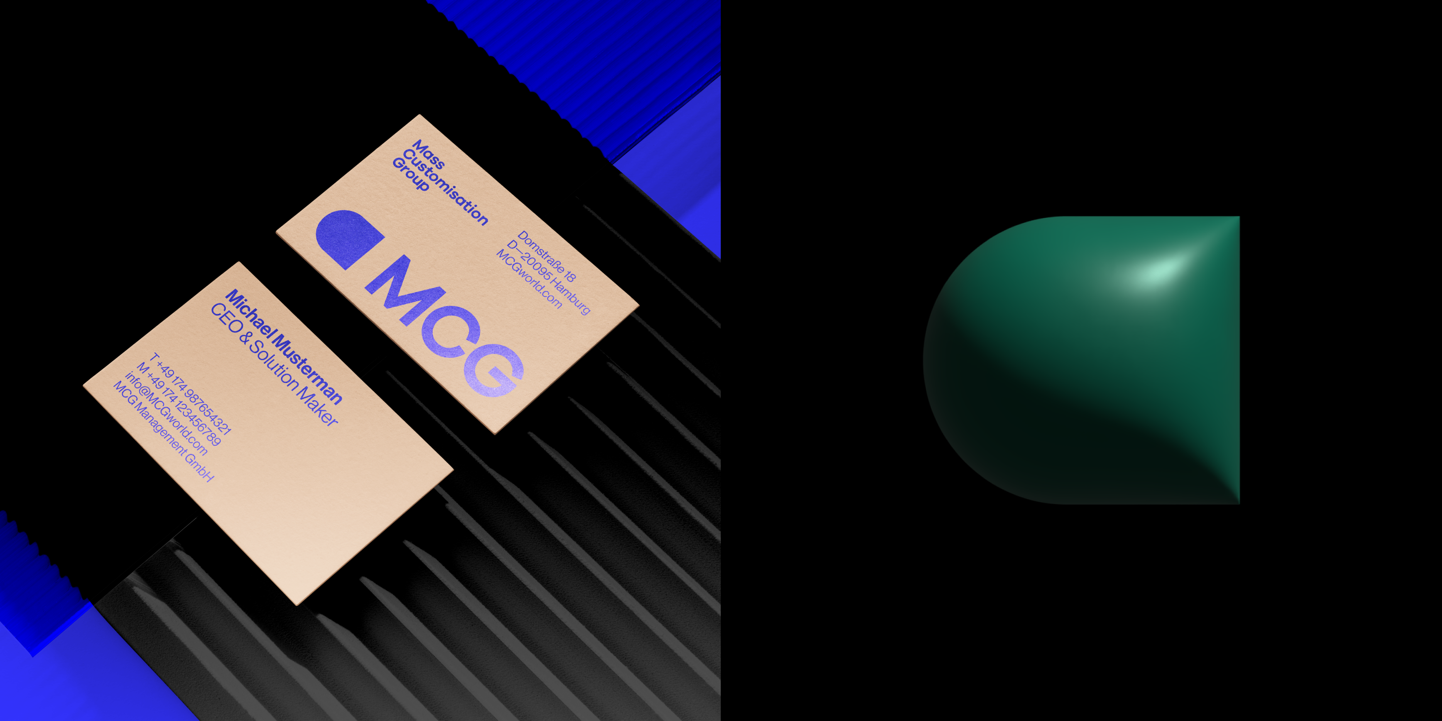
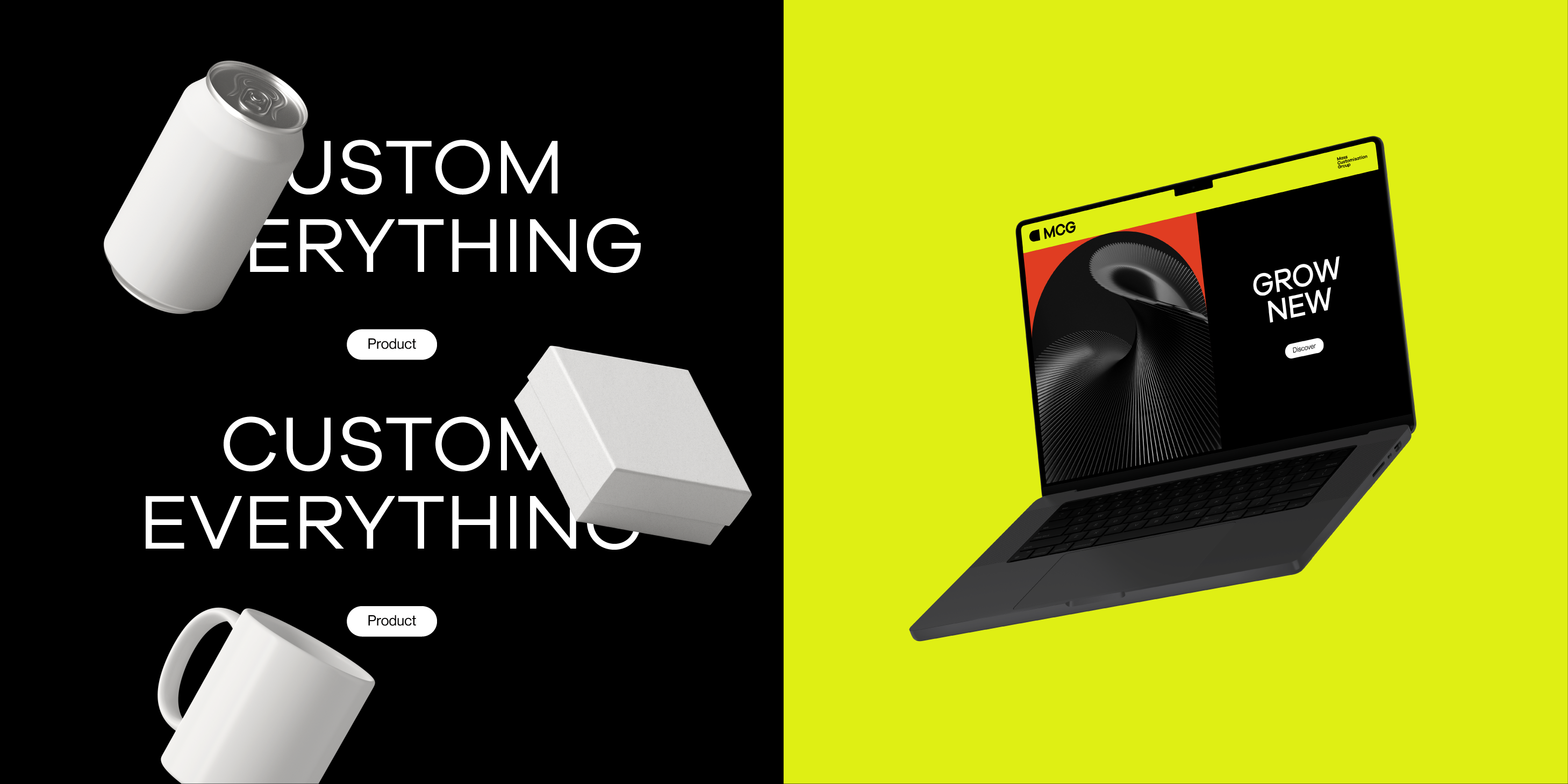
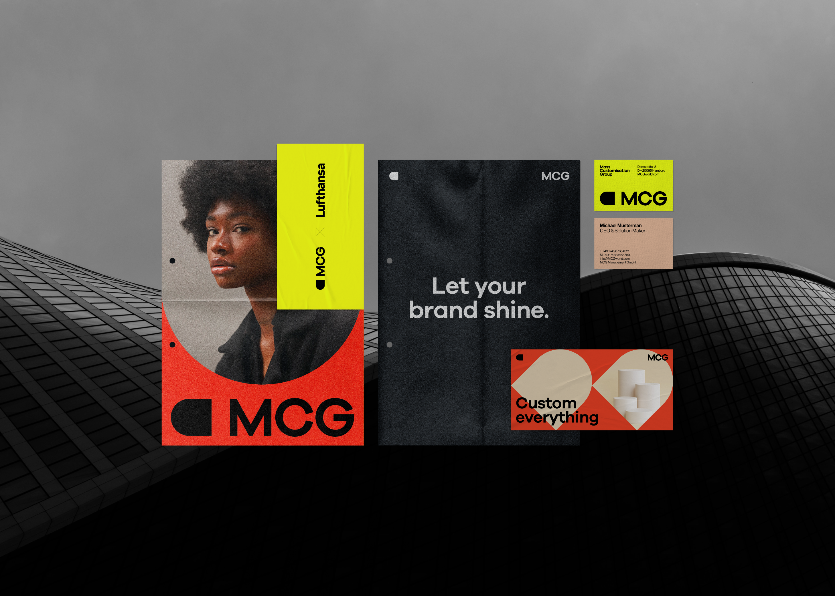
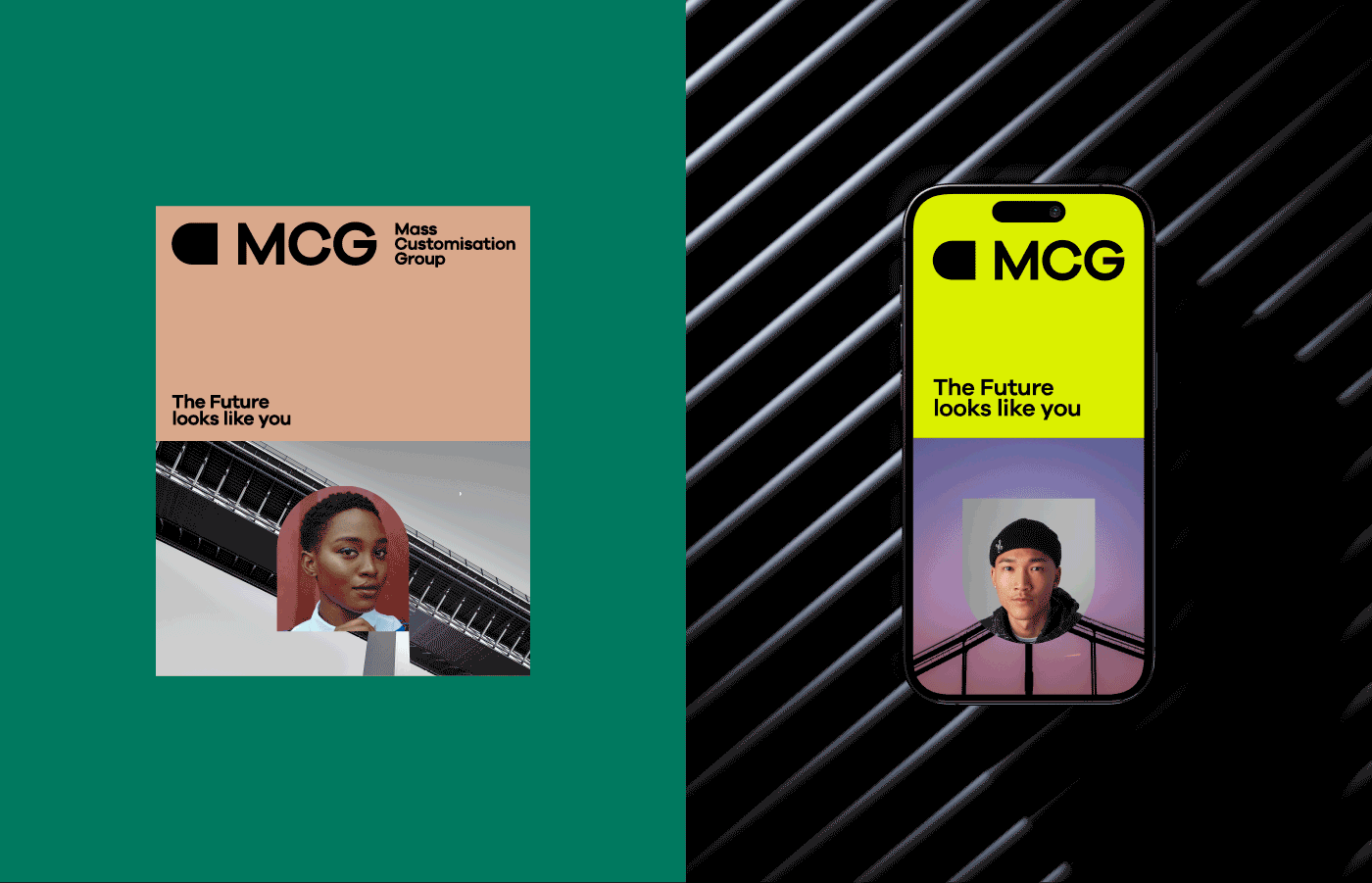
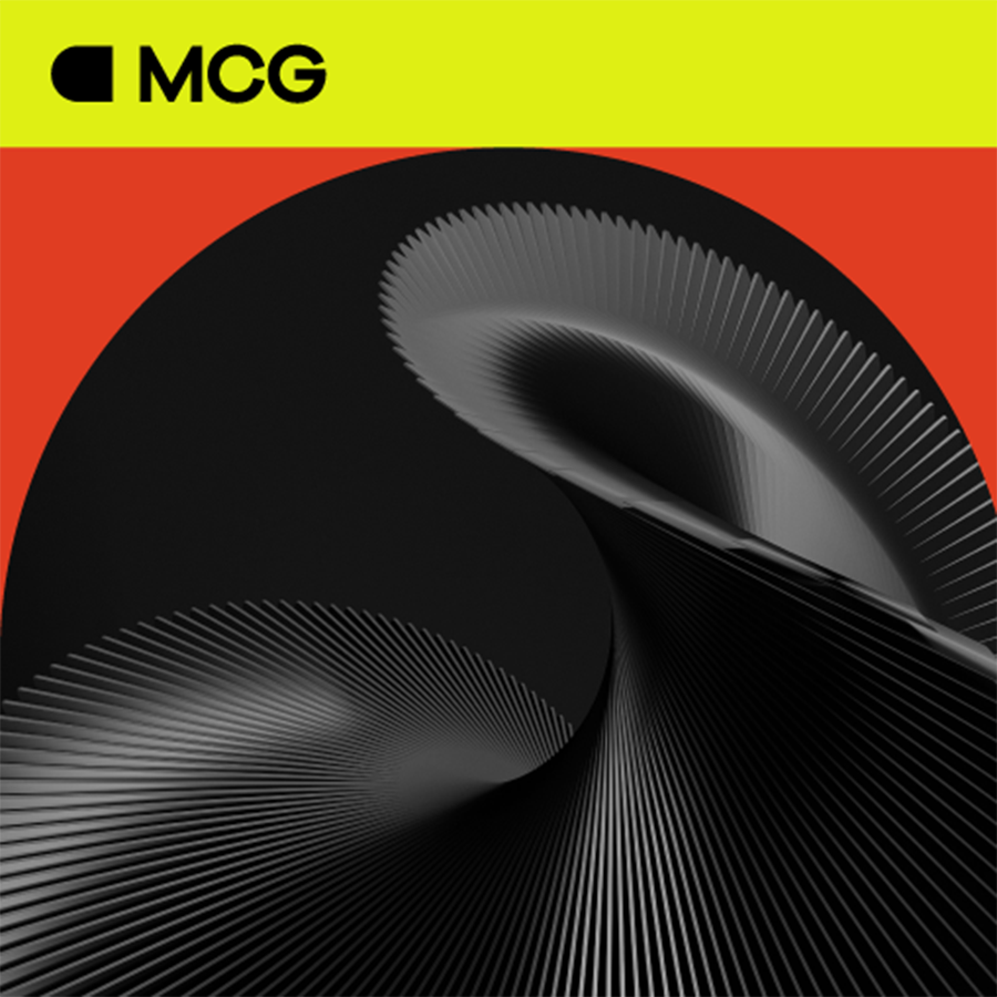
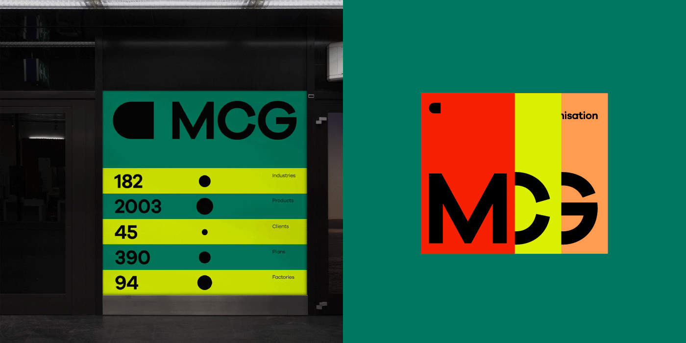
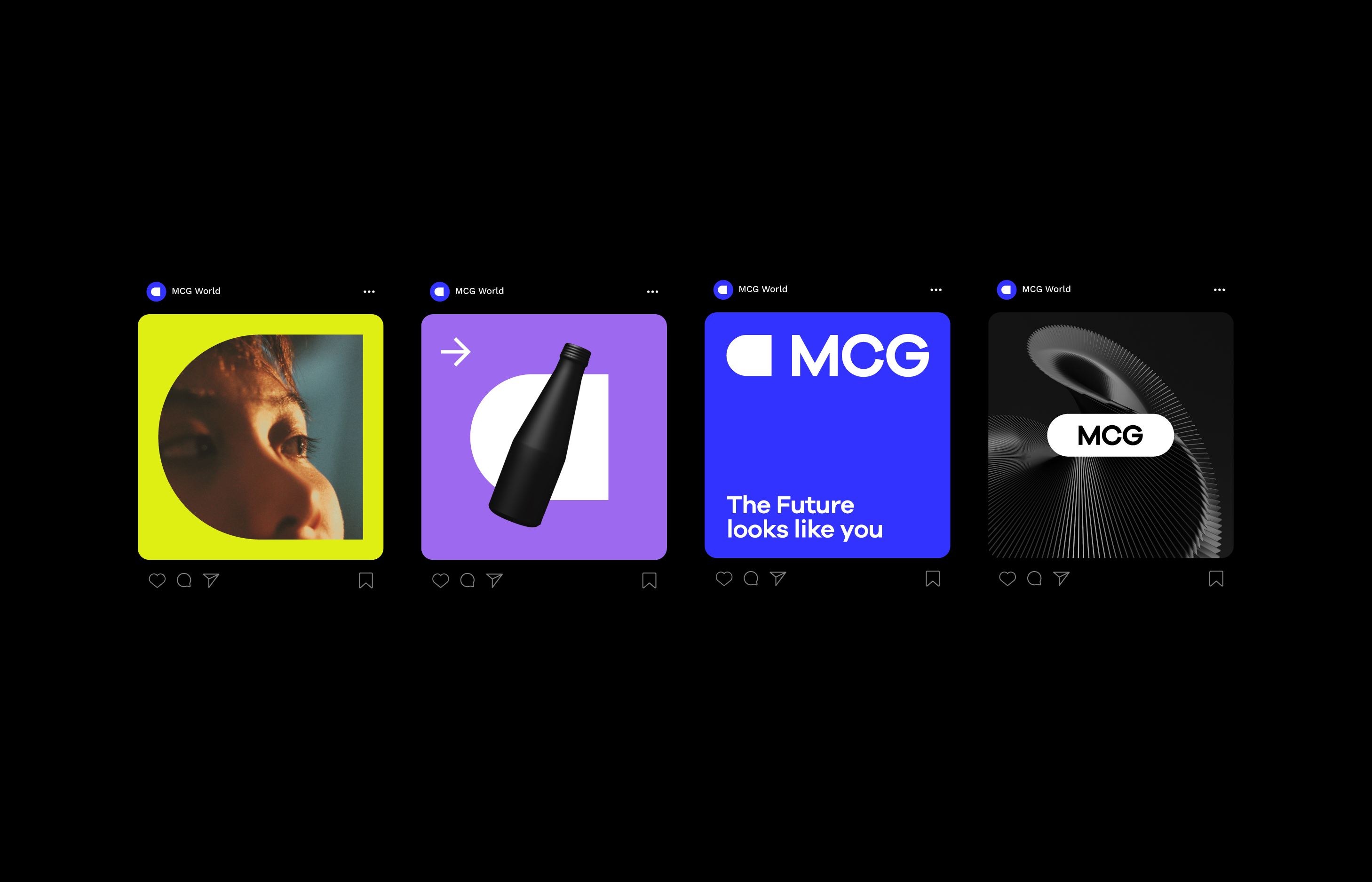
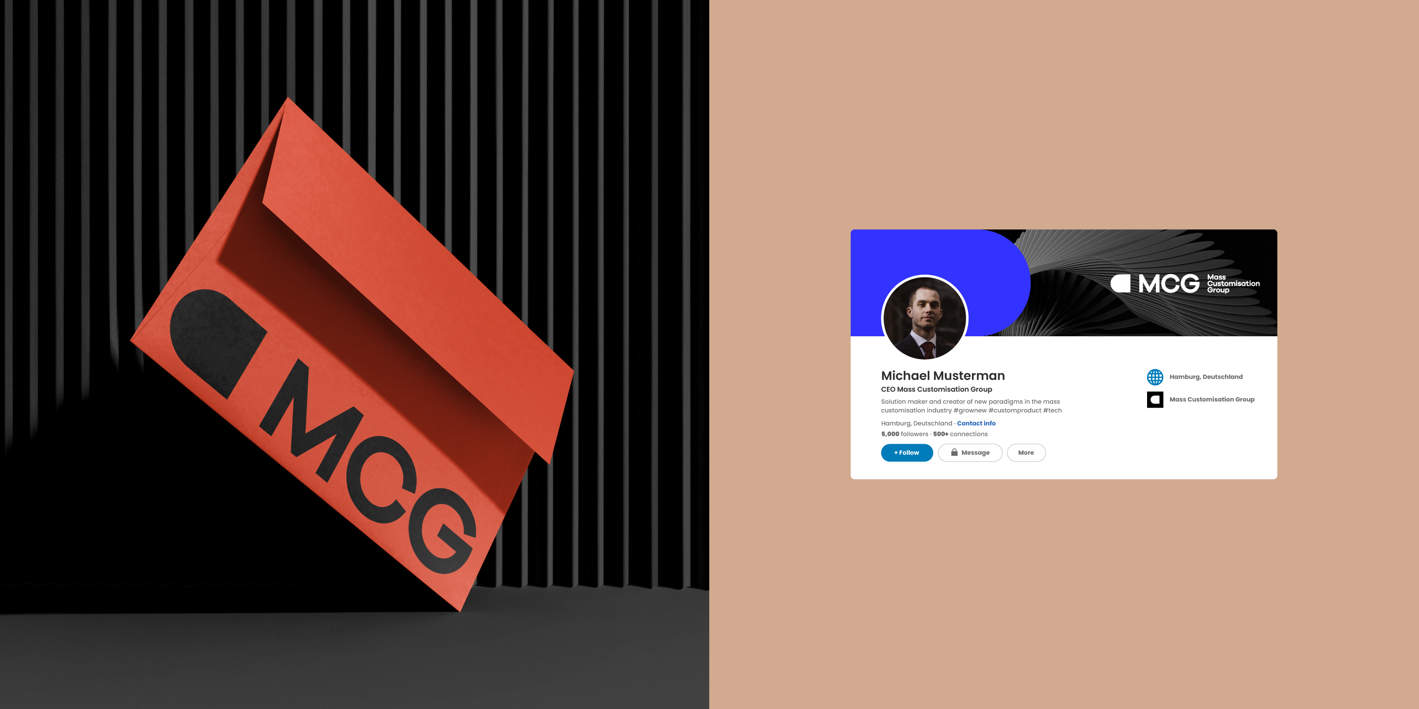
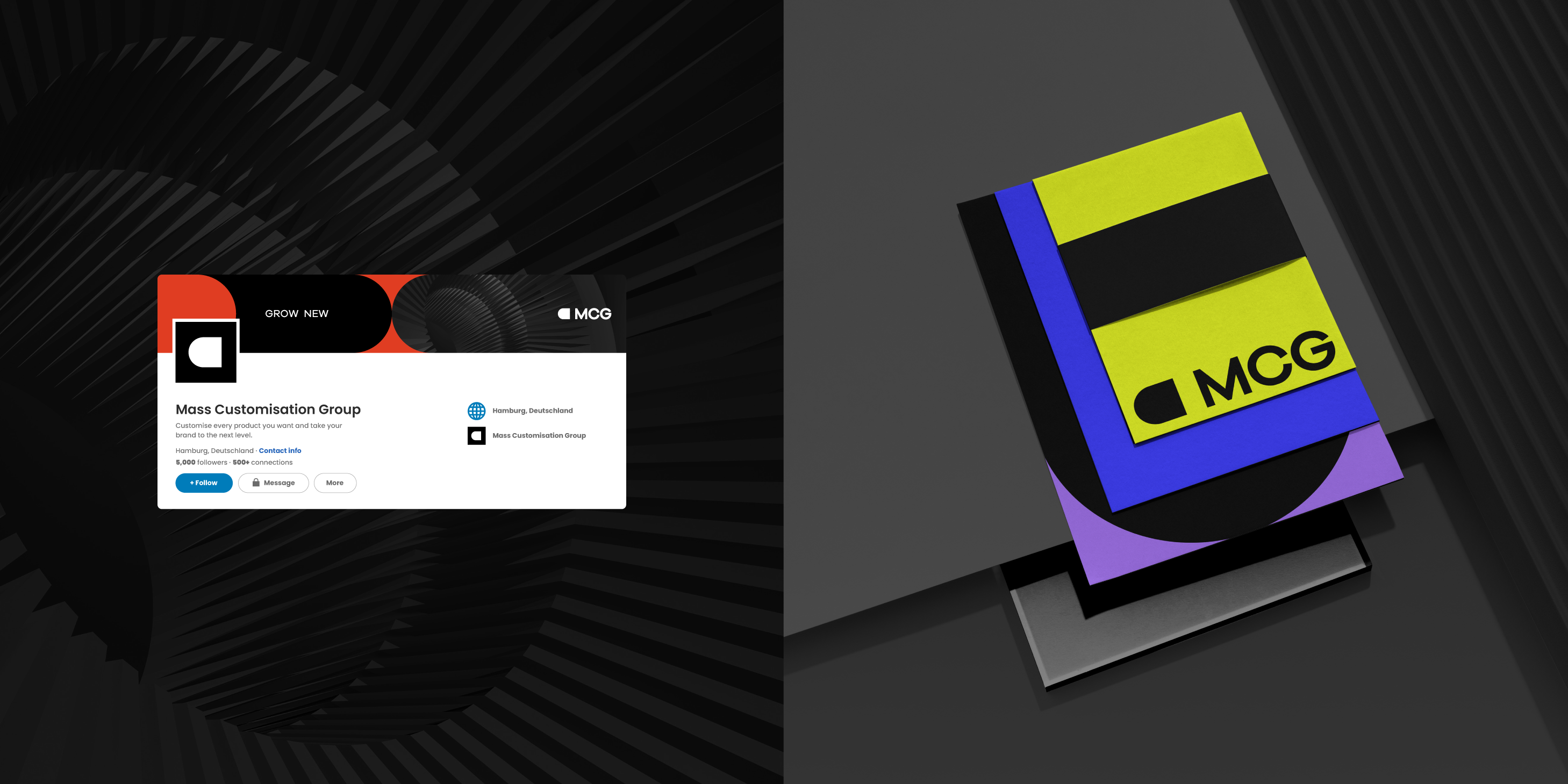
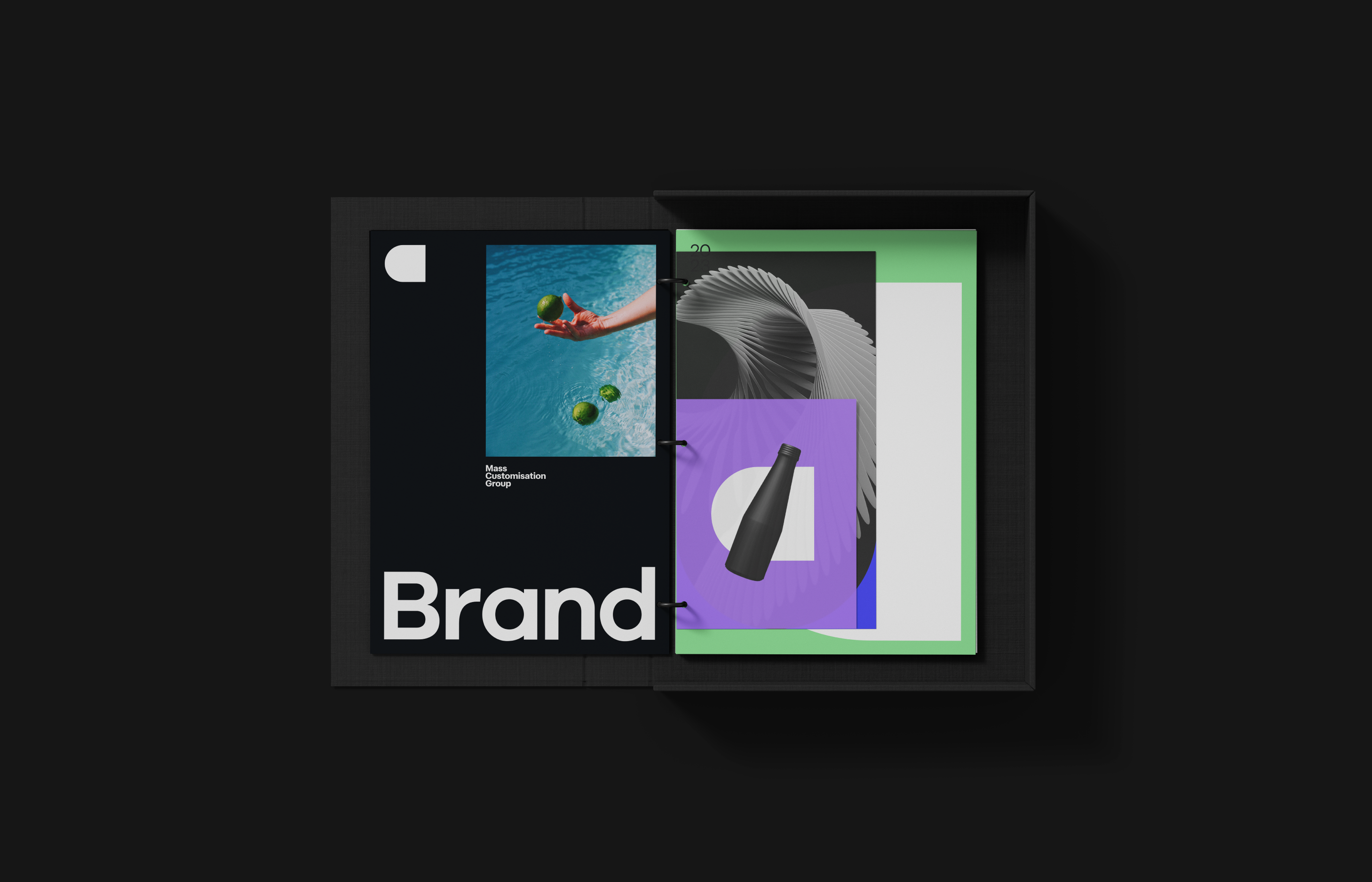
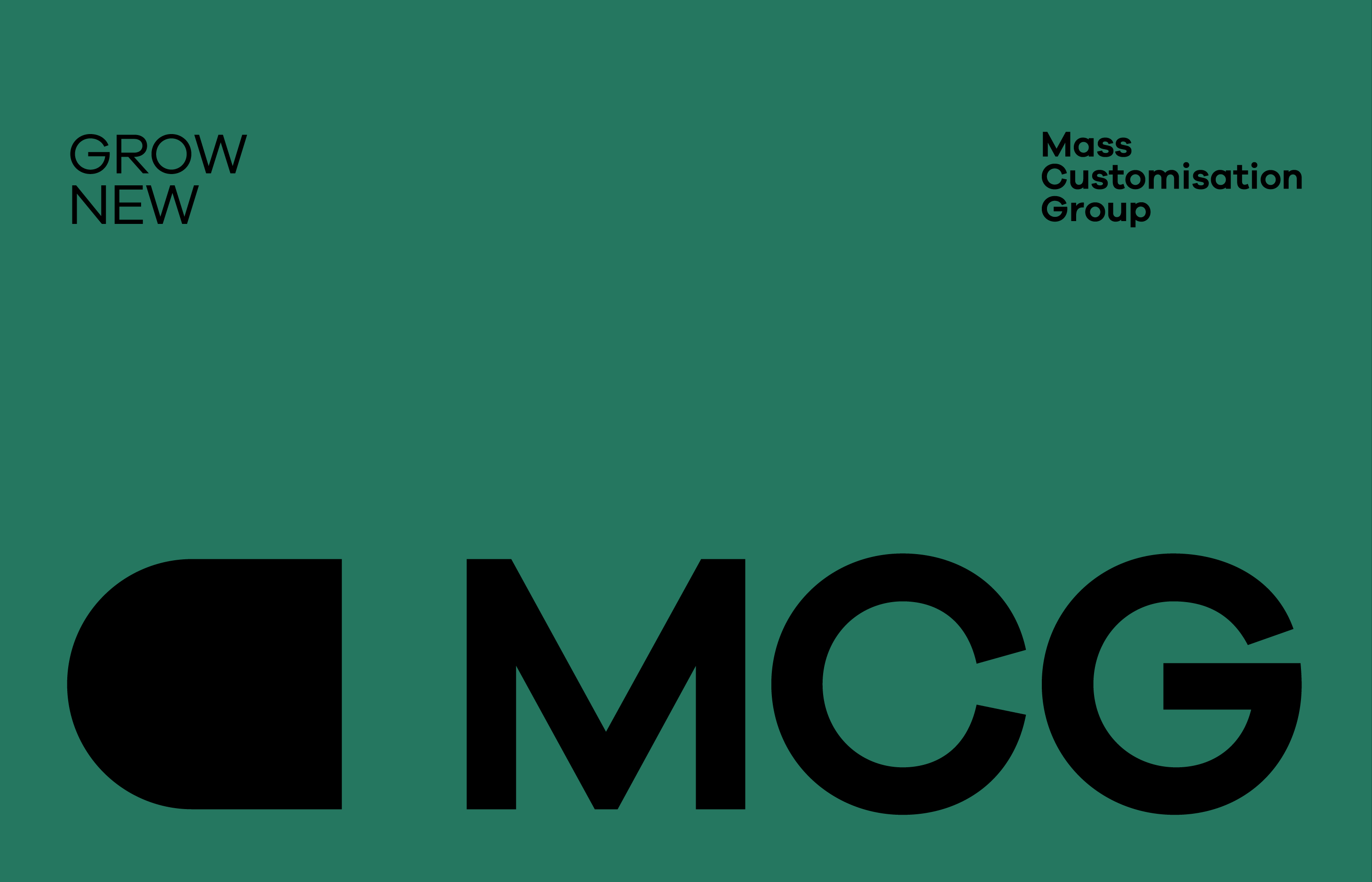
MCG (Mass Customisation Group) is a holding company that creates customised premium products on-demand to set companies apart from the competition through personalisation, digitalisation and automation. They will become the Amazon of mass customisation.
challenge
Creating a brand for a new holding compan within a business system that does not yet exist in its territory is always complicated as it reauires fine-tuning from strategy, through art direction to the final branding desian. That’s why we join forces to provide muscle in all aspects of the process.
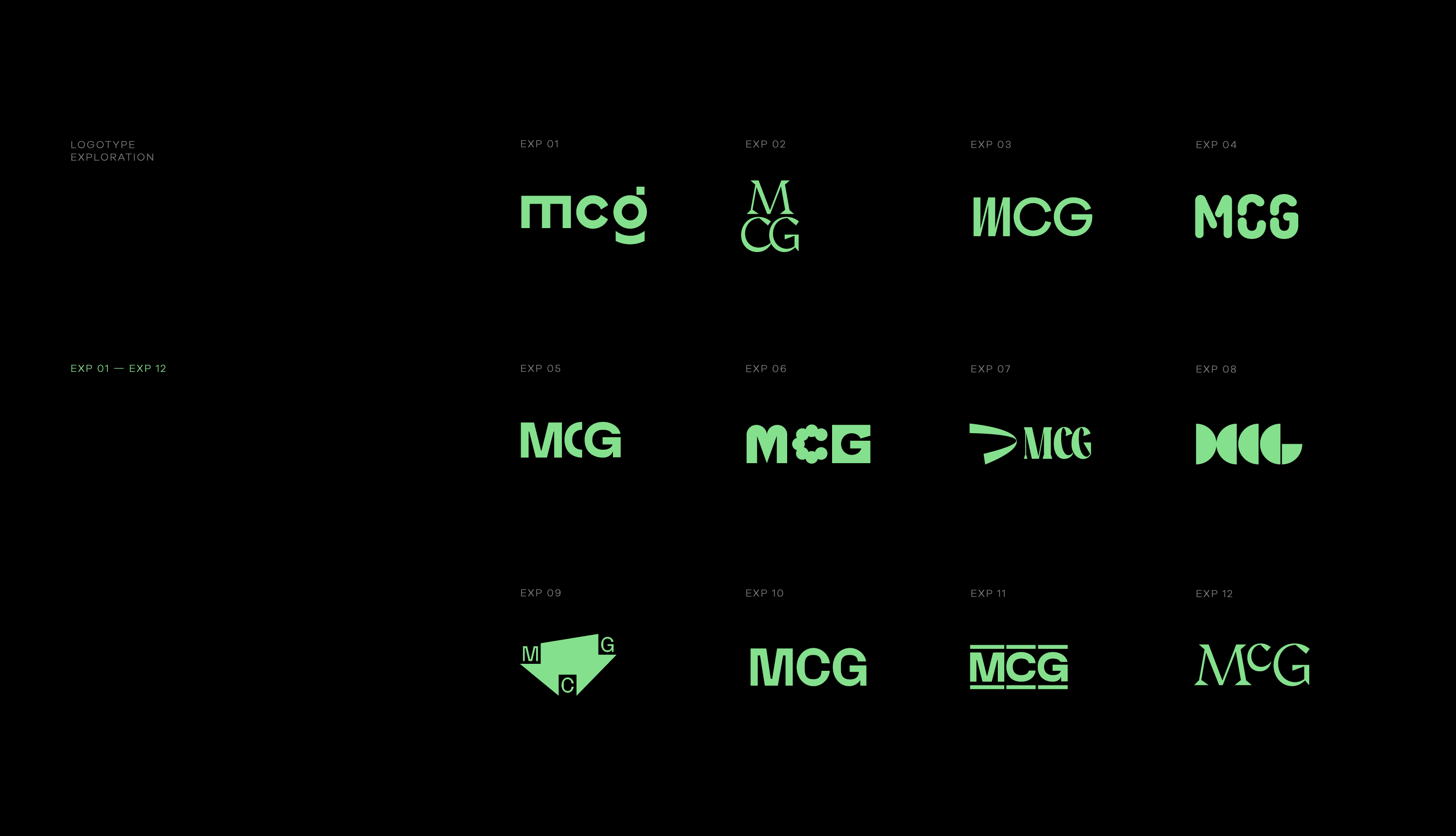
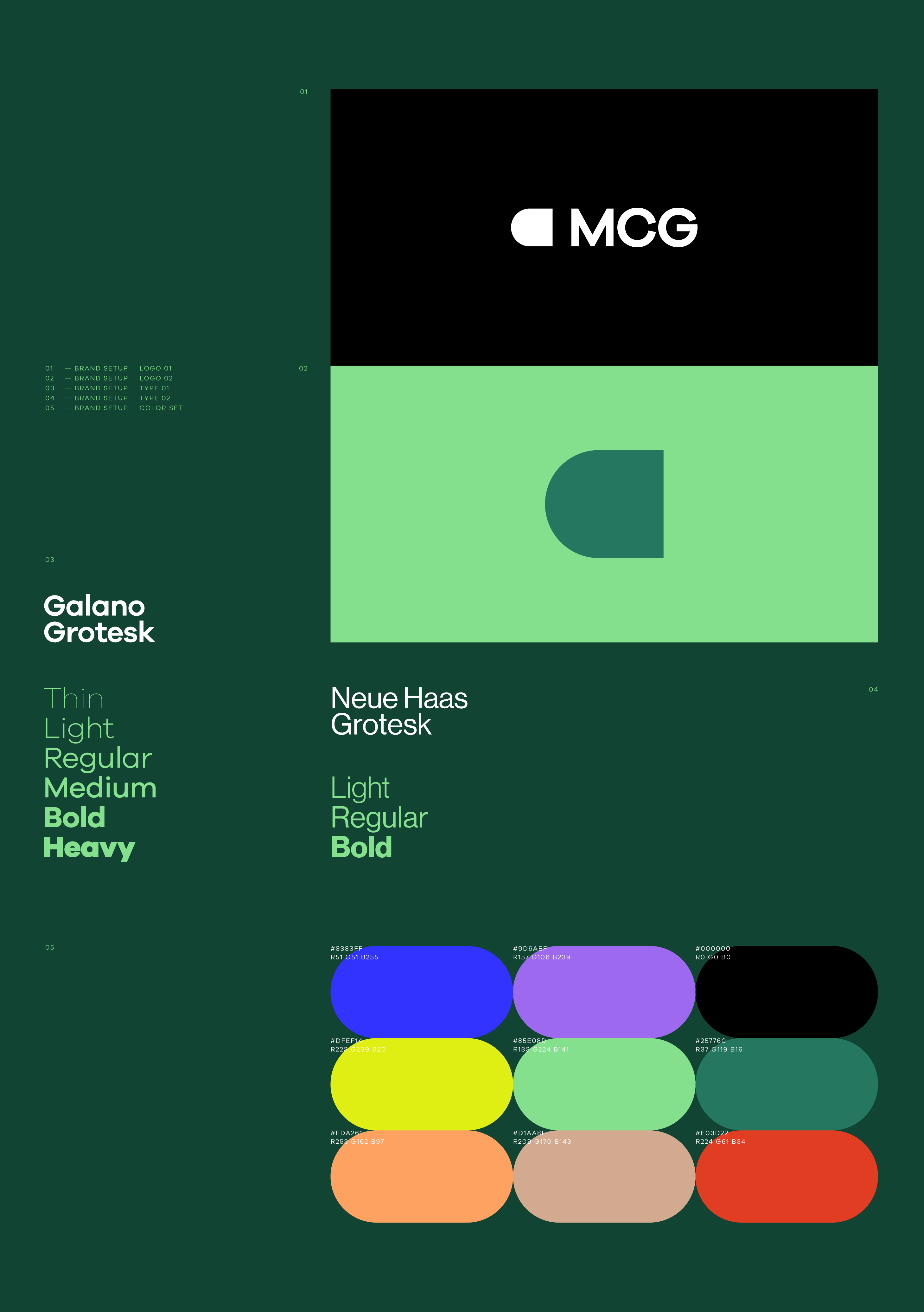
APPROACH
MCG (Mass Customisation Group) is revolutionizing the market with customised premium products on-demand, using personalisation, digitalisation, and automation. The branding reflects innovation, reliability, and customisation capabilities, with a modern logo and vibrant colors. Sleek typography and dynamic graphical elements illustrate the company’s forward-thinking ethos. Clear messaging emphasizes the value of on-demand customisation, positioning MCG as a trusted partner for businesses. Overall, MCG’s branding strategy aligns with its vision of becoming a leader in mass customisation, synonymous with innovation and customer satisfaction. We love the outcome!
YOU LOVE THE VIBRANT COLORS?
LET’S GET IN TOUCH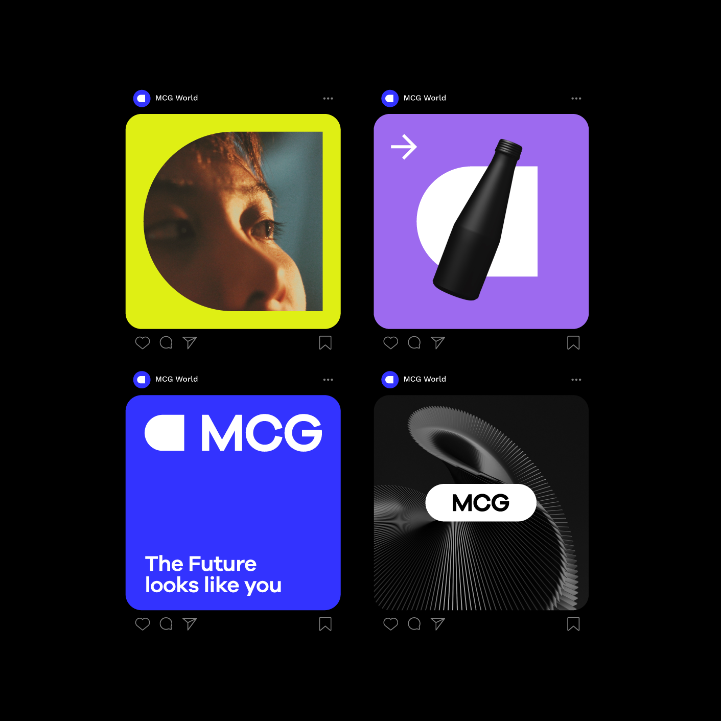
Team
ONOGRIT x MSG
Credits
Art Direction & Graphic Design: ONOGRIT x Lucas Aritz ❤️
WALBERT-SCHMITZ
year
2019
client
Walbert-Schmitz
industry
Brand Experience
services
ReDesign
scope
Mission, Vision, Personas, Target Groups, Semantic Analysis, Redesign Logo, Color Climate, User Experience Design, Website, Typography, Copy, Stationary, Production Support, Project Management.
CLIENT
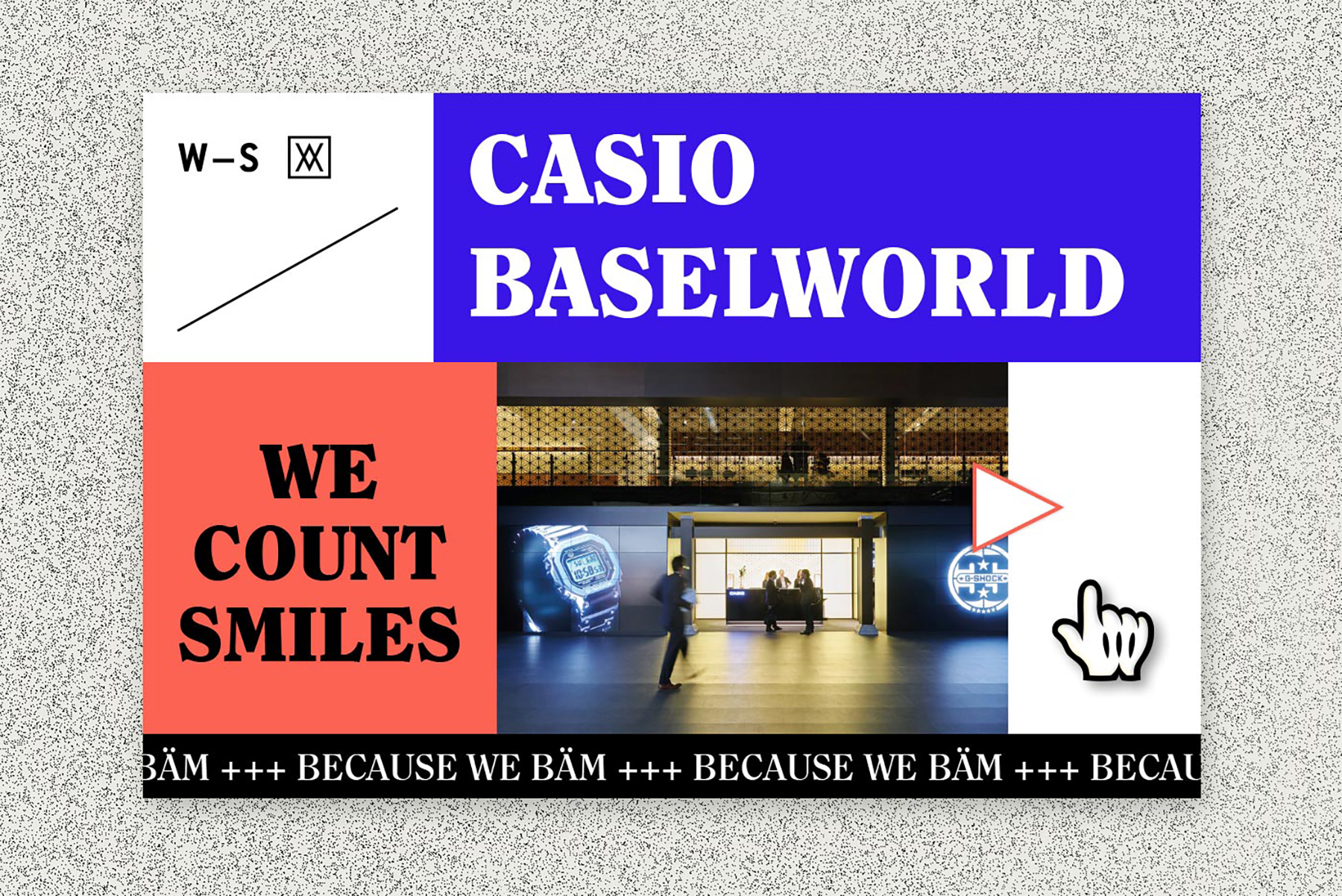
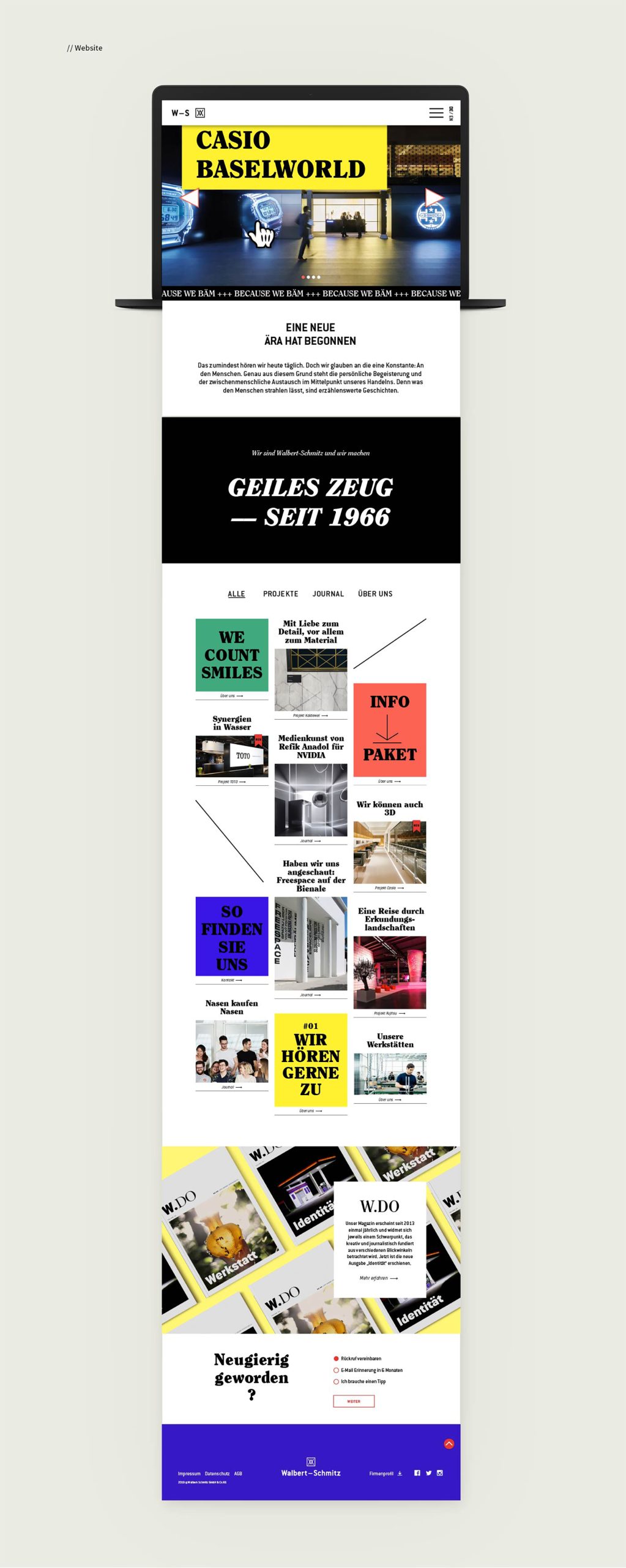
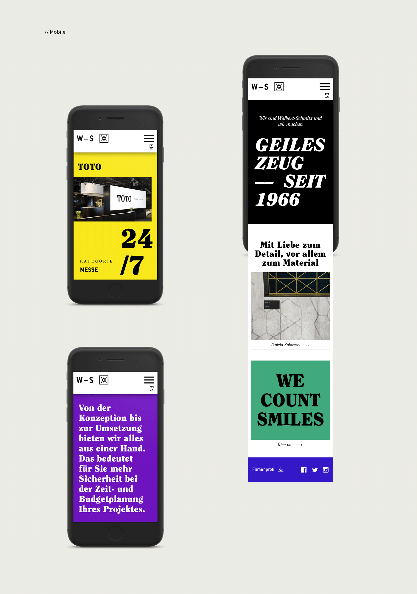
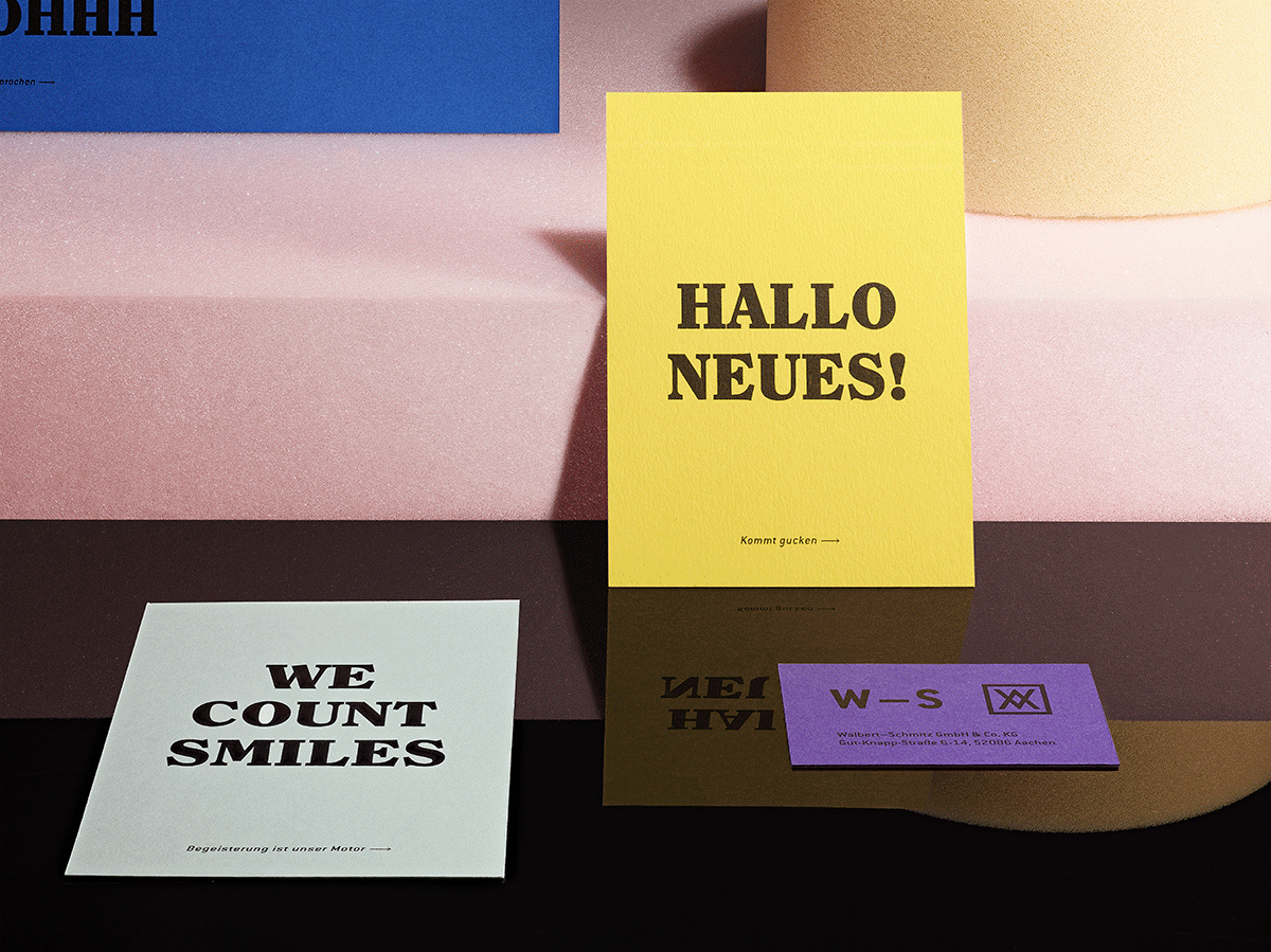
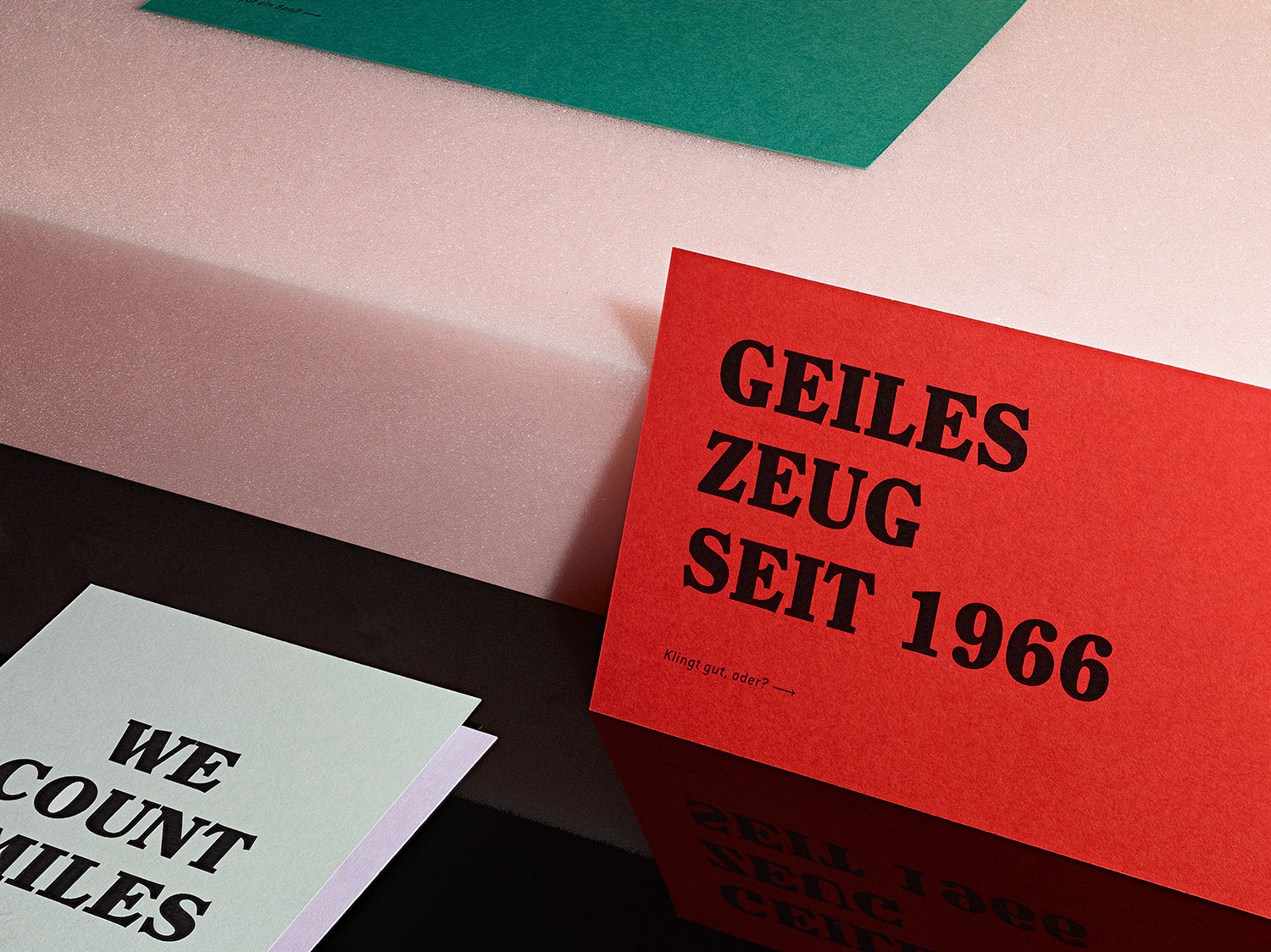
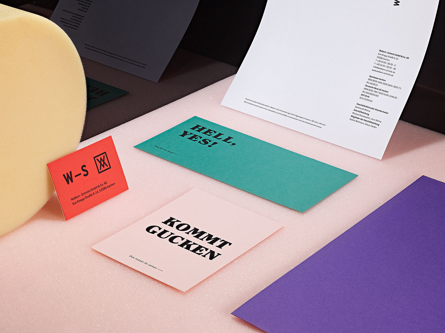
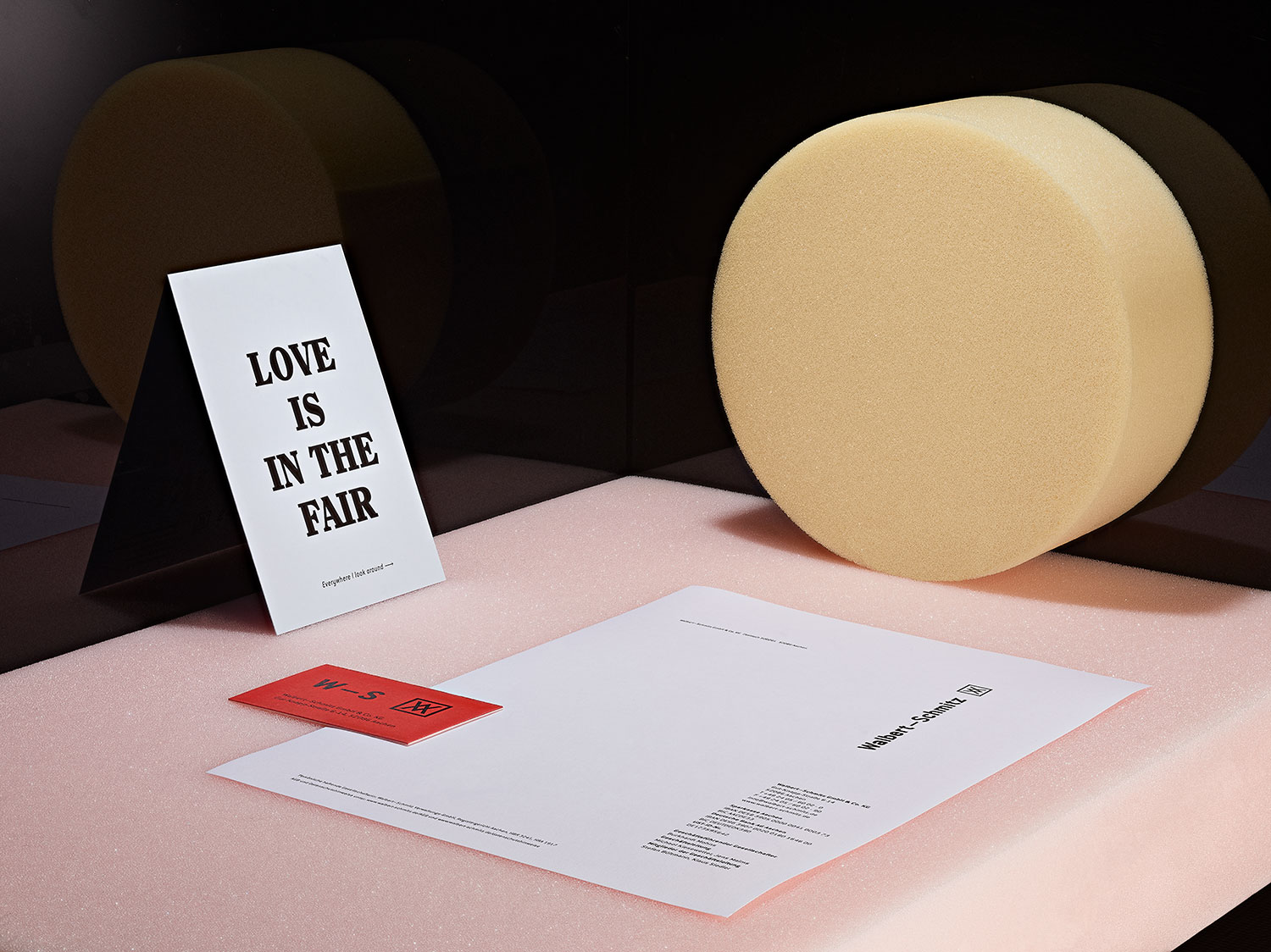
Walbert-Schmitz is an Aachen-based company for brand experiences in the fields of trade fairs and events. What makes it special is its holistic approach to every project. With experts in the fields of creation, planning, project management and craftsmanship, it is one of the few companies in this field that can accompany a project from start to finish. With over 50 years experience they master light, water and above all emotions which the visitor takes home again. So far the business. What really makes Walbert-Schmitz special is the friendliness and the fun with which one is welcomed here. It doesn’t take 2 minutes until you feel just right here.
challenge
The objective for the new corporate design was to match the exterior to the interior and to increase the visibility of the brand. Above all, however, the new appearance should help the company to present itself more authentically and to be perceived much more strongly as a creative partner for its customers.
APPROACH
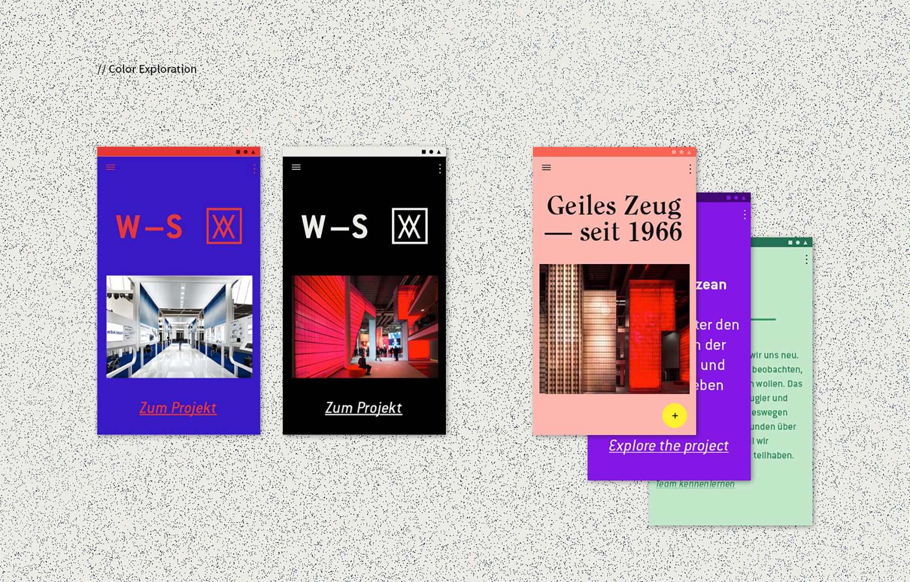
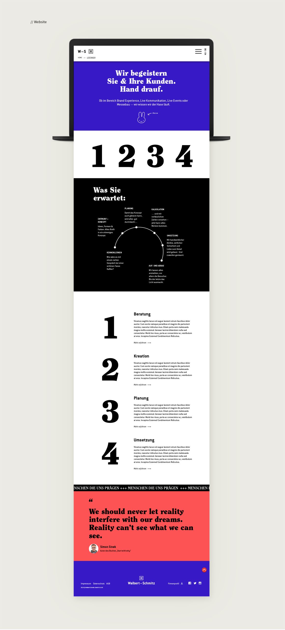
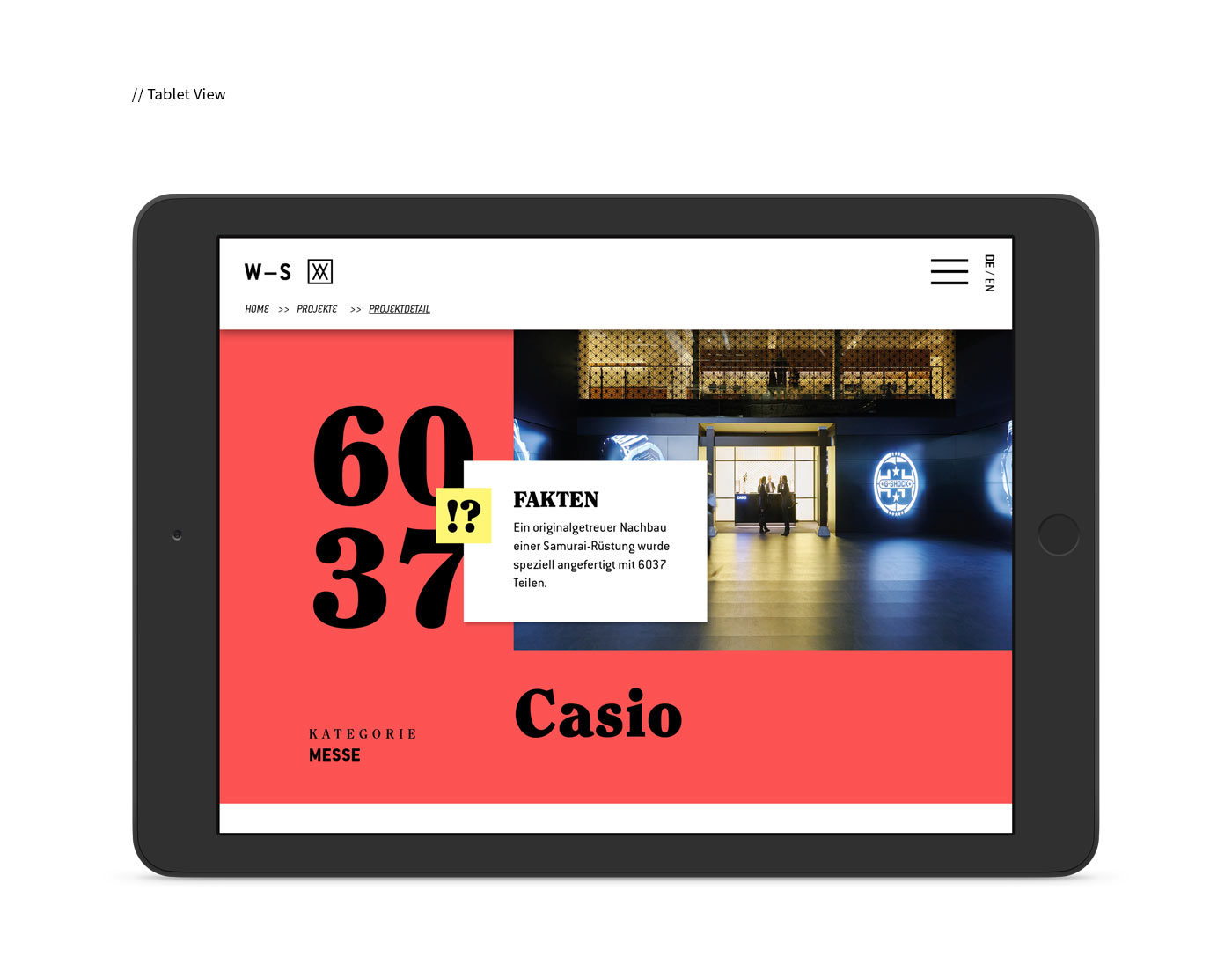
In the first phase of the project the focus was on a semantic analysis and the elaboration of the values that characterize and represent Walbert-Schmitz. We defined the vision (the future of live communication shaped by floating media boundaries), the mission (to transform a visit of a place into a lasting experience) and the positioning. The development of Personas and Use Cases finally created the necessary context and helped us to understand what the result should look like. After a successful meeting, the design idea resulting from the strategy phase carried the beautiful working title “Cool stuff since 1966. Because we Bäm!” as it expressed everything that needed to be integrated: self-confidence, courage, creativity, openness, tradition, dialogue, emotion and fun.
DO YOU NEED WHAT YOU SEE?
Let’s meet and greet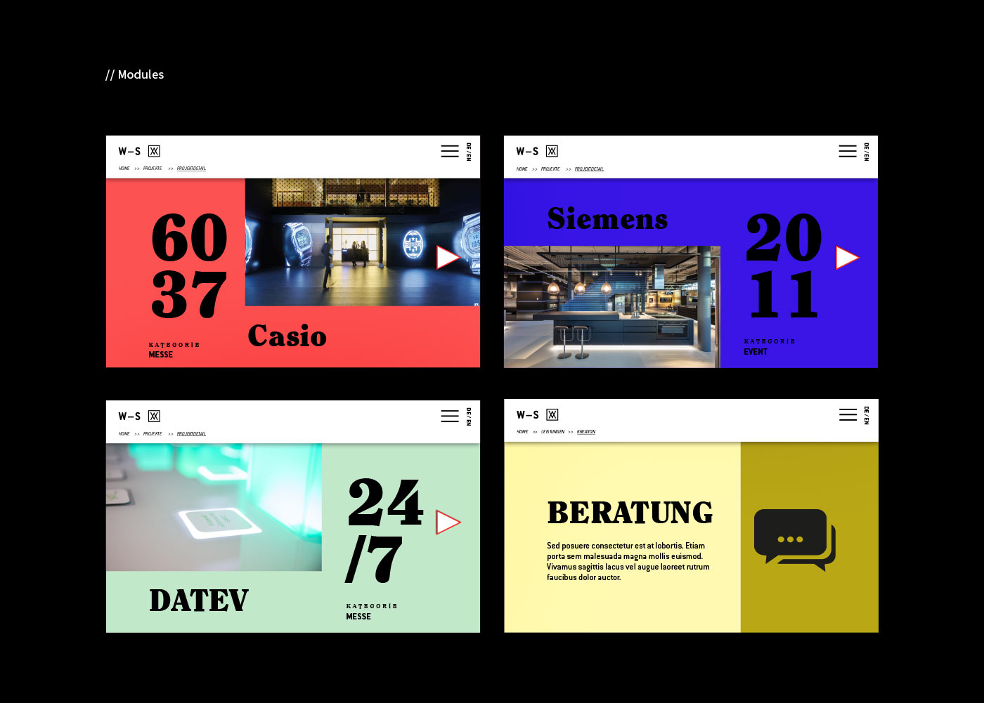
Team
ONOGRIT x Walbert-Schmitz
Credits
Project Photos: ONOGRIT x Manuel Mittelpunkt ❤️
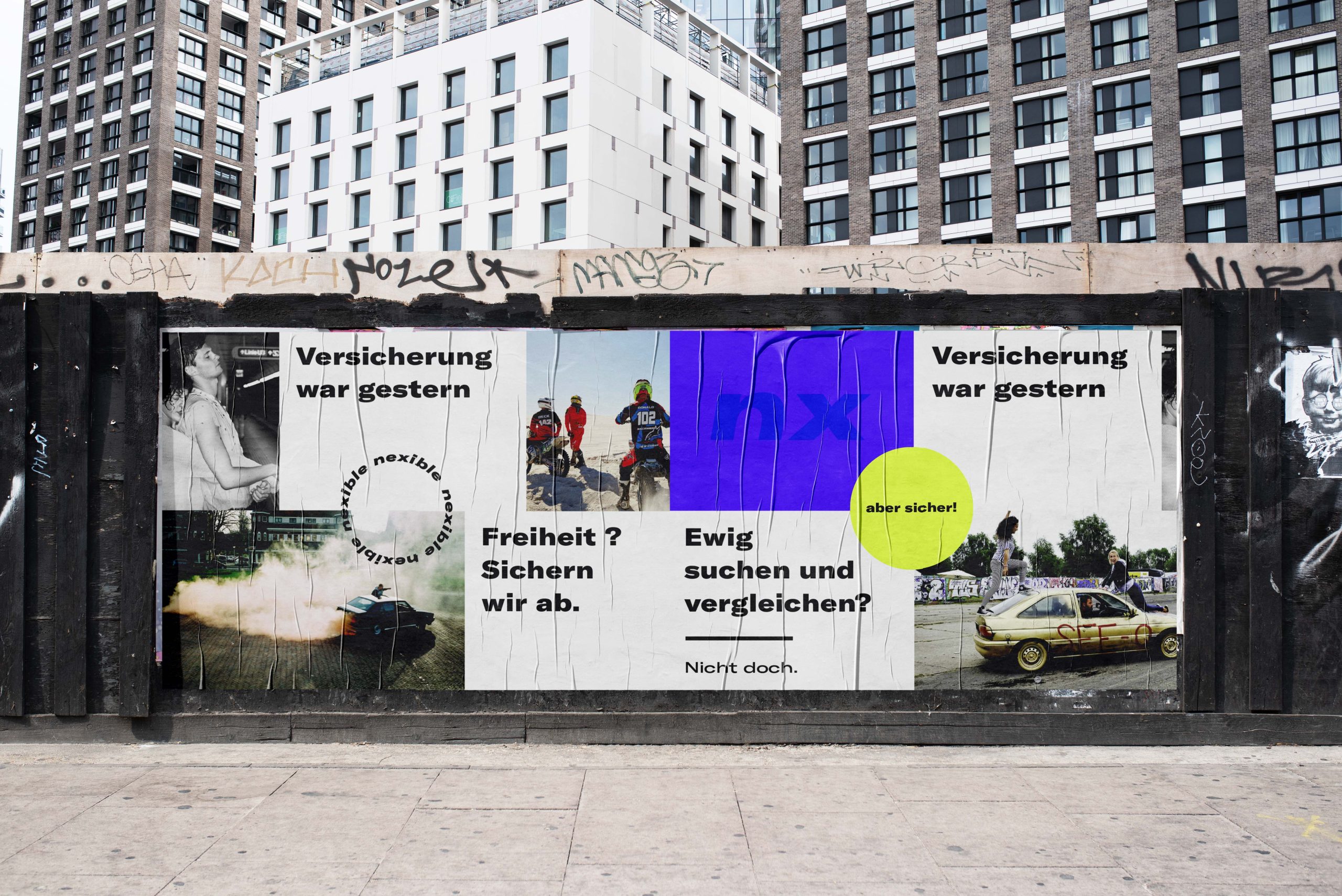
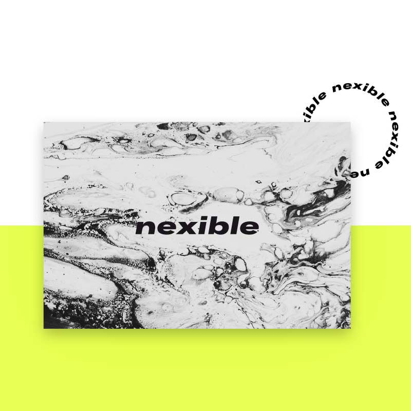
NEXIBLE
year
2017
client
Nexible
industry
InsureTec
services
Digital Branding
scope
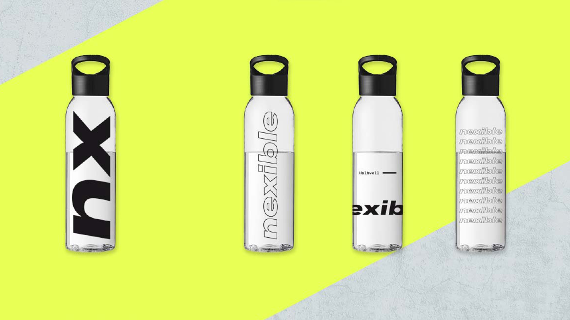
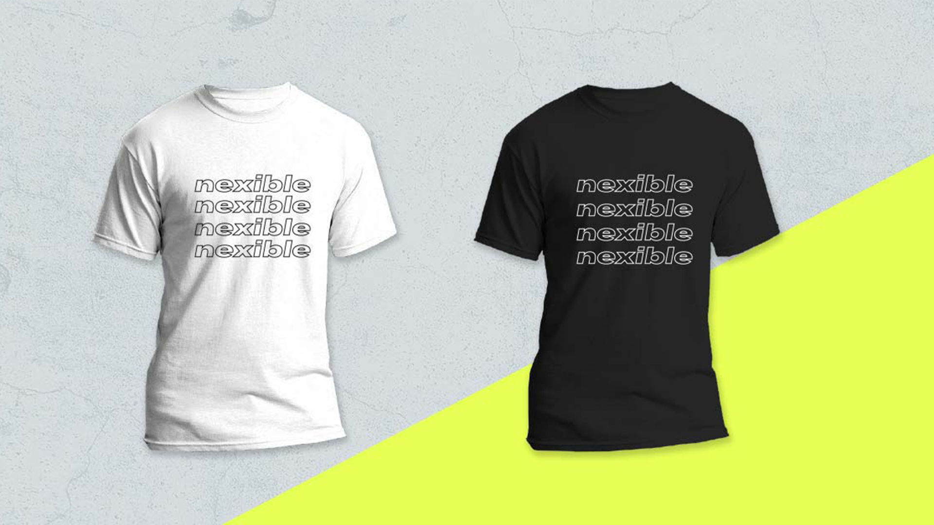
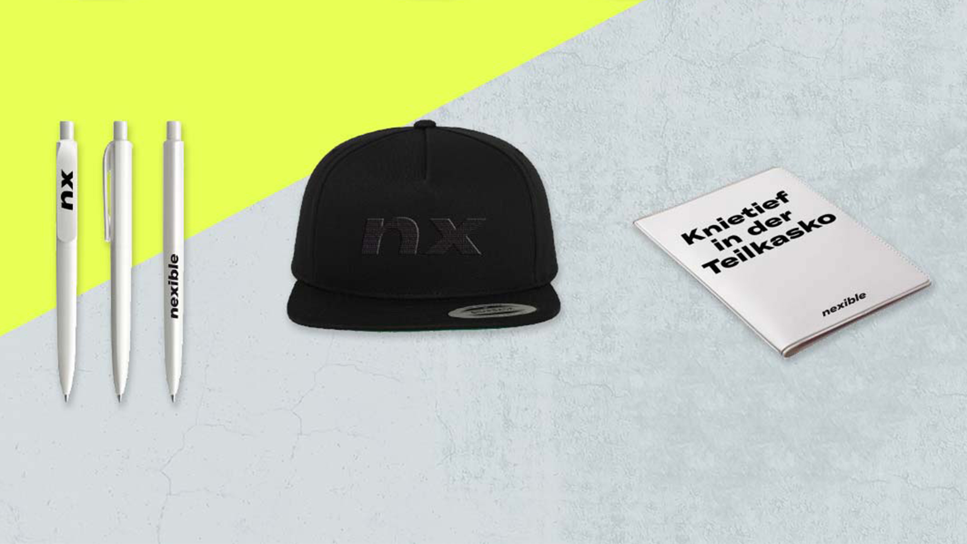
Ideation, Design Direction, Concept, Visual Language, Logo Development, Screen Design, Copy Text, Imagery Concept, Design System, Merchandising.
CLIENT
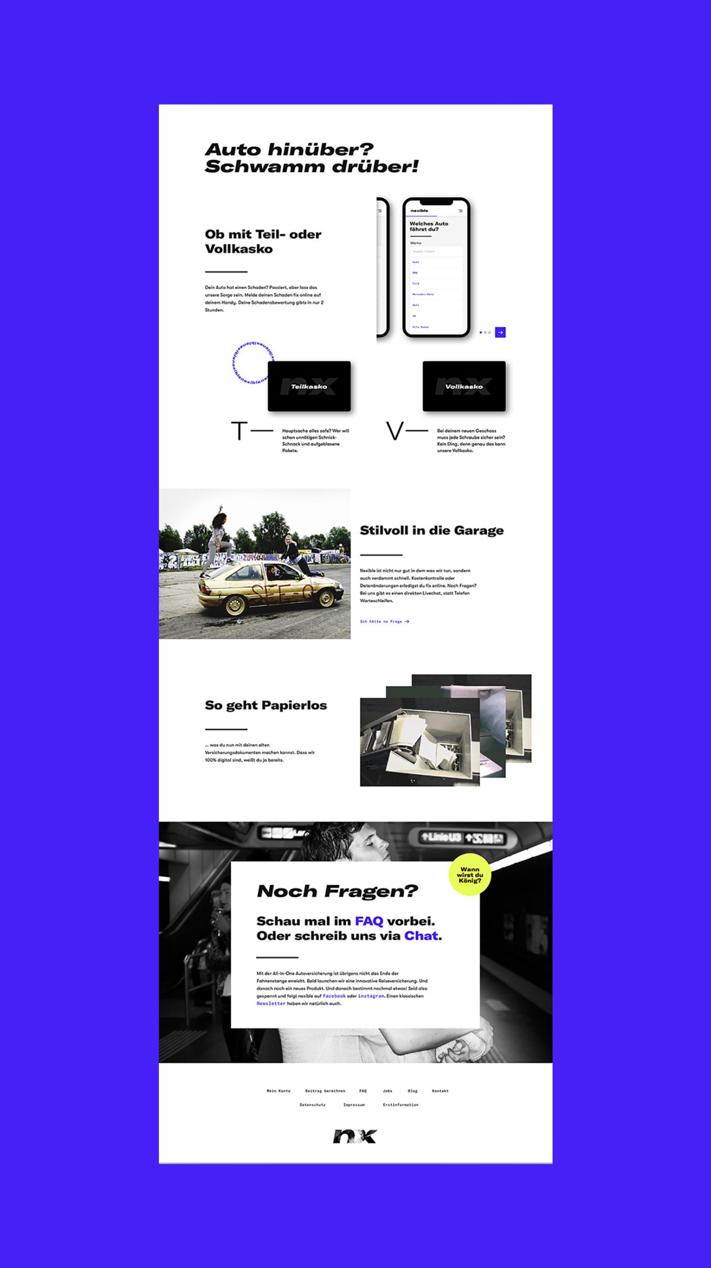
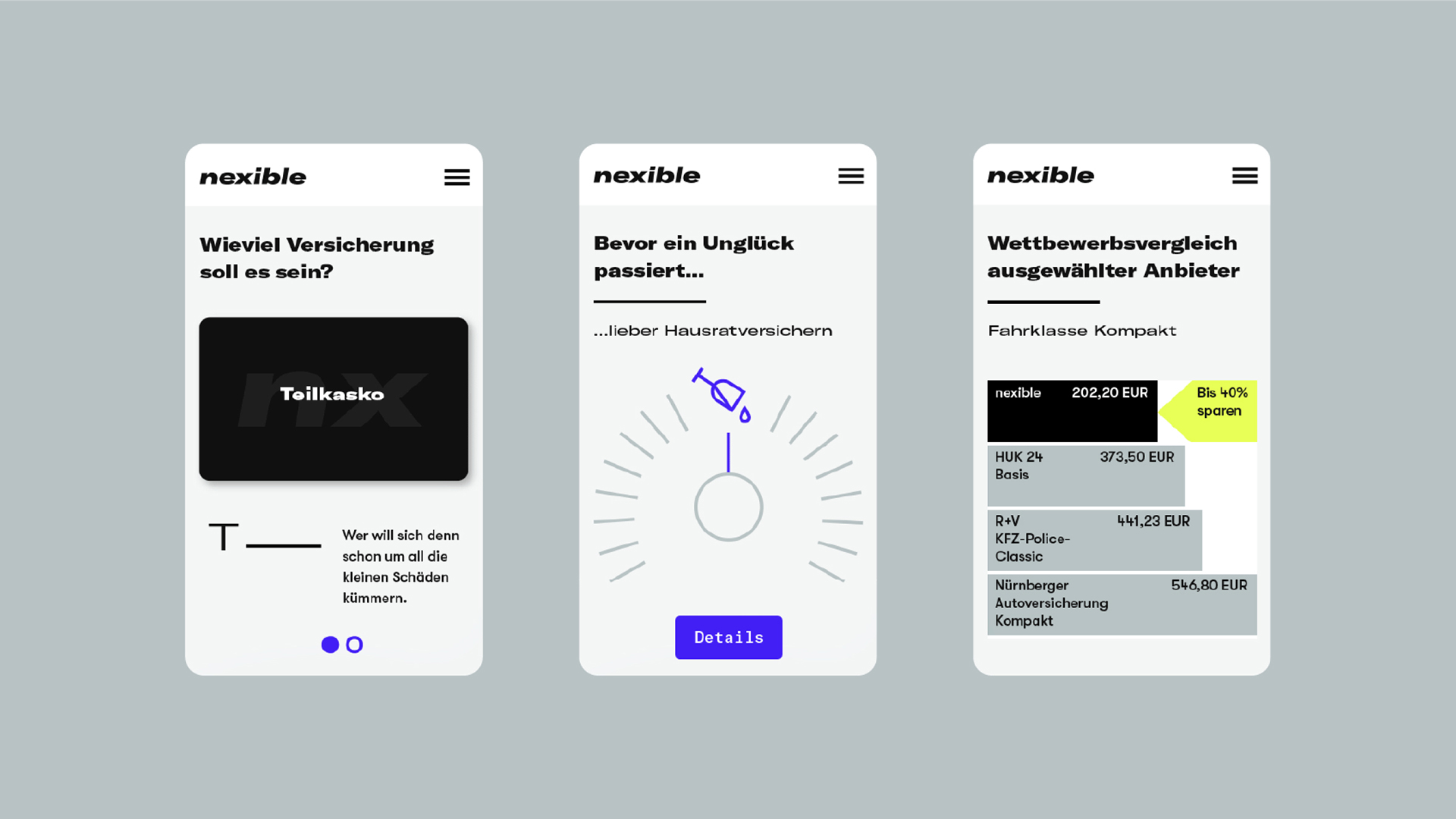
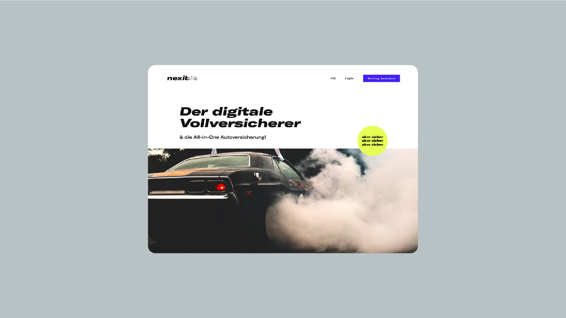
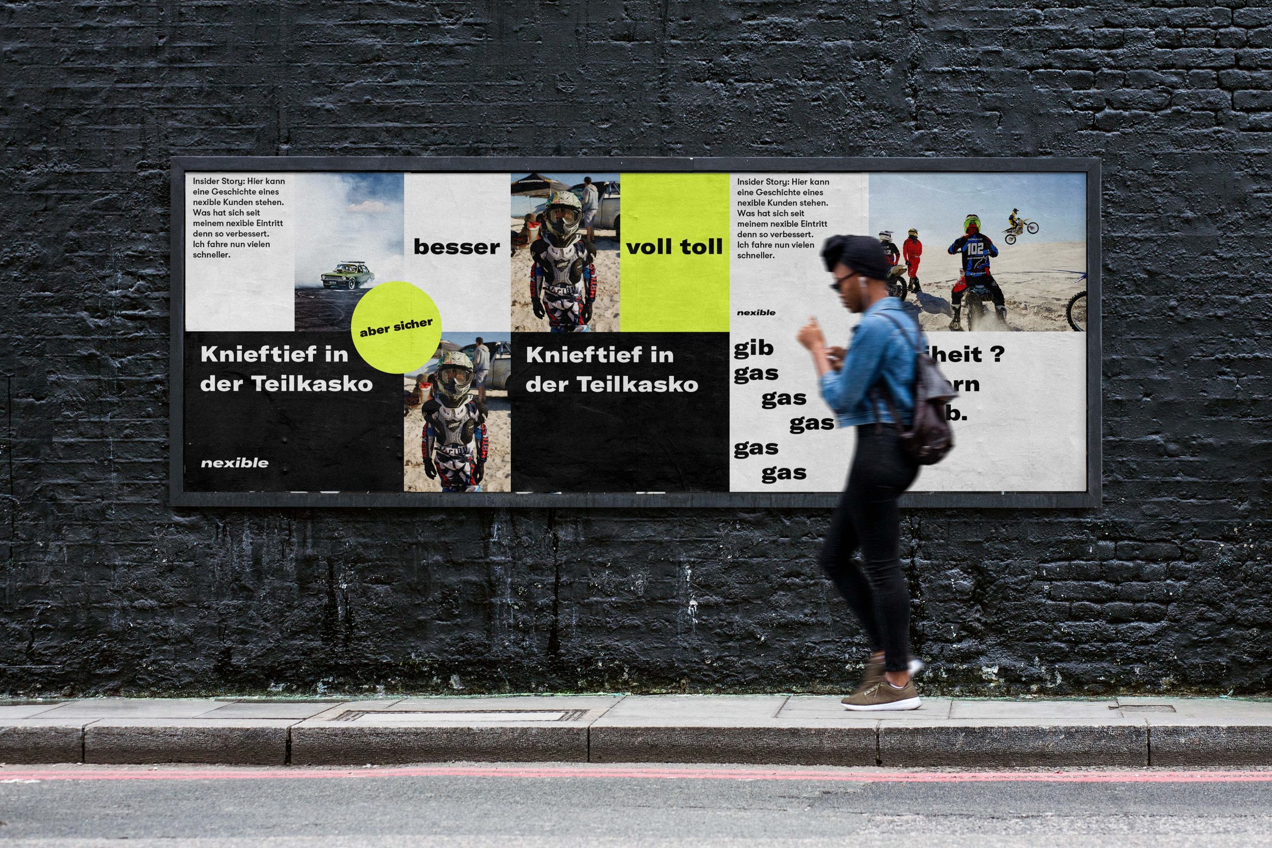
Nexible is next. At least that was the briefing in a nutshell. As an ERGO Digital brand, nexible rolls up the insurance field from the rear. Everything simple, everything transparent and absolutely certain with much less bureaucratic.
challenge
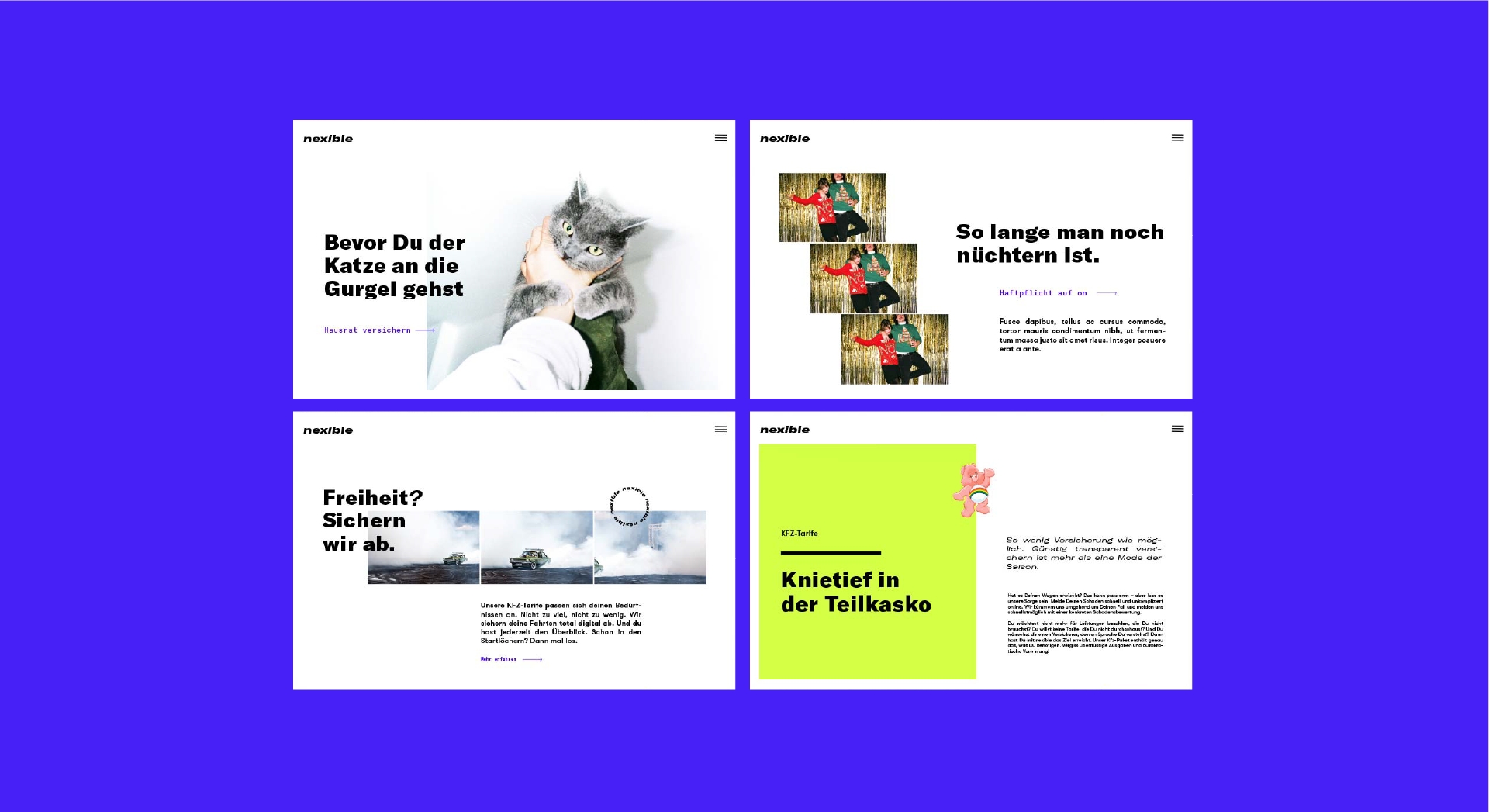
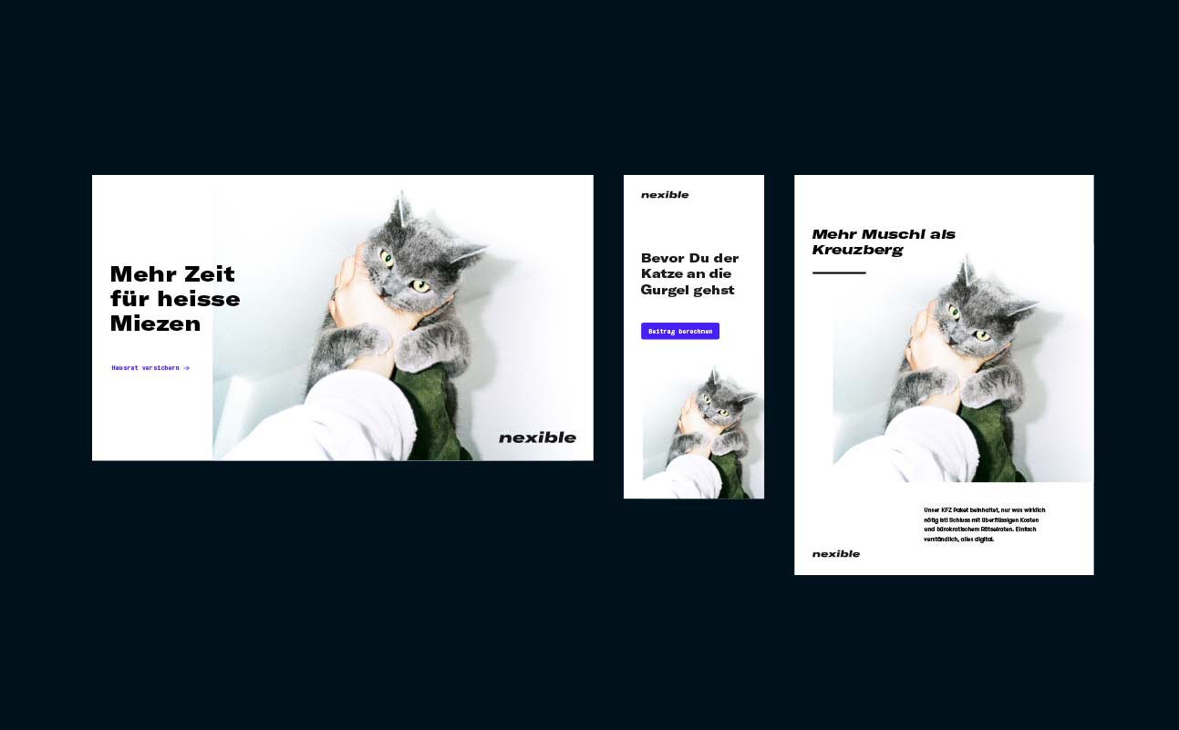
ONOGRIT developed a visual appearance that can be used as a flexible design system across all media. To the standard criteria of a modular design principle two essential ingredients were added: Swag and Slang. With the right typography, colour and visual language, a corporate design was created that presents itself fresh and self-confident.
APPROACH
The branding speaks the same language across all channels to create a consistent brand experience. Users not only enjoy smooth processes, but also the scattered silly moments. The focus is always on the information itself, except that it does not always take itself too seriously. More pussy than Kreuzberg in fact.
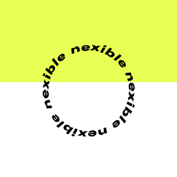
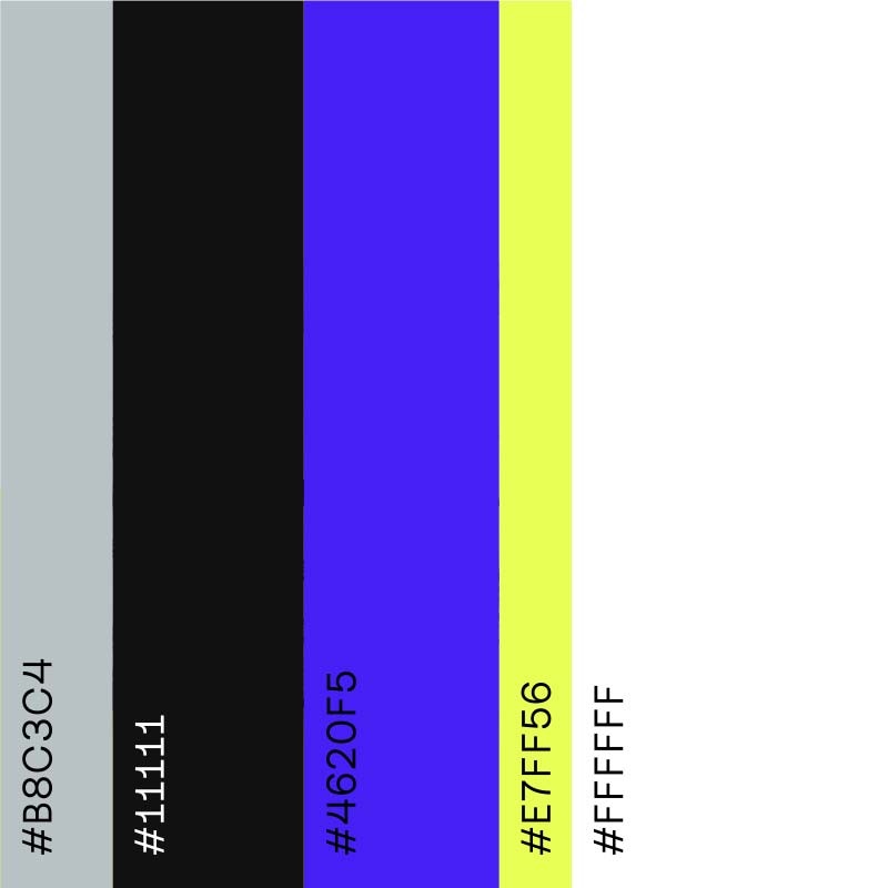
logo & colors
Nexible is next. At least that was the briefing in a nutshell. As an ERGO Digital brand, nexible rolls up the insurance field from the rear. Everything simple, everything transparent and absolutely certain with much less bureaucratic.
DO YOU
LIKE WHAT
YOU SEE?
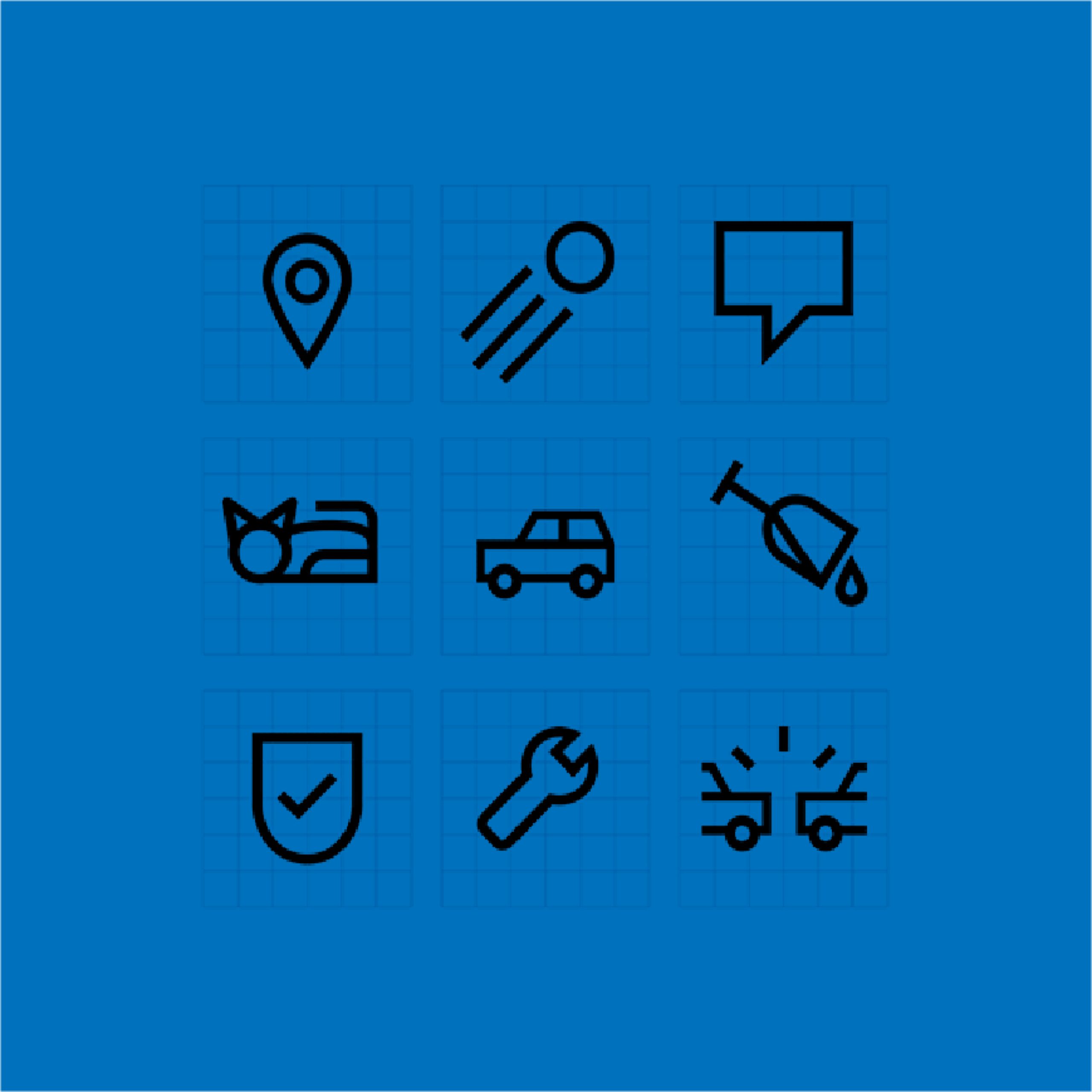
icons
Nexible is next. At least that was
the briefing in a nutshell. As an ERGO Digital brand, nexible rolls
up the insurance field from the
rear. Everything simple, everything transparent and absolutely certain with much less bureaucratic.
Kind Words
“From the first moment we got to work I realised that the Onogrit team was always going to give us something more than expected, taking Nexible to the next level” — Patrick Müller, CEO Nexible
Team
Friends in Crime: dayy
Creative Direction: ONOGRIT
Realisation: dayy
Credits
Photographs used in layout: ©Maeve Stam and Dave Kennedy represented by Christa Klubert
NOTO
year
2016
client
Noto
industry
Industrial Design
services
Branding
scope
Naming, Visual Language, Style, Strategic Branding, Portrait Photography, Production
CLIENT
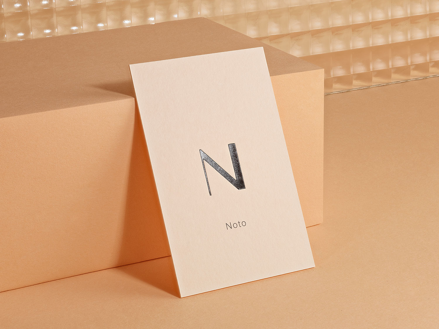
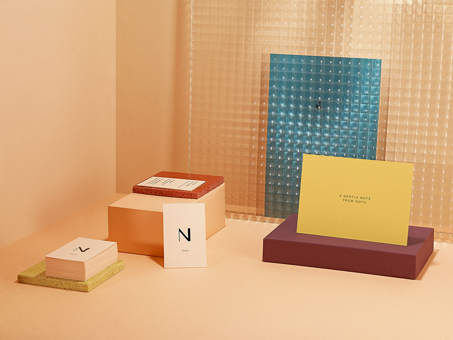
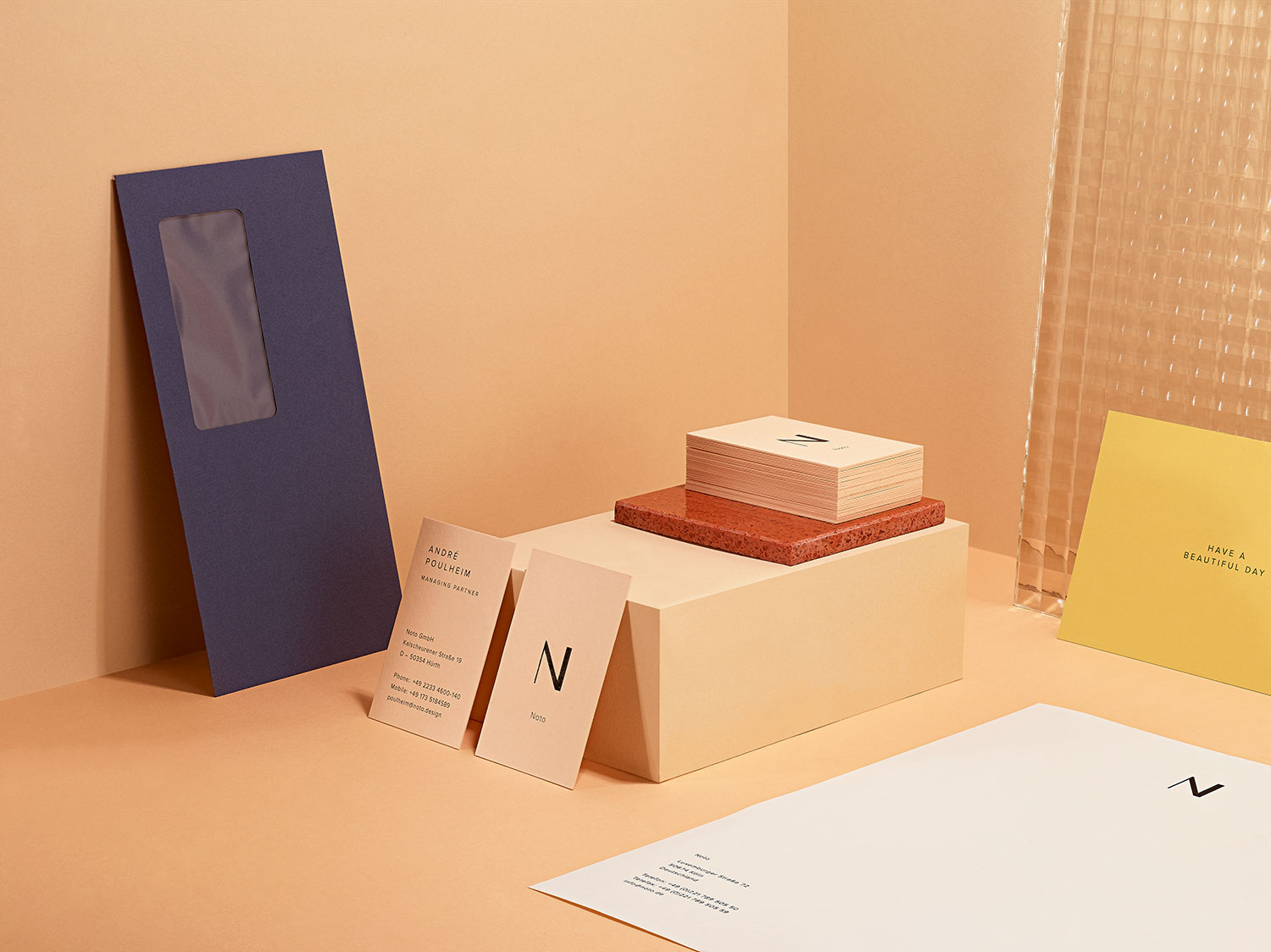
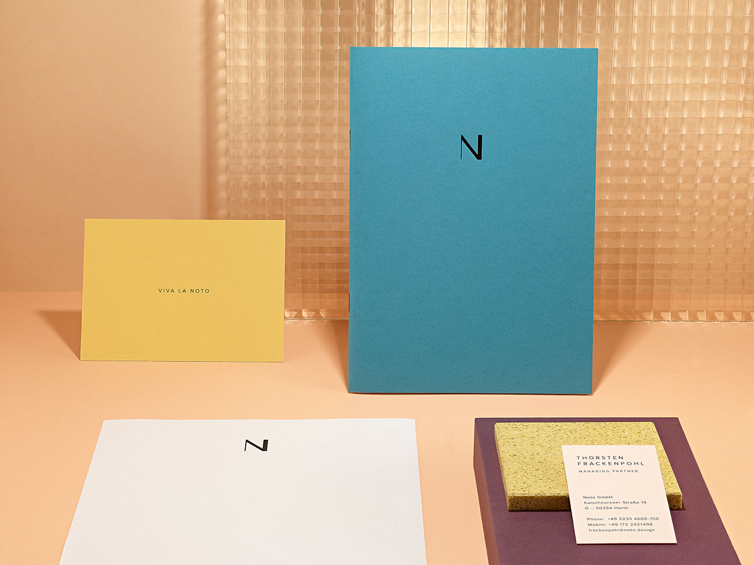
Hello Noto. The managing directors of the award winning industrial design studio with the former name “Frackenpohl Poulheim” once said at a dinner to us: “We have more customers, but you have more fans”.
challenge
They liked that ONOGRIT has something that many studios lack: a personality. And since they wanted to reposition themselves with their company anyway, they asked us to work together to find a new memorable name and afterwards to develop a new, characterful corporate design. A design that reflects the personalities of the two managing directors André Poulheim and Thorsten Frackenpohl and also presents the studio as it is in reality.
APPROACH
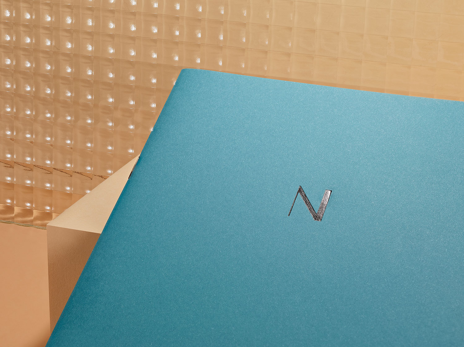
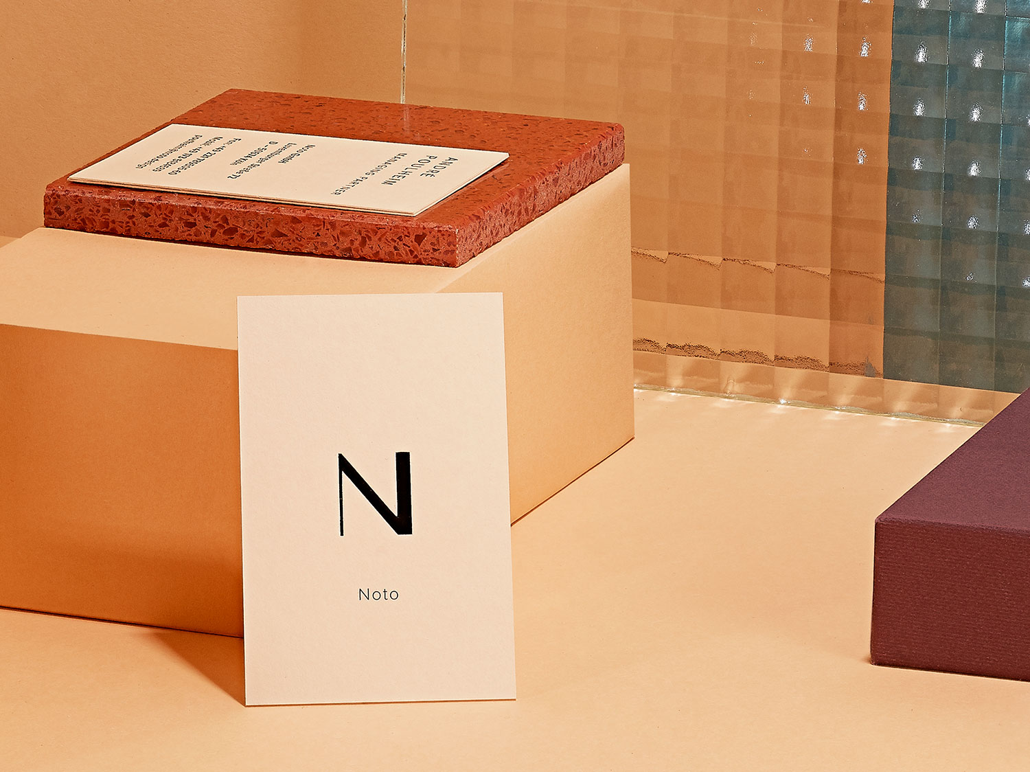
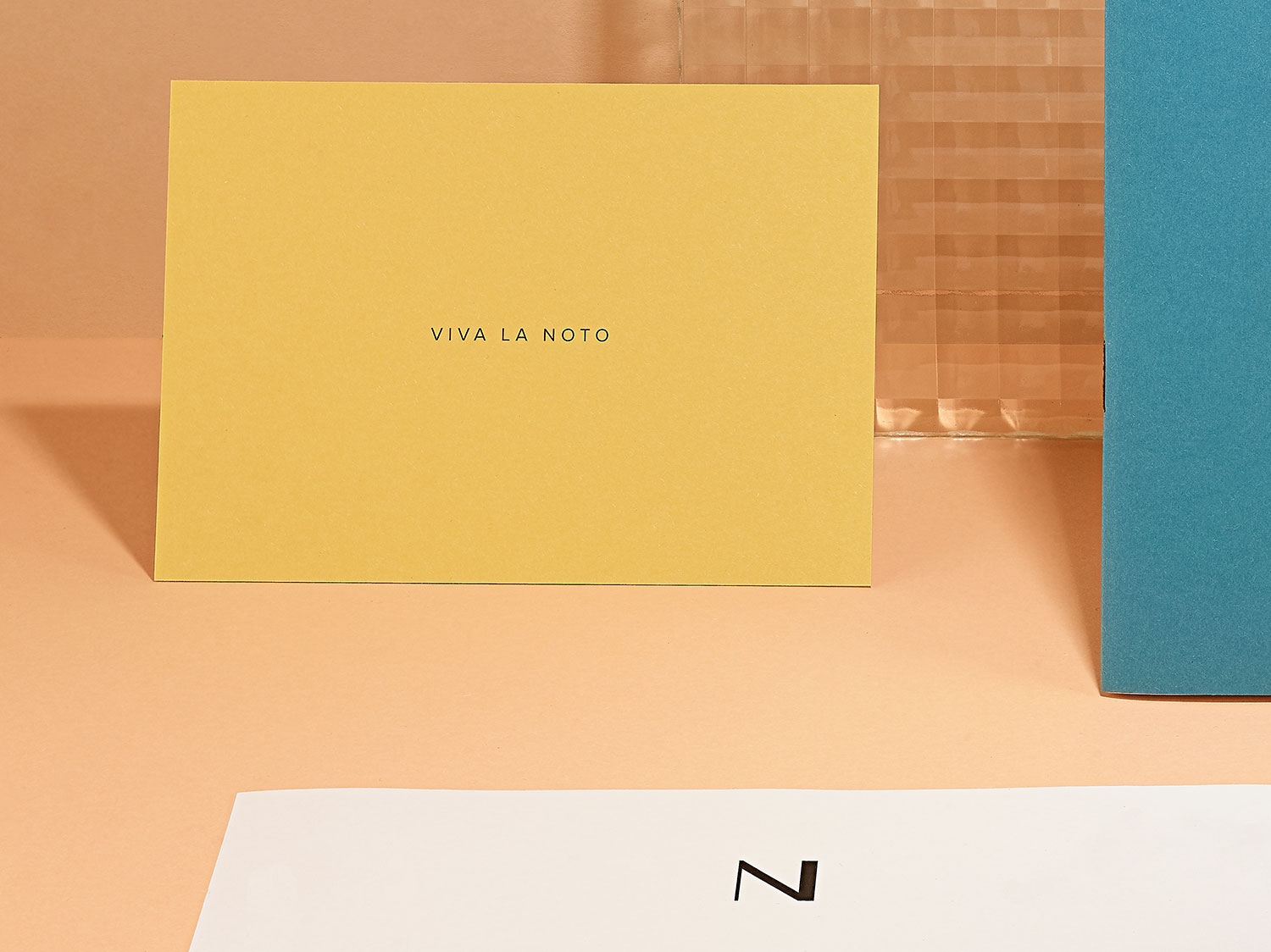
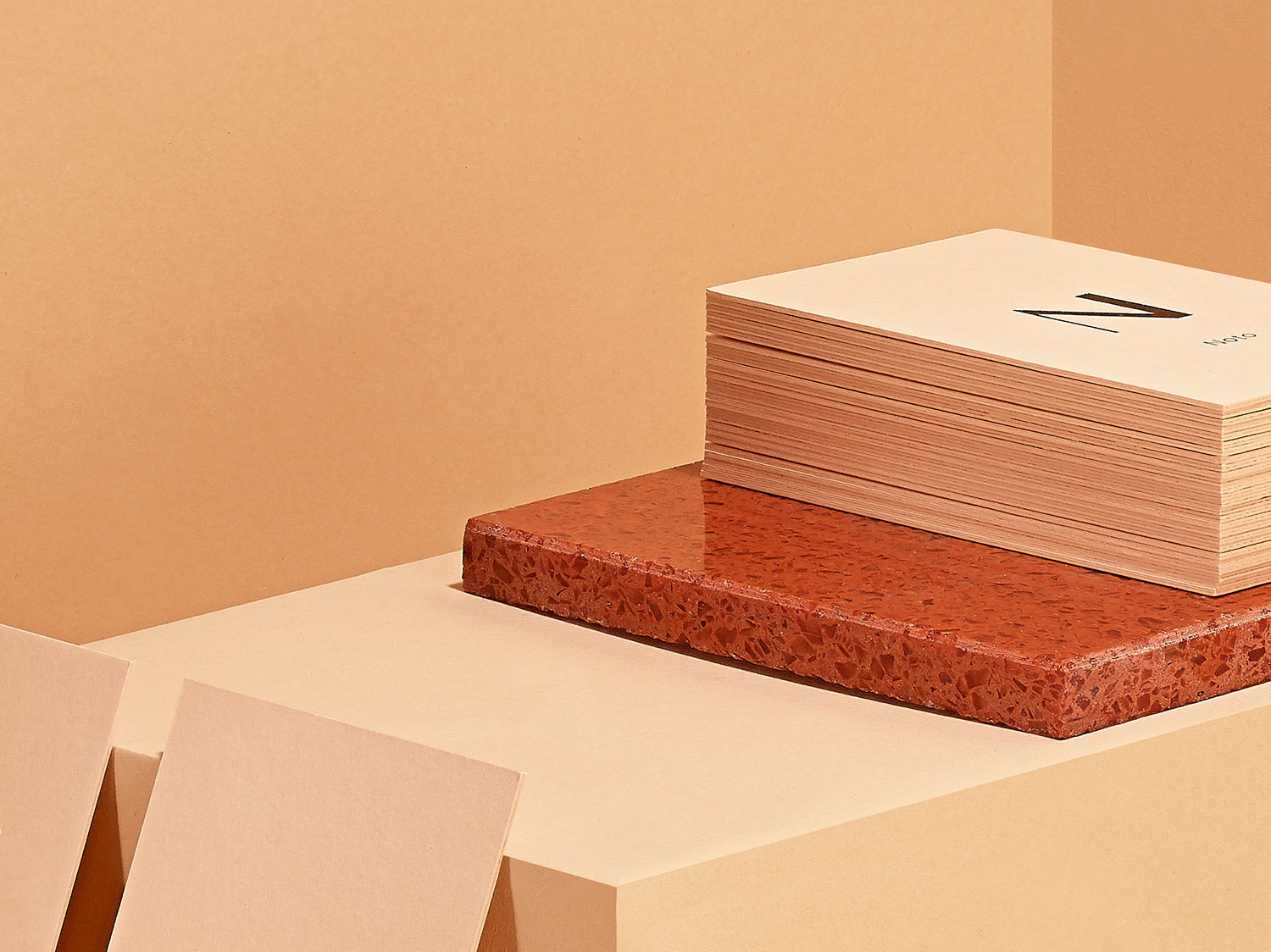
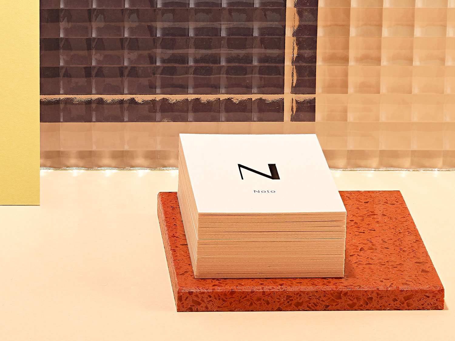
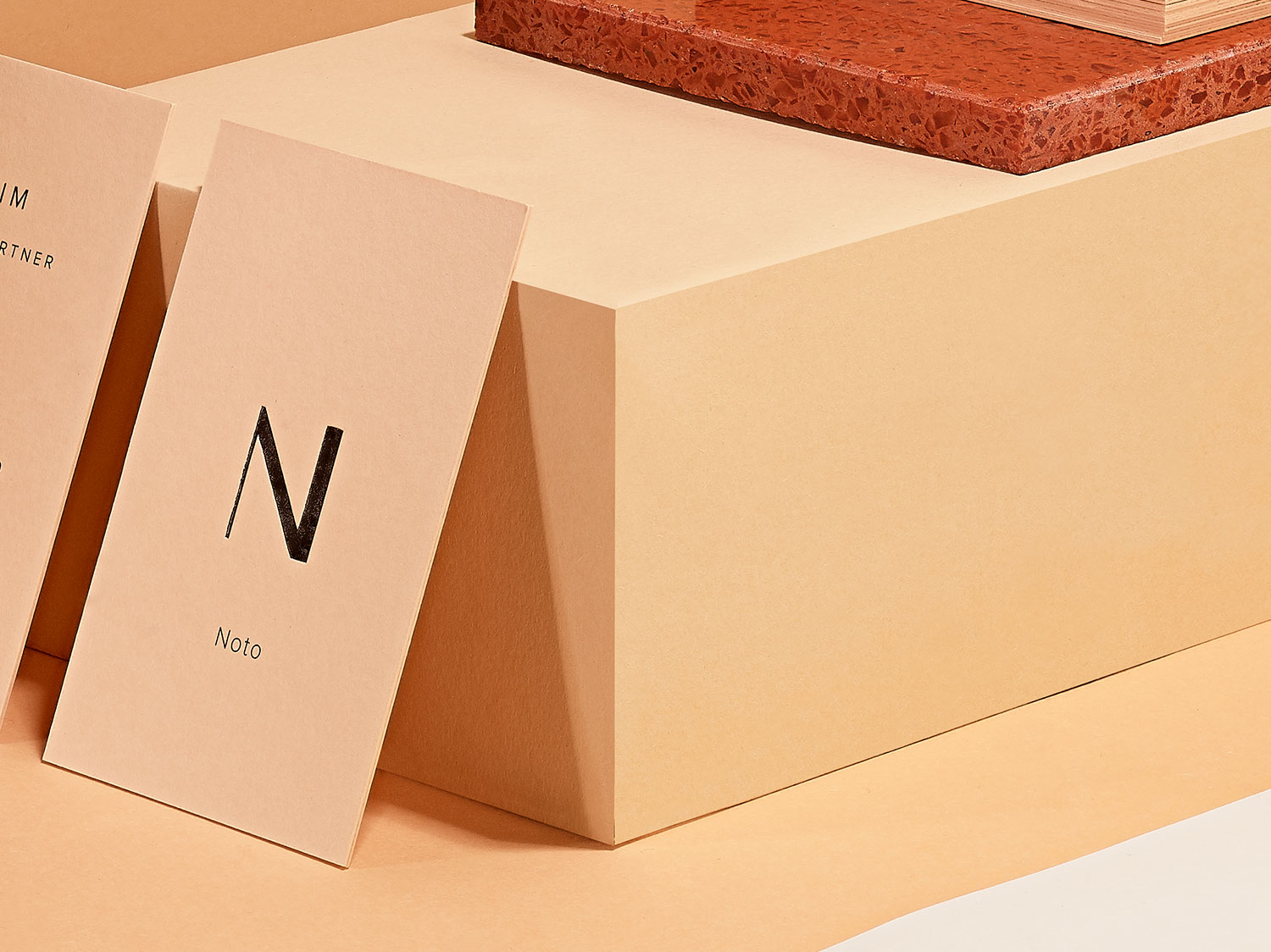
The goal was nothing less than to develop a visual language that felt real. The aim was also to develop a design system that could be continued by the employees after creation. We made the biggest change to the new appearance via three channels: colour climate, visual language and text. Instead of building the CI on the colour spectrum blue, grey and black, we combined warm colours such as mustard, night blue, petrol and a tone that can only be incorrectly described as light apricot. Sounds bold? Looks great. We created a colour spectrum of more than 20 shades, which can be used until today. One of the most beautiful phases of a corporate design is when the fun begins. This clearly includes the postcards. Since then, NOTO has been sending its prototypes to its customers and enclosing friendly greeting cards with the package. Sometimes with nice wishes like “Have a nice day”, sometimes with euphoric celebration mood “Viva la Noto” and sometimes with a rather philosophical approach “To be or NOTO be”. www.noto.design
Do you like what you see?
Let’s work together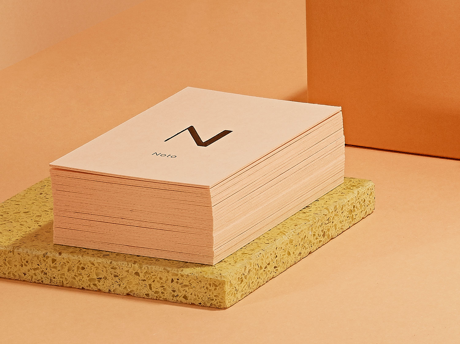
Kind Words
“Working with you is always a lovely adventure.” – André Poulheim, CEO Noto
Team
ONOGRIT x Noto
Credits
Project Photos: ONOGRIT x Manuel Mittelpunkt ❤️
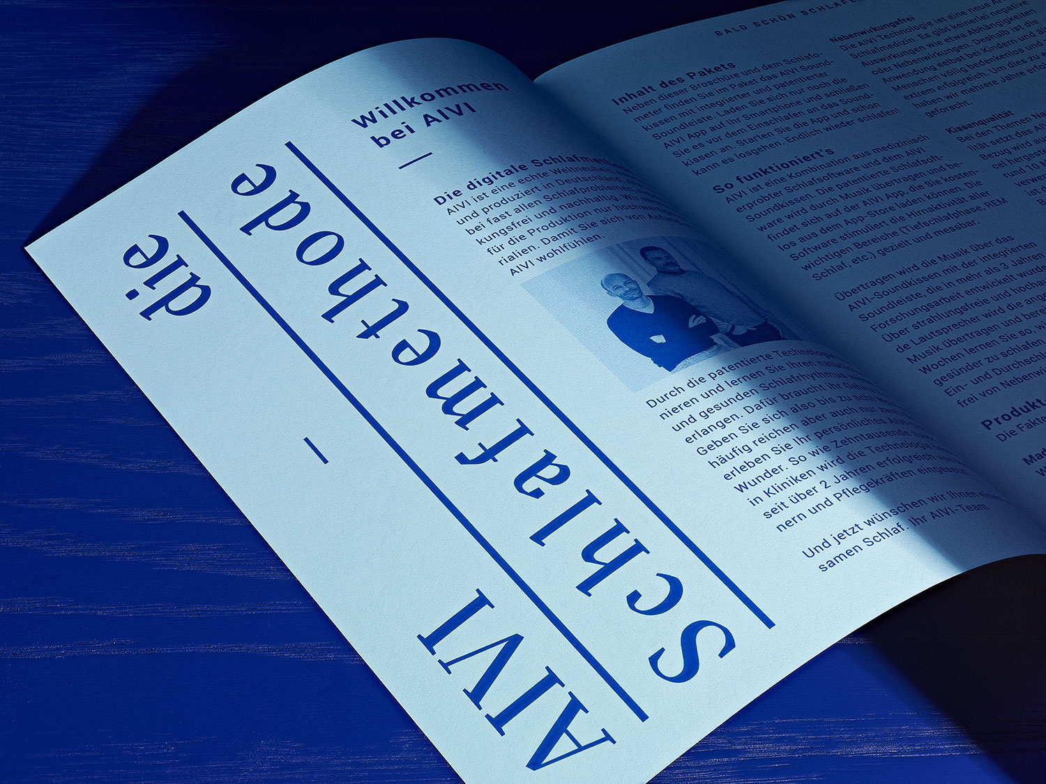
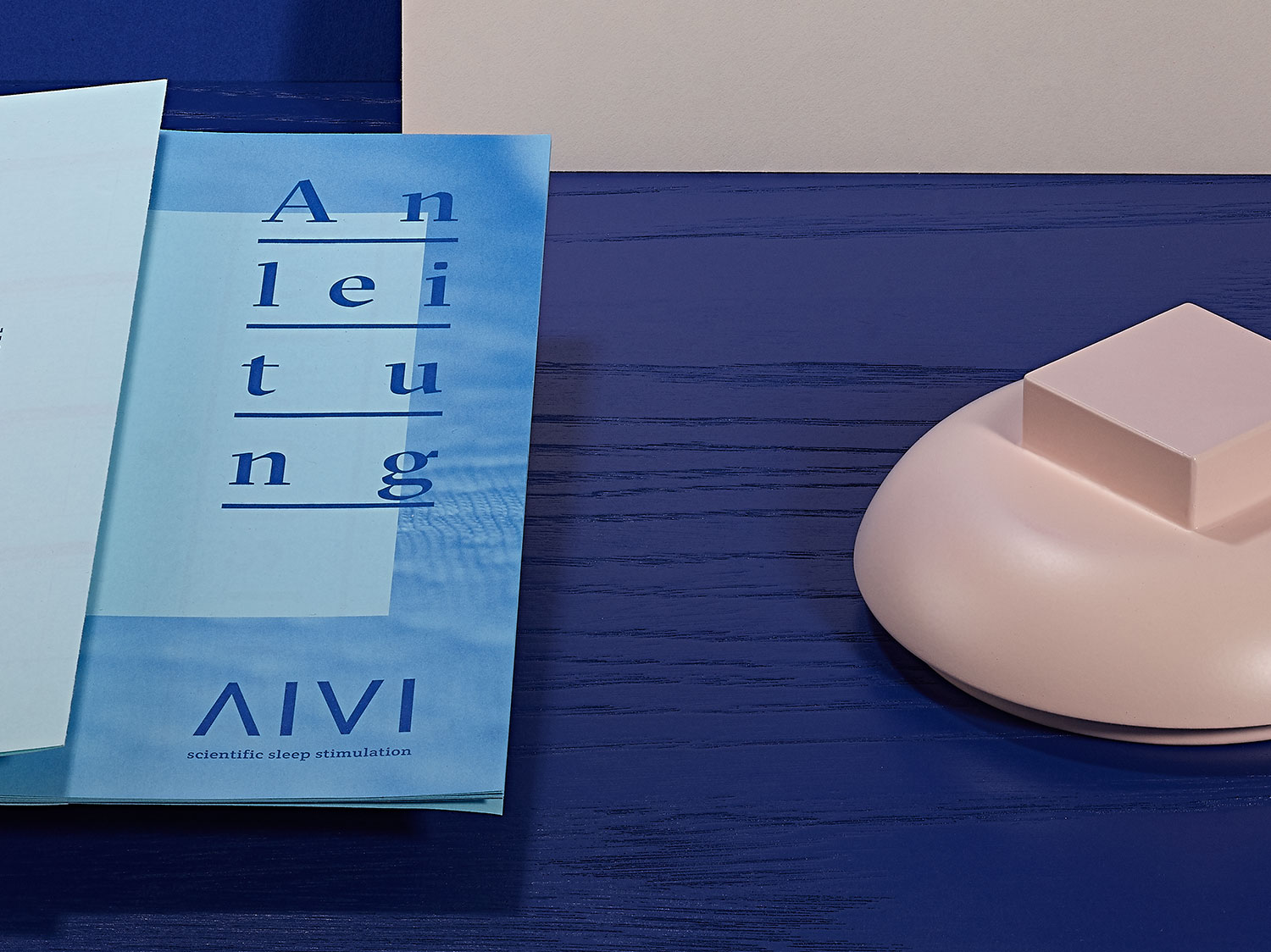
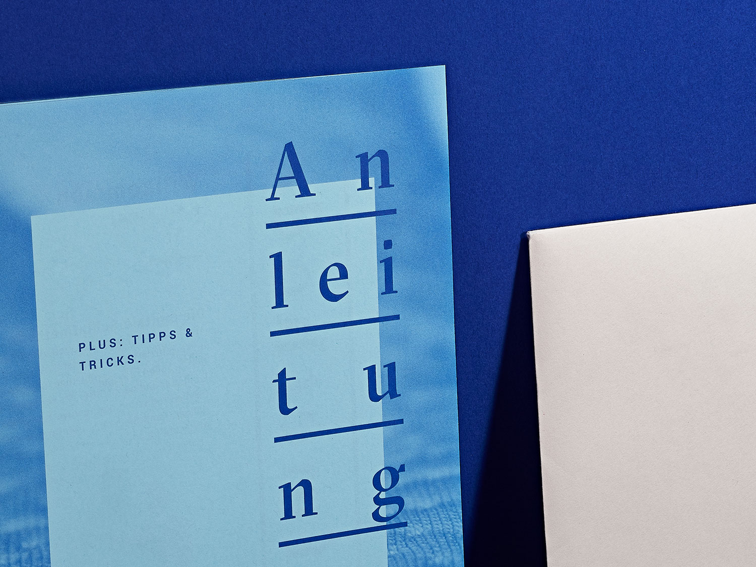
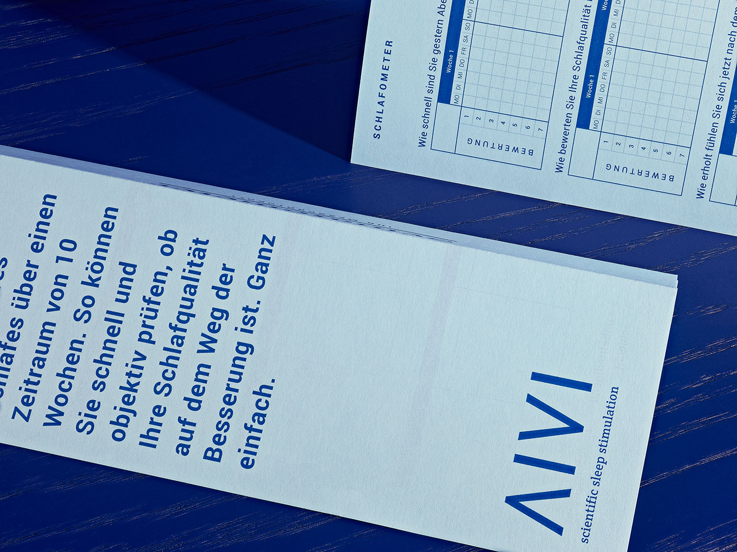
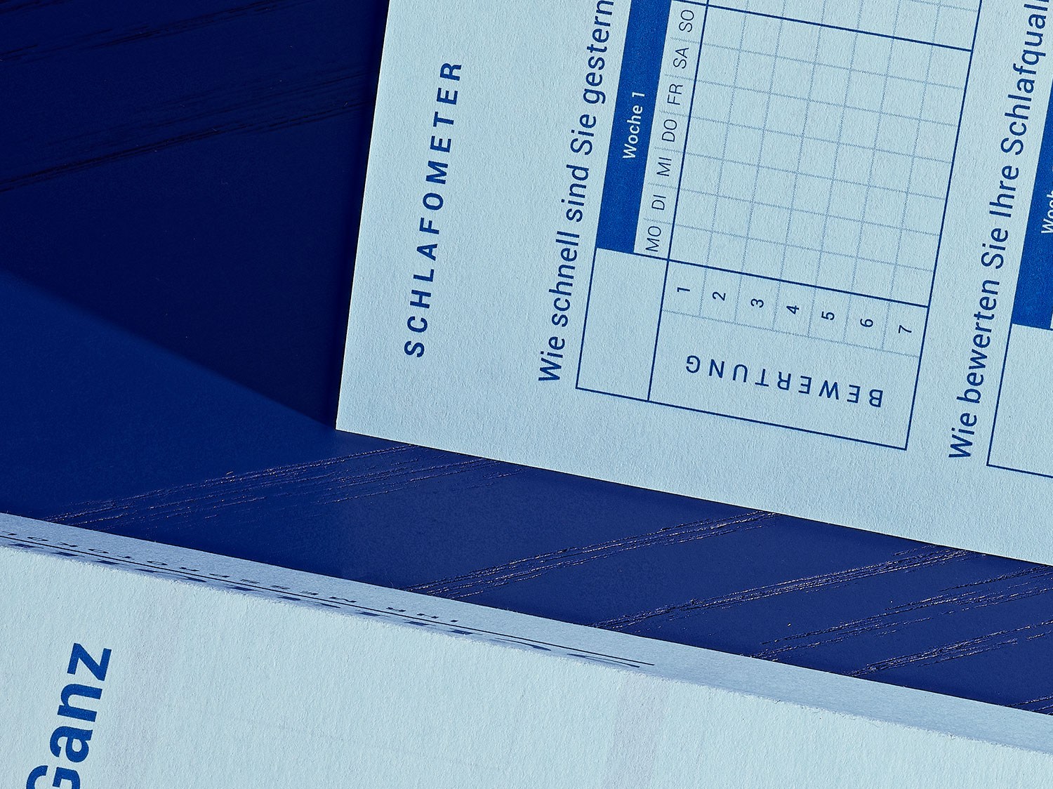
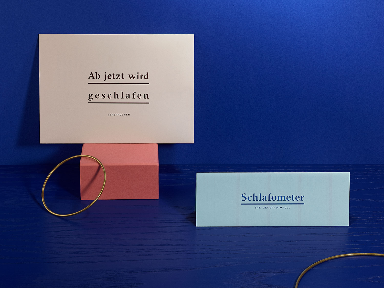
AIVI
year
2019
client
AIVI
industry
Health & Science
services
Product Launch
scope
Product Name, Logo Development, Target Group Approach, Product Brochure, Copy, Infographics, Illustrations, Photography, Editorial Design, Project Management
CLIENT
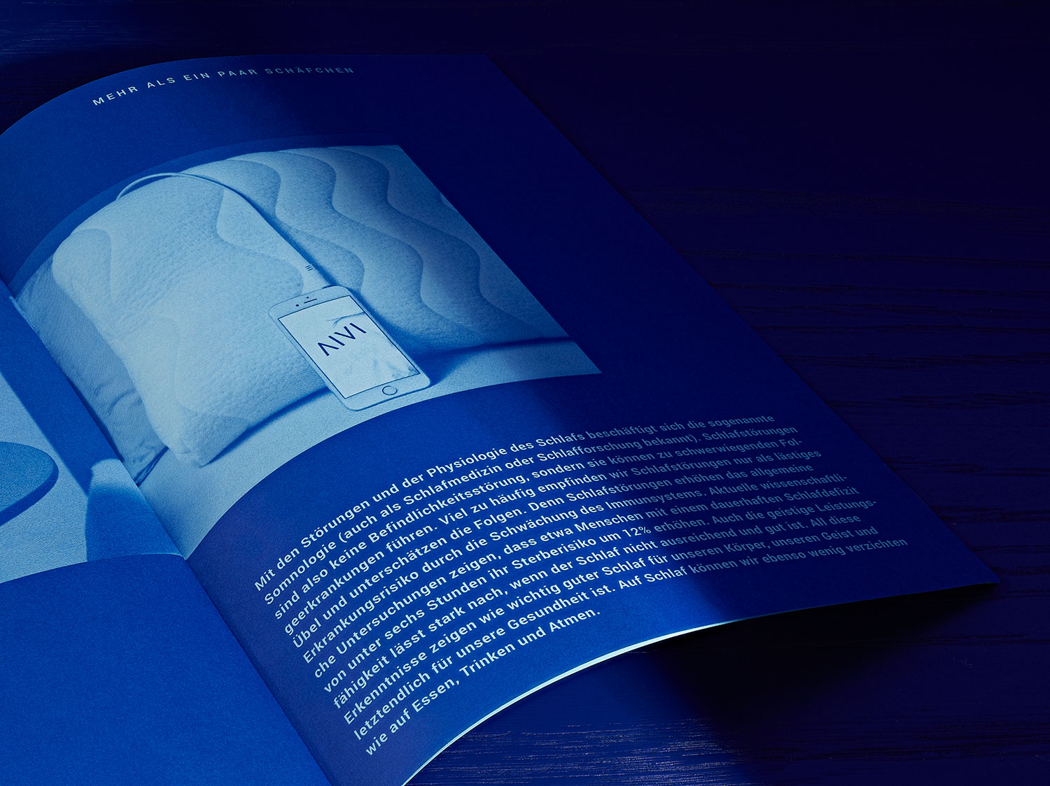
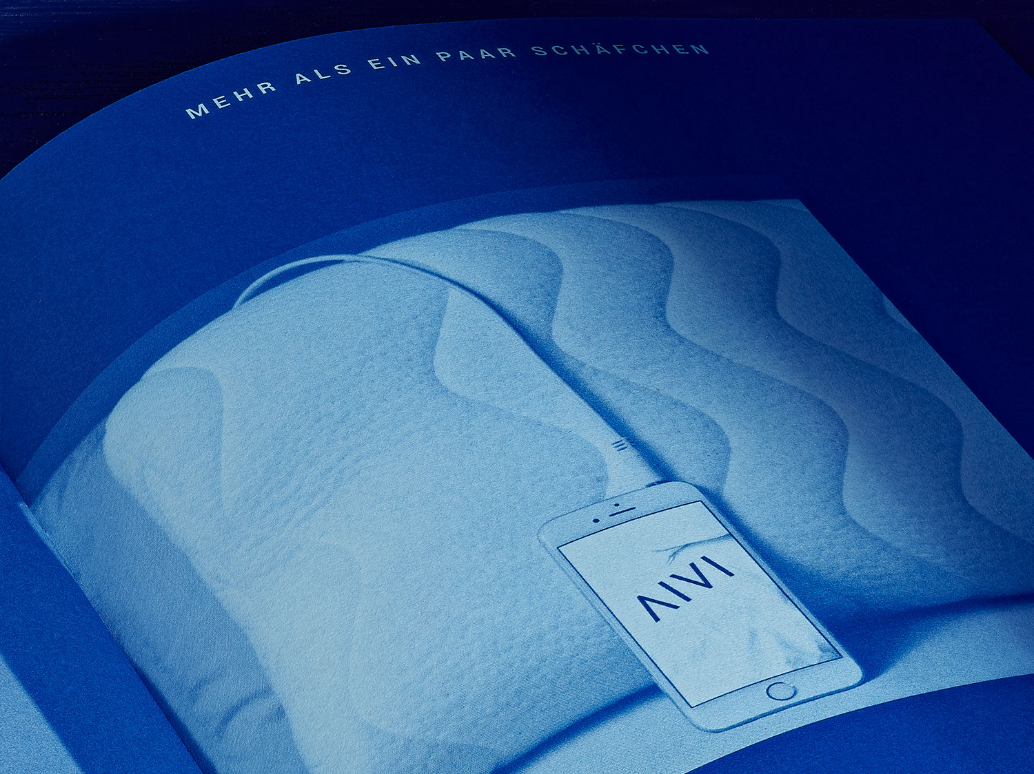
AIVI is much more than just an ergonomic cushion. It is a complex sleeping system that calms the neuronal brain waves of the sleeping person with hardly audible sound and thereby promotes or restores the quality of sleep in an innovative way. This world innovation was developed in Cologne and improved by sleep experts Jermoe Lavrut and Christoph von der Malsburg together with the German Sports University Cologne.
challenge
AIVI is a new and patented sleep solution, which helps to sleep better again. We managed the complete brand appearance from name finding to rollout in print & digital.
APPROACH
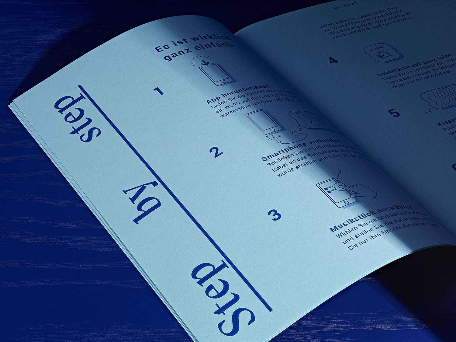
In close cooperation with the two managing directors, our studio developed a concise overall package within one year: product name based on defined target group, corporate design, brand personality and language (tone of voice), set design and art direction for the photo shoot with the renowned Cologne based photographer Anna Siggelkow, technical and strategic consulting, design and programming of the website and quality assurance after product launch.
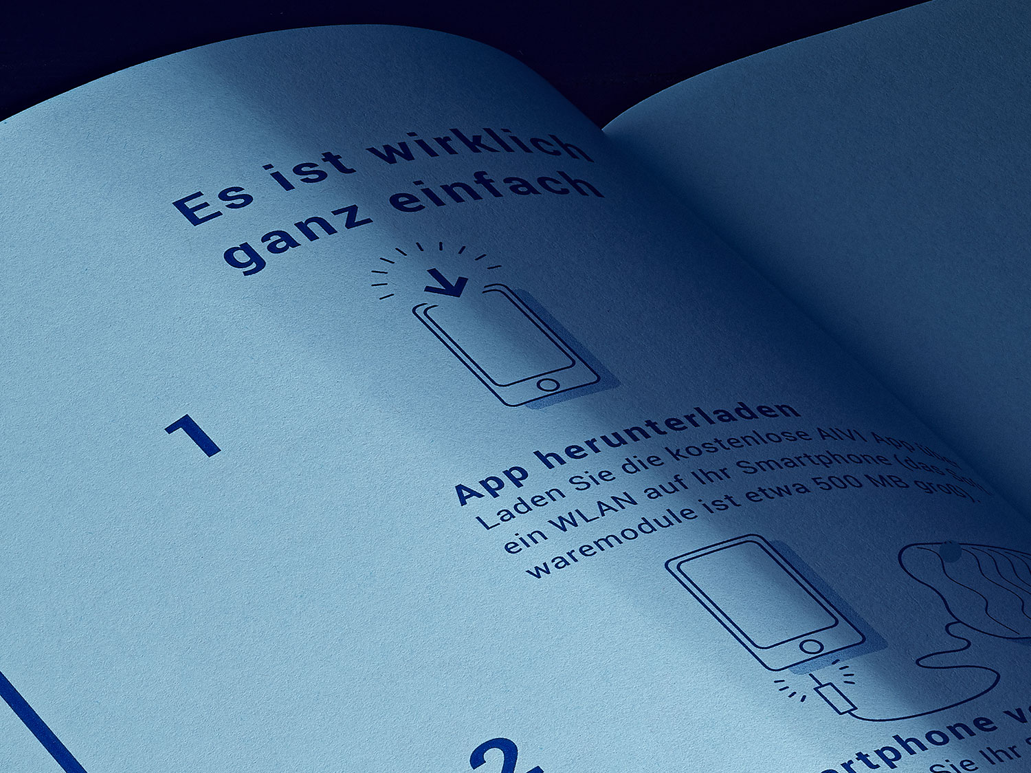
Some Facts
Services: Naming, Creative Consulting, Brand Strategy, Corporate Design, Website, Creative Direction, Set Design
Branch: Health, Sleep Technology
Production: Offset printing, CMS coding
Do you like what you see?
Let’s work together
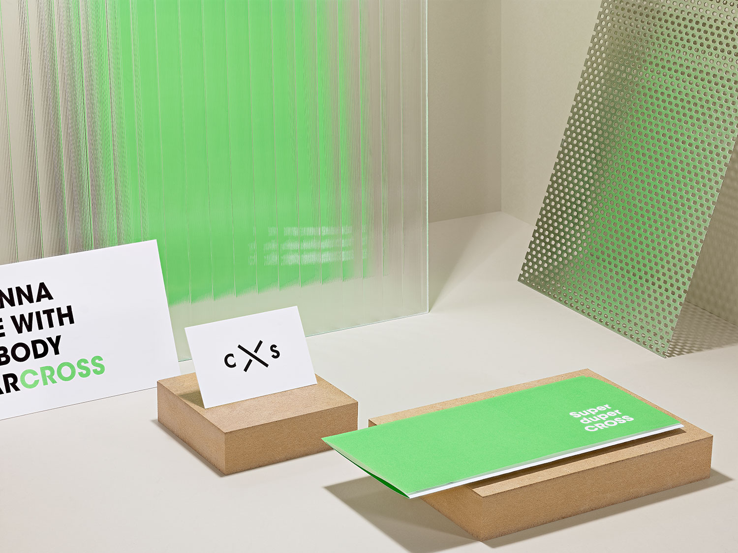
CROSS ARCHITECTURE
year
2016
client
CROSS Architecture
industry
Architecture Office
services
Corporate Design
scope
Logo Development, Letterhead, Greeting Cards, Business Cards, Invitation Cards, Stickers, Company Stamps, Word Templates, Presentation Folder, Template Files, Website and Content Management System
CLIENT
The architectural office CROSS is an international team of 20 passionate professionals – specialists for current and future issues in urban planning, architecture and society. It emerged from the renowned Dutch architecture firm Benthem Crowel (BNTMCRWL).
challenge
Within half a year, our studio developed the new brand identity, which included the corporate design, the technical consulting for the appropriate CMS system, the screen design and the stringent declination of all necessary working documents.
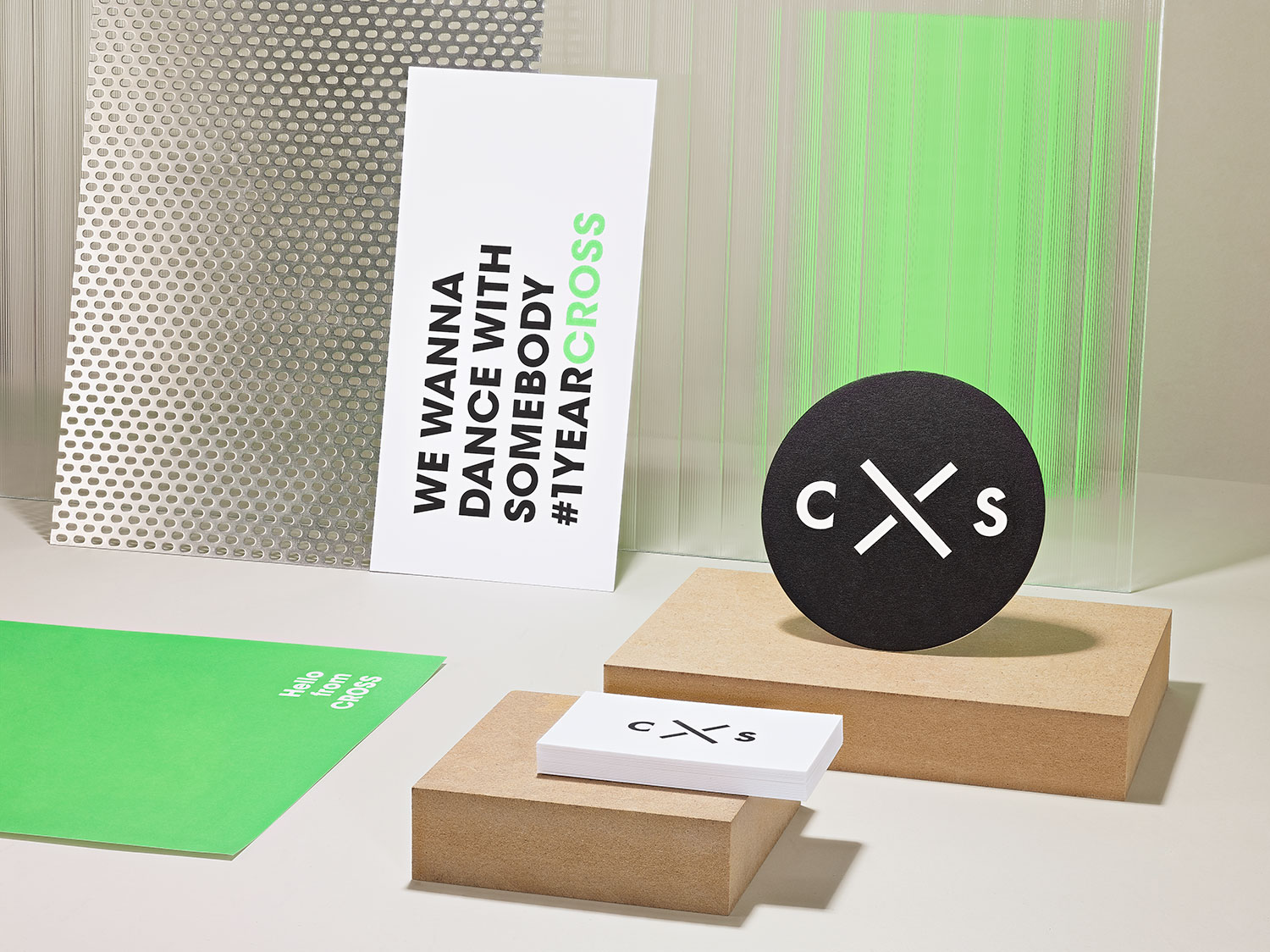
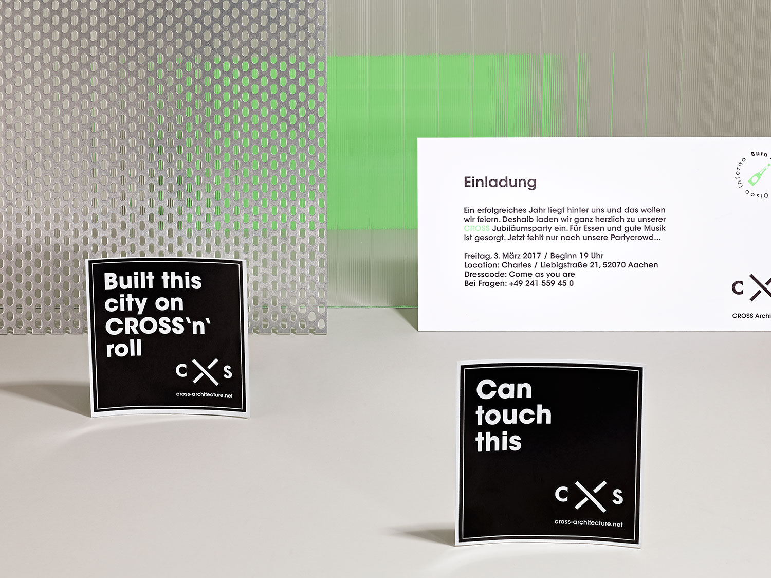
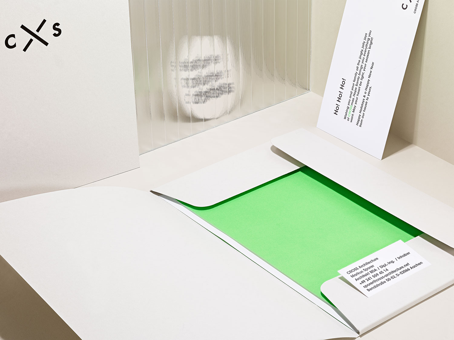
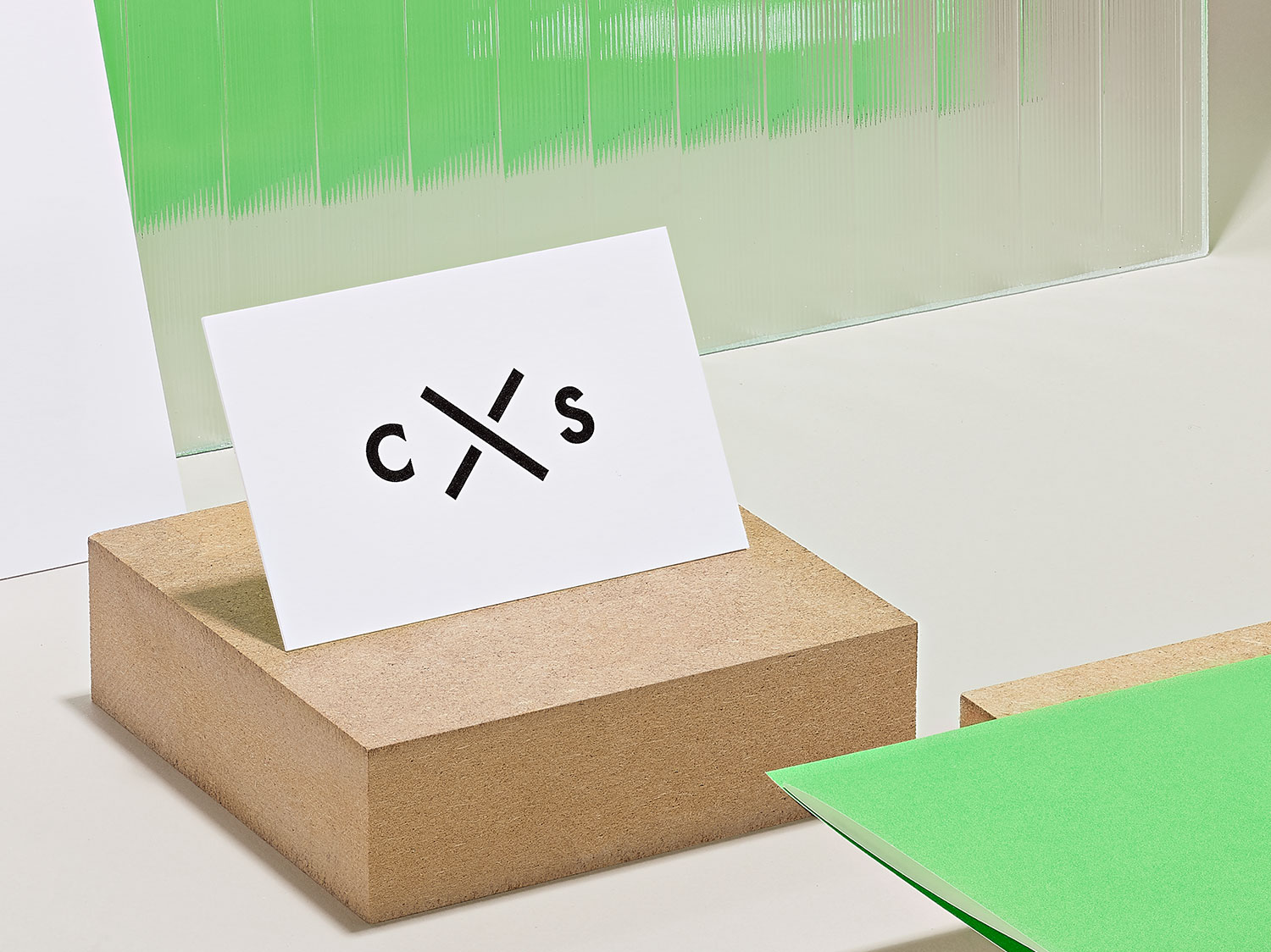
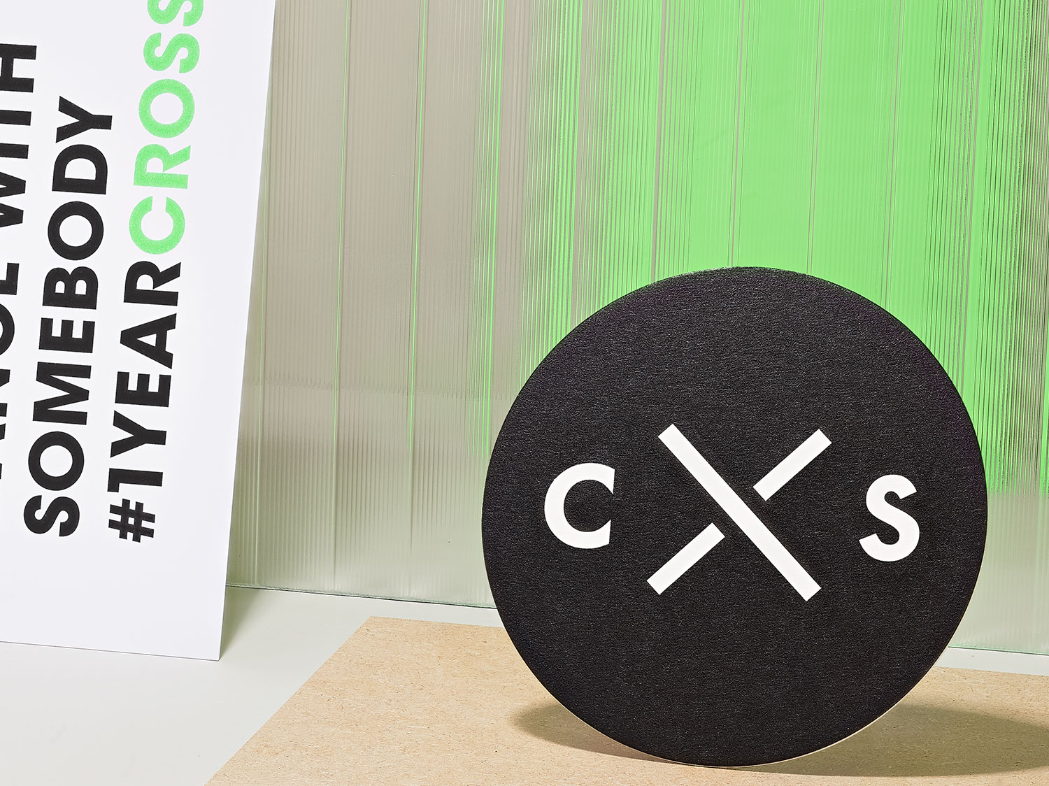
APPROACH
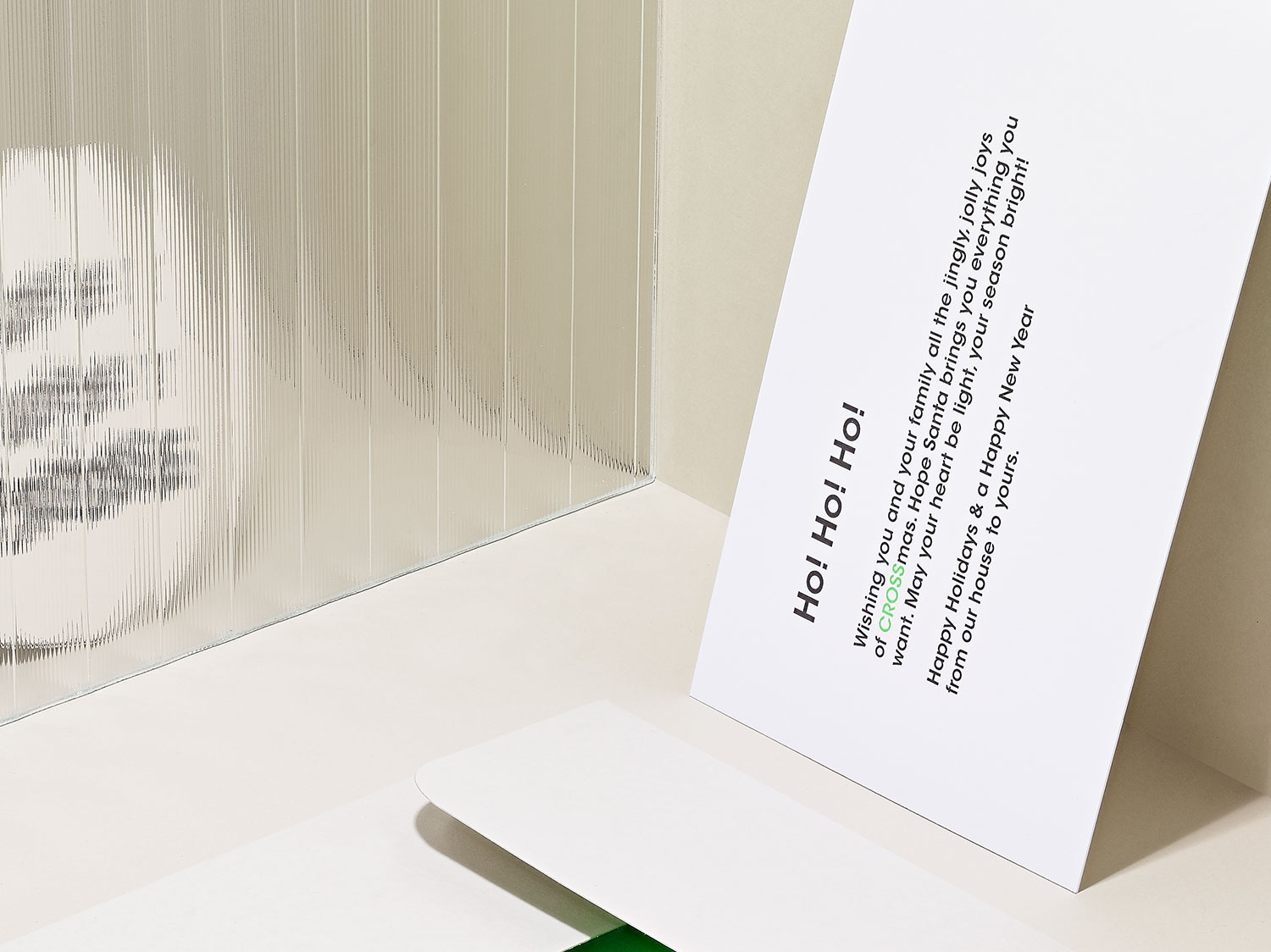
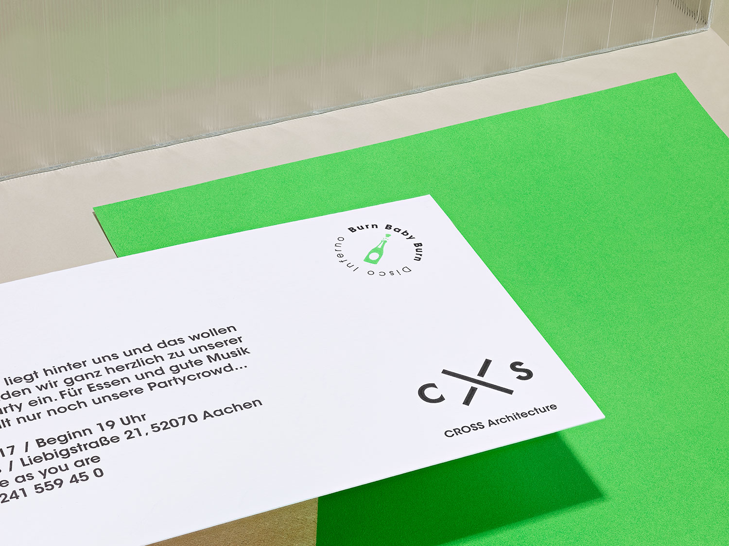
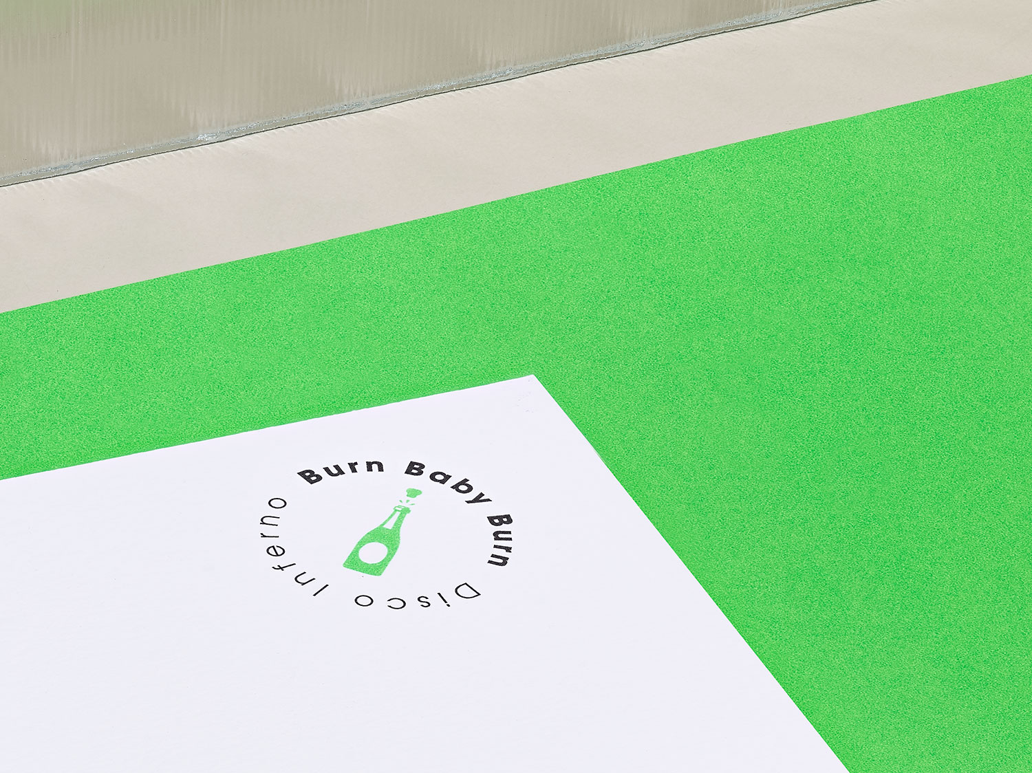
We at ONOGRIT know that details are never just details, but the soul of a brand. As part of our creative consulting, we have developed several ideas together with the managing directors Markus Sporer and Cornelius Wens on how to communicate the CROSS brand authentically to the outside world. The core values of the design language are self-confidence, clarity and freshness. Christmas cards such as “Santa CROSS is coming to town” or “All we want for CROSSmas is you” are cheerful witnesses of these creative sessions. They not only give the architectural office personality and closeness, but also successfully differentiate it from its competitors. www.cross-architecture.net
Do you like what you see?
Let’s work together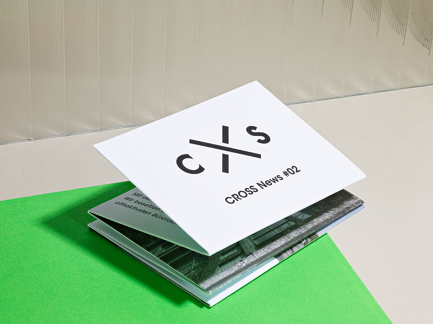
CIRCLE
year
2010
client
Circle
industry
IT
services
Branding
scope
Logo Development, Letterhead, Business Cards, Website
CLIENT
Circle is a German developer team with no less than the ambition to do everything differently. They question conventions and are radically authentic. They refrain from eyewashing and for this very reason they are unwaveringly on their way as one of the top-class IT development teams in Germany.
challenge
Tobias Hauck, one of the founders of Circle, writes in his first mail: “We believe that there are so many things in this world that can be improved by rethinking things fundamentally. For example, I wonder why a TV remote control needs more buttons than a smartphone, even though it can do much less? Thus the founding members Tobias, Marko and Sven break with dusty business practices and intentionally abandon their family names and job titles in their external communication. Their credo is: If the cooperation fails due to these missing conventions, it was worth nothing anyway.
APPROACH
Our studio developed the fitting brand identity for the team. The name Circle is supported by a Japanese Enso. In the philosophy of Zen Buddhism, an Enso represents a moment in which consciousness is free and the mind is not restricted in its creative process. The logo was coded by us in a processing process and played out as an animated logo so that each partner can generate his own individual logo. www.circle.ai
What ya think?
That’s nice!