Archive
IT’S ALL ABOUT
EXPERIENCE
2016
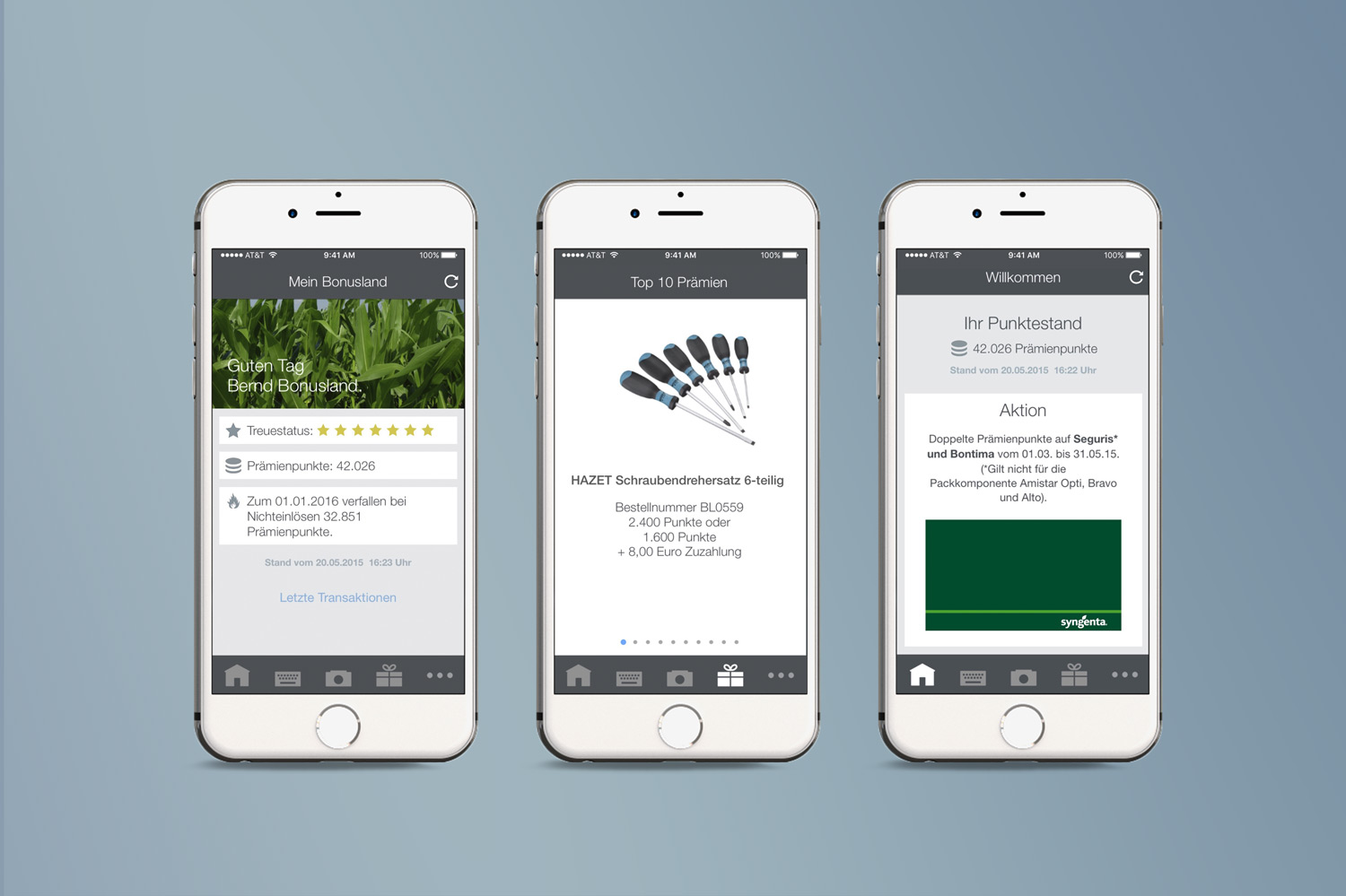
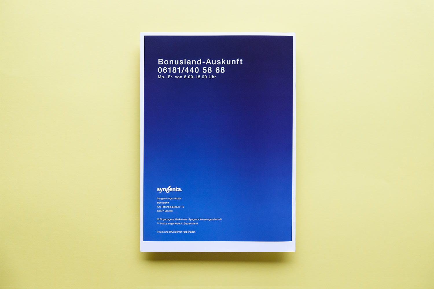
Bonusland
Agriculture, Affiliation
• Information Architecture
• UX
• Screen Design
• Illustration
• Project Management
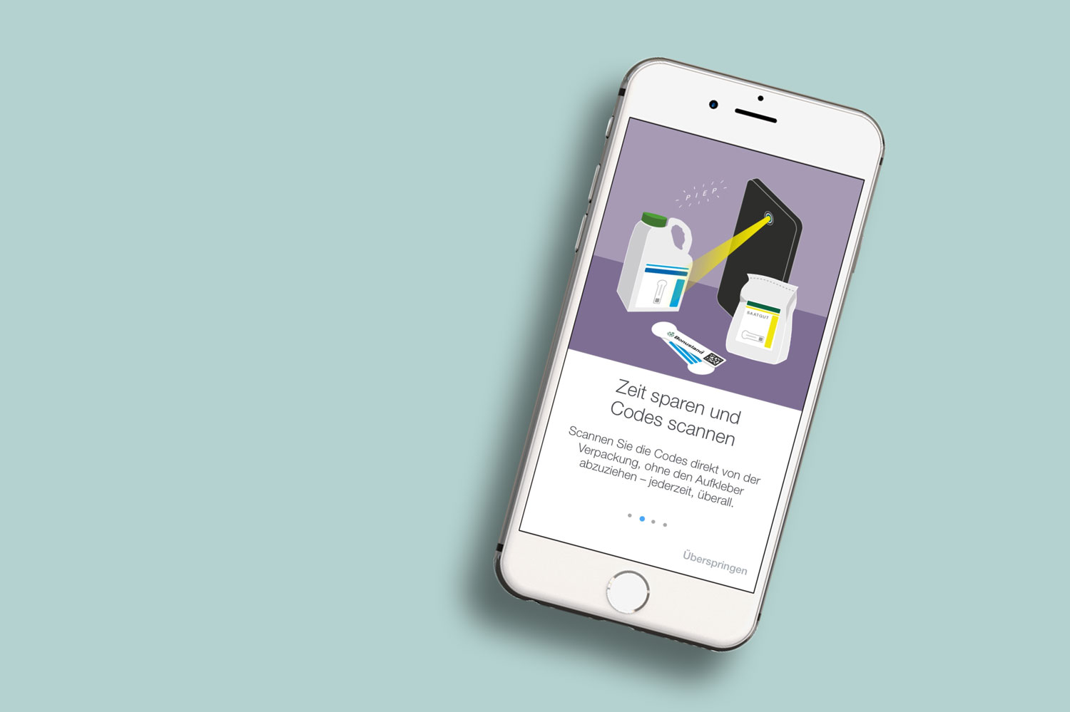
Our studio is in charge of Bonusland, Syngenta’s rewards program, since 2010. We had already worked on several projects together such as catalogues, brochures, newsletters and a website update – so this was just the next step for our partnership. In addition to our visual design services, we advised the company when it came to strategy and kept them regularly informed of current developments and potential opportunities within the market.
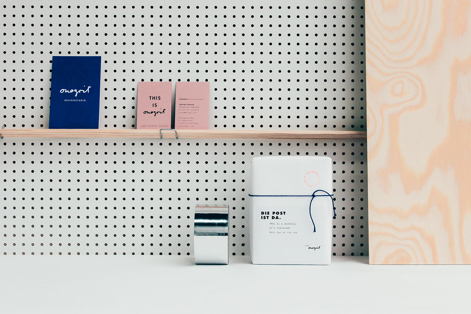
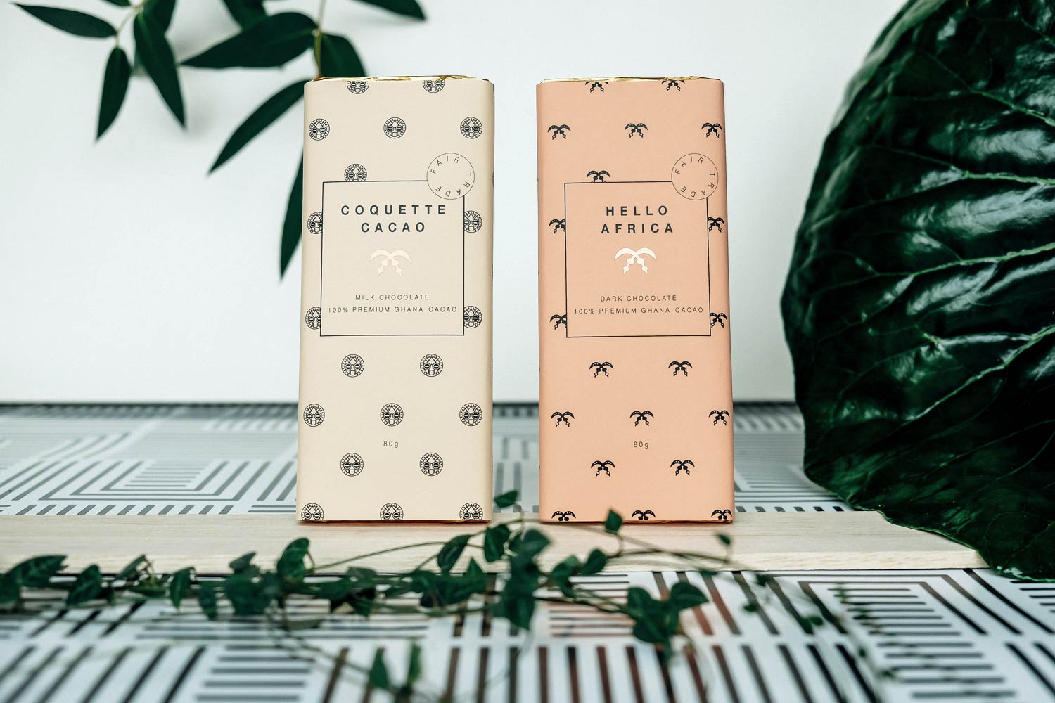
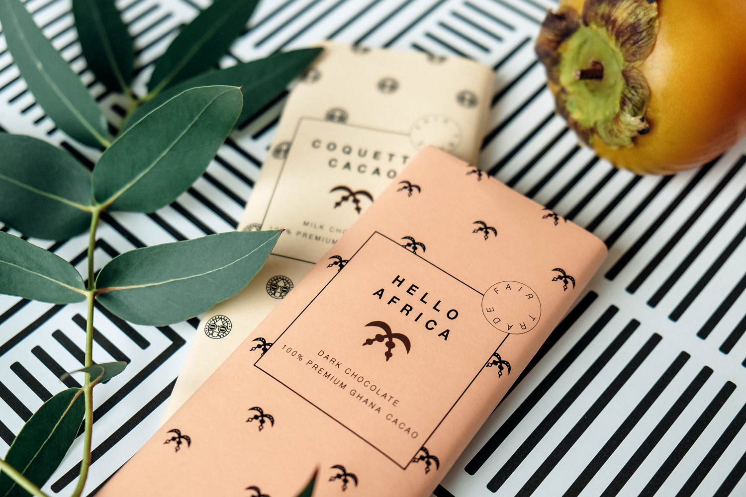
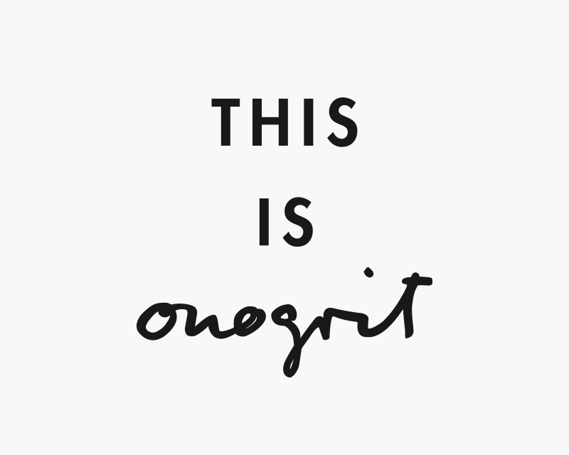
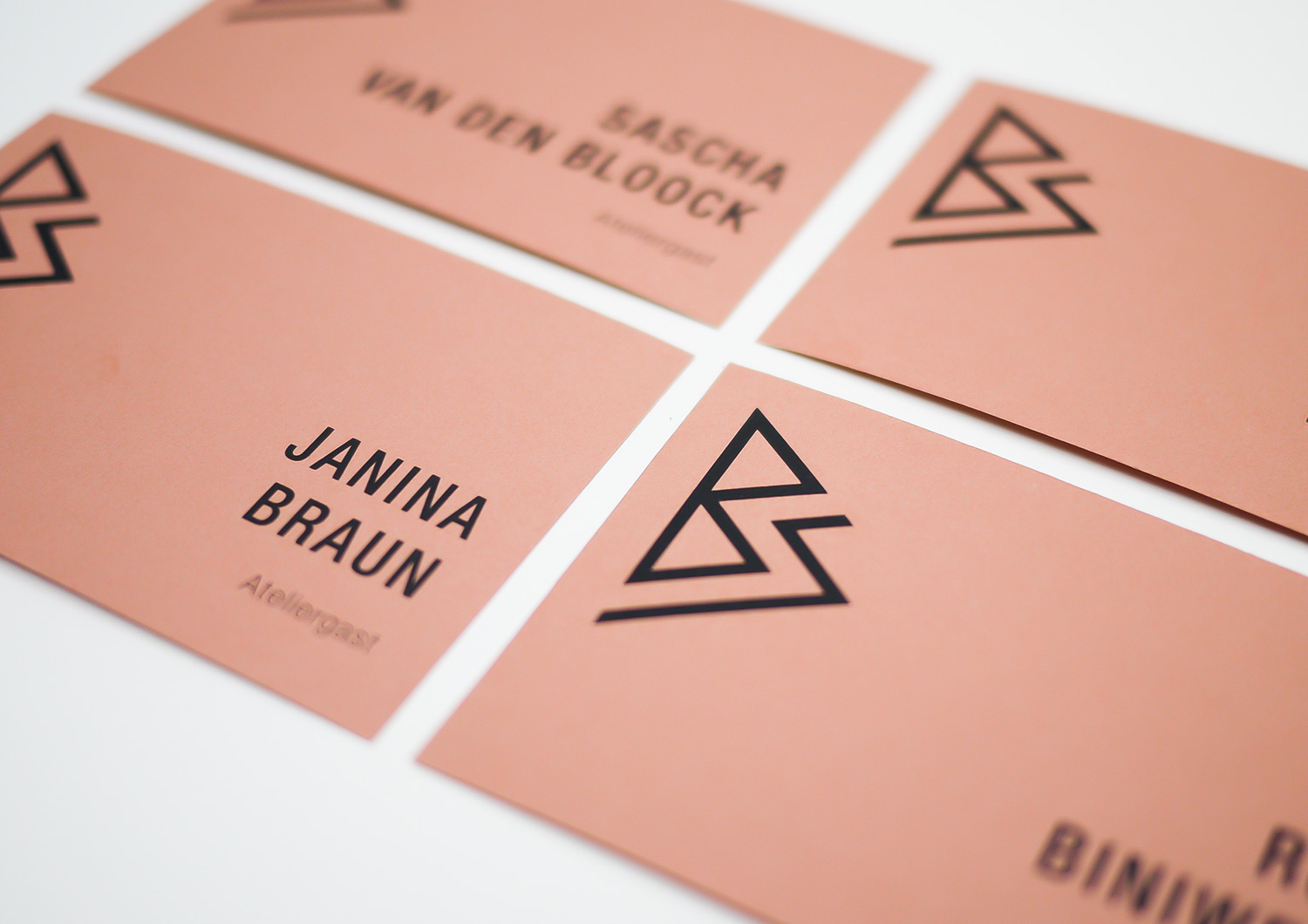
ONOGRIT
Creative Consultancy
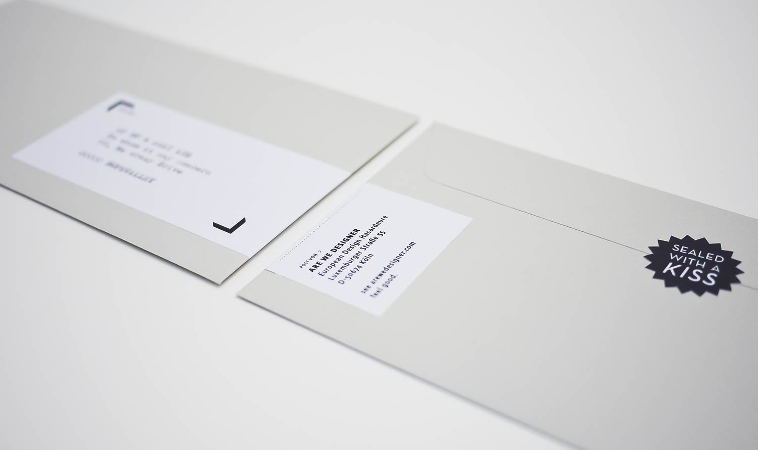
• Logo
• Business Cards
• Stamps and Stickers
• Packaging
• Responsive Website
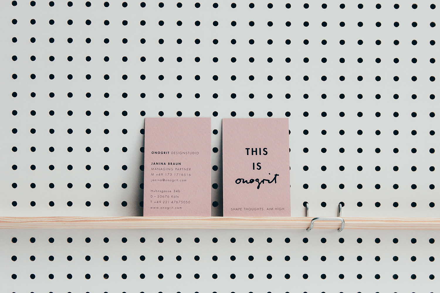
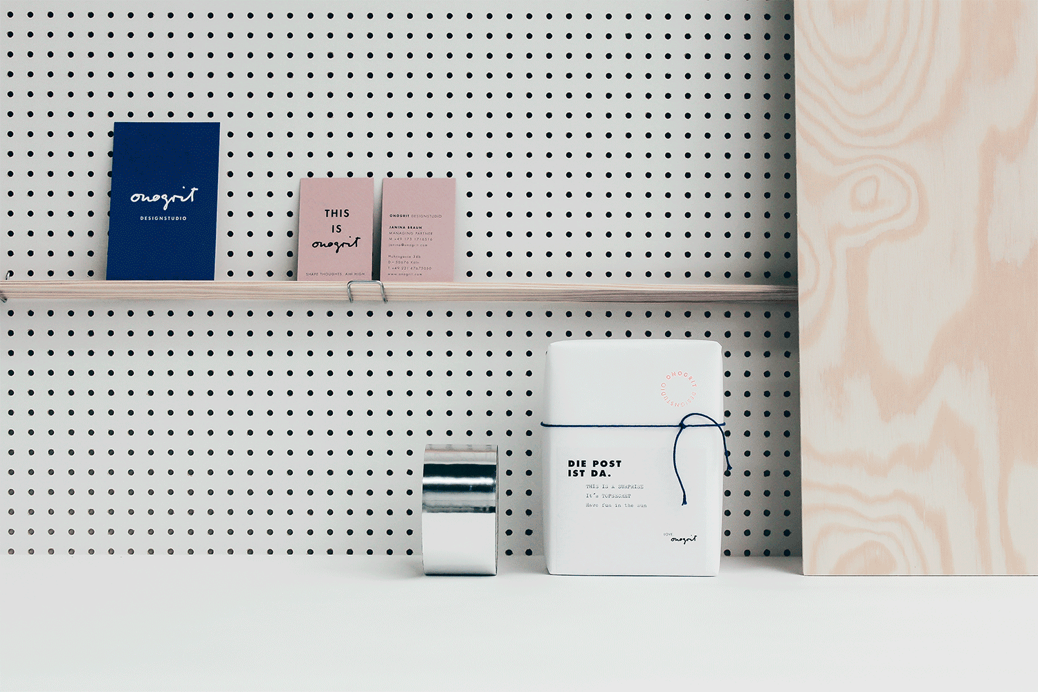
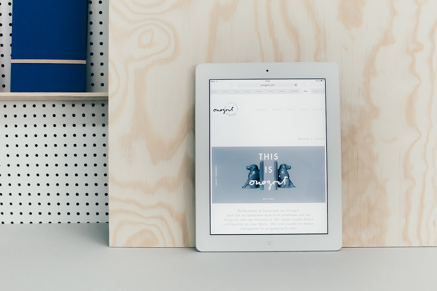
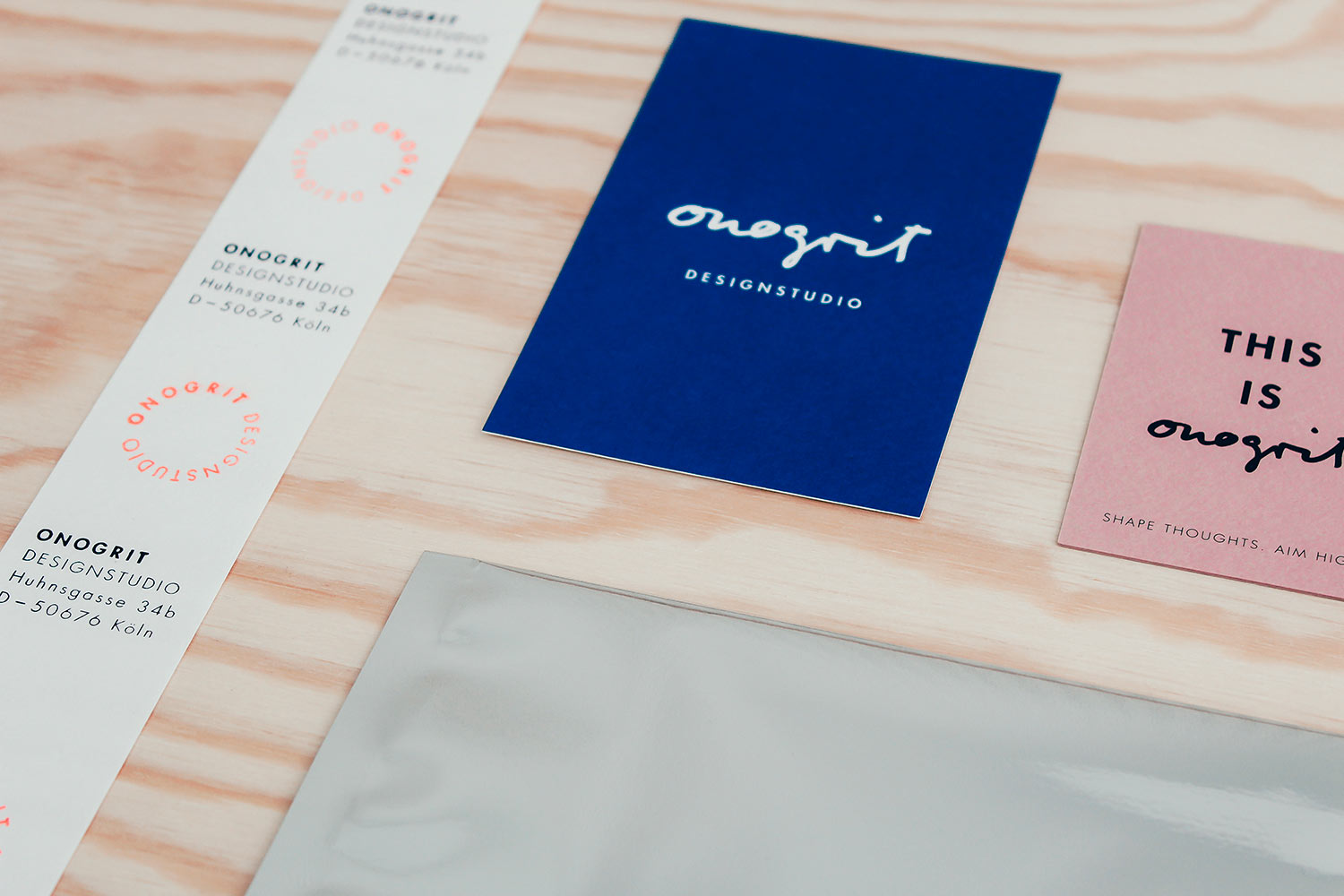
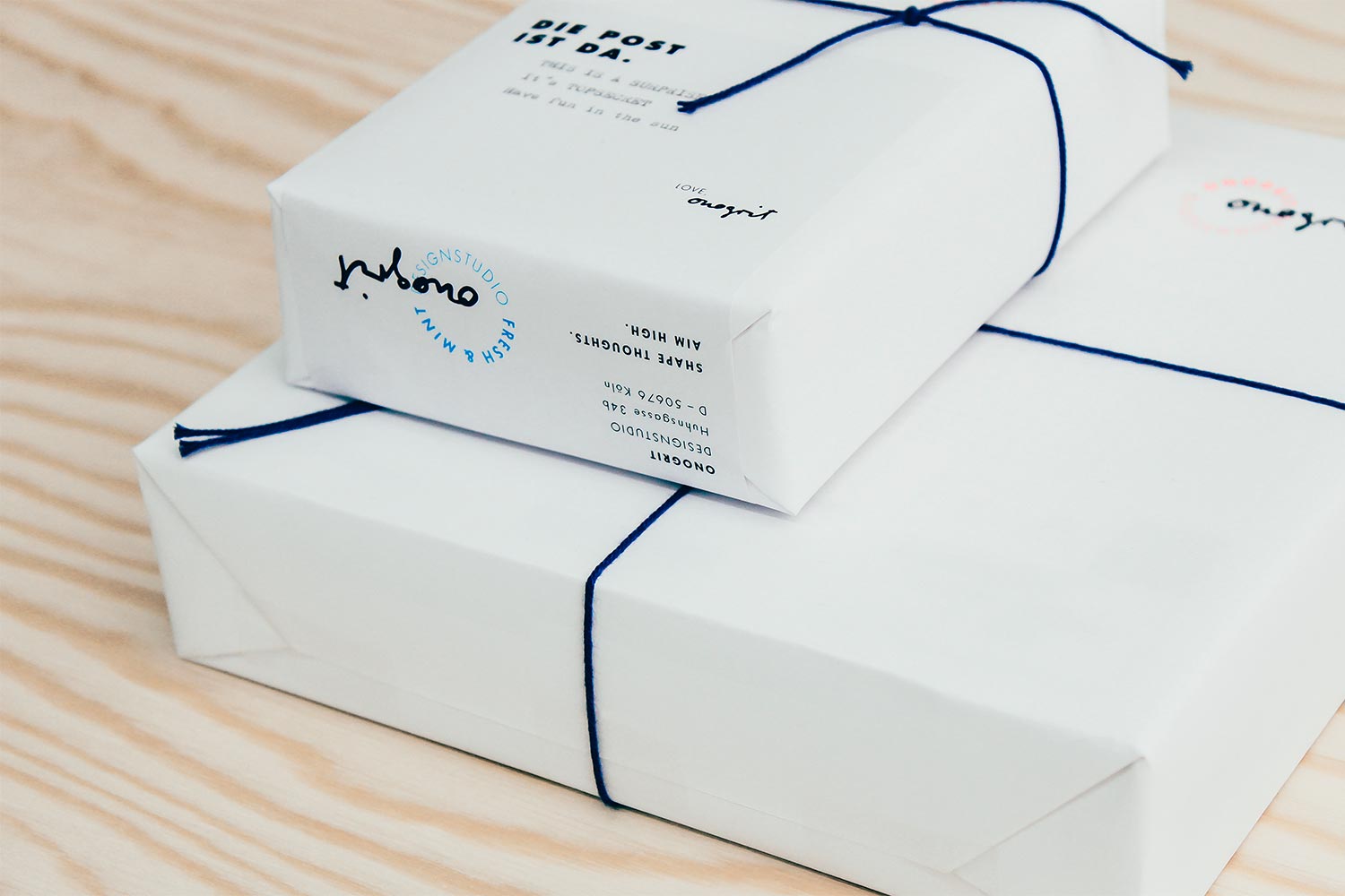
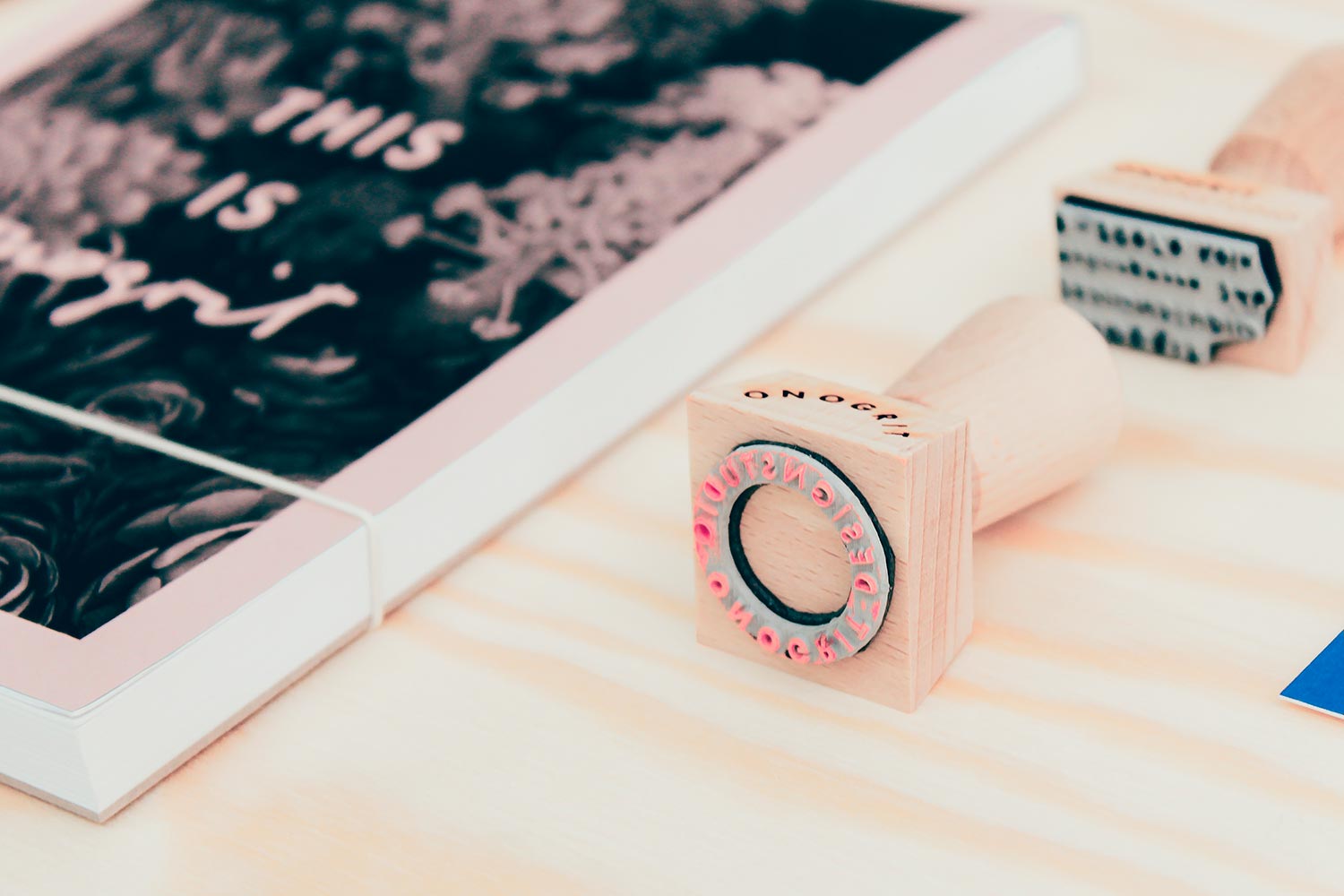
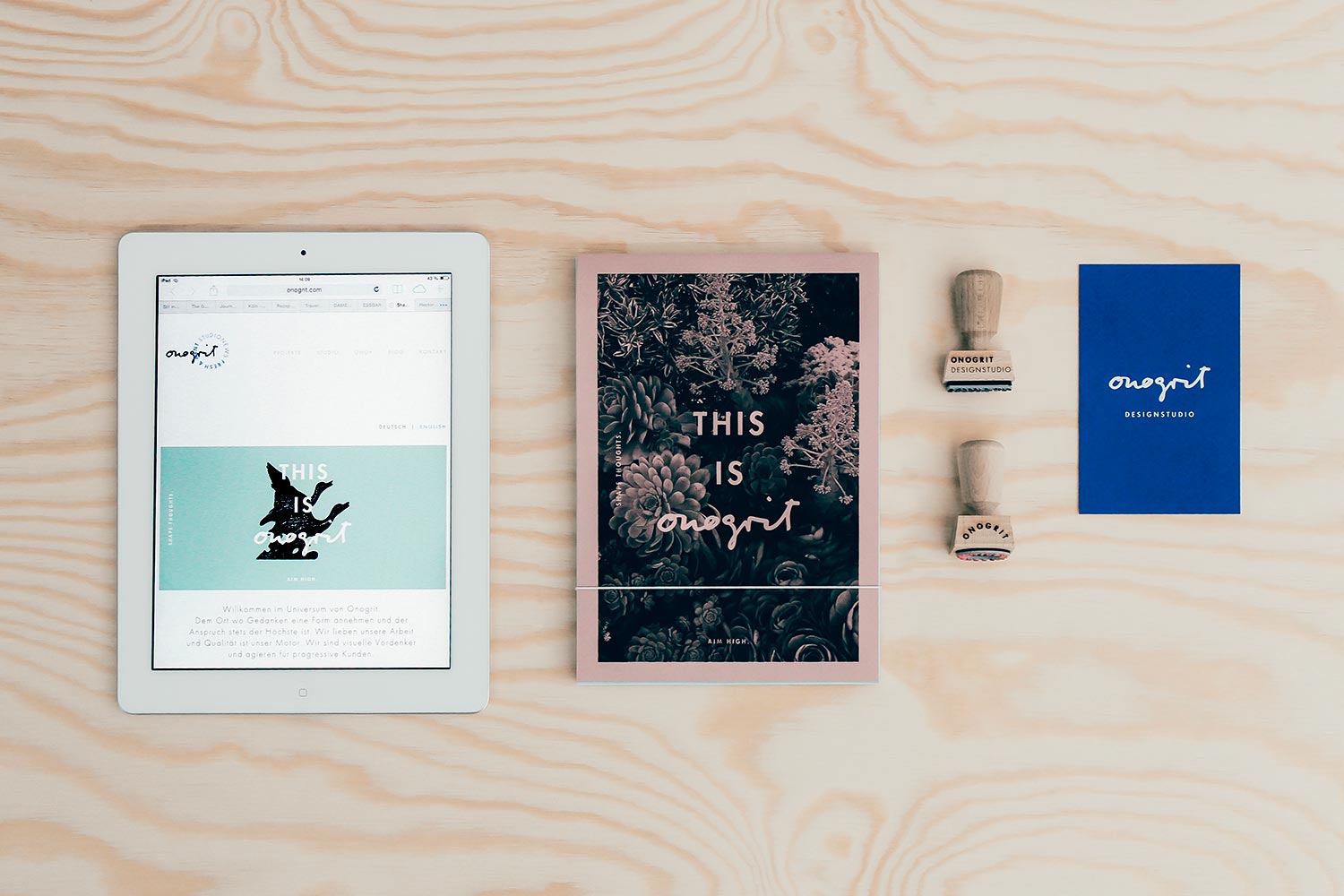
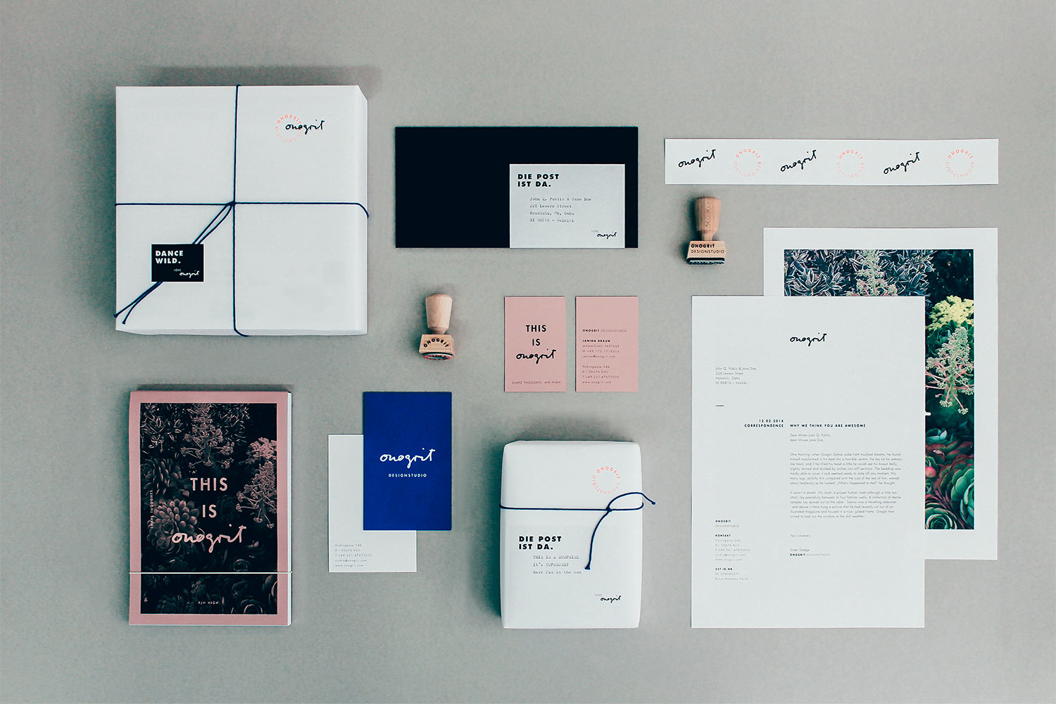
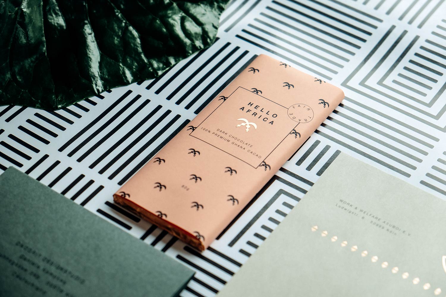
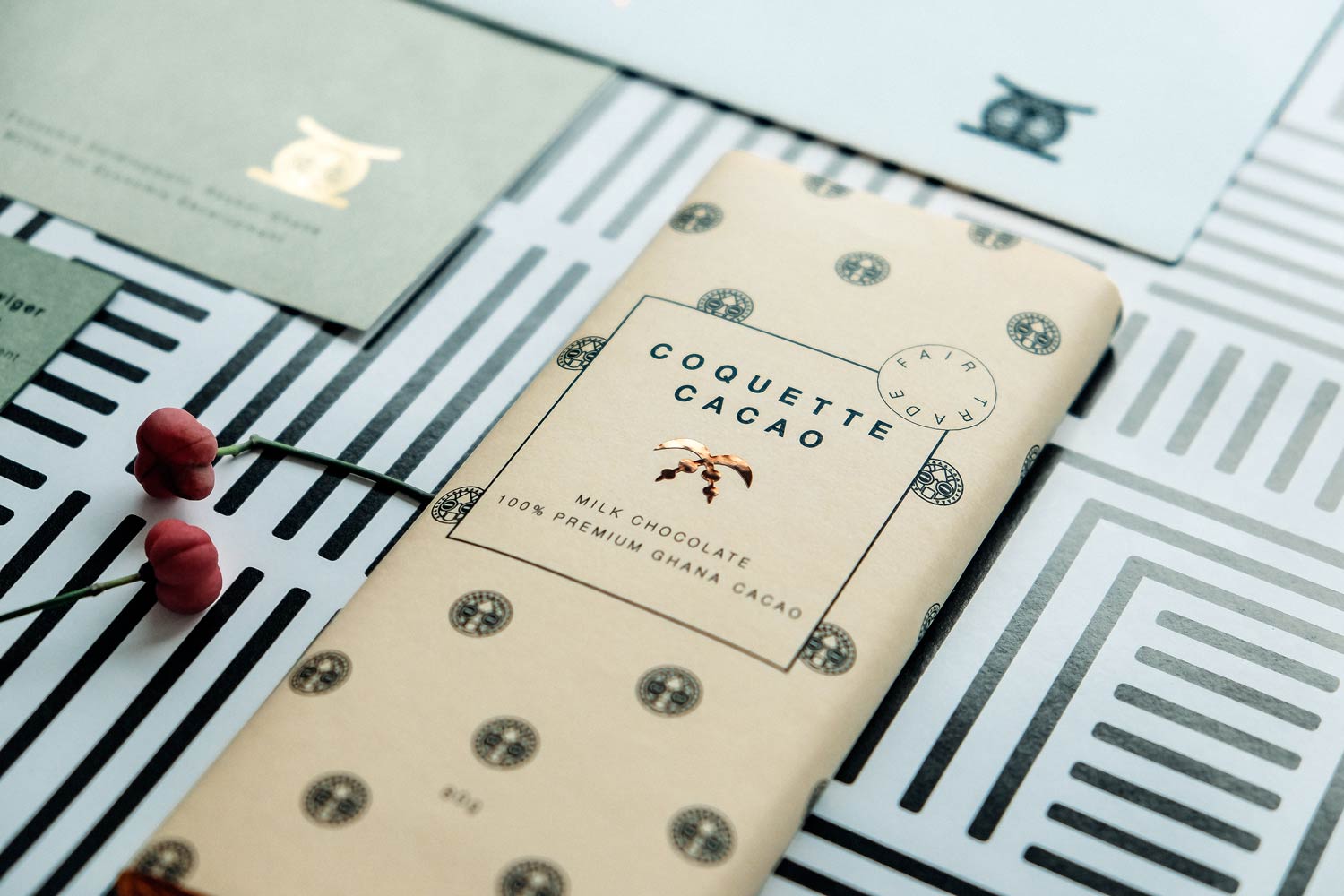
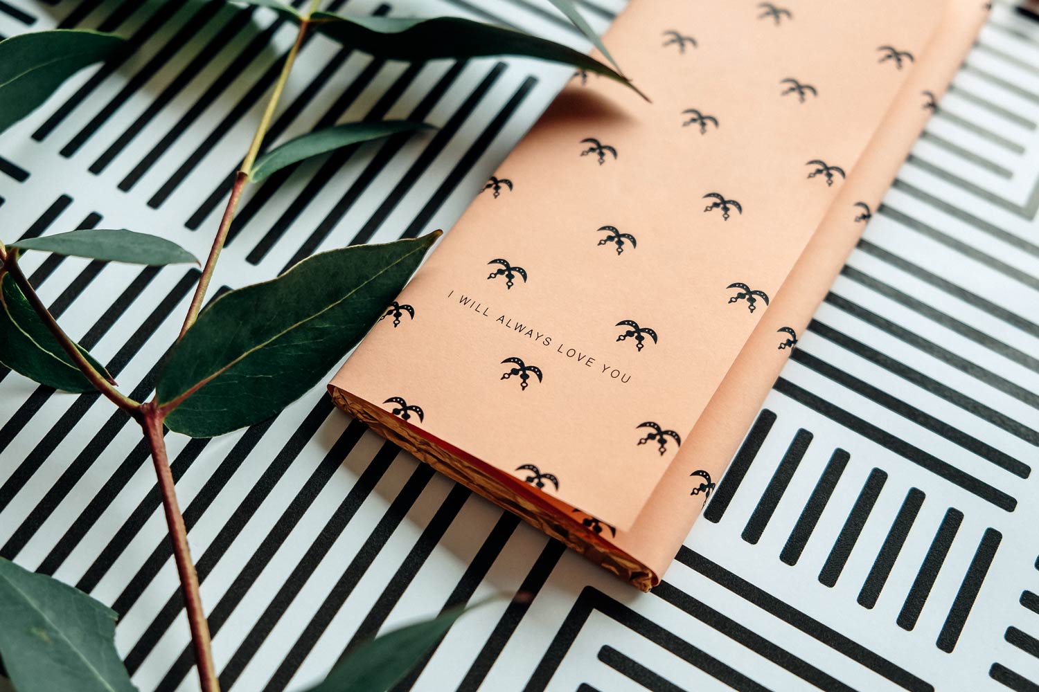
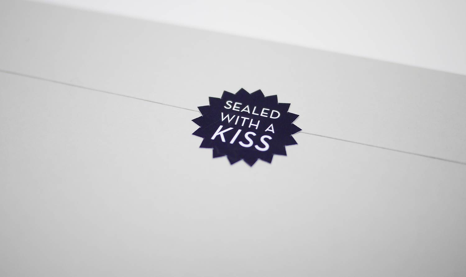
All of us at ONOGRIT design studio have been working hard towards this day, and it has finally arrived. We can say the words we’ve been longing to say – Our stationary design is ready to rumble! Rumble with us if you dare. Go on, show us some love on Facebook, Instagram & Twitter.
King of Ghana
Royal person of public interest
• Corporate Identity
• Stationary
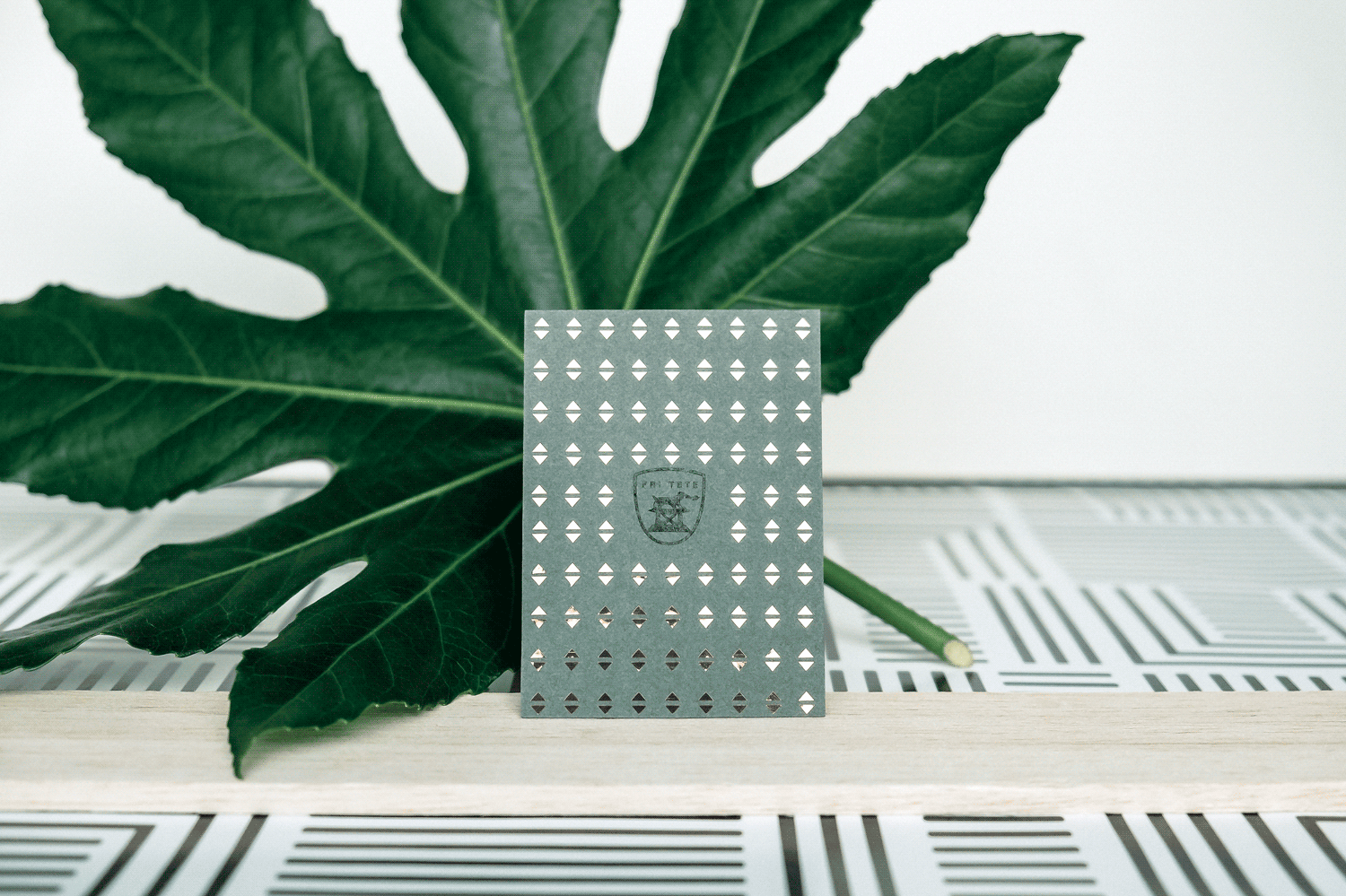
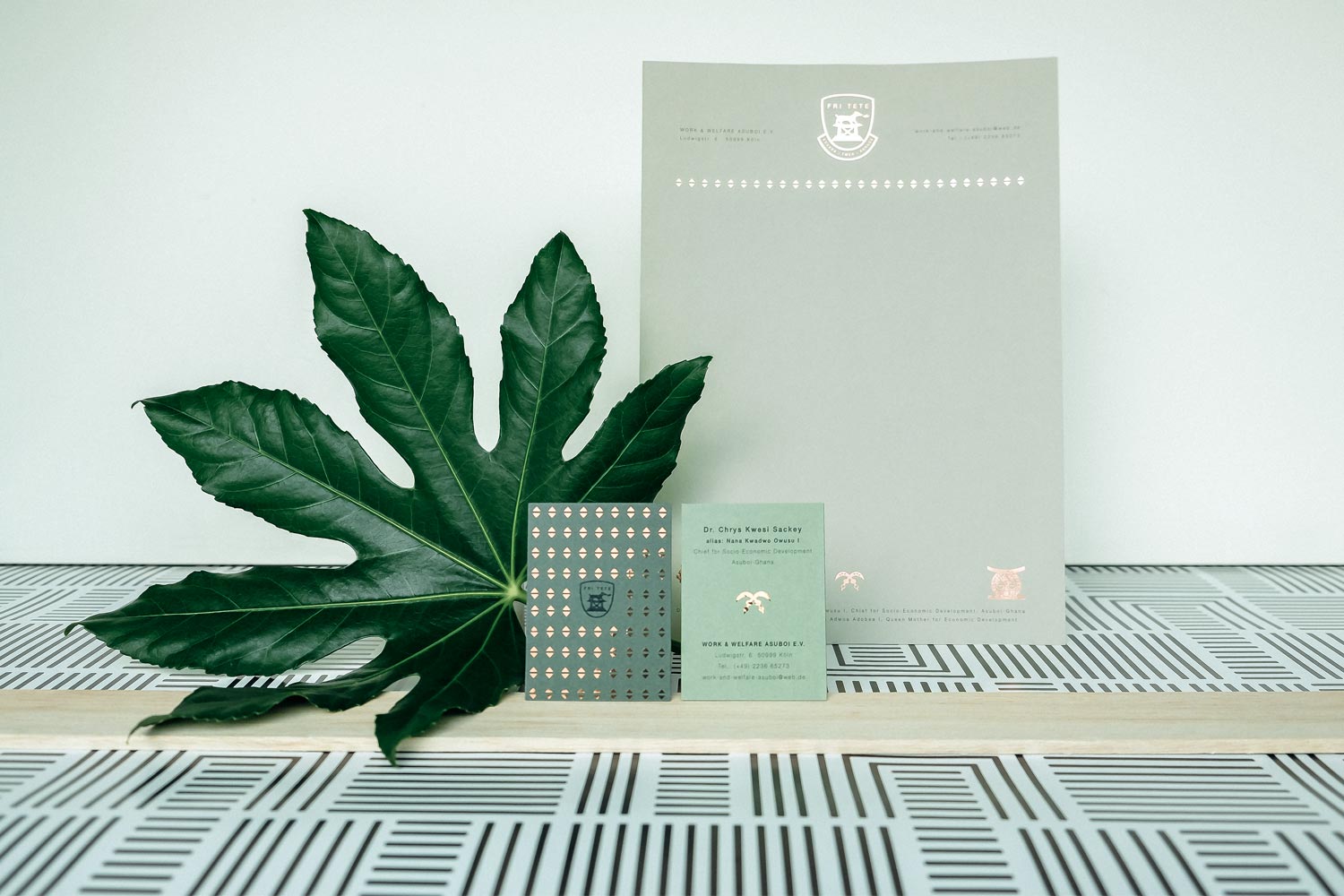
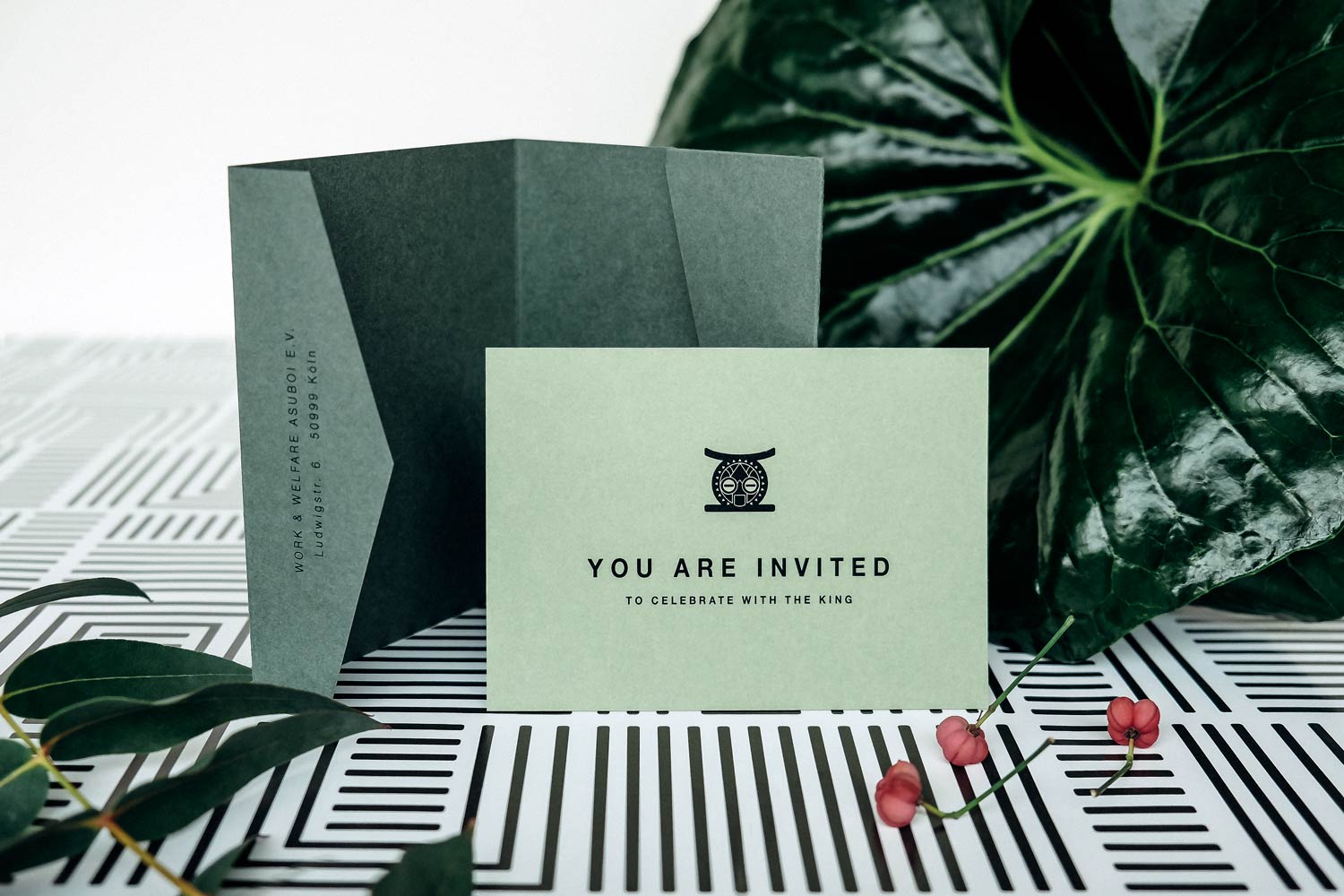
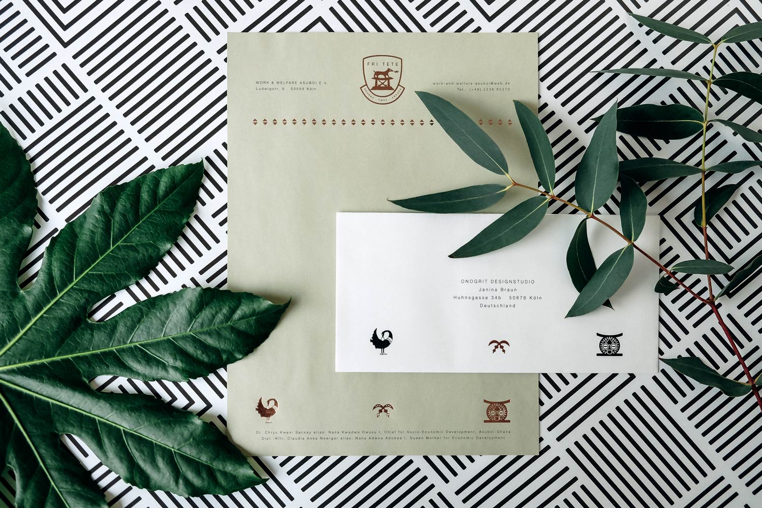
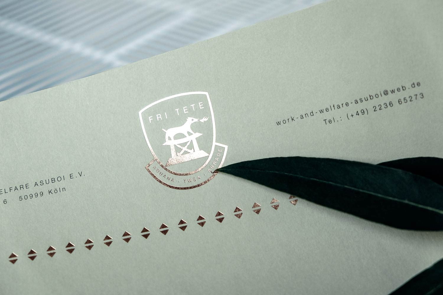
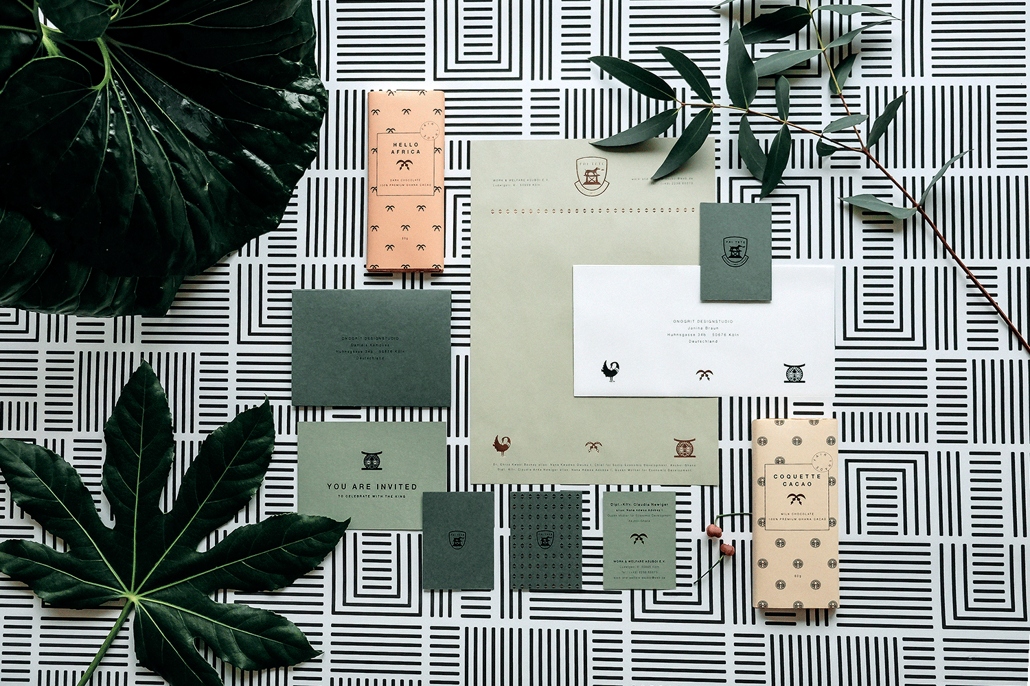
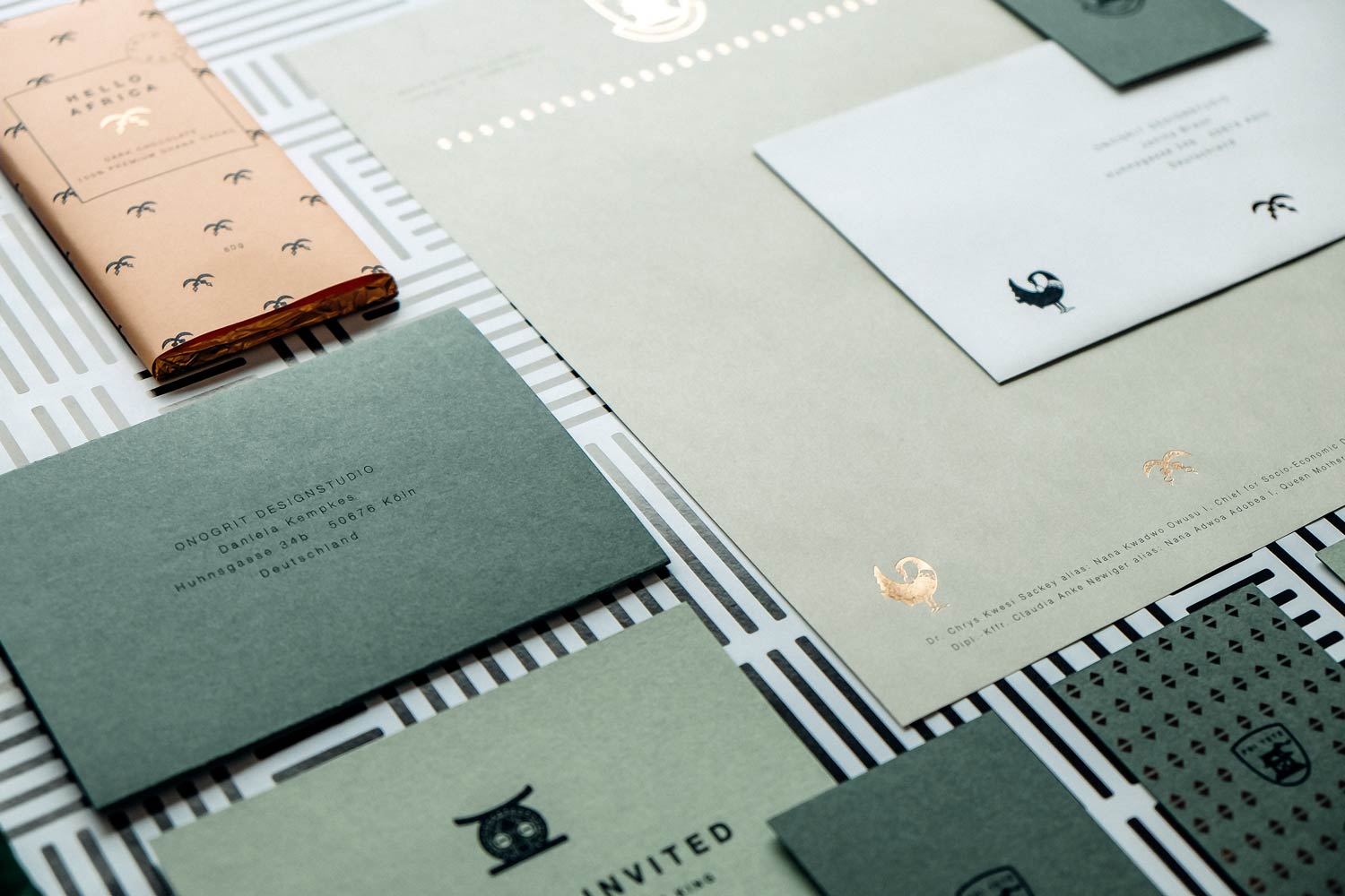
A real king in the house! For the African King Nana Kwadwo Owusu I from Ghana our studio designed a stationary set consisting of letterhead, business card and invitation card for his business correspondence.
Introducing ONOGRIT
Creative Consultancy
• Ideation
• Paintings in acrylic
• Gif-Animation
“Onogrit.” – “Ono… what?” That’s pretty much the first response we get about our studio name. To prevent any future misunderstandings, we illustrated the best slips of the tongue (and ear). By hand, on paper, with color and brush. And here they are – our top ten artworks. Any more rhymes in stock? Send them to us!
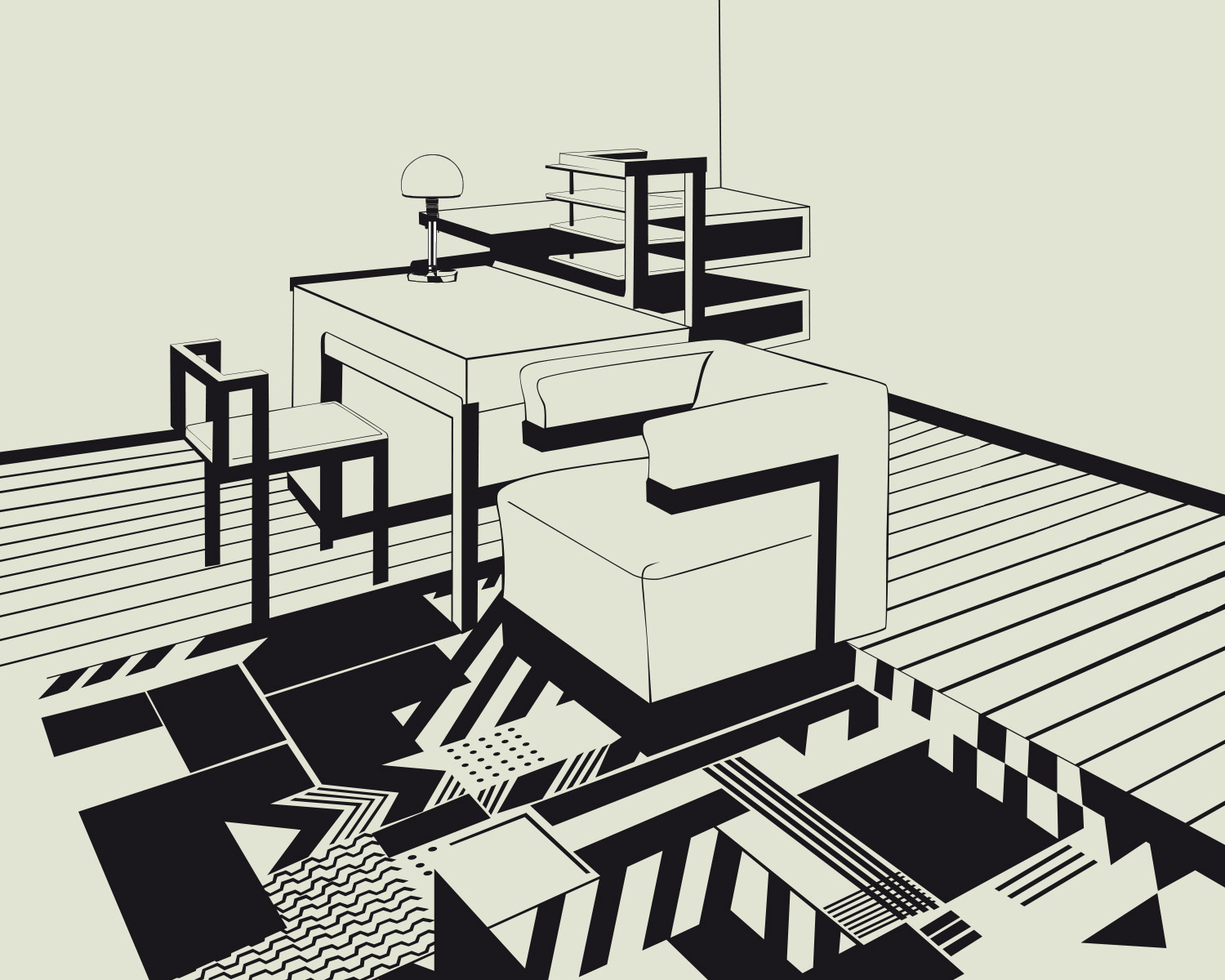
Seemann Verlag
Publishing House
• Style Development
• Image Research
• Hand drawings
• Illustration
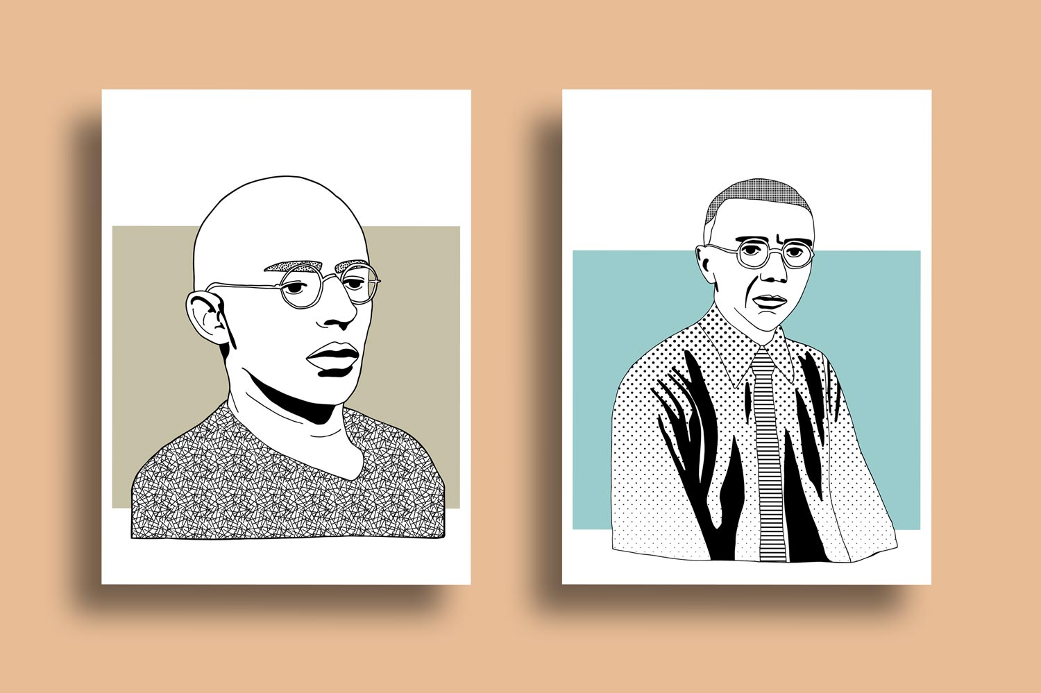
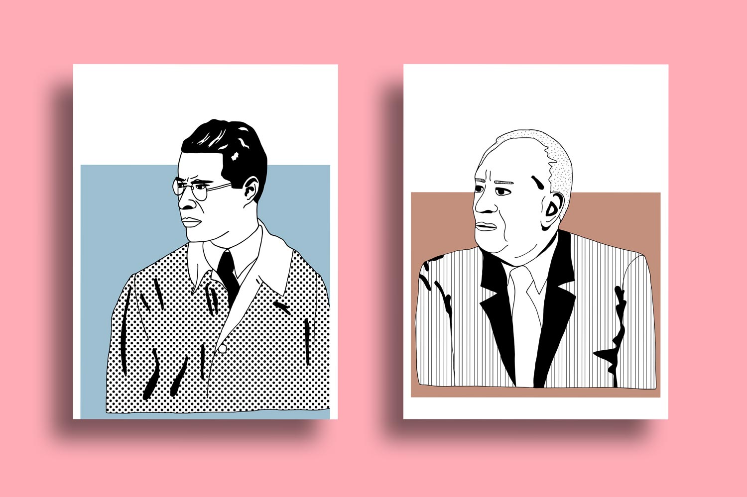
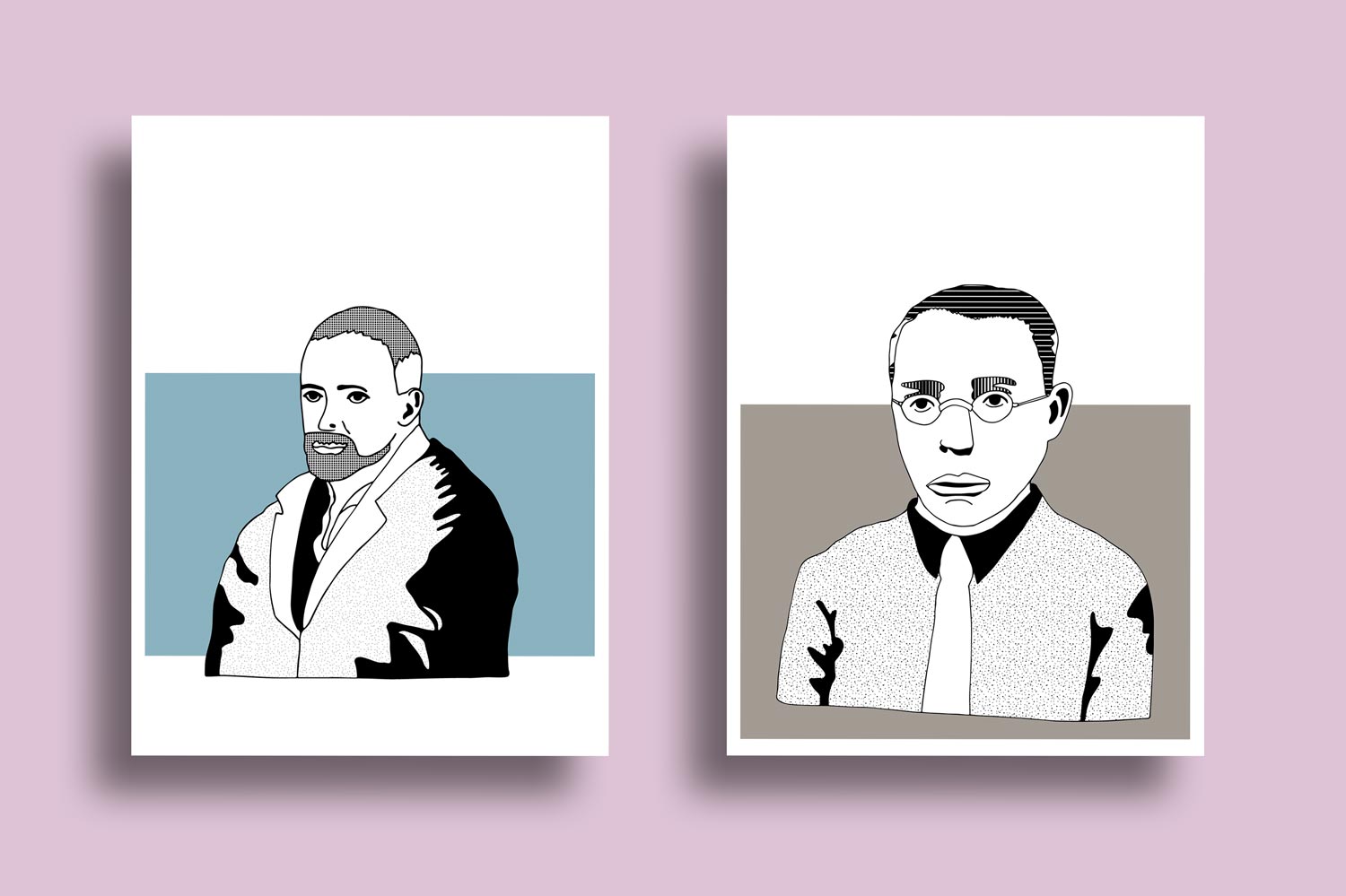
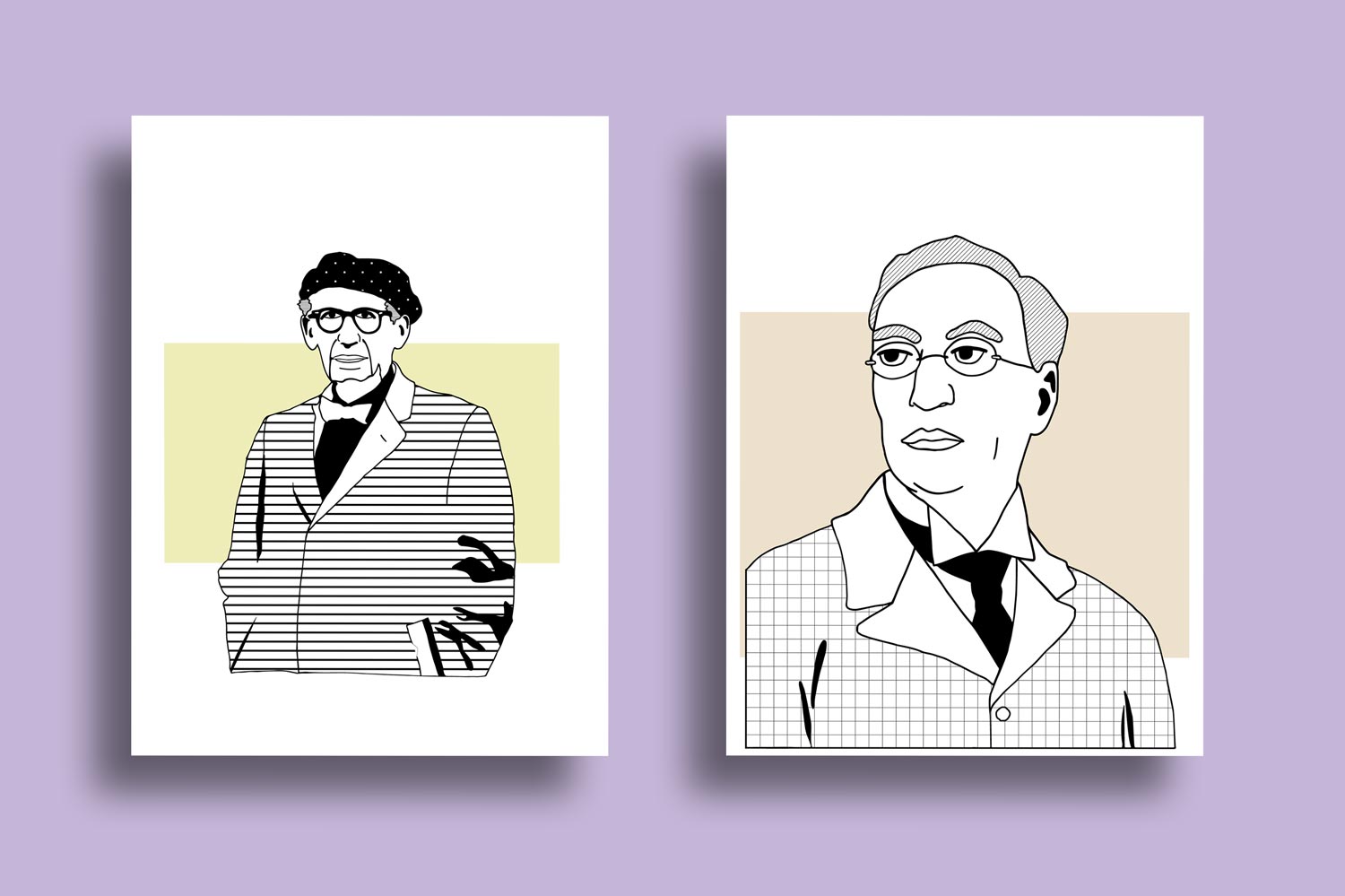
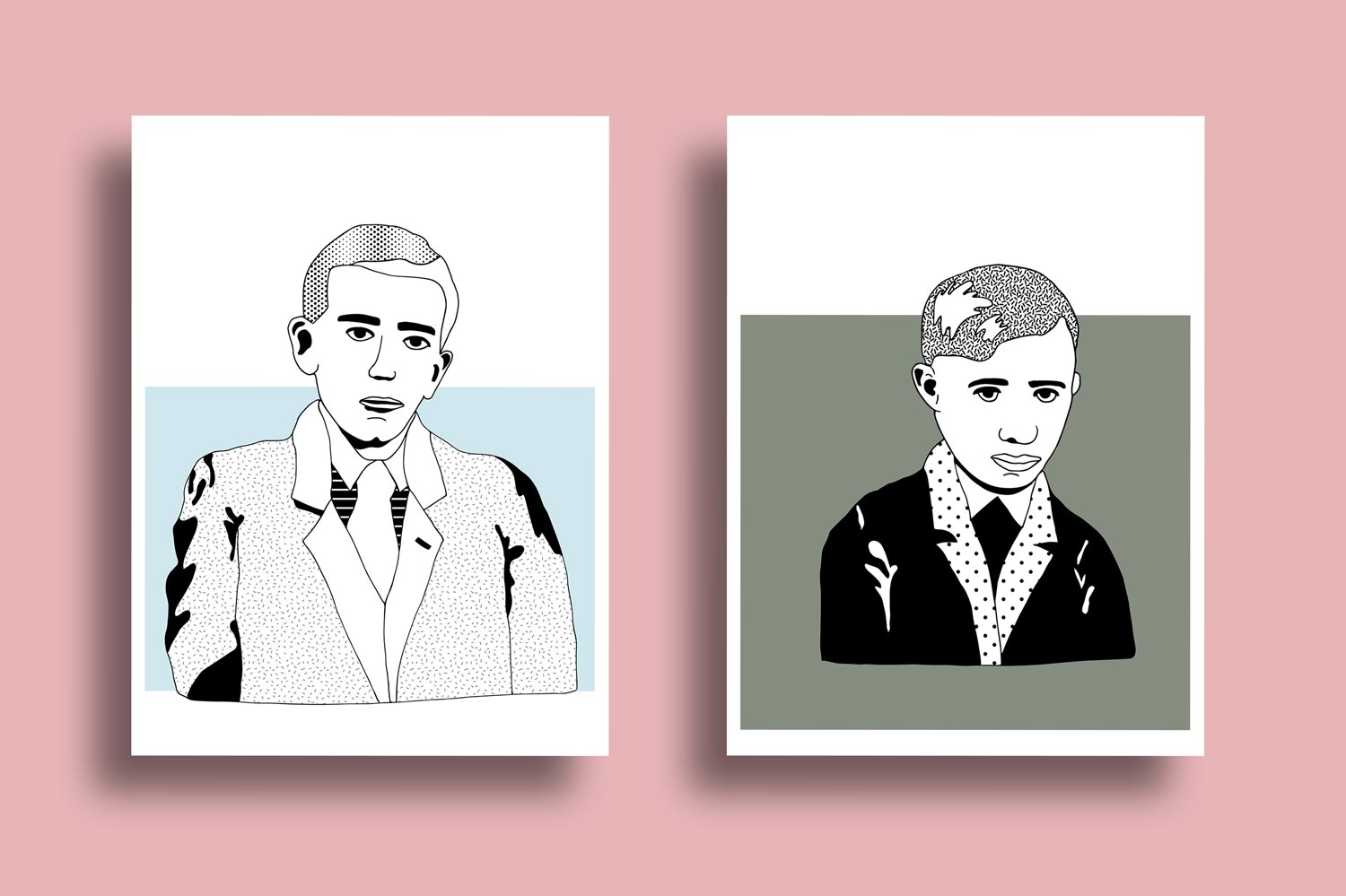
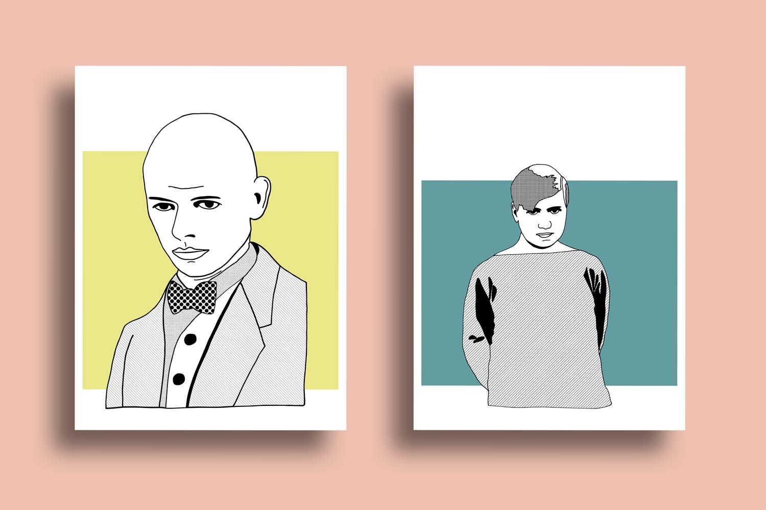
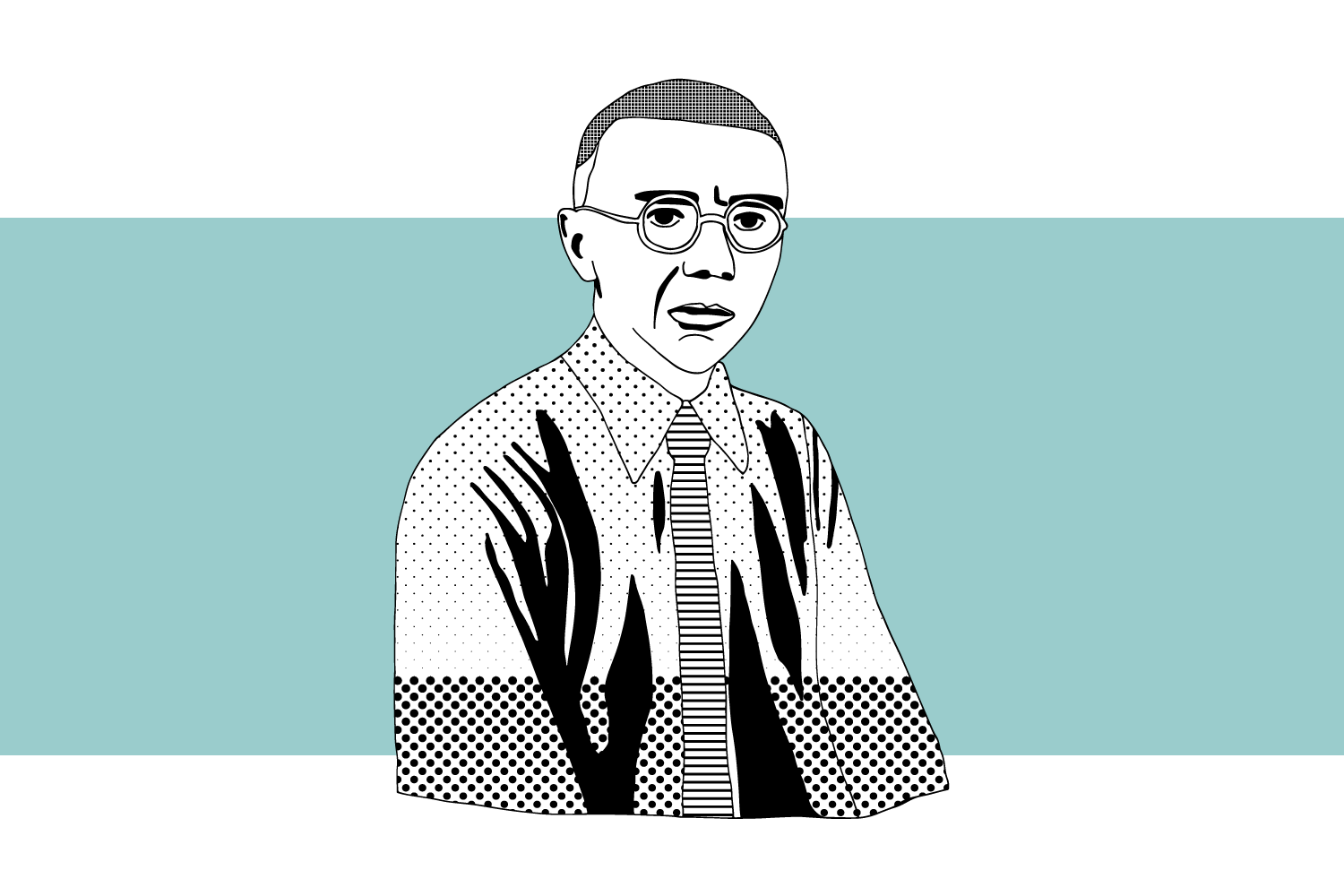
After seeing our Comic Panorama for the Weimar Foundation, the legendary Seemann publishing house asked us to make a series of illustrations of the most famous names in Architecture and Interior Design of the 20th century. Walter Gropius, Wassily Kandinsky, Johannes Itten, Paul Klee, Marianne Brandt oder Gunta Stölzl – the list of world famous students of the Weimar/Dessau/Berlin Bauhaus school is endless. The adaptations were created in a reduced two-tone style, with only black and a background colour.
hell & freundlich
Interior Design Office
• Web Design
• Visual Design
• Consultancy
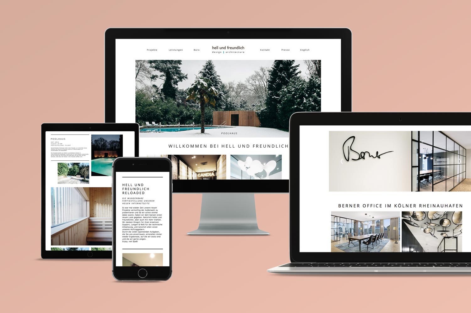
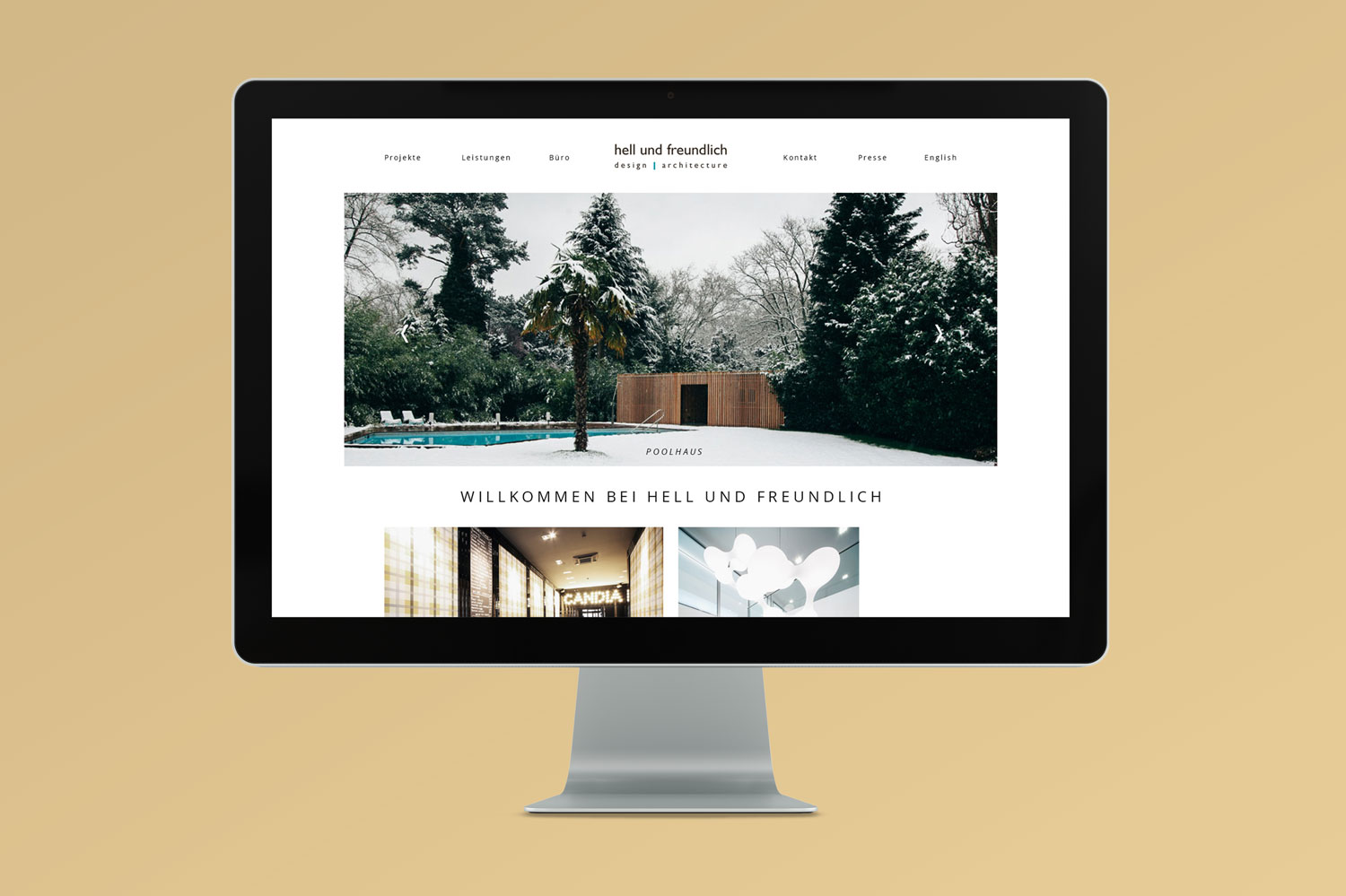
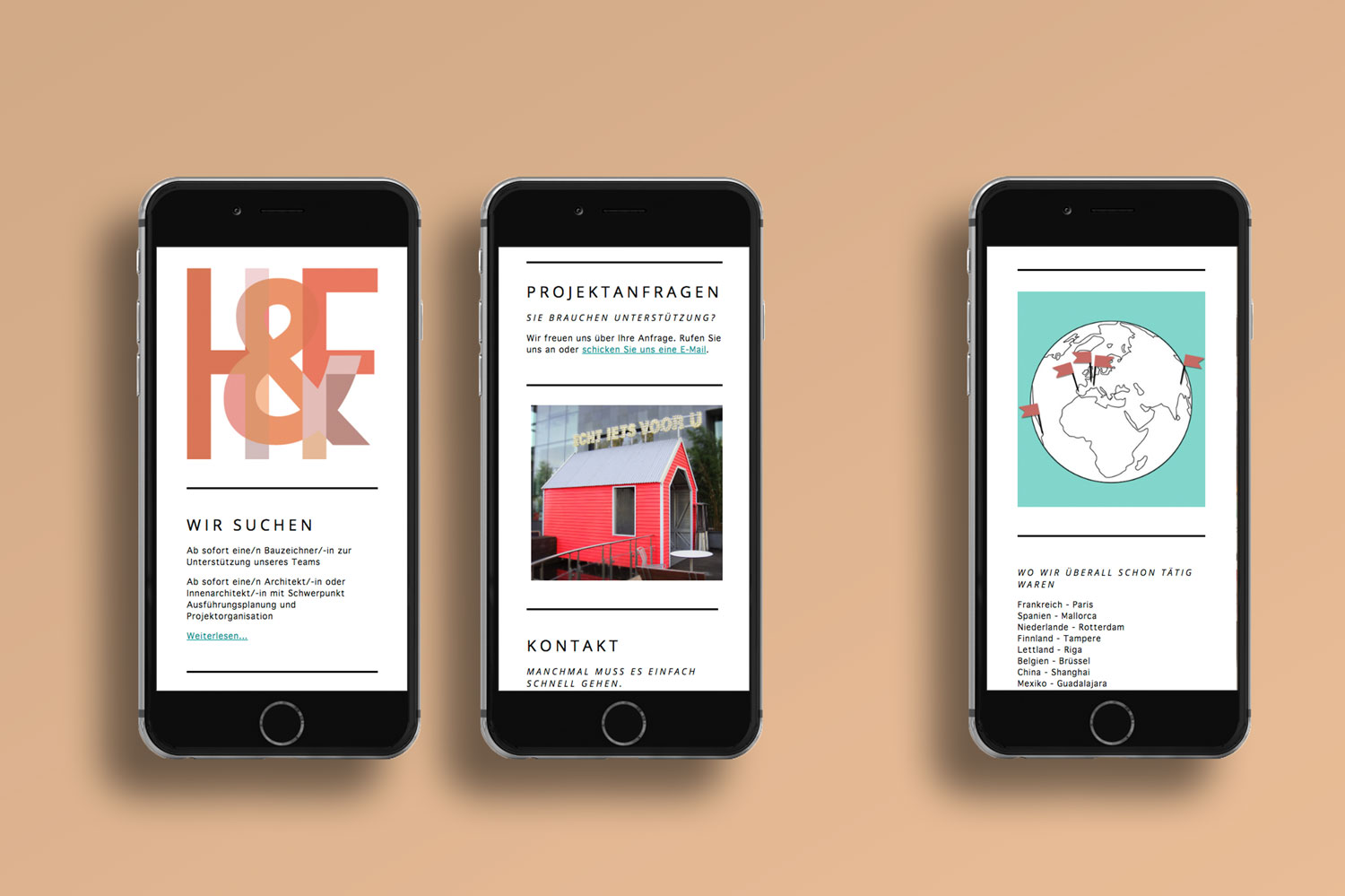
The crazy talented architecture studio Hell und Freundlich, from our home town of Cologne, asked us to help them out with some juicy design for their new company website. The gang of architects, also specialists in the area of bringing good vibes to medical clinics and hospitals, needed an all new responsive website for the age of mobility. It was so much fun to see all their projects and choosing the best pictures to let their website shine bright like a diamond. Neighbour love forever!
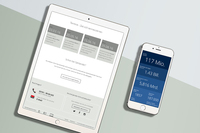
Santander Bank
Banking
• UX Concept
• Content Strategy
• Visual Design
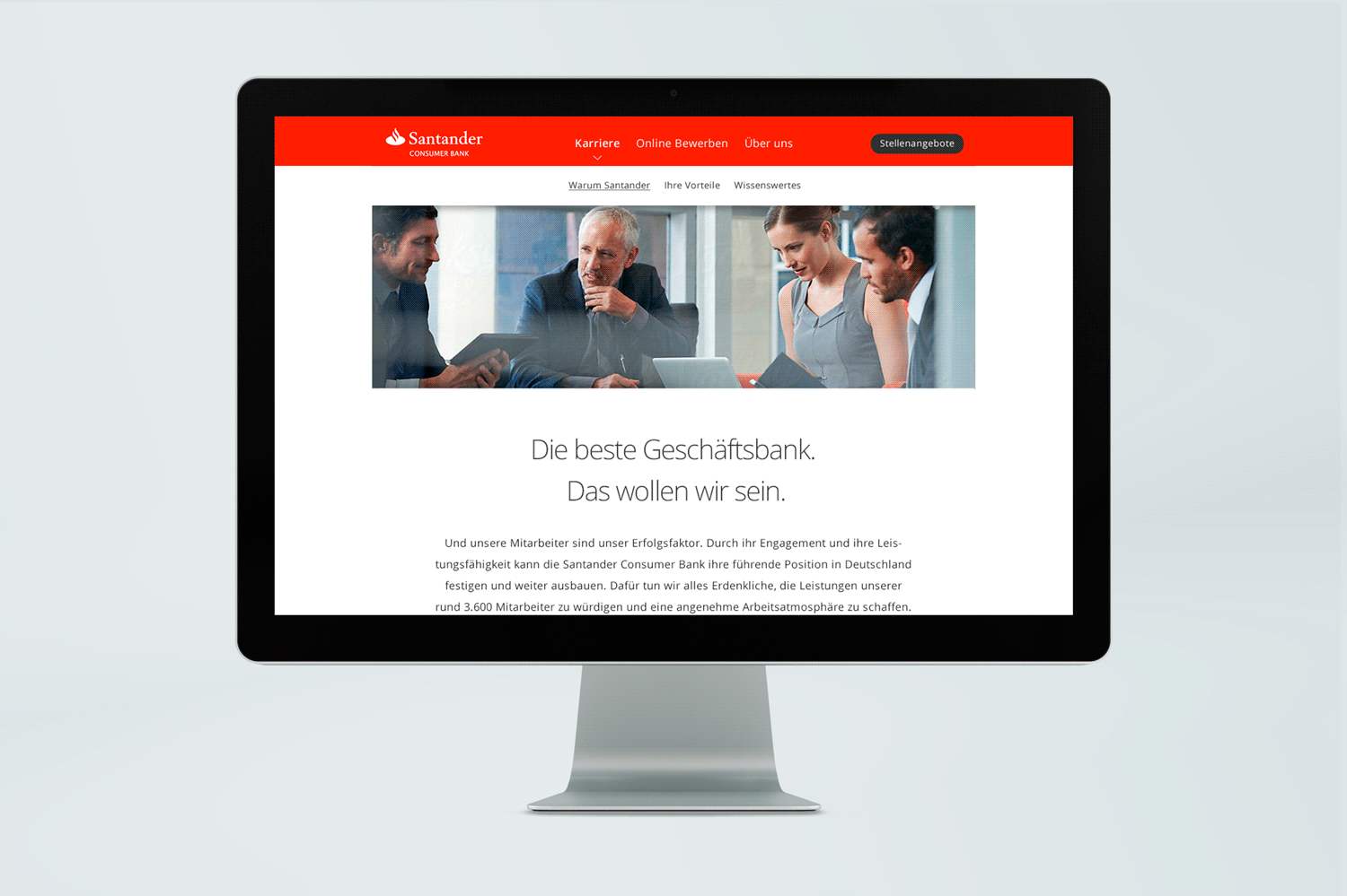
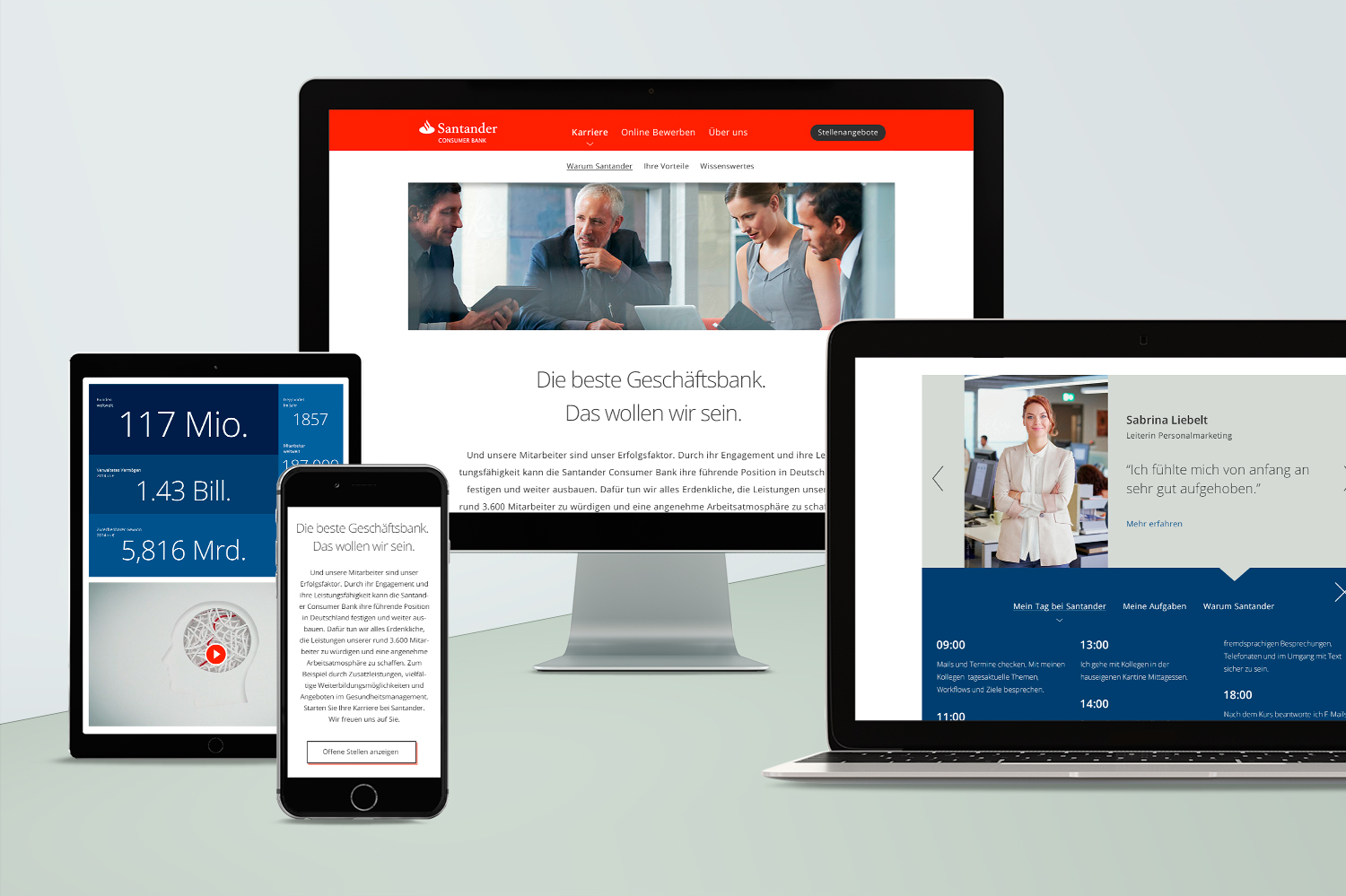
On behalf of kernpunkt, we developed a career portal for the corporate website of Santander Bank, that is not only graphically up to date, but, through clever content, will help the right candidate make their way to the company. To fulfil the task, we put the quality of the content at the forefront of our work. Therefore, we developed a content strategy composed of gathered research and created simple ways to consume content, such as infographics.
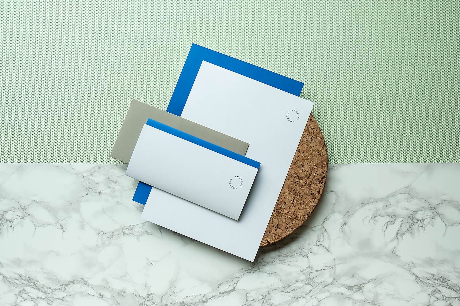
A. Horbelt
Live Experience
• Corporate Design
• Web Design
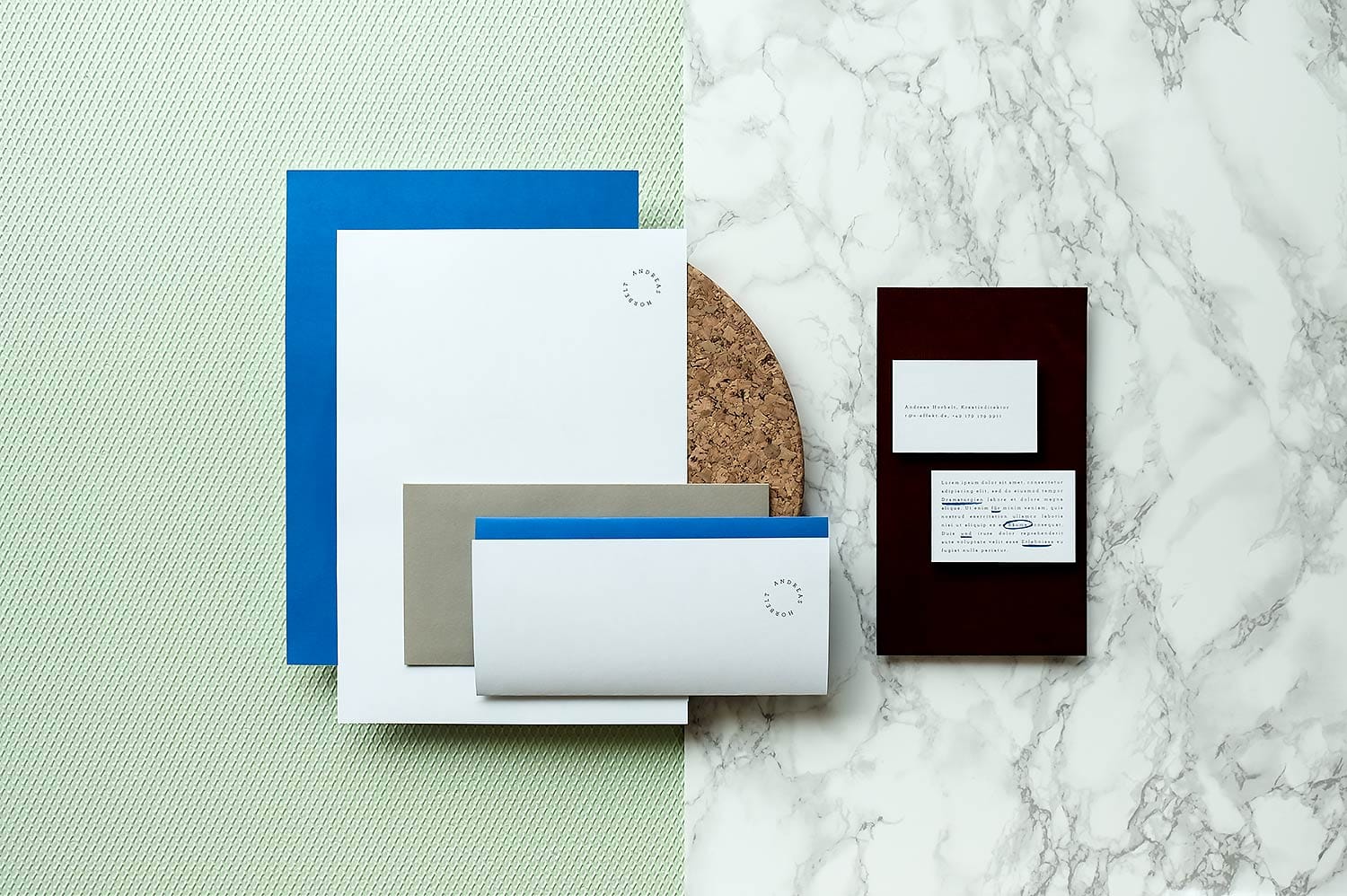
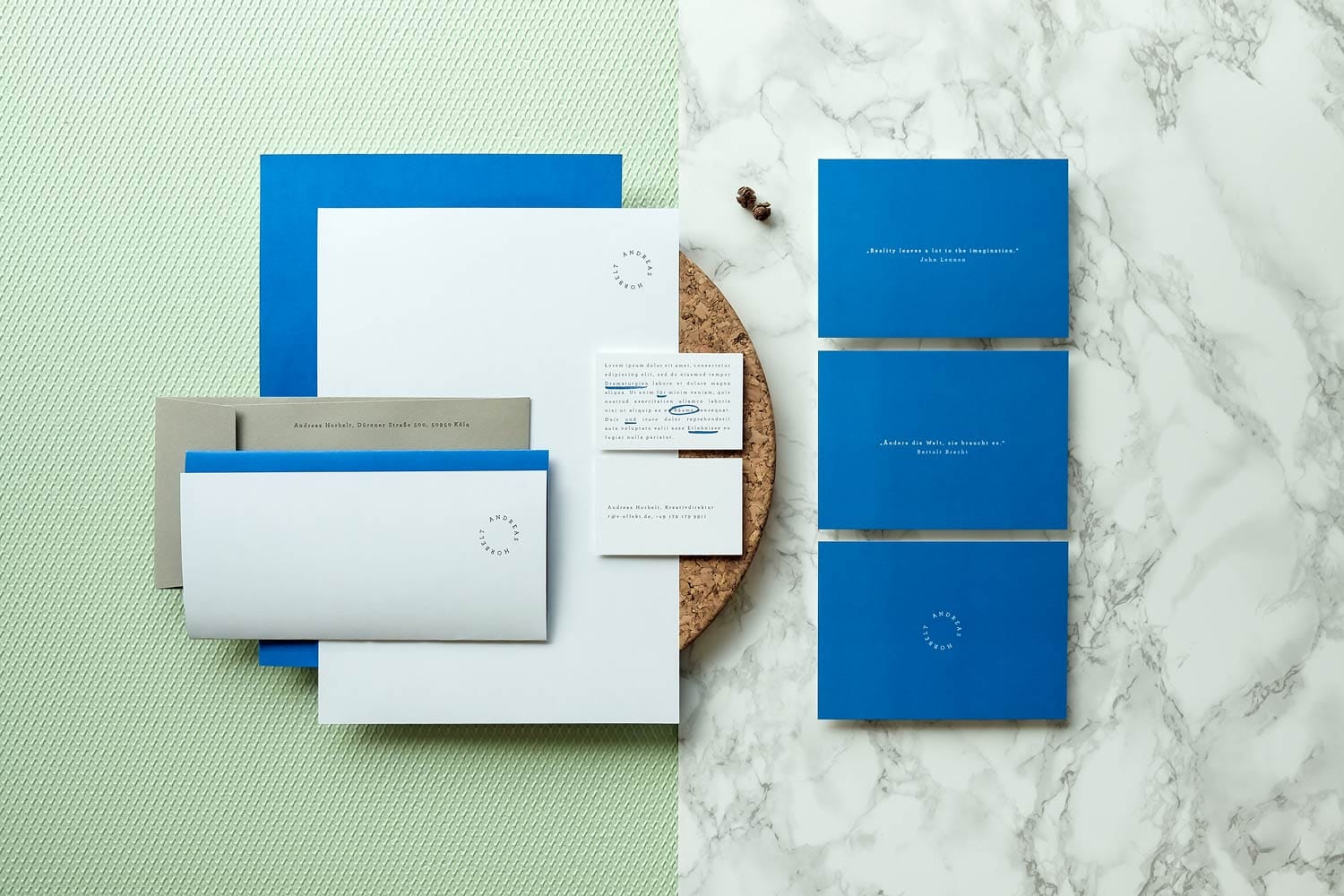
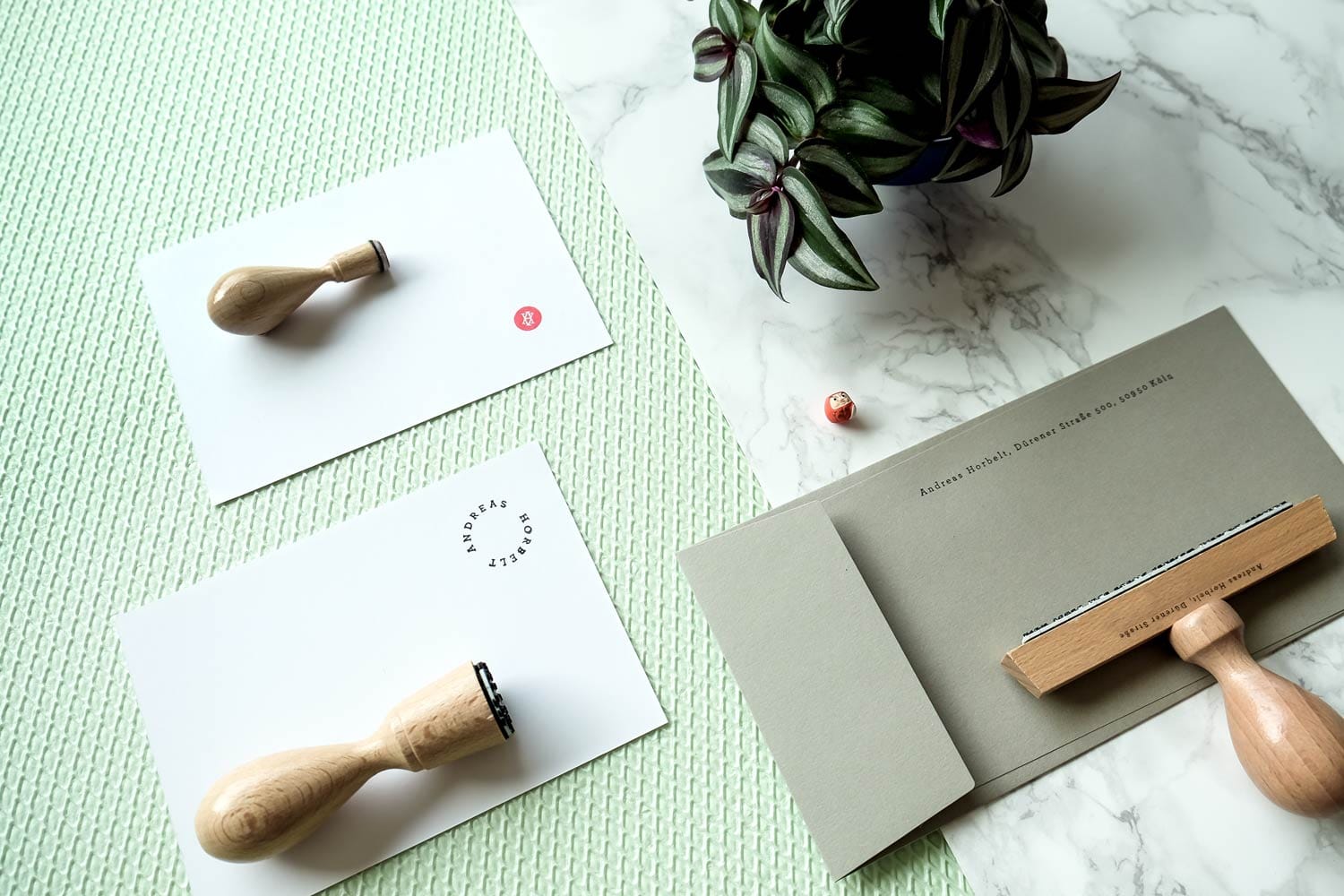
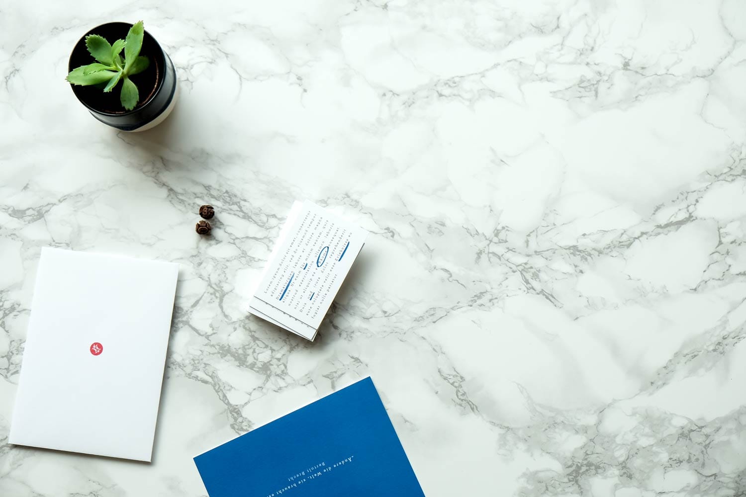
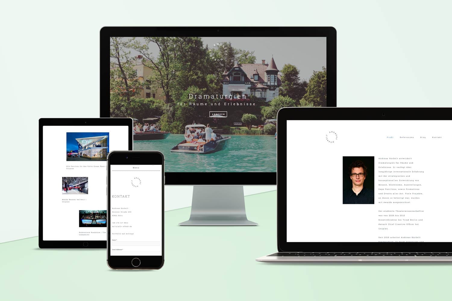
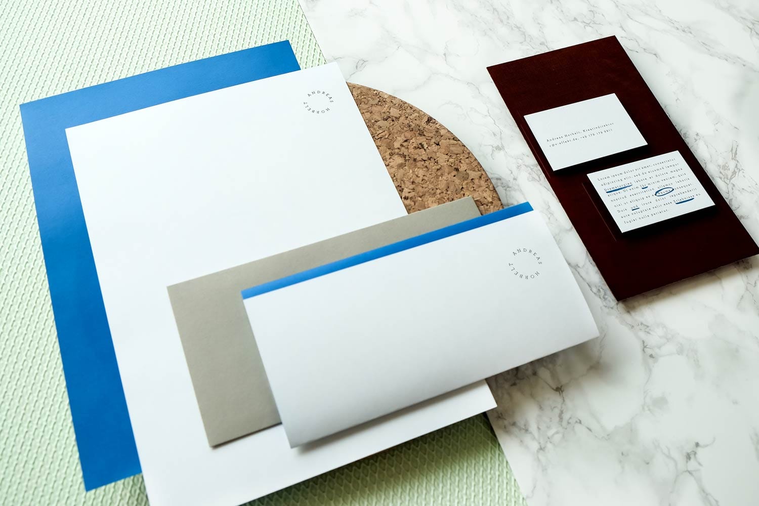
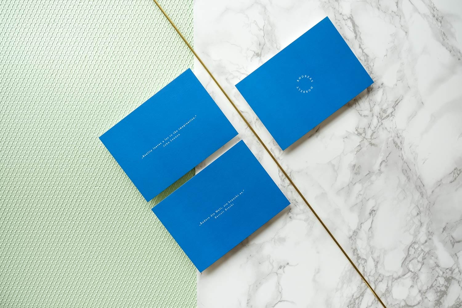
In a close partnership with Andreas Horbelt, a prominent Cologne-based Creative Director, we developed a visual language for his business stationary consisting of a letterhead, business cards, greeting cards, stamps and a website.
2015
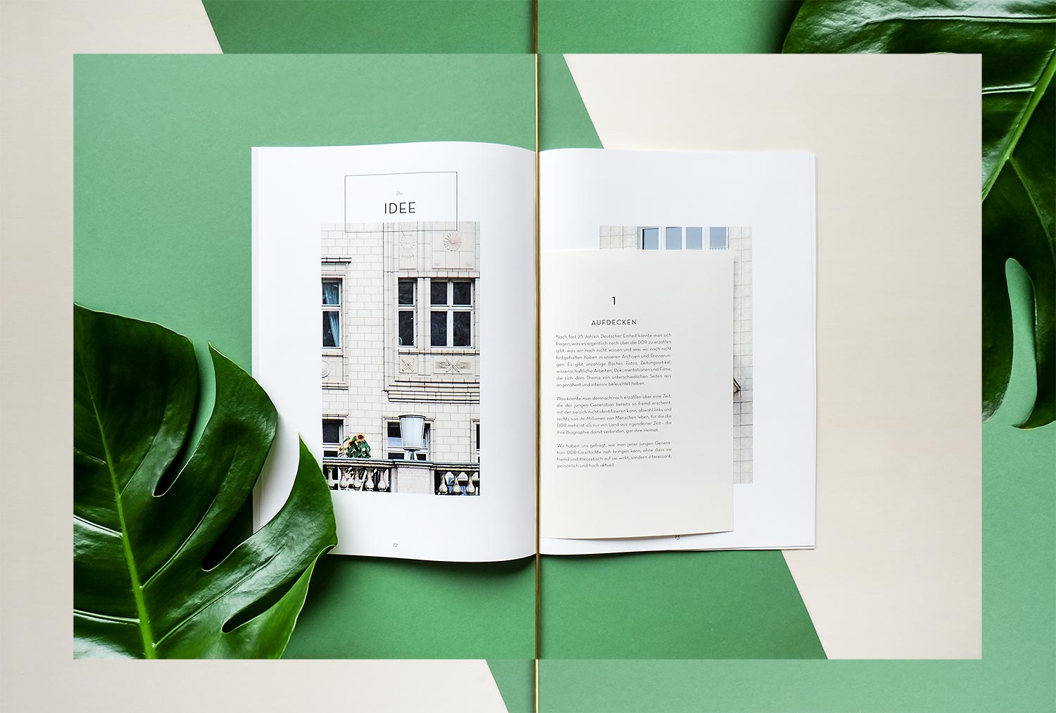
The Beauty Aside
Film
• Magazin Concept
• Layout
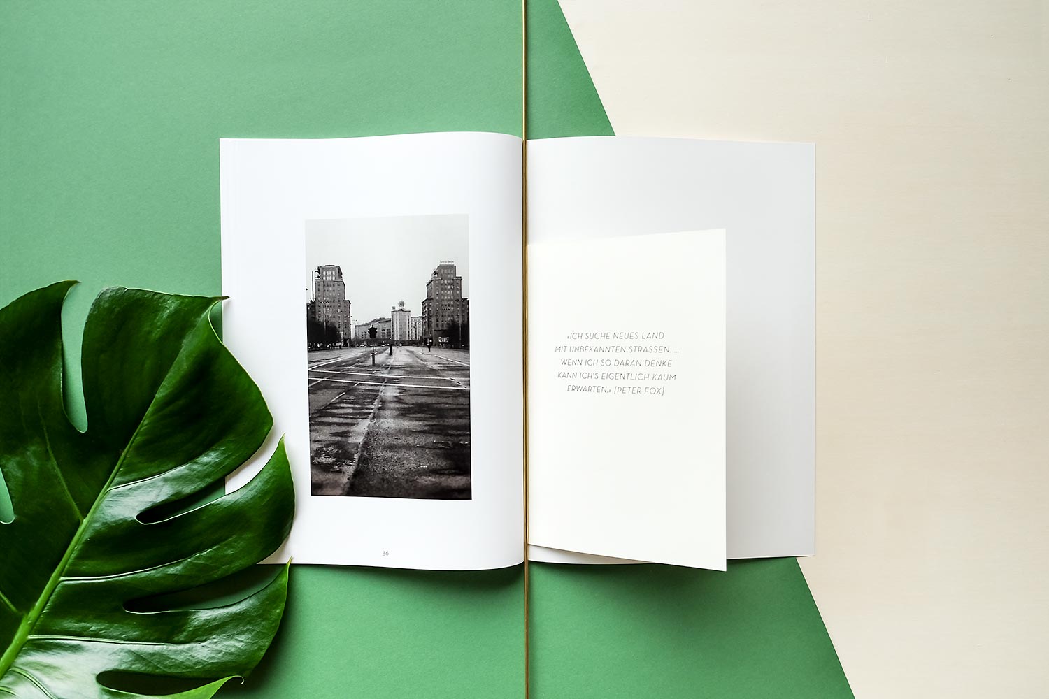
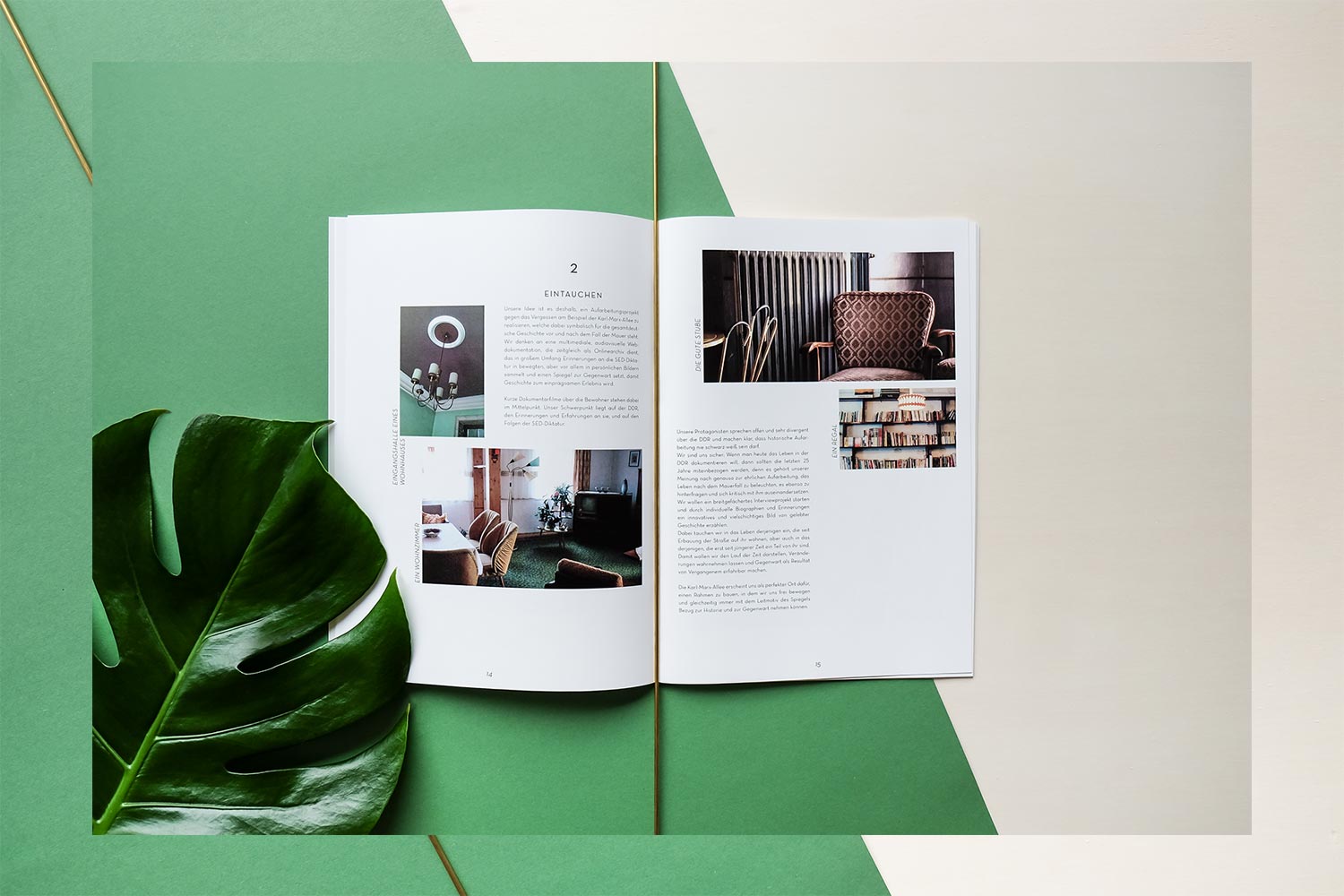
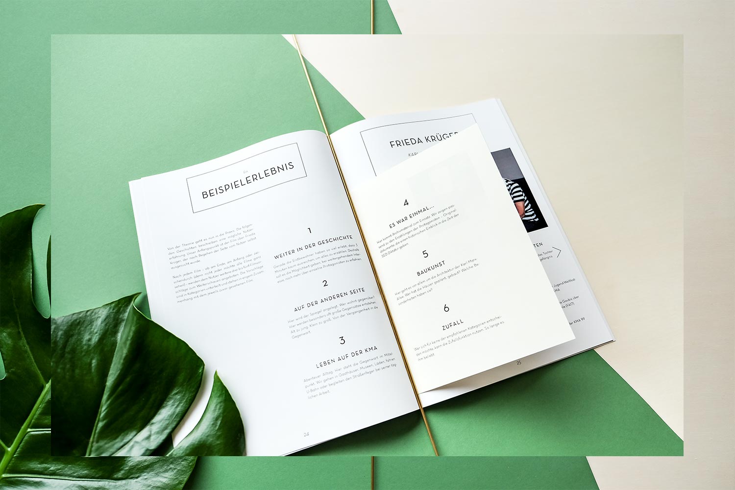
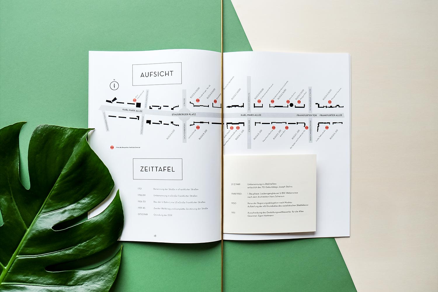
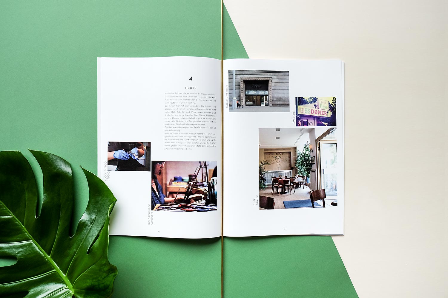

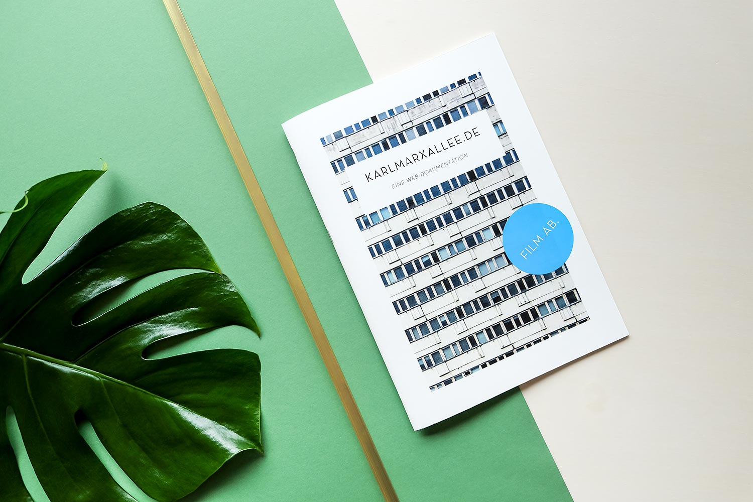
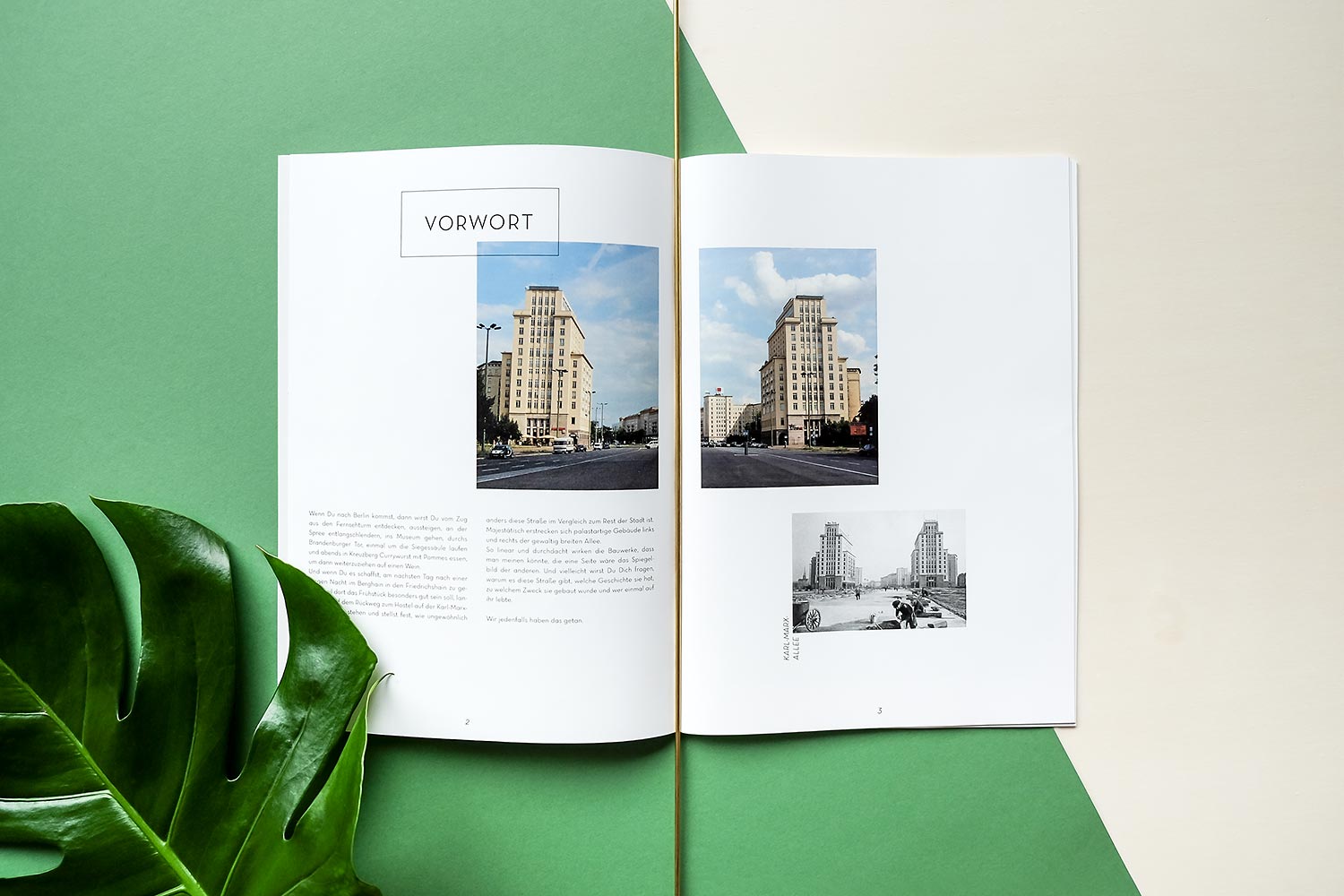
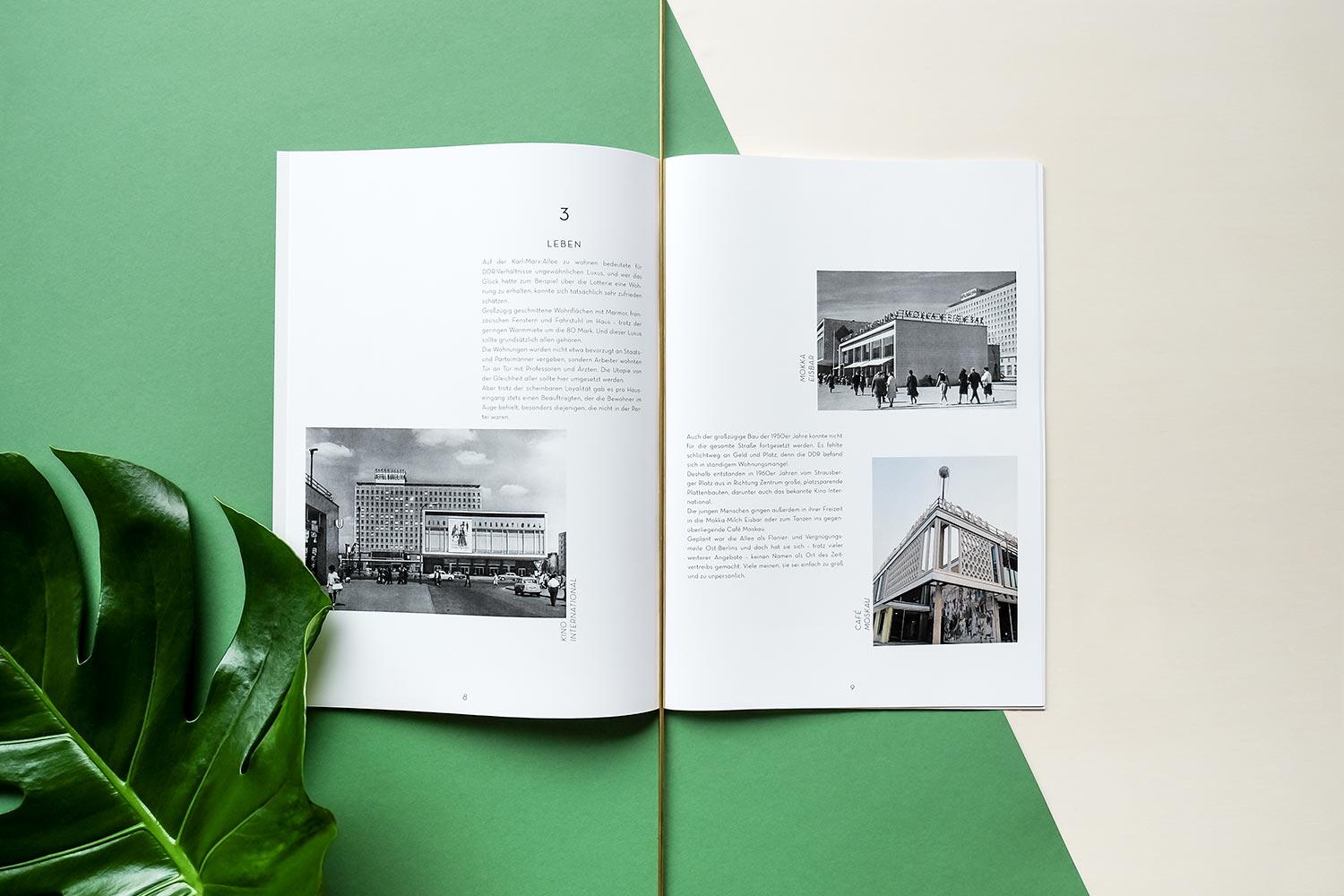
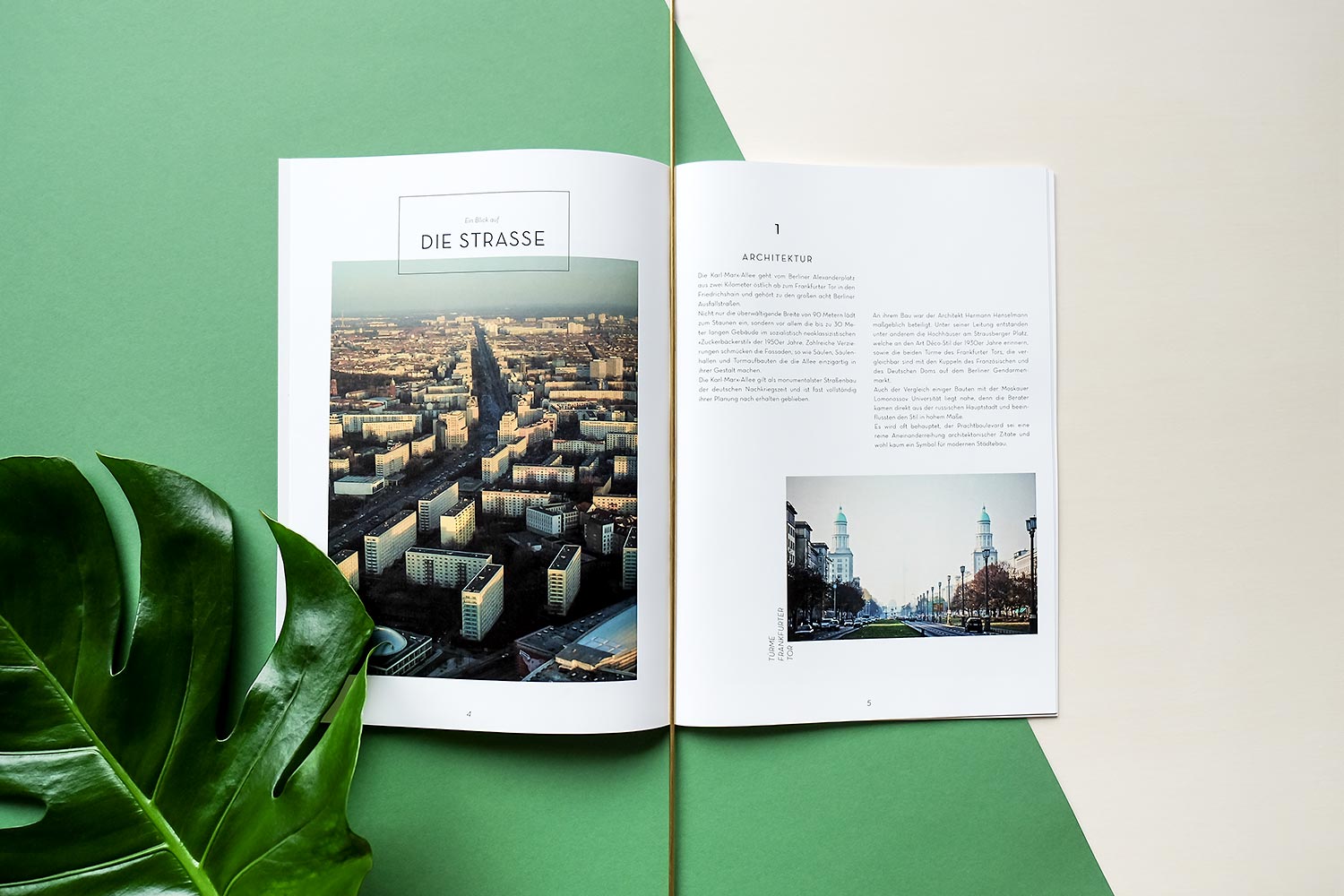
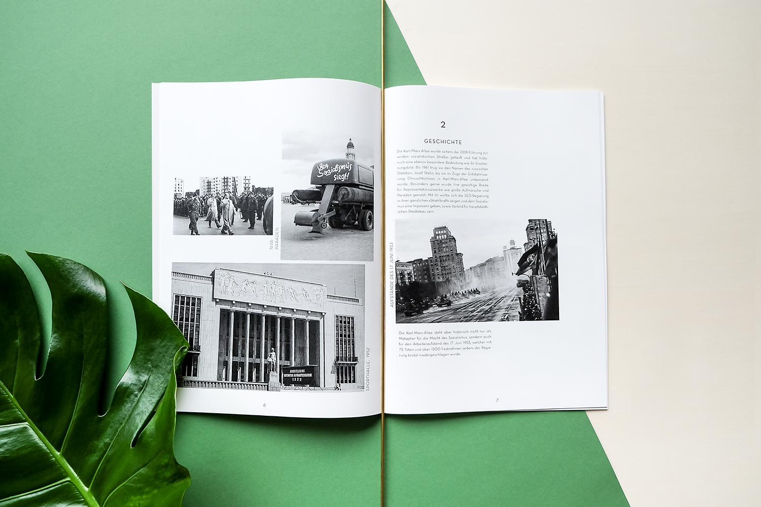
Together with the Cologne-based film production company tba / the beauty aside, and under the direction of Conny Klause, we helped produce a publication working as a tool to collect funds in order to produce a stunning documentary about Berlin’s Karl-Marx-Allee. The project idea included several documents about the lives of long-established residents and their stories.
Syngenta
Rewards Program
• Editorial Design
• Print
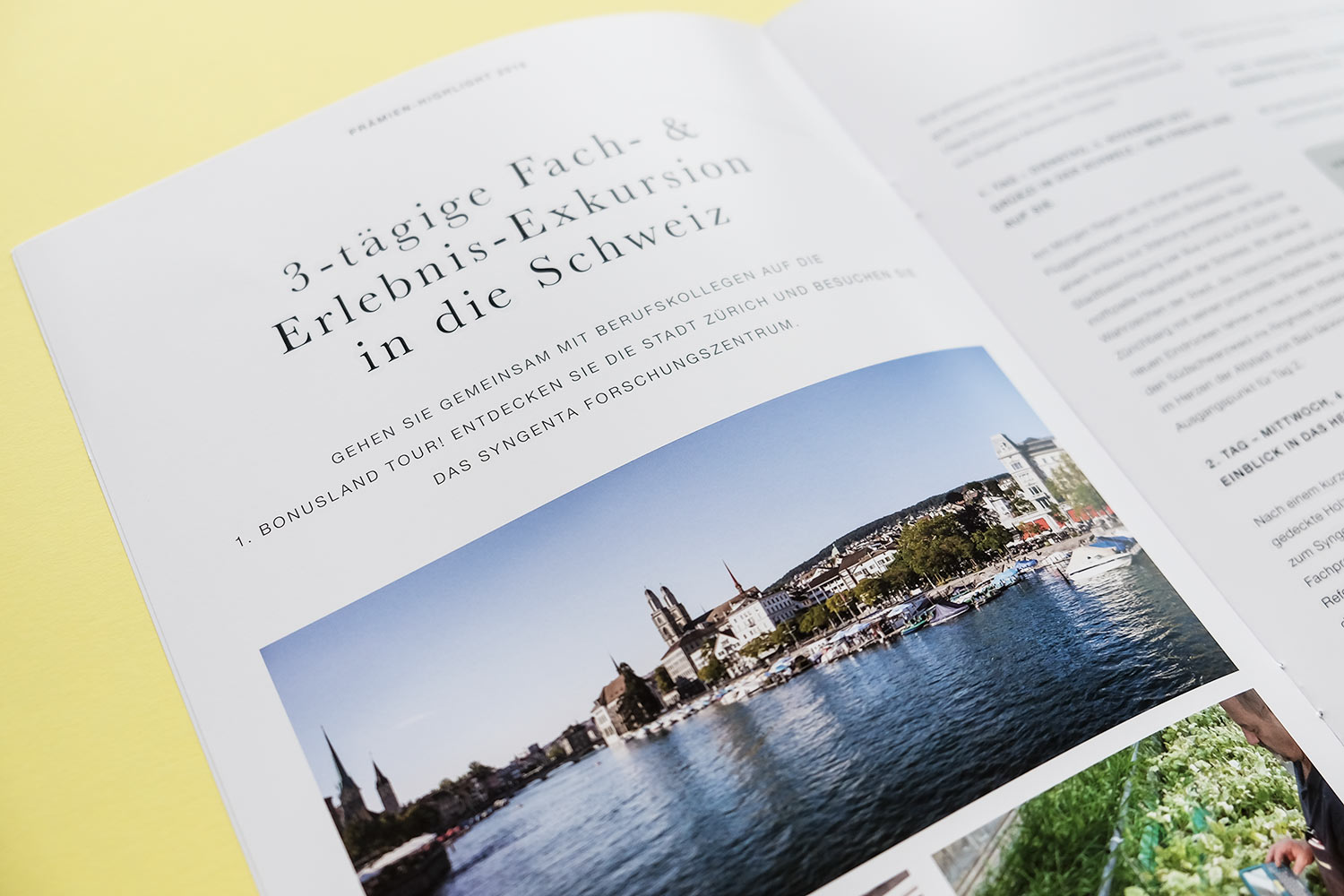
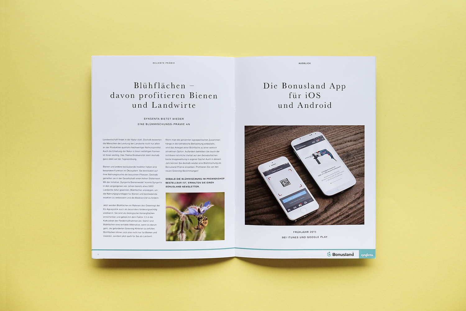
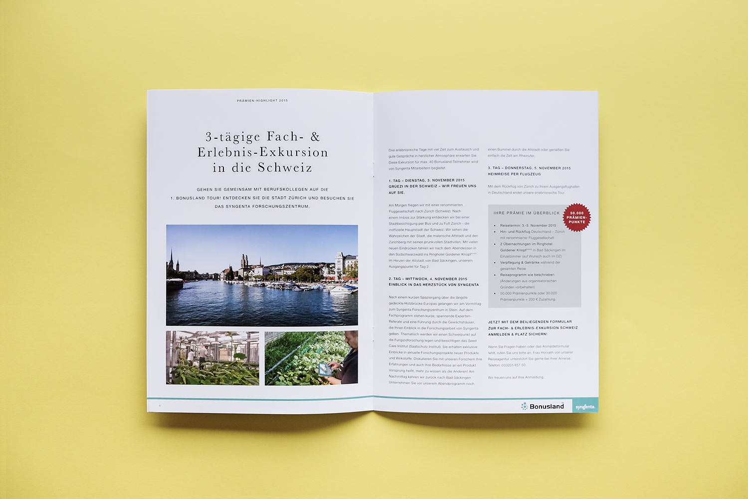
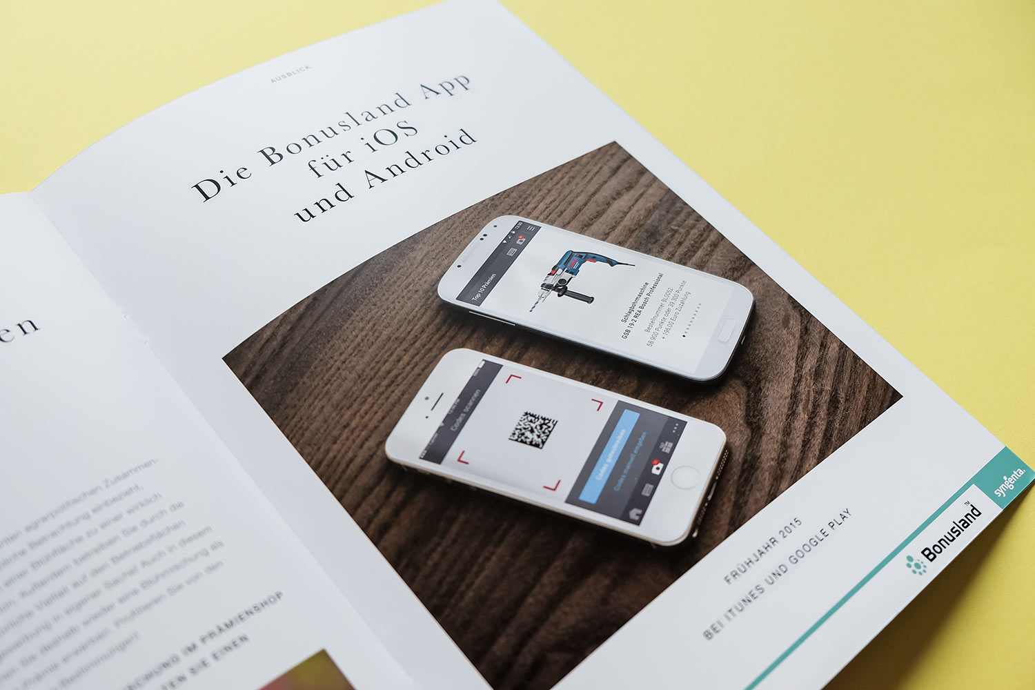
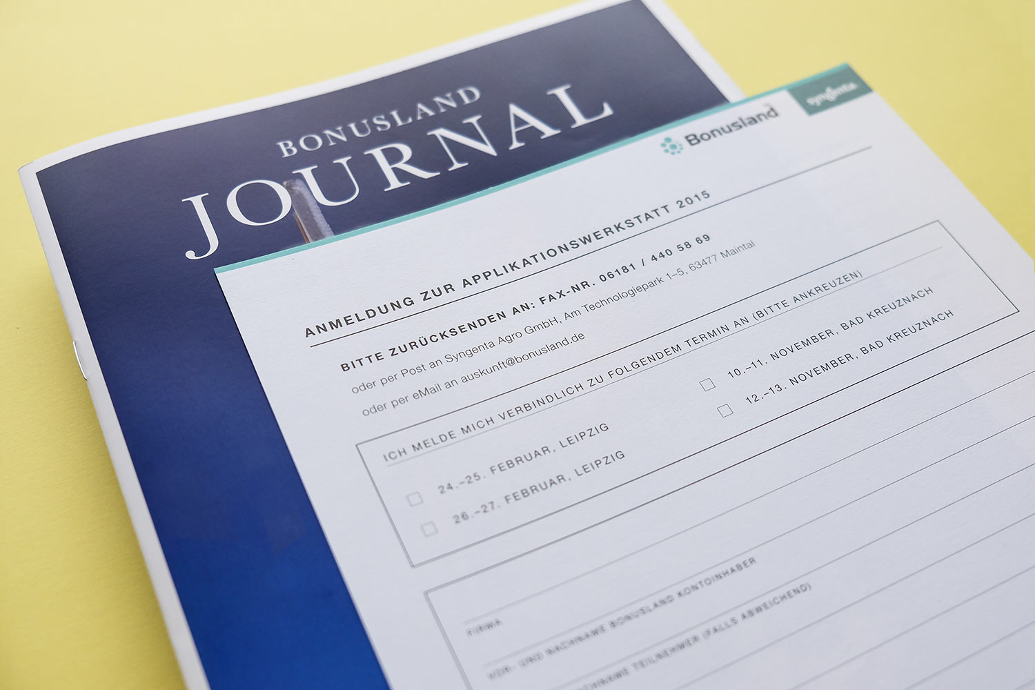
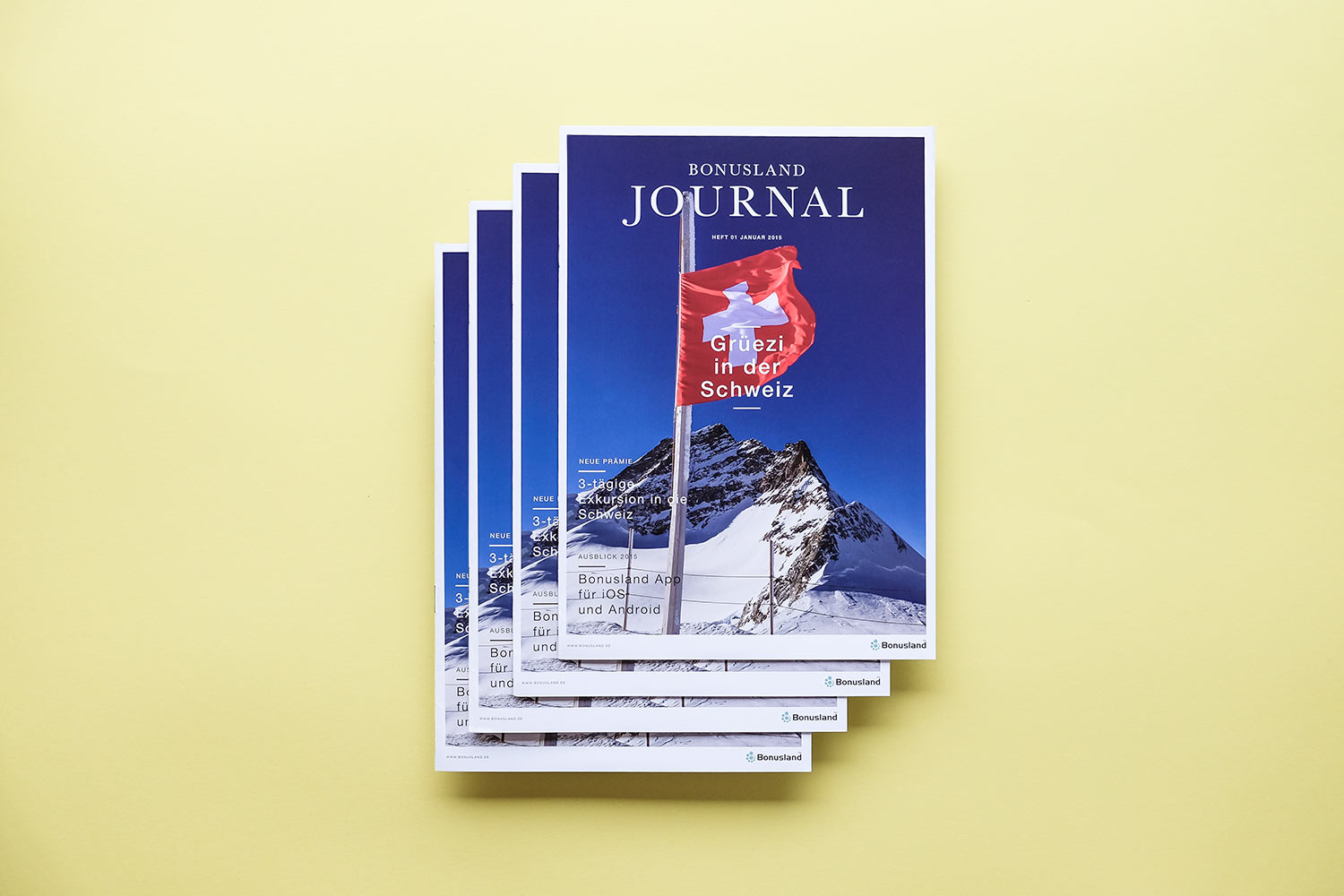
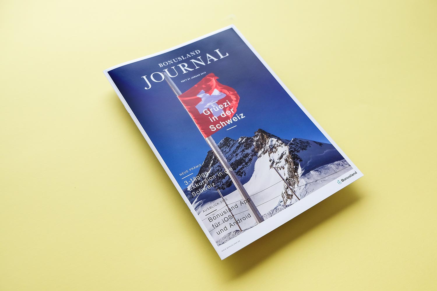
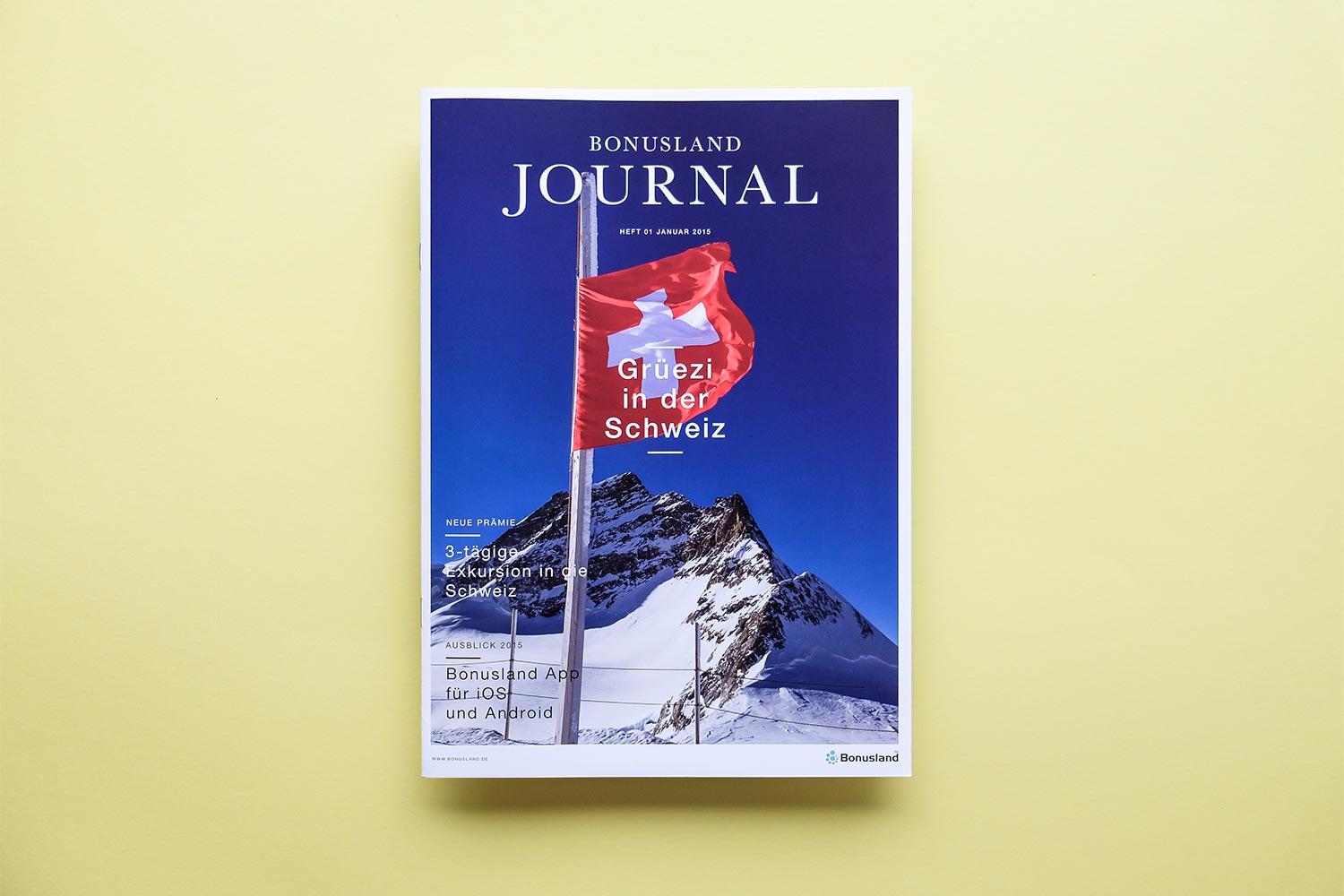
We designed “Bonusland Journal” for our long-term customer, Syngenta Agro’s Bonusland reward system, the annual corporate magazine about the latest developments in agricultural technology and within the rewards program. We created infographics and mockups to show their content in the best light. They also trusted us with taking care of the printing process and all communication with third parties. Talk about a dream team.
2014
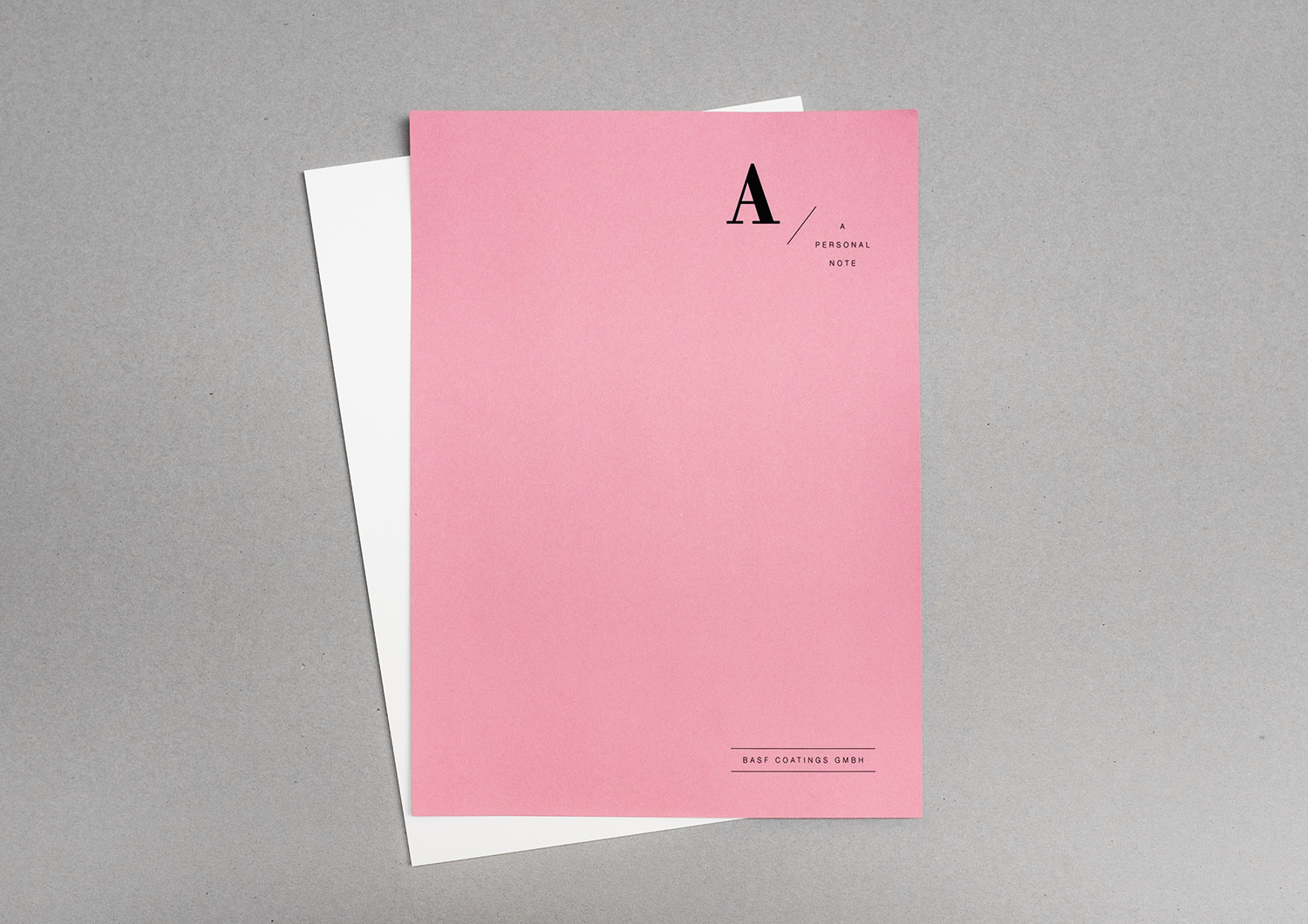
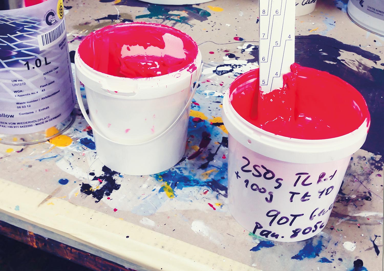
BASF Coatings
Automotive
• Concept
• Layout
• Typography
• Production support
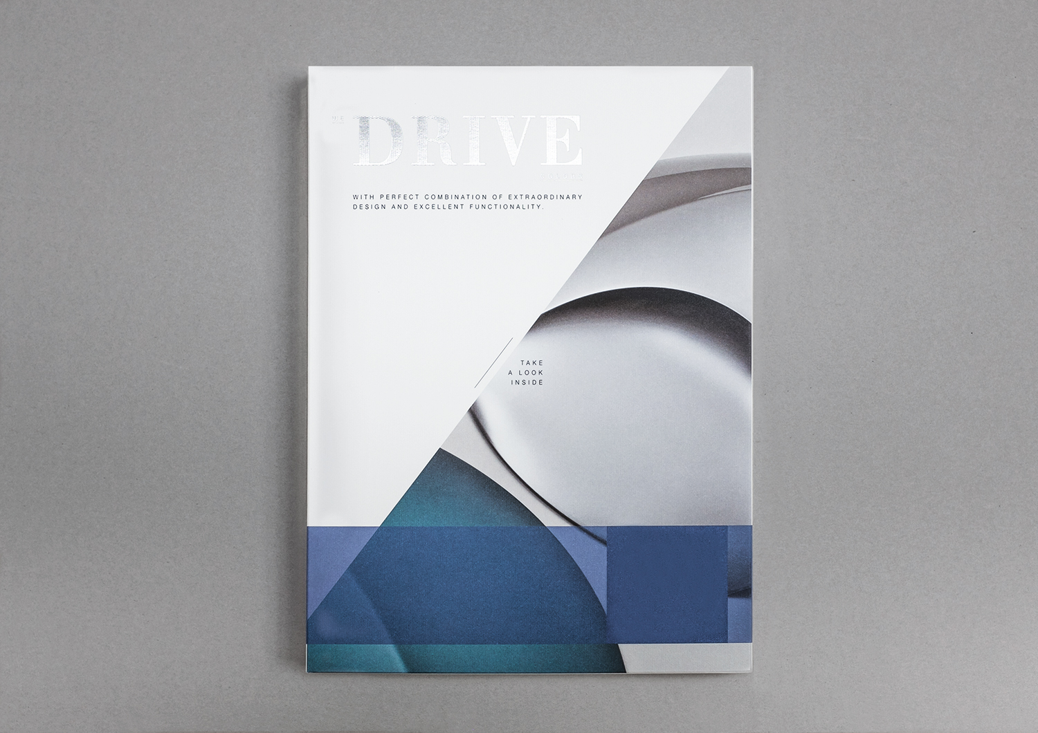
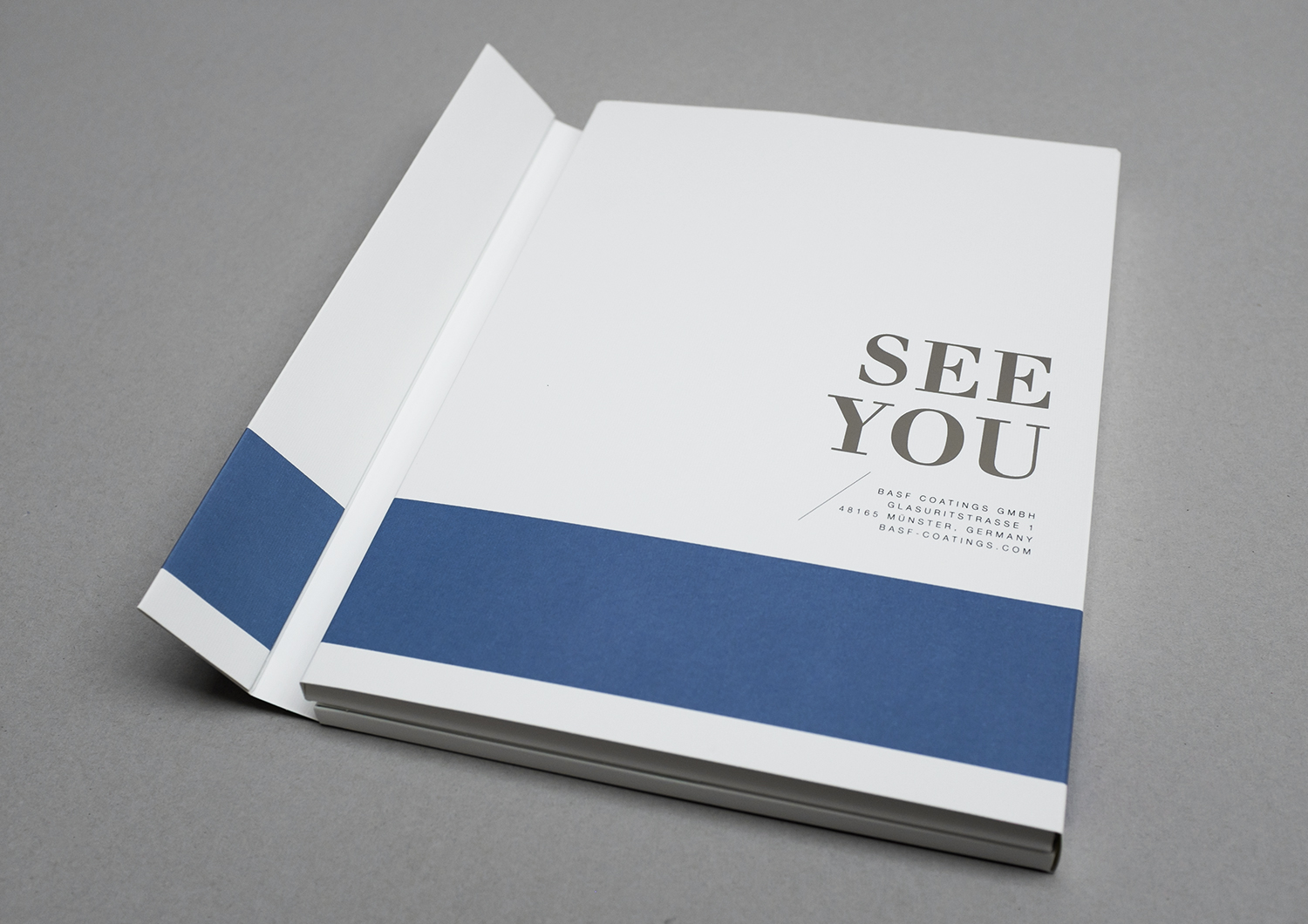
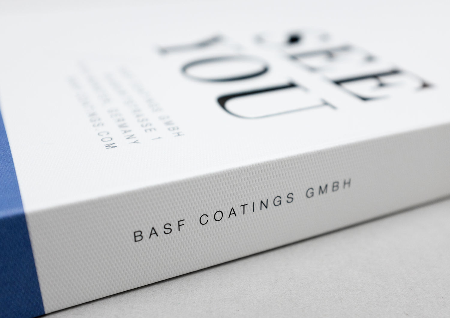
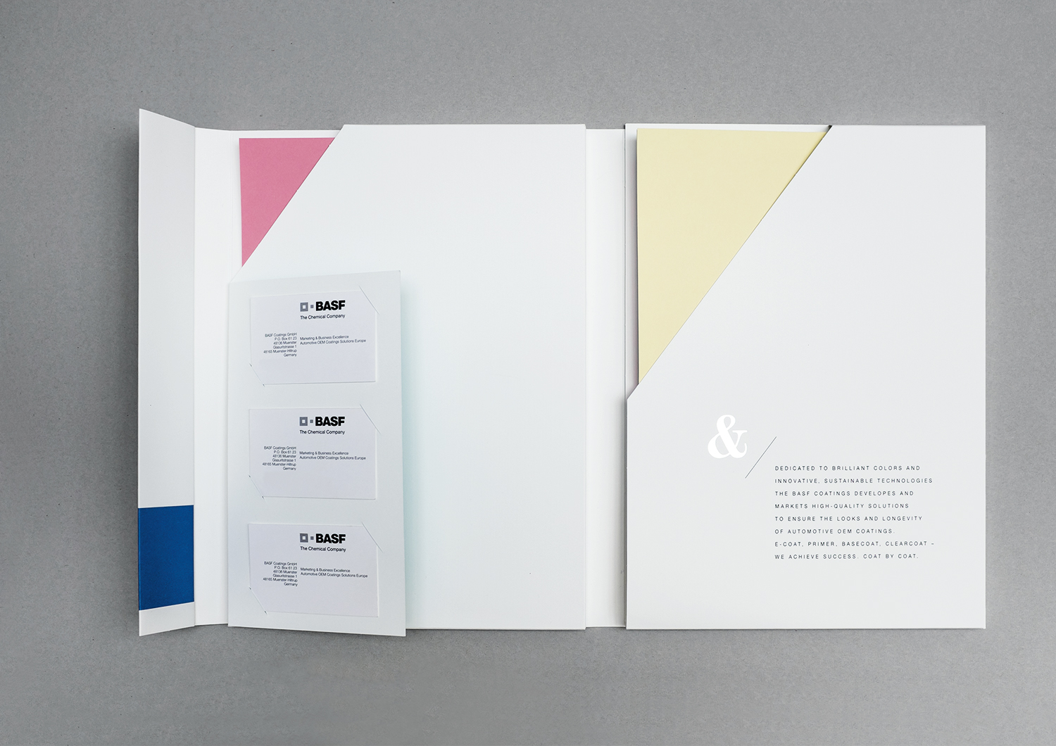
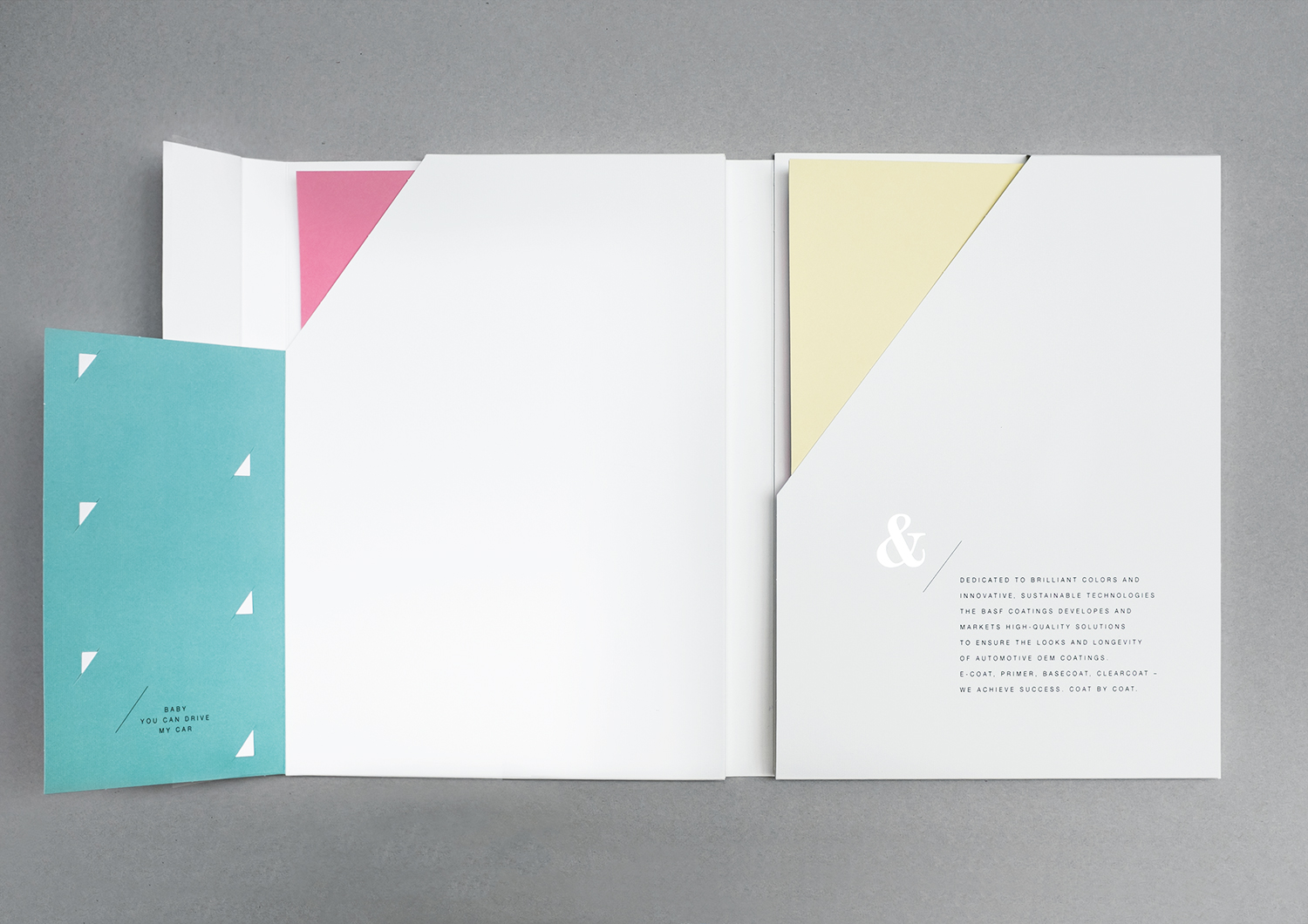
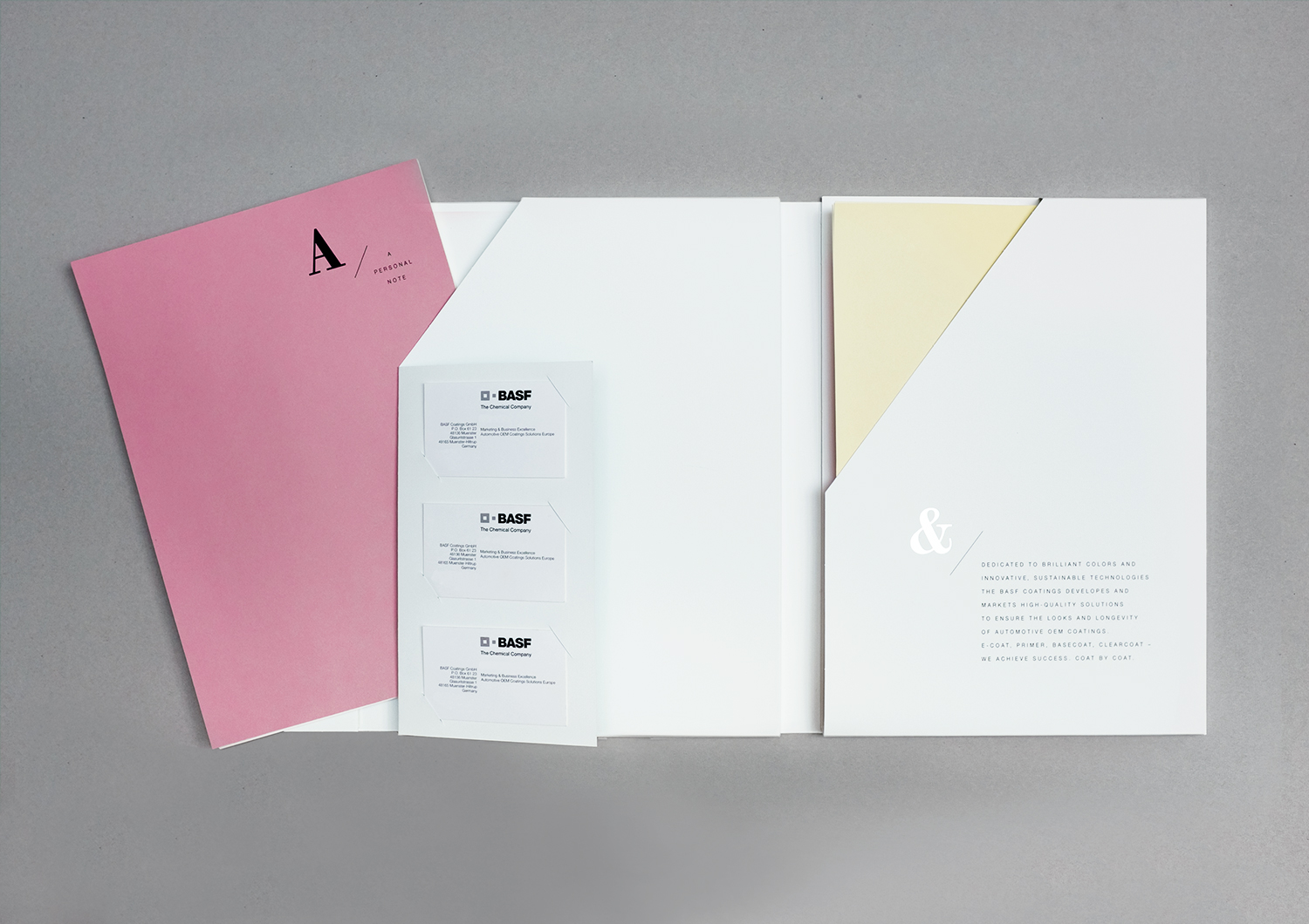
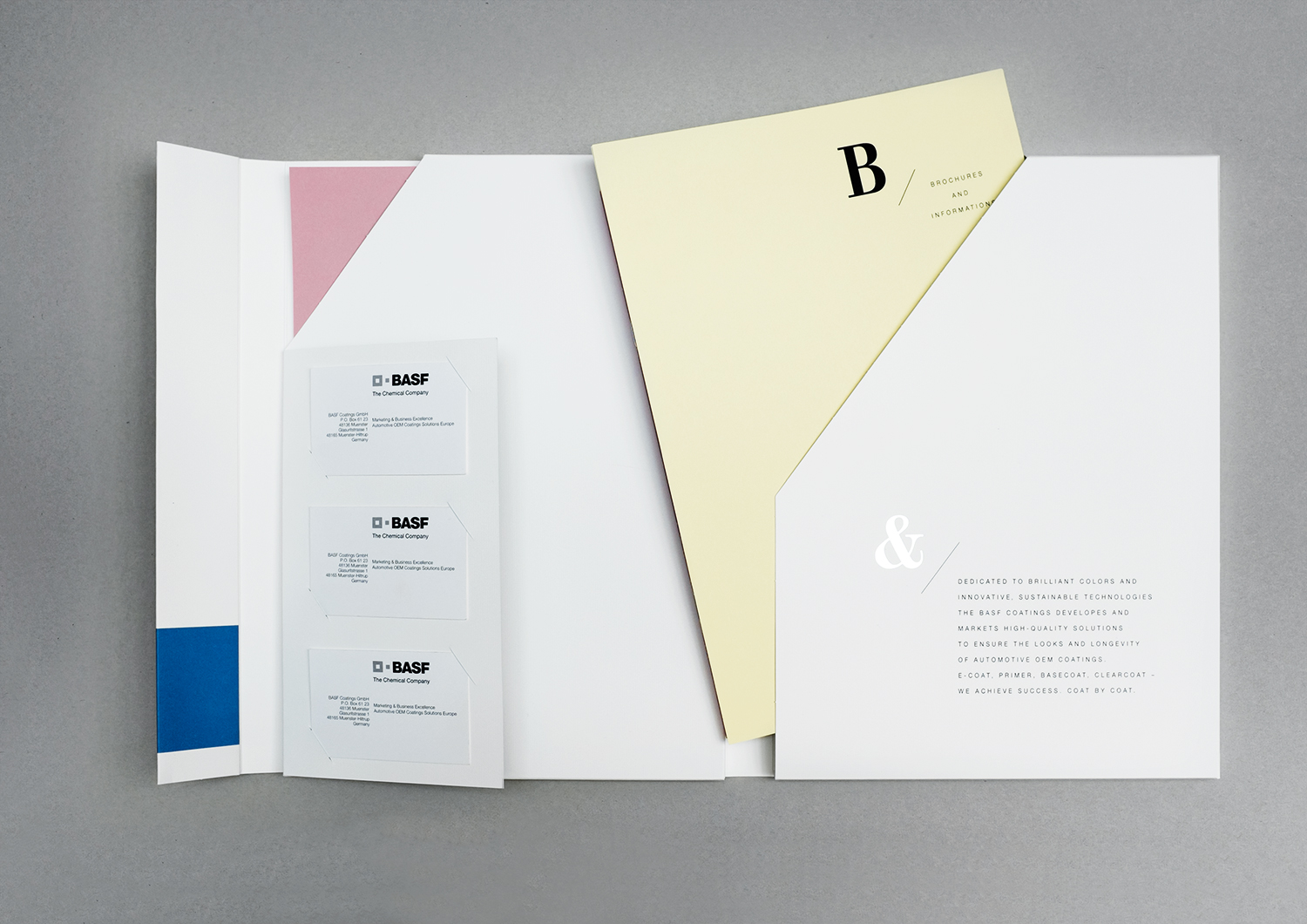
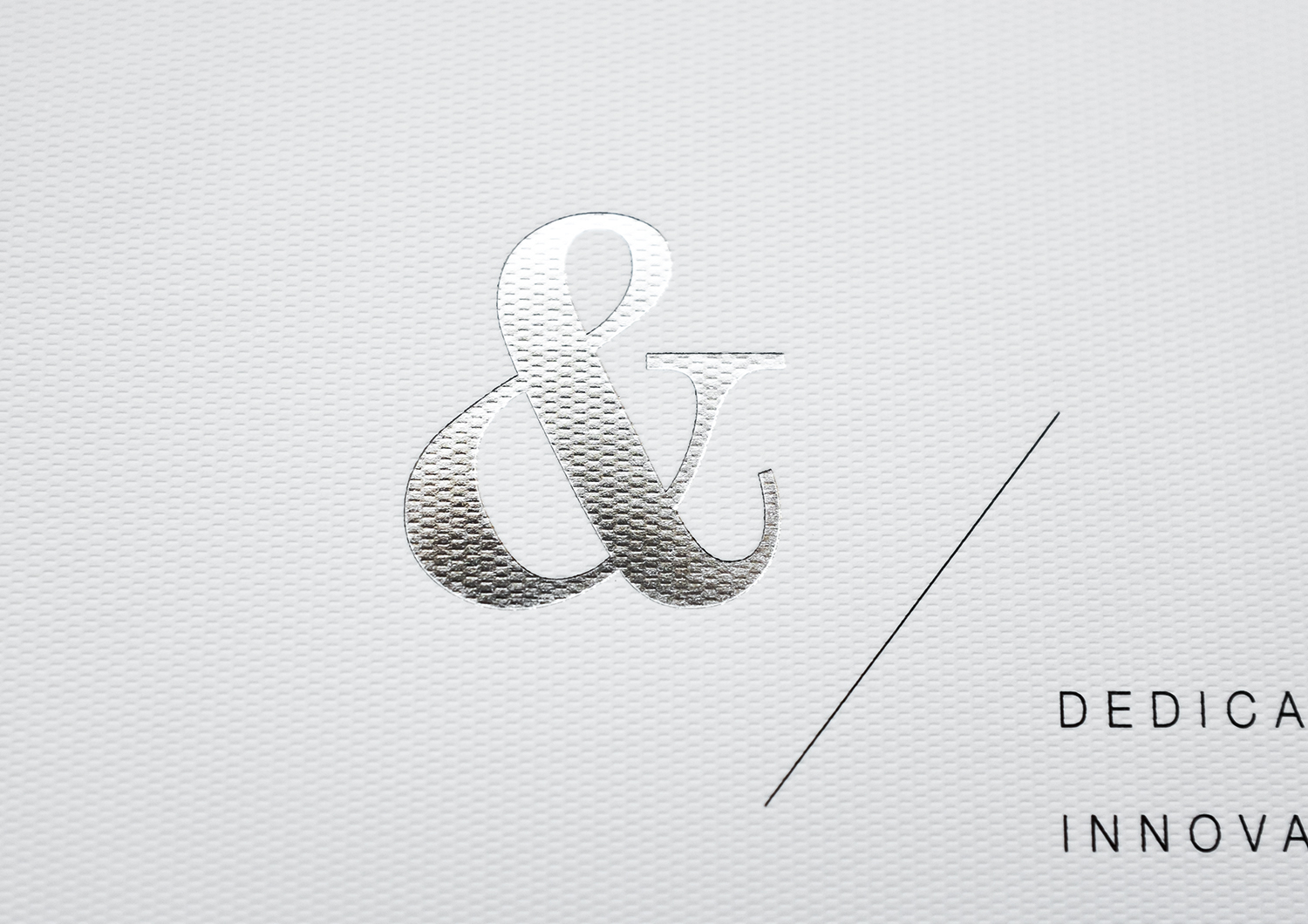
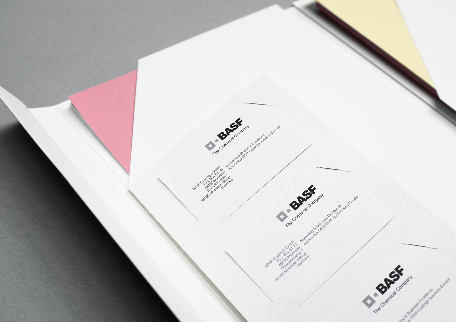
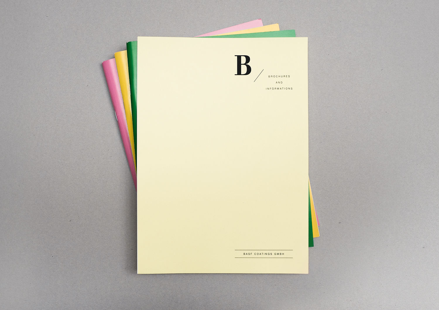
The members of the board at BASF Coatings GmbH needed an exclusive portfolio folder. So we developed it. Completely bespoke. Die-cut and folded from a single piece of material, now it holds all important documents: correspondence, brochures, business cards, a USB flash drive. We embossed the folder with silvery lettering and design on the oustide and inside.
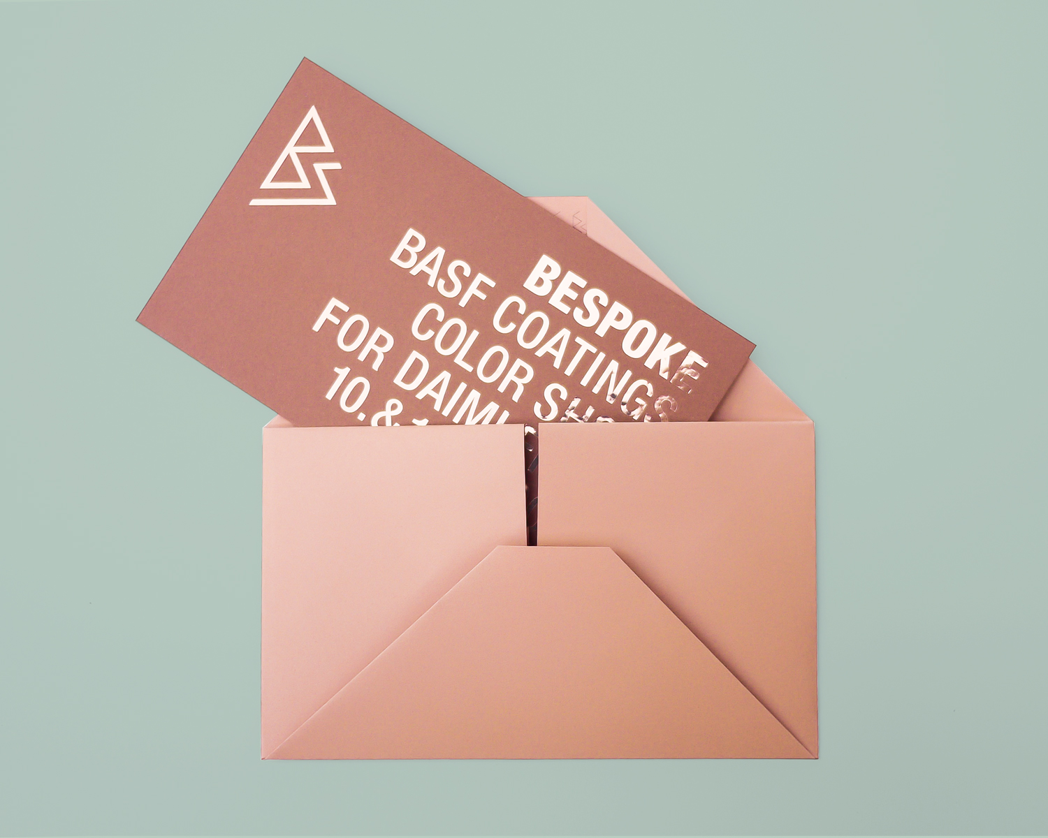
BASF Coatings
Automotive
• Ideation
• Concept
• Typography
• Production
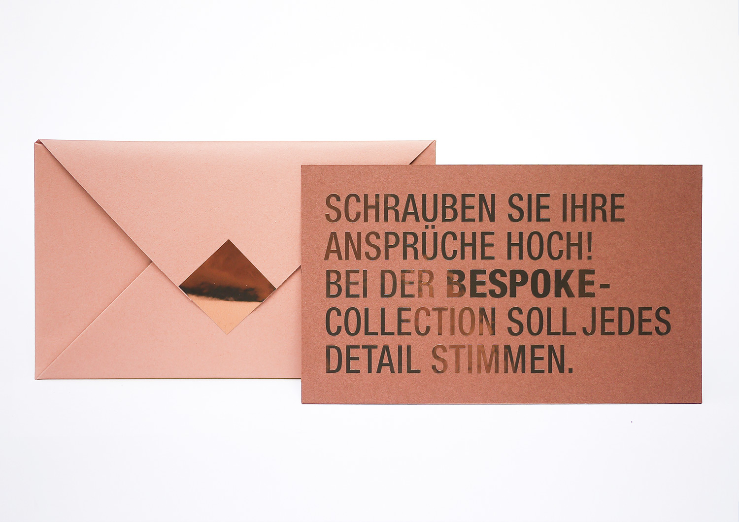
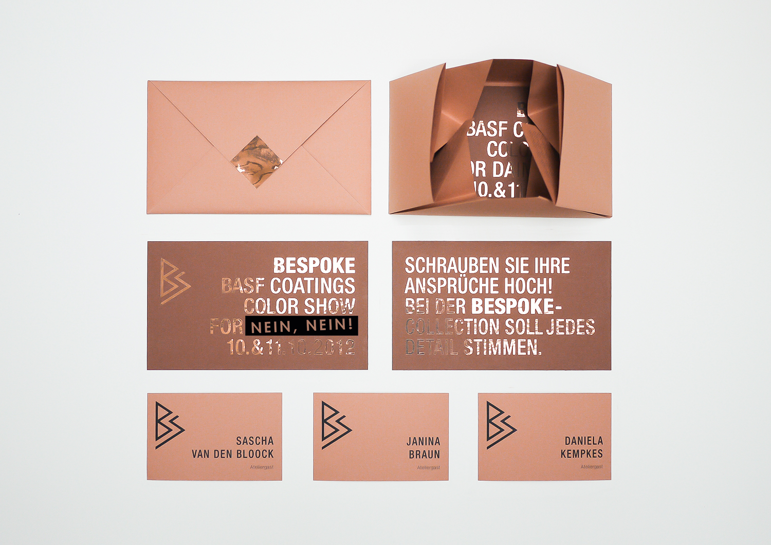
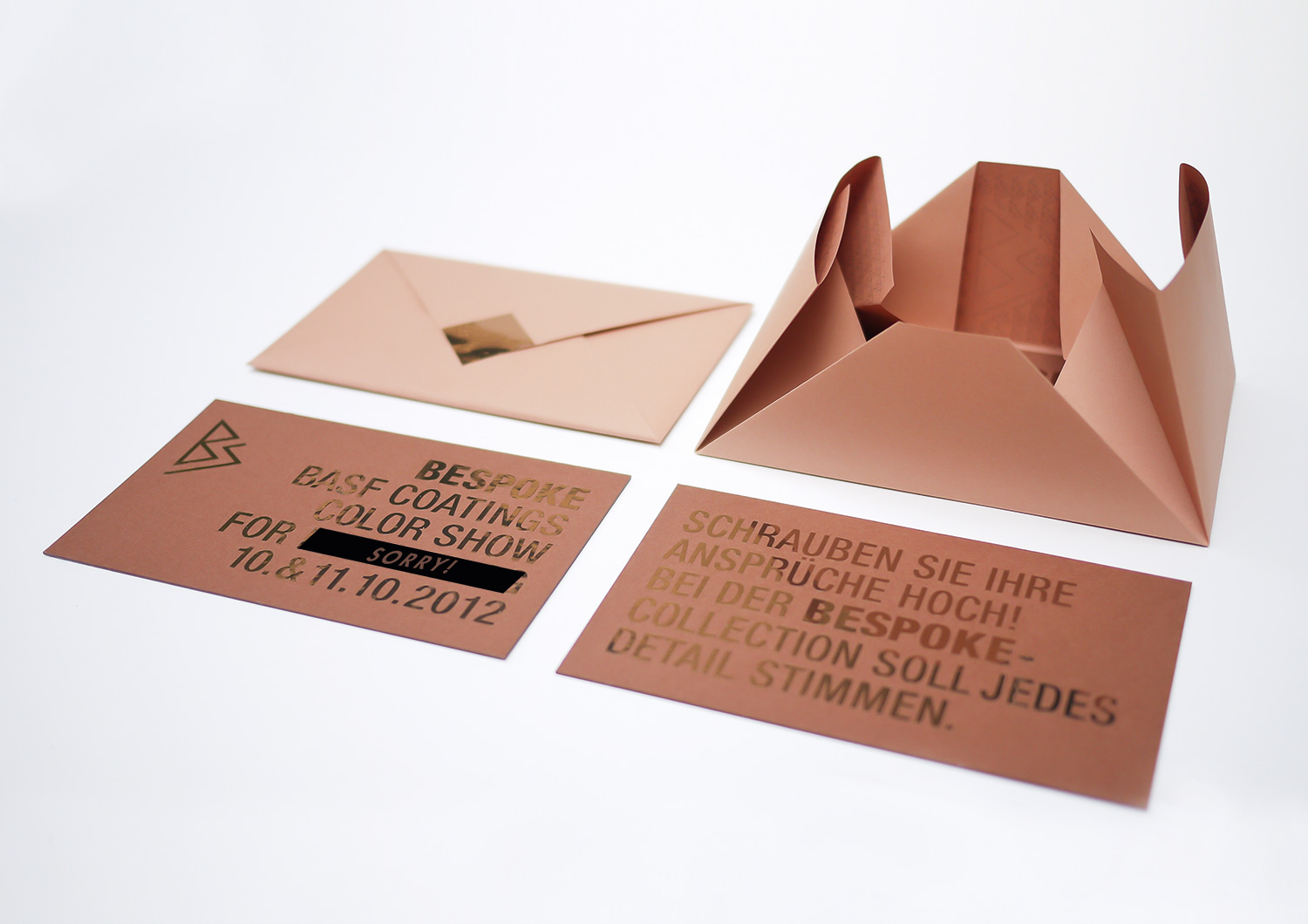
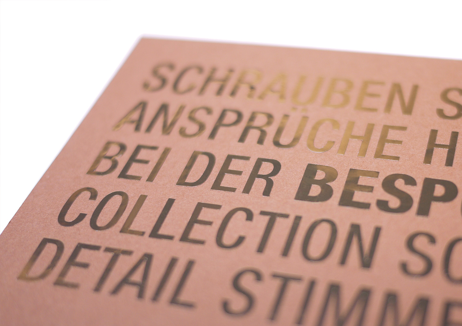
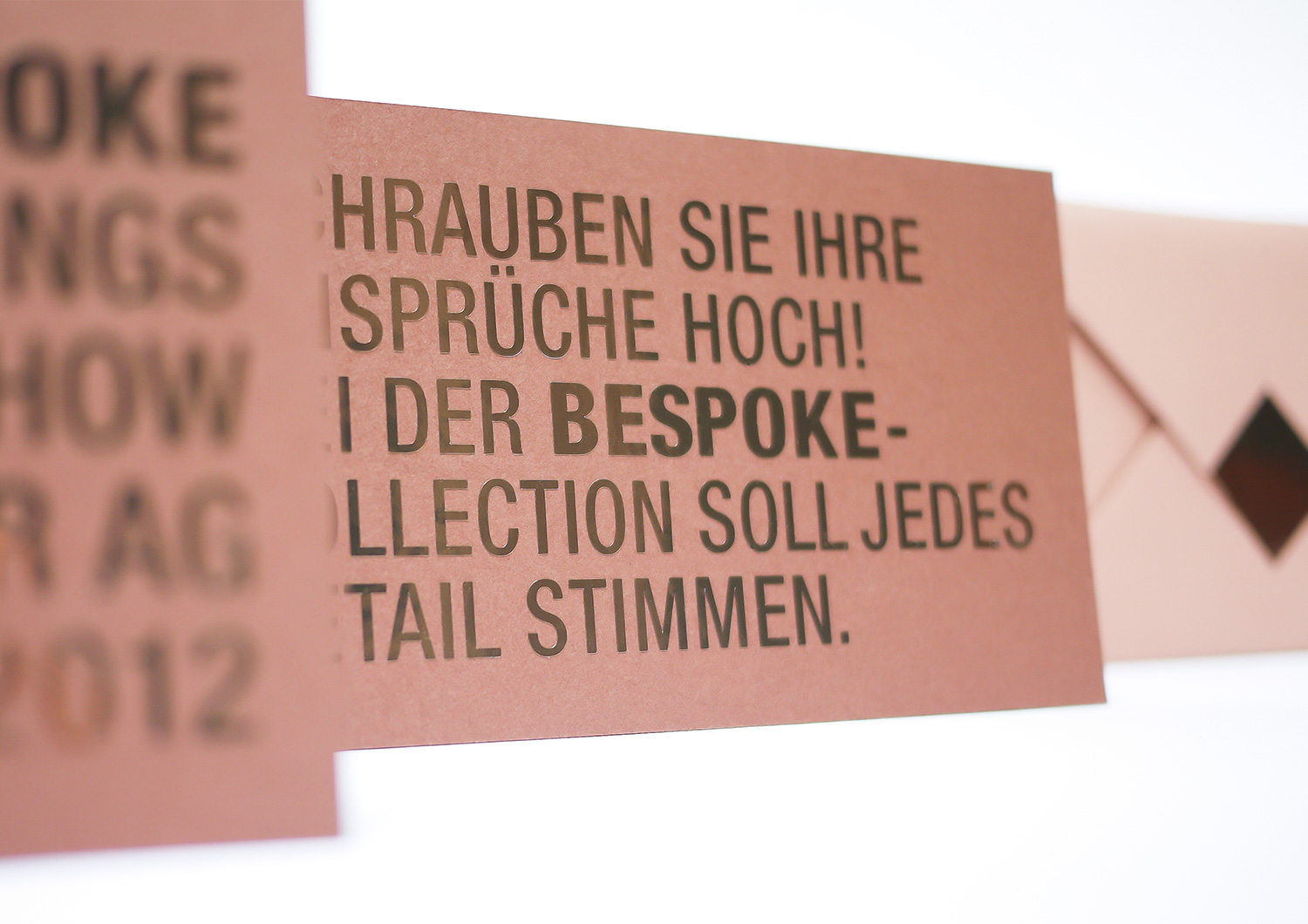
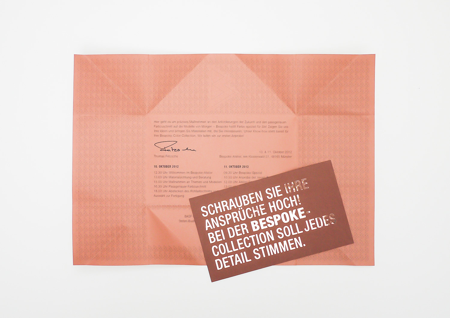
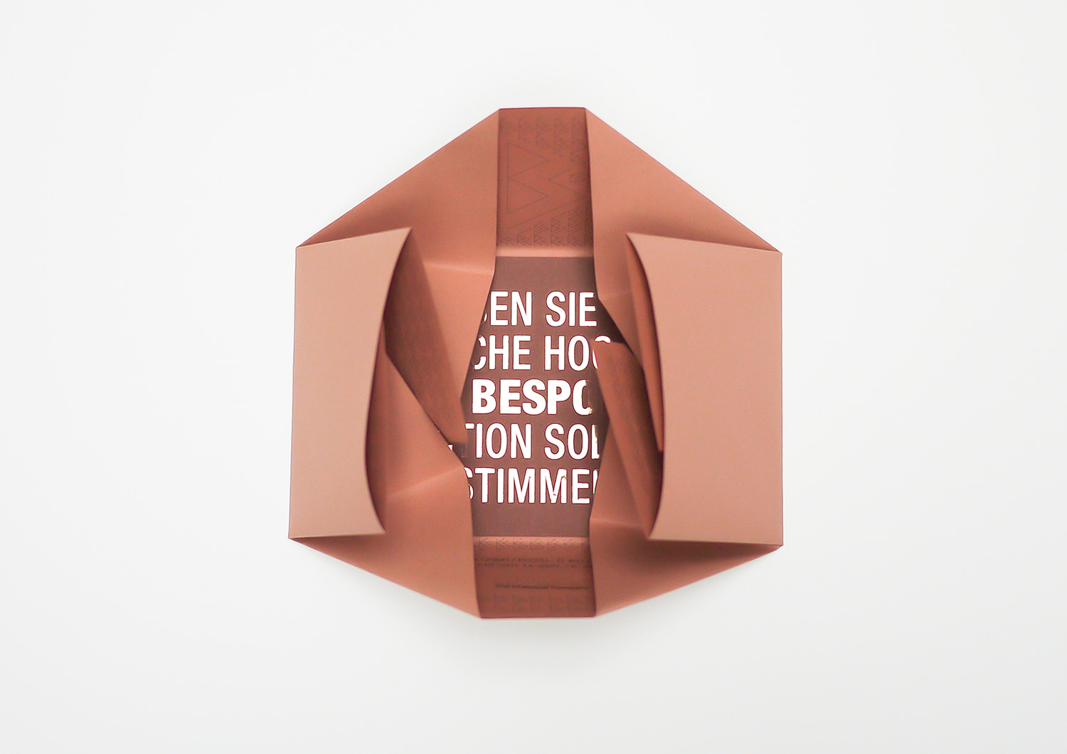
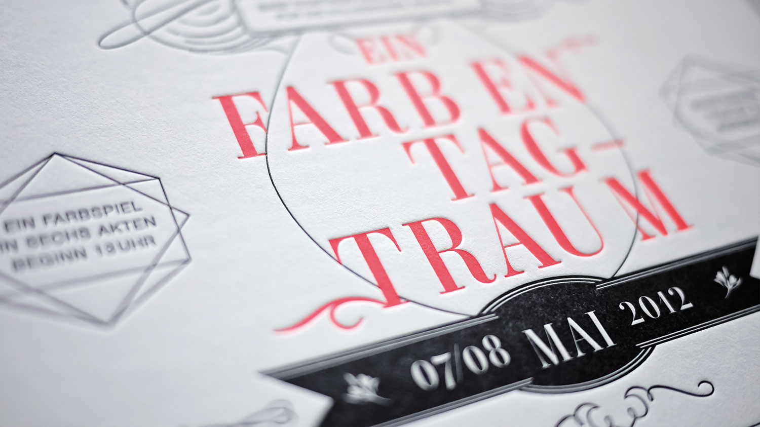
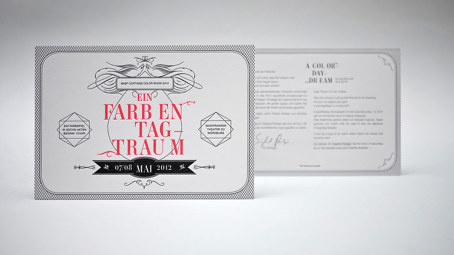
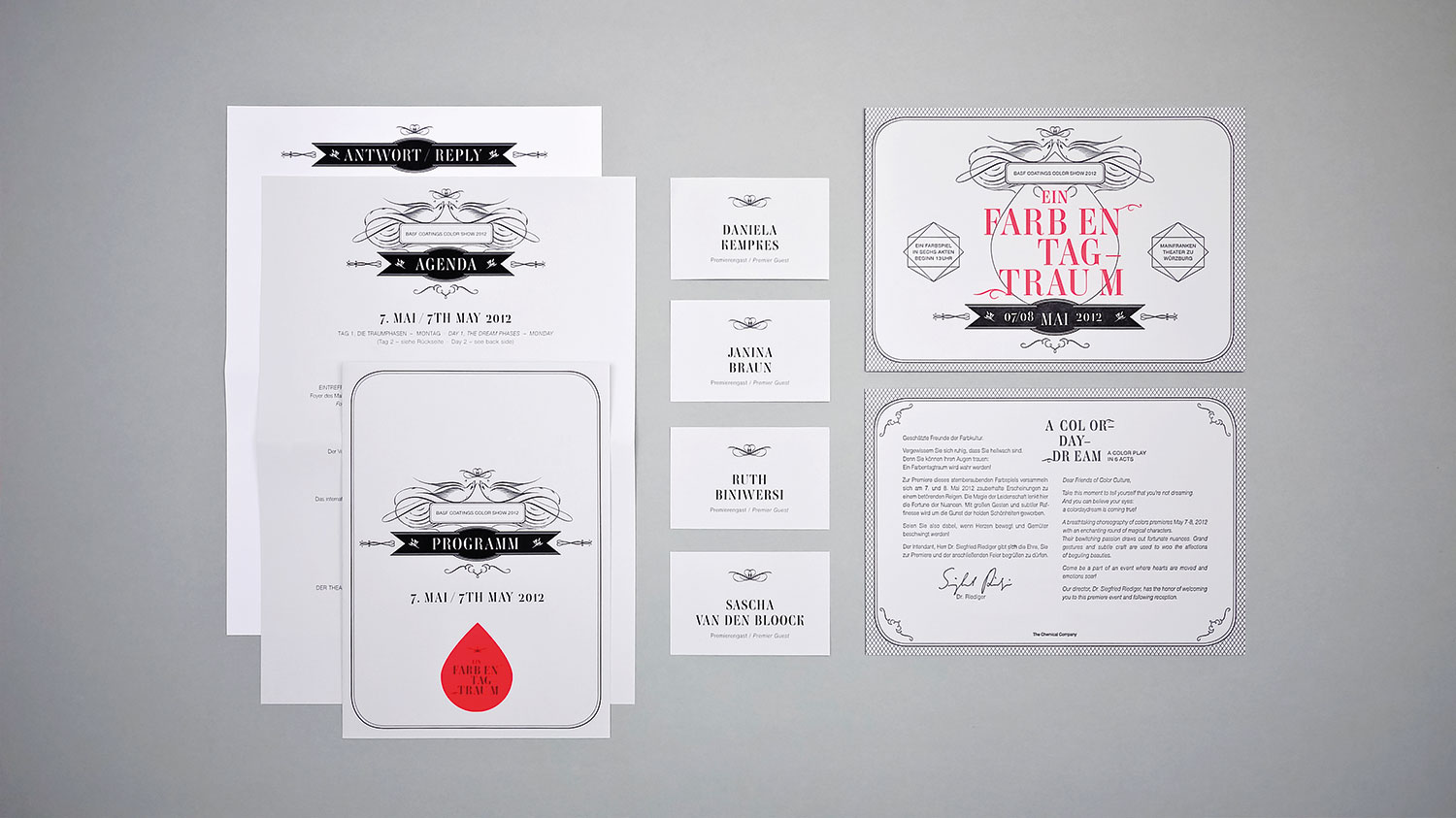
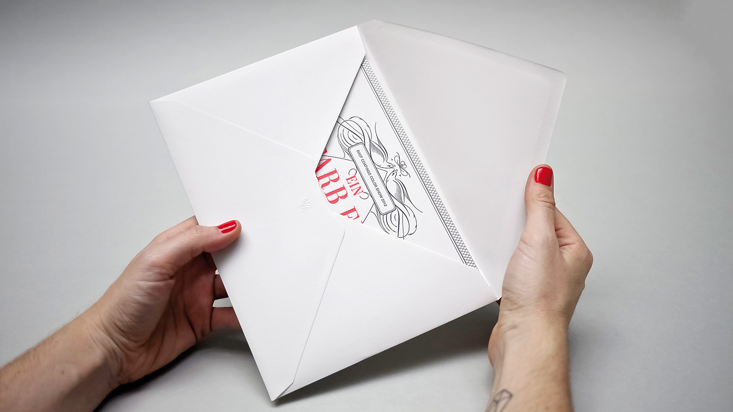
A card that stays, even after the event. To achieve this goal, we tossed all the cool combinations into this challenging print story.. We designed the text block in massive capital letters and plotted them on a fancy copper mirror film. And that’s when the fun really started. So with utmost care, we trimmed every single letter using our scalpels from off the rack. Finally we had to polish every single word by hand and place each invitation into the origami envelope especially created for that project.
BASF Coatings
Automotive
• Book Concept
• Editorial Design
• Development of a Visual Language
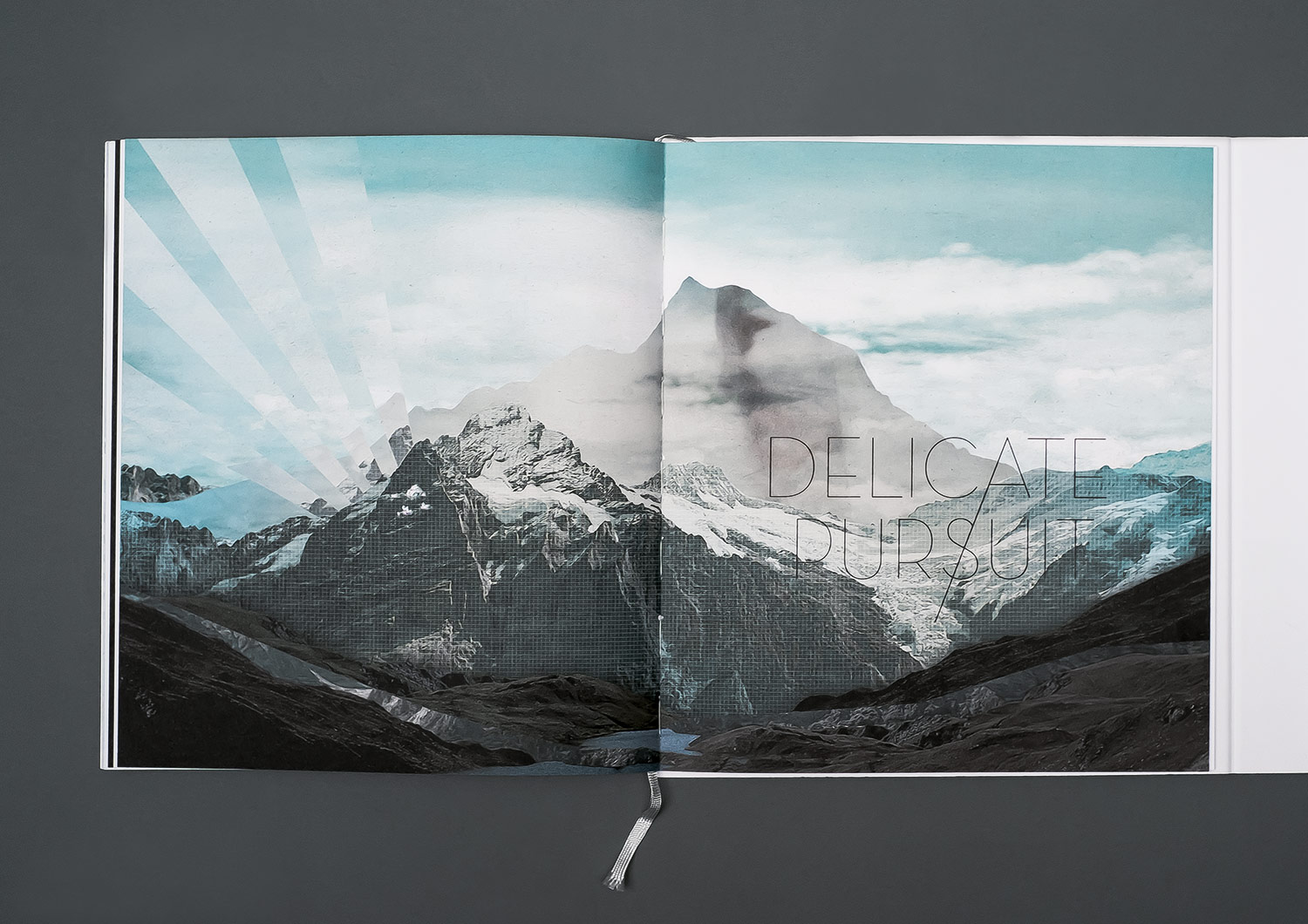
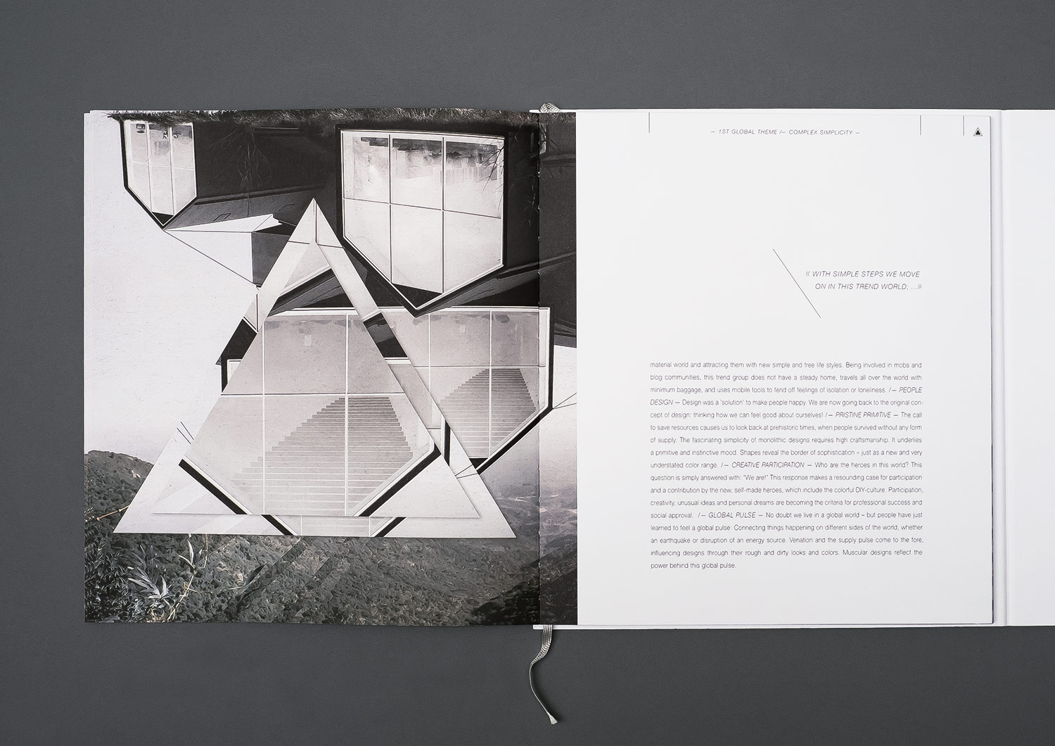
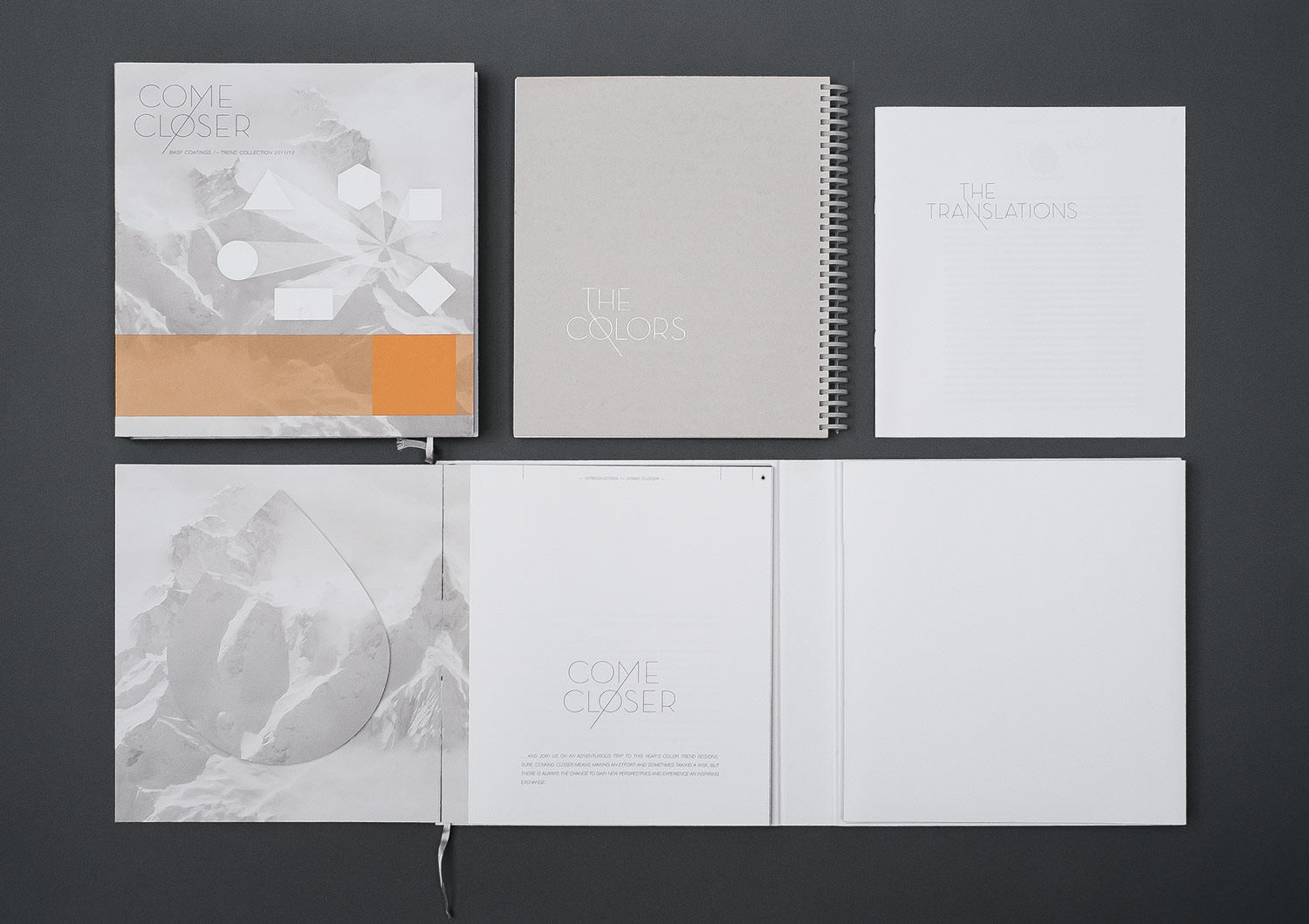
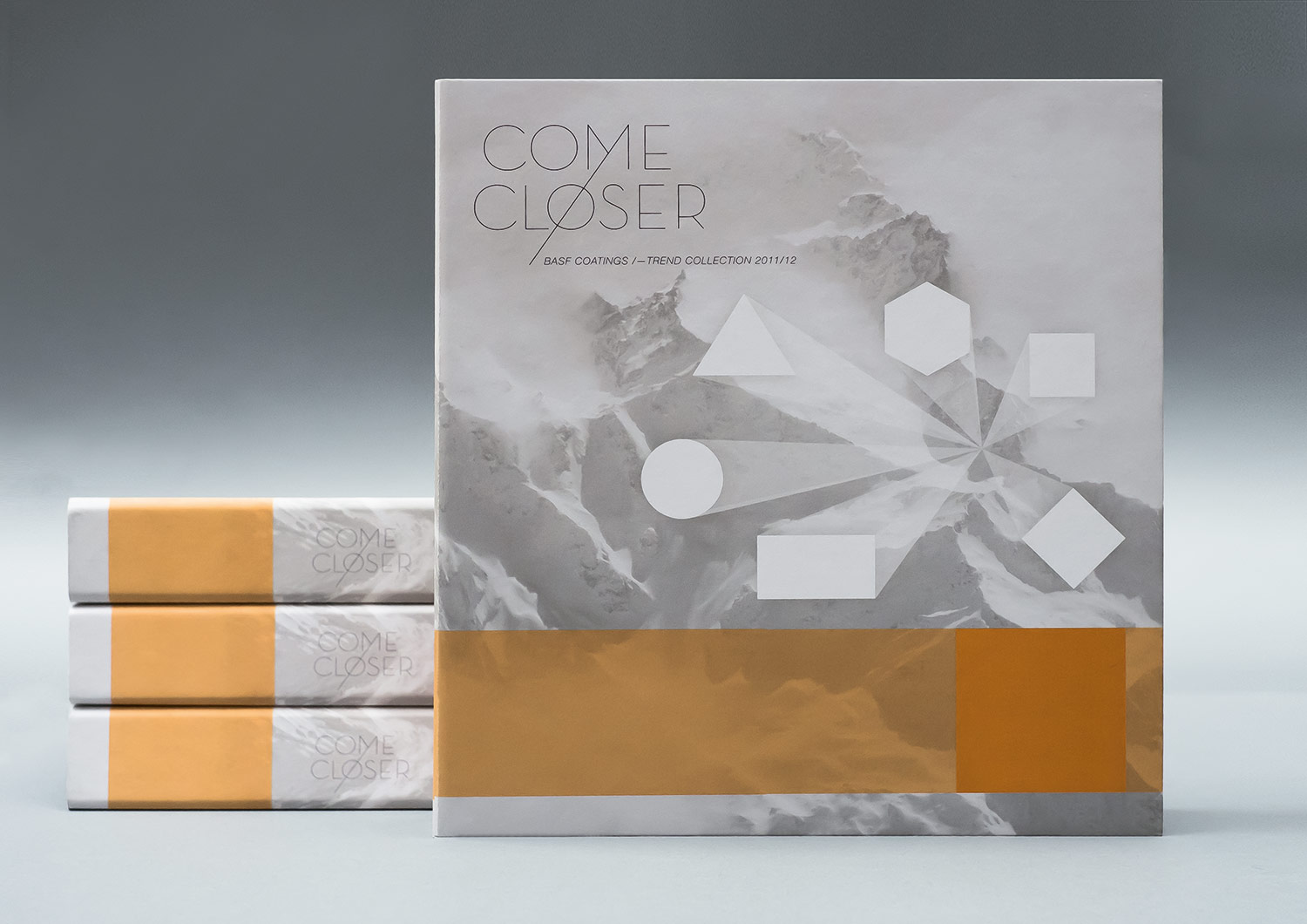
For the first time in our history with BASF COATINGS, we’ve found a place not only for the European point of view but also for the American and Asian ones. May we introduce: The wonderful international Design Team of BASF. Exciting! Our first global theme was COME CLOSER. Because that’s what it’s all about – approaching each other midway with slowness and respect, and finding one’s place in the global world. We also had to really dig in, for now our concept had to work convincingly on a global level. Okay, let’s go. But first, the biggest nut to crack was redesigning the book.
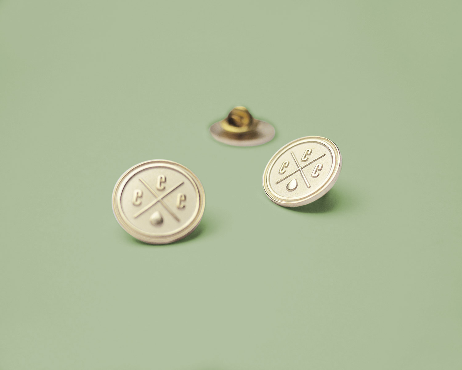
BASF Coatings
Automotive
• Ideation
• Concept
• Typography
• Production
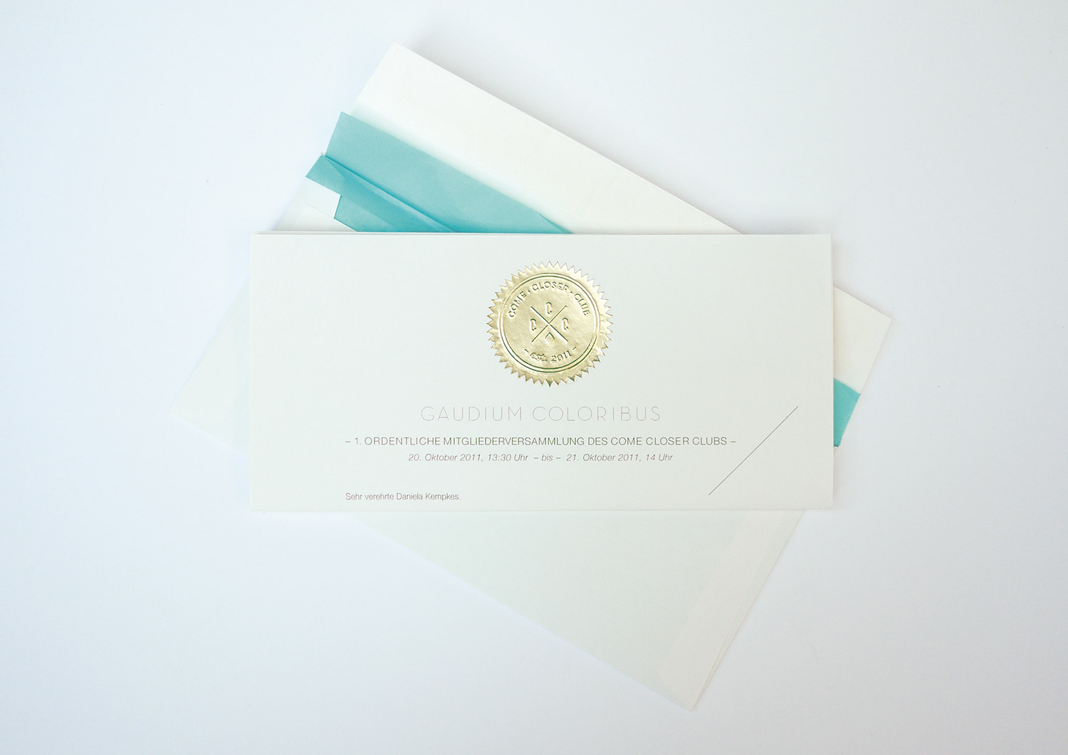
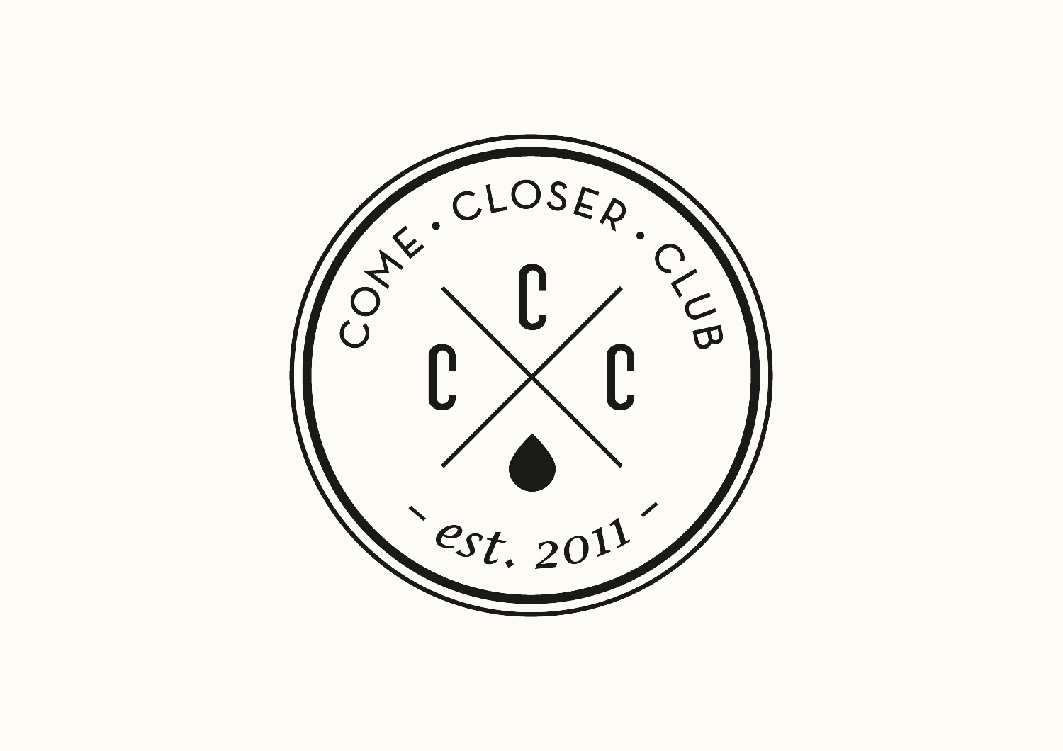
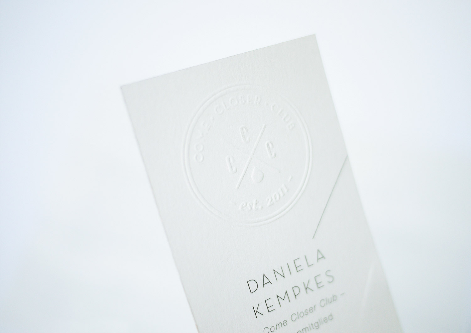
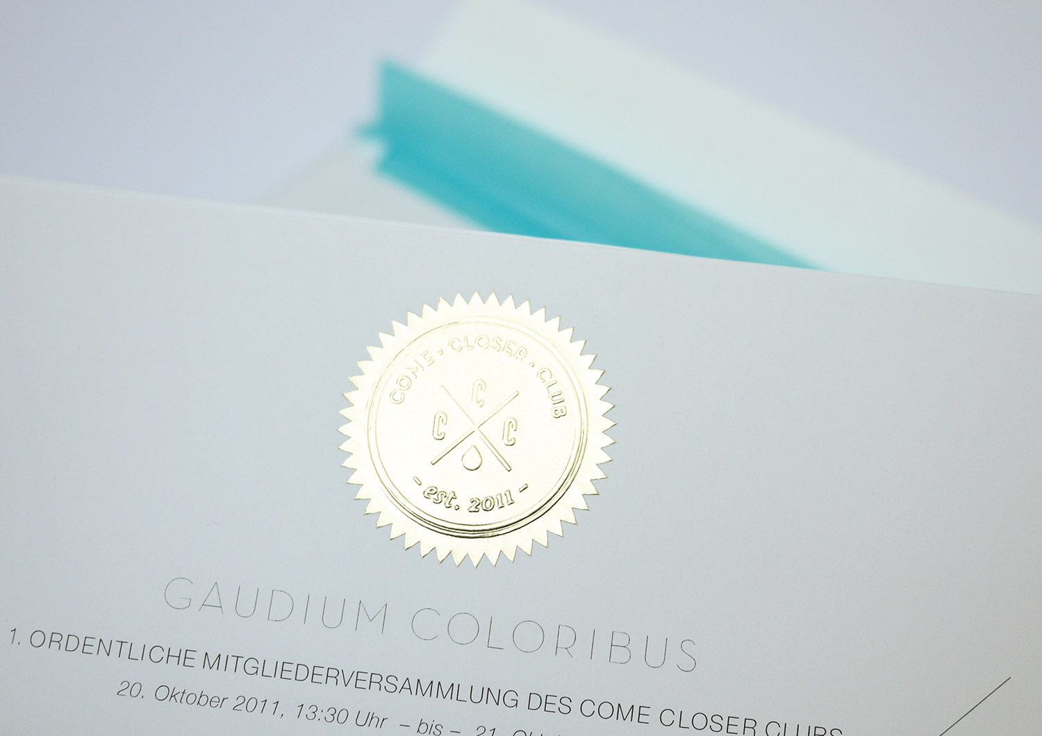
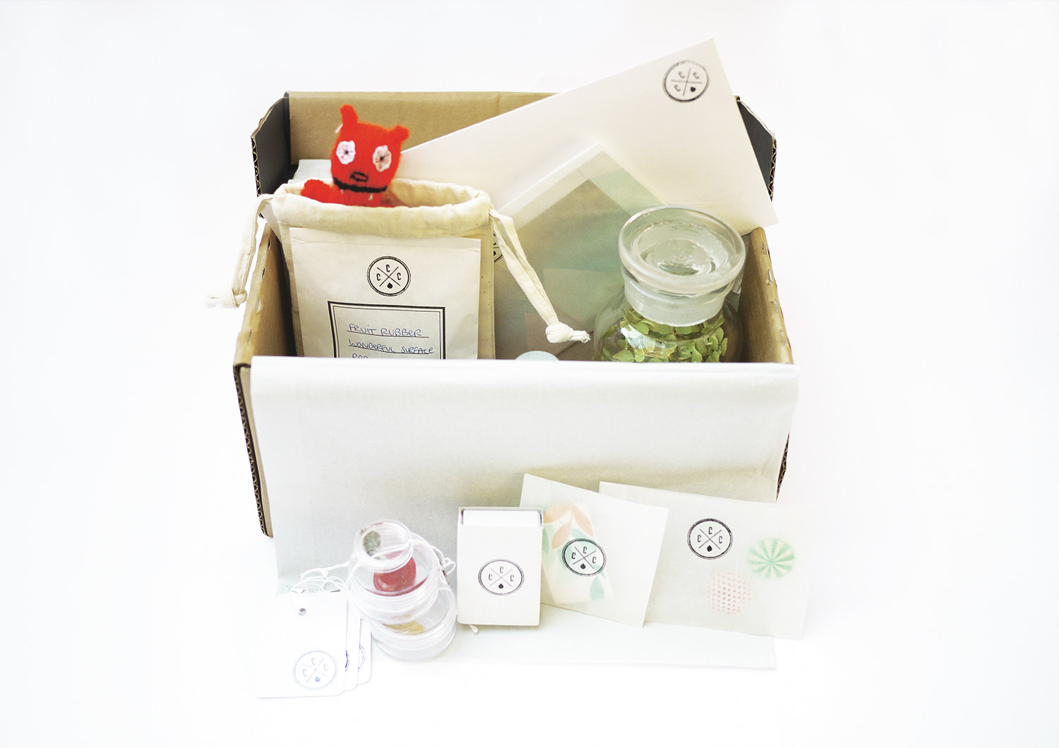
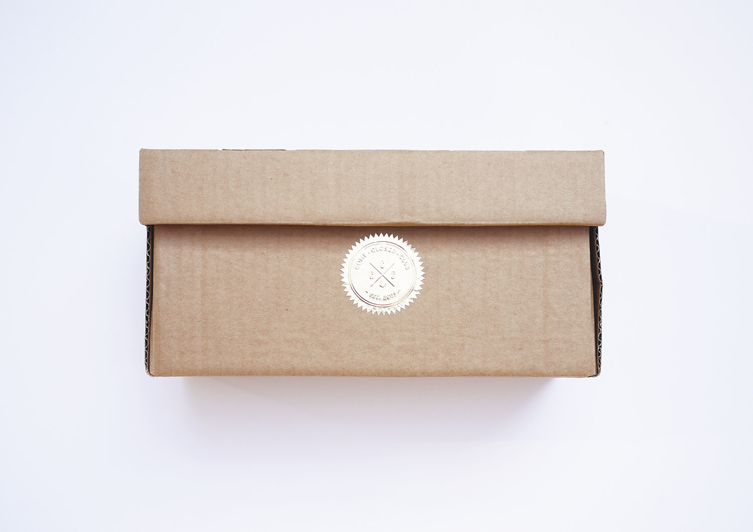
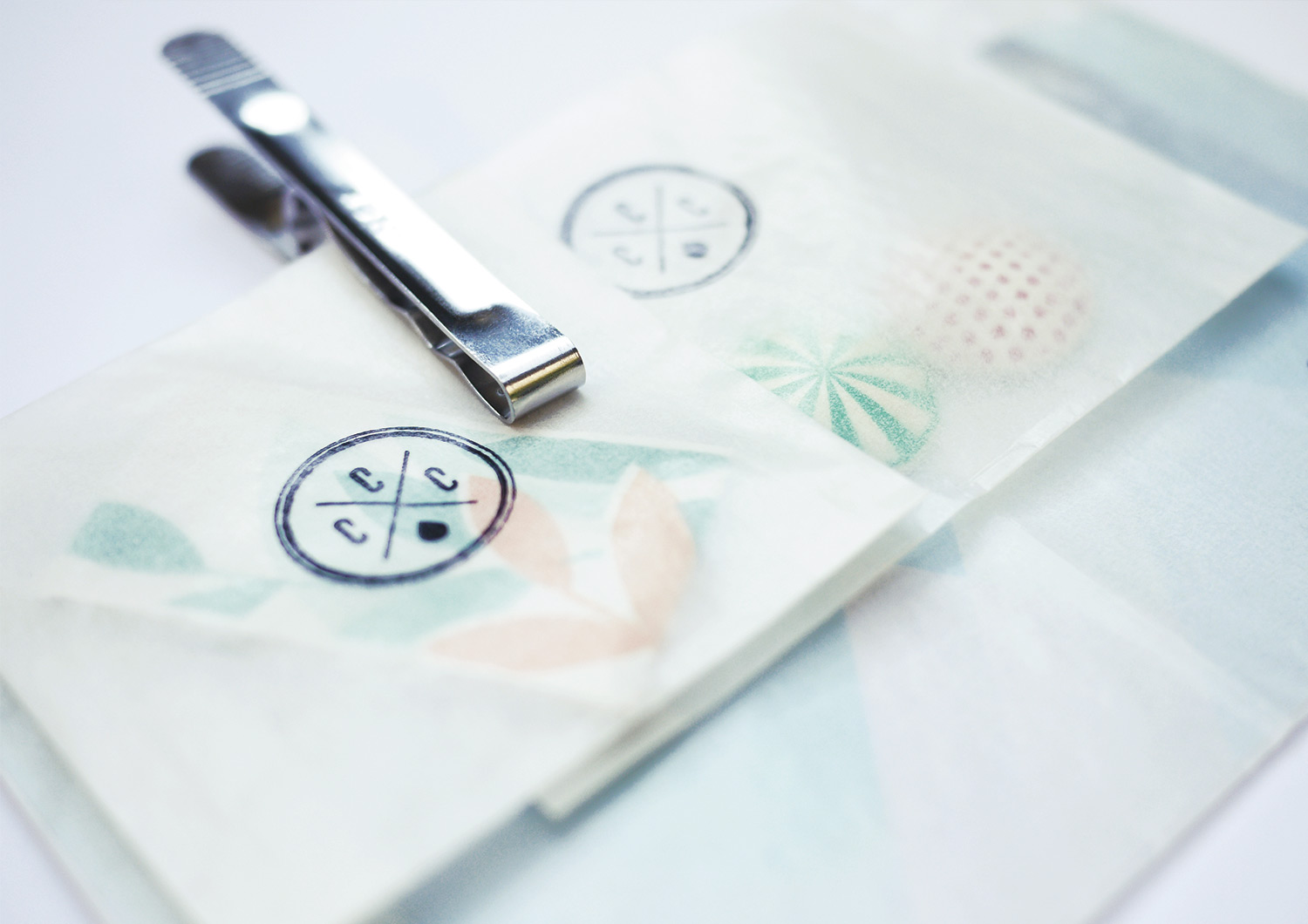
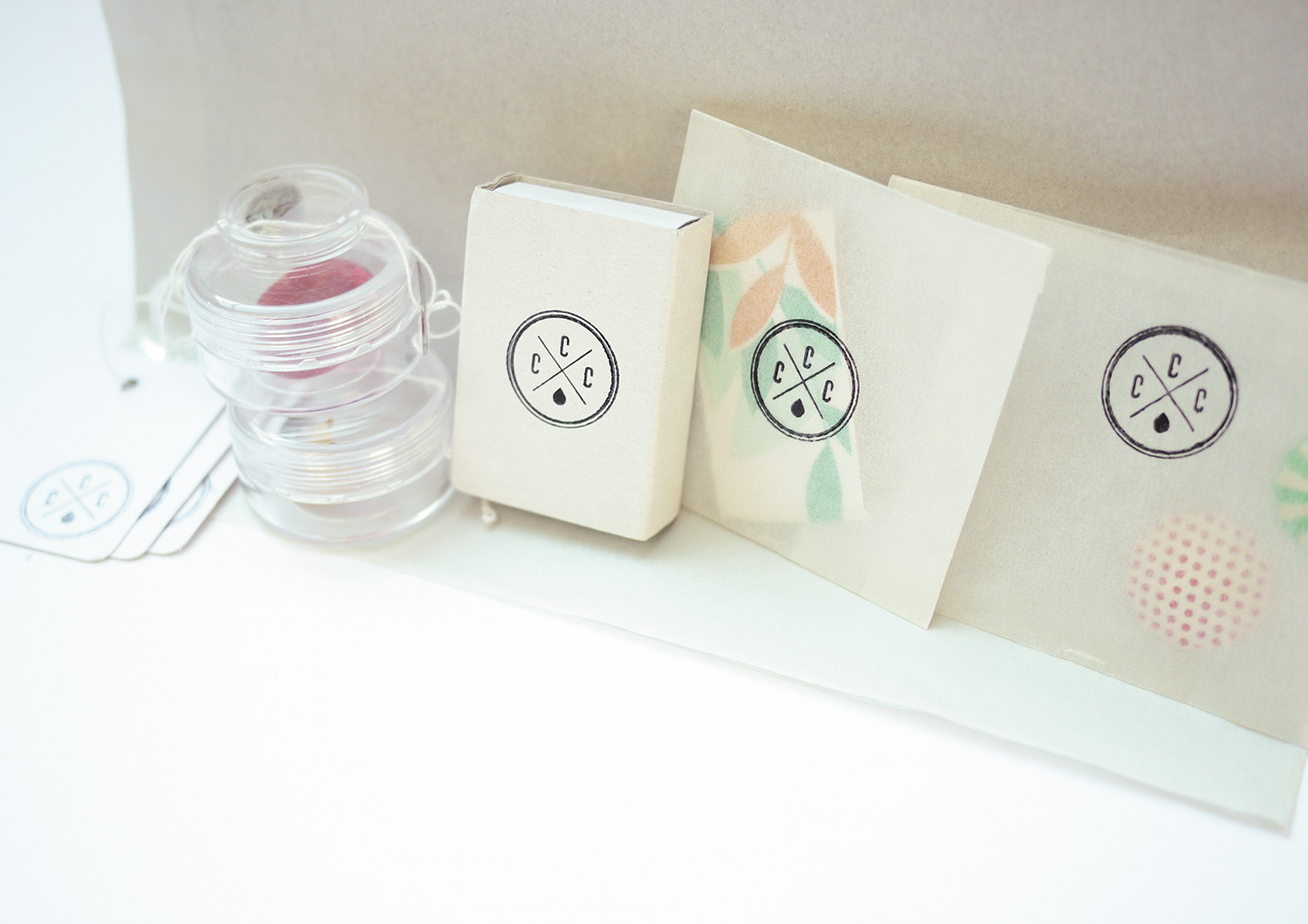
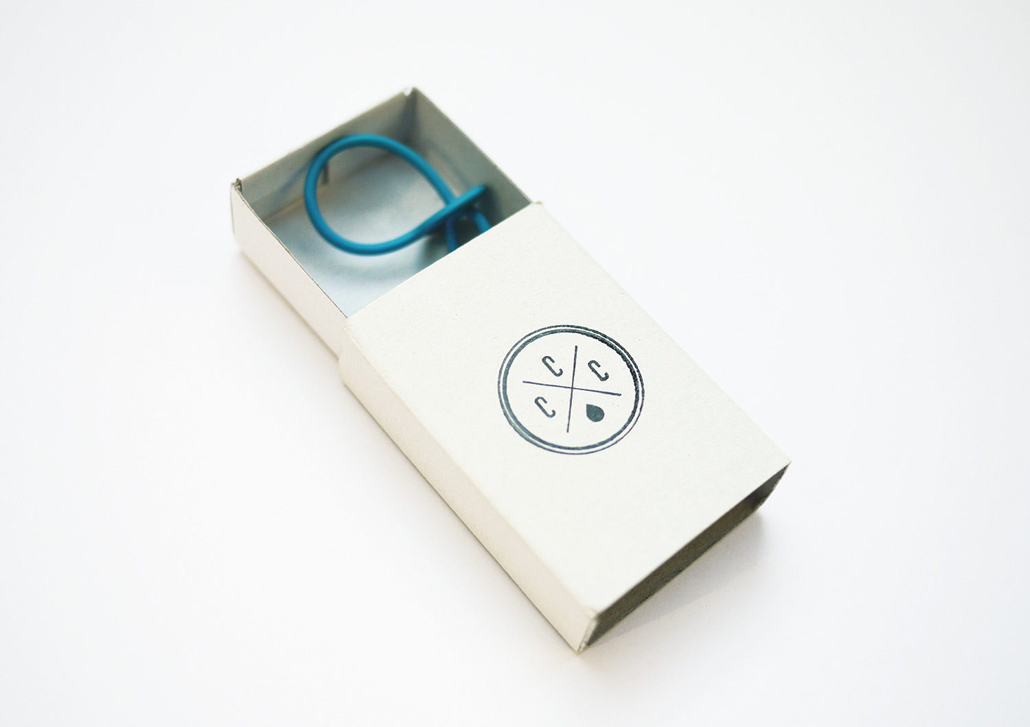
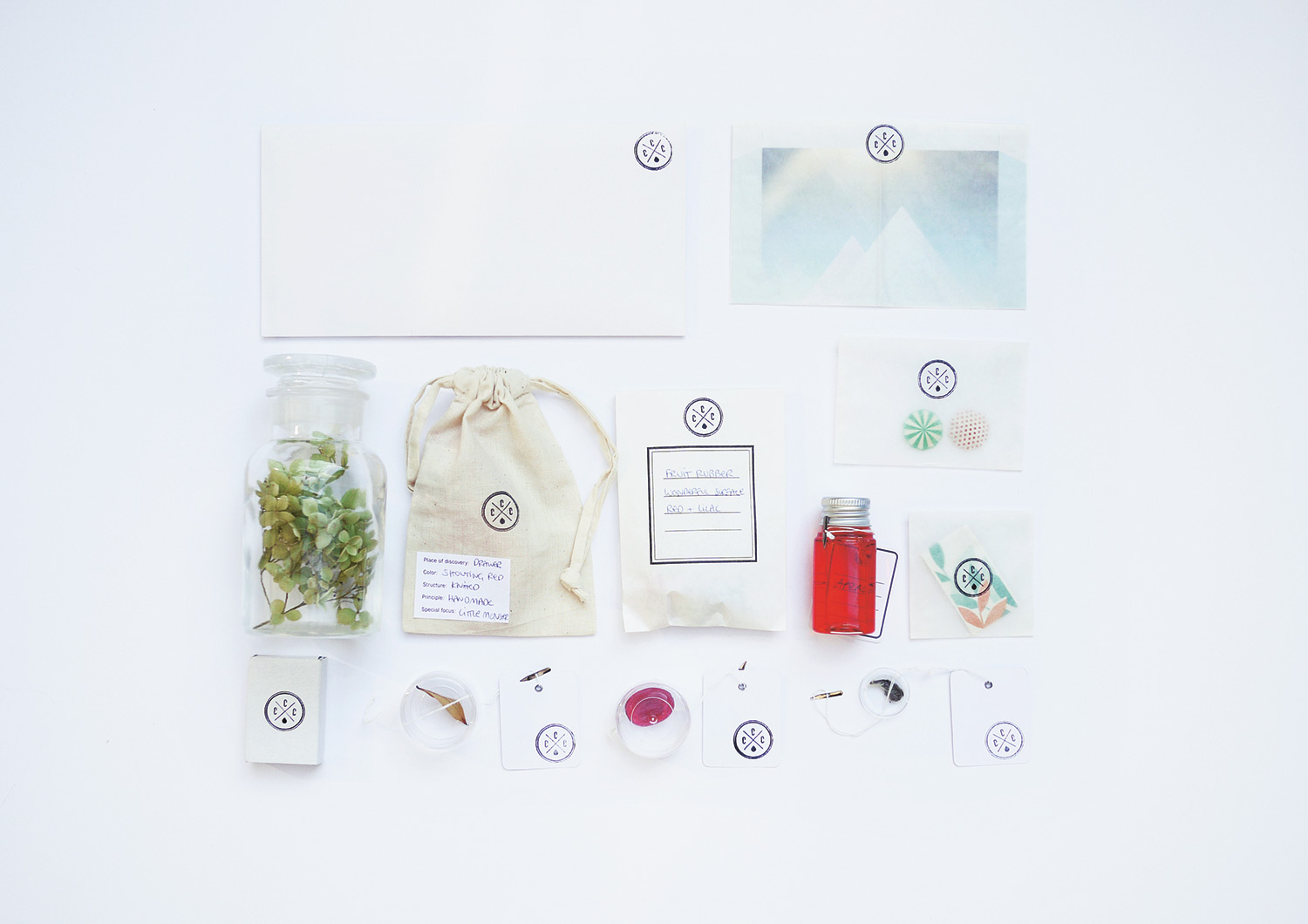
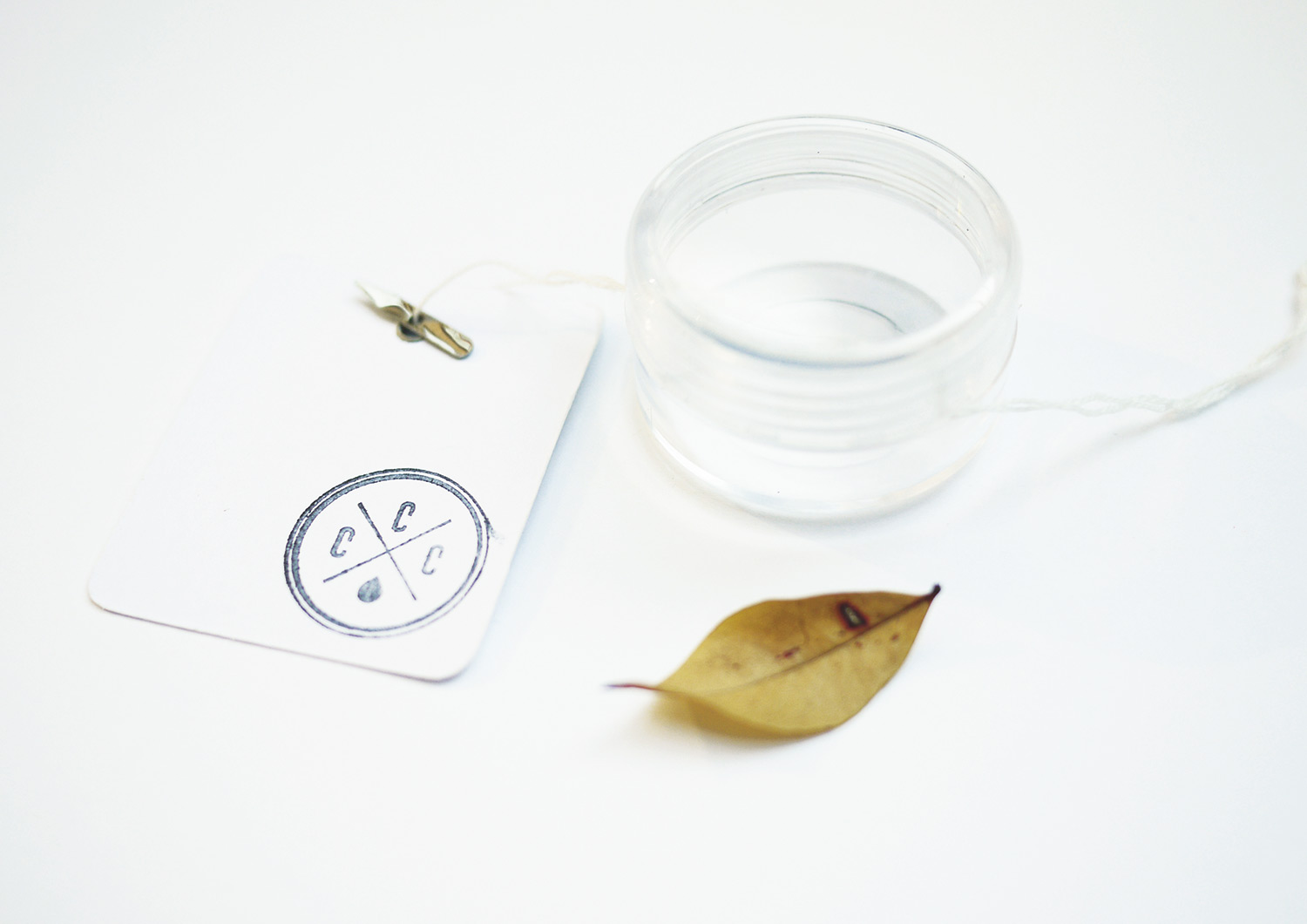
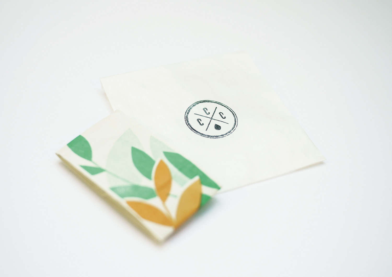
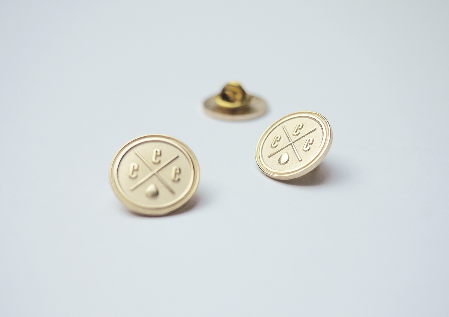
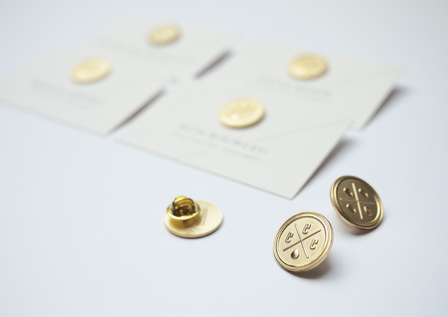
Gaudium Coloribus! Who learned Latin in school? No one! It means: celebrate the colors! Our clients asked us for an entertaining firework display for this special edition of COME CLOSER. So we invented the super exclusive COME CLOSER CLUB (CCC) for premium BASF Coatings clients. They got the finest lettering on the most expensive papers.
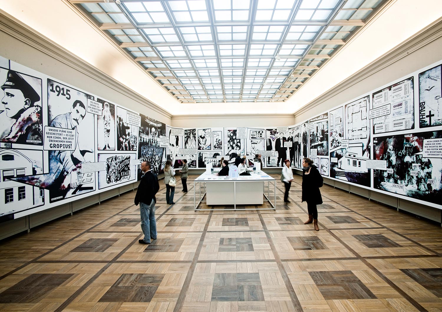
Klassikstiftung Weimar
Museum, Culture
• Style
• Concept
• Illustration
• Collages
• Production
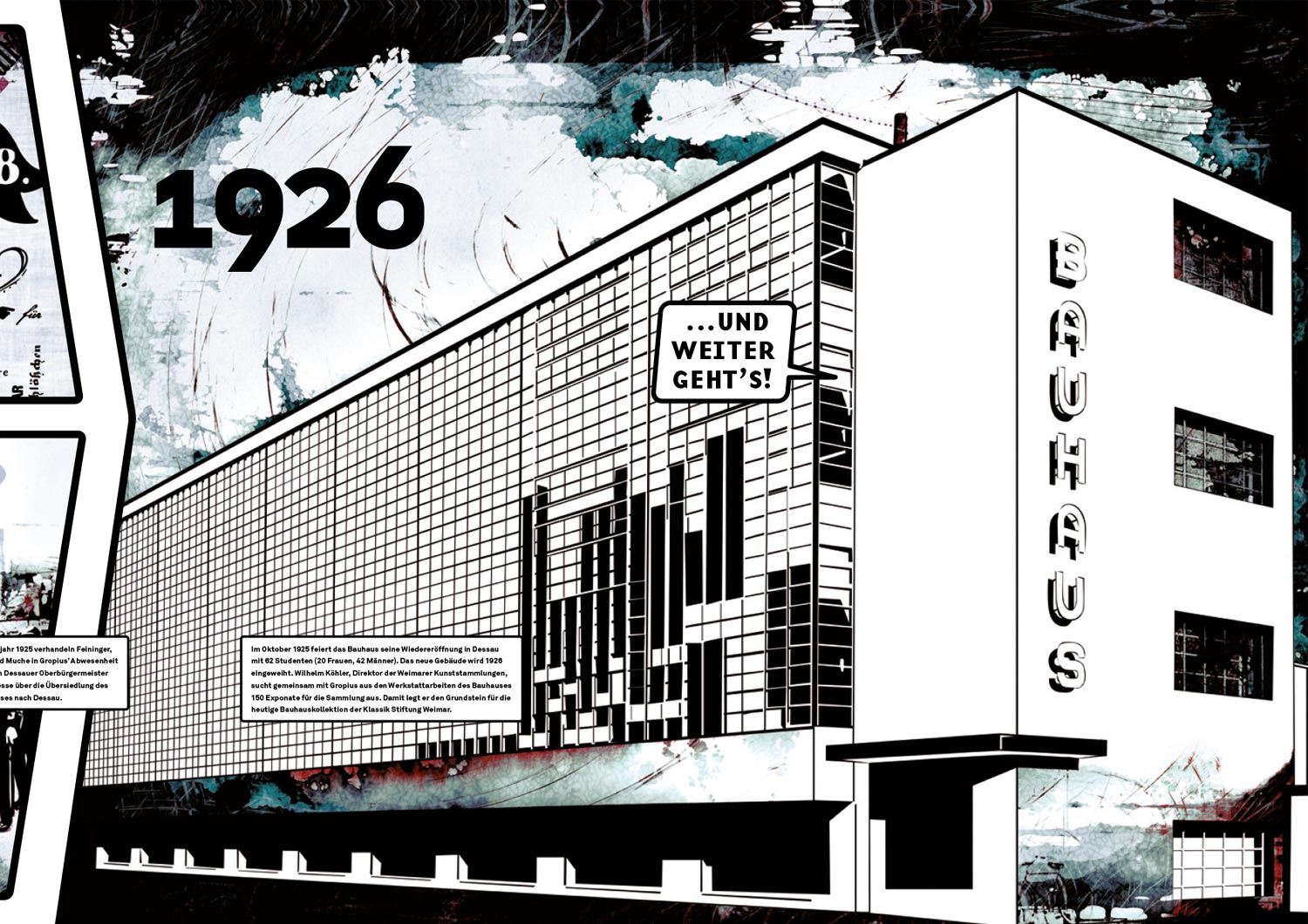
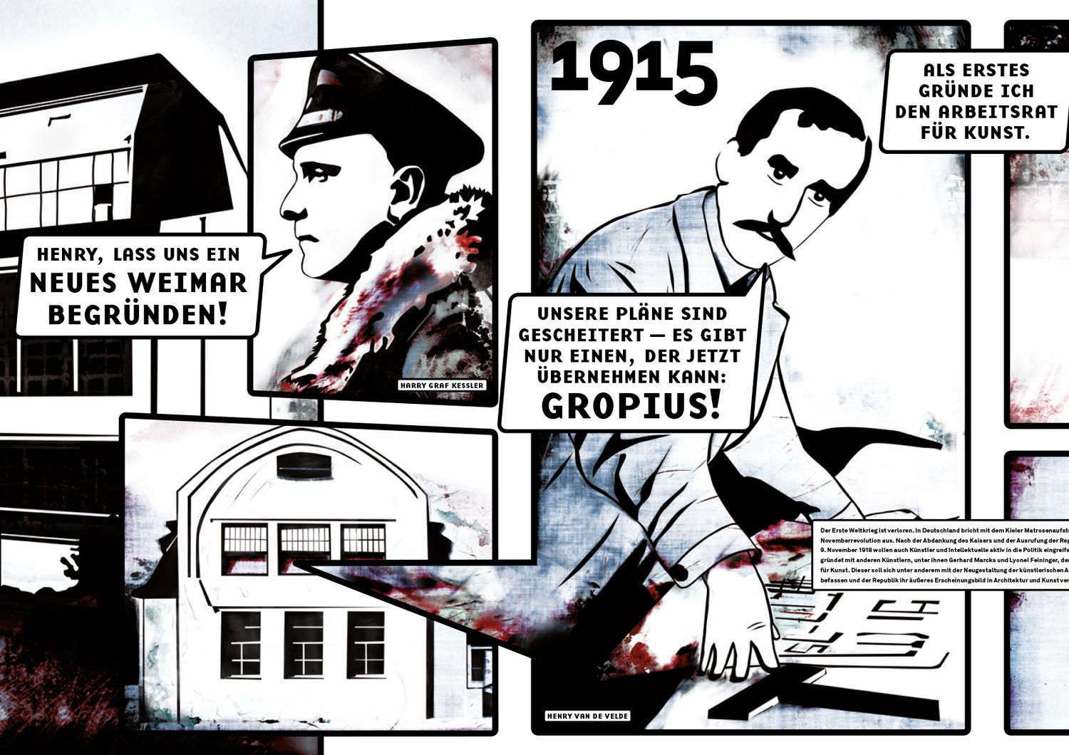
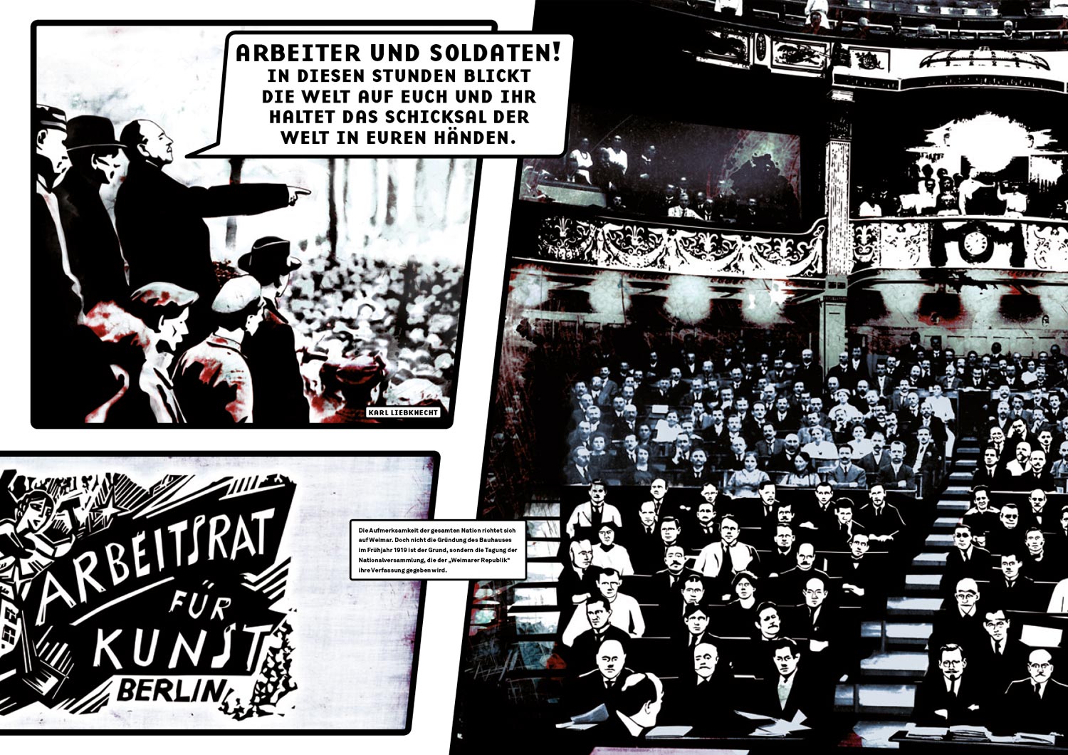
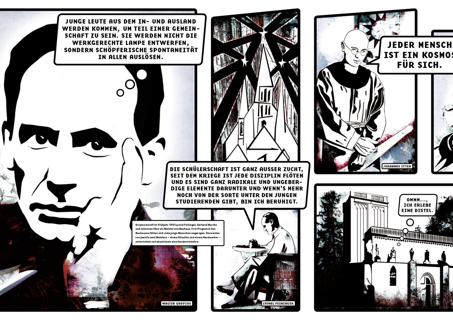
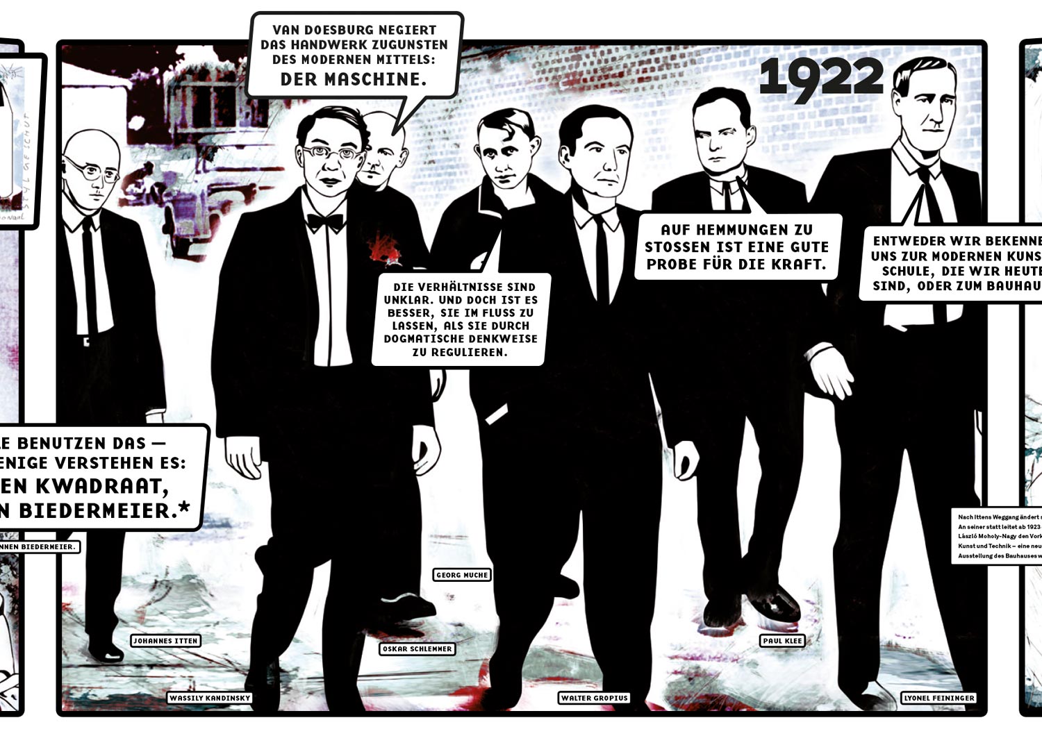
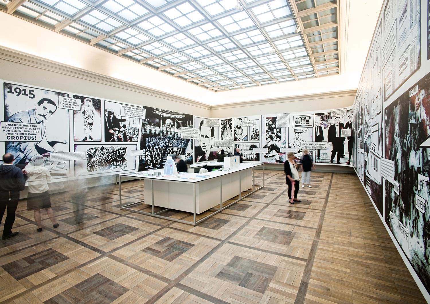
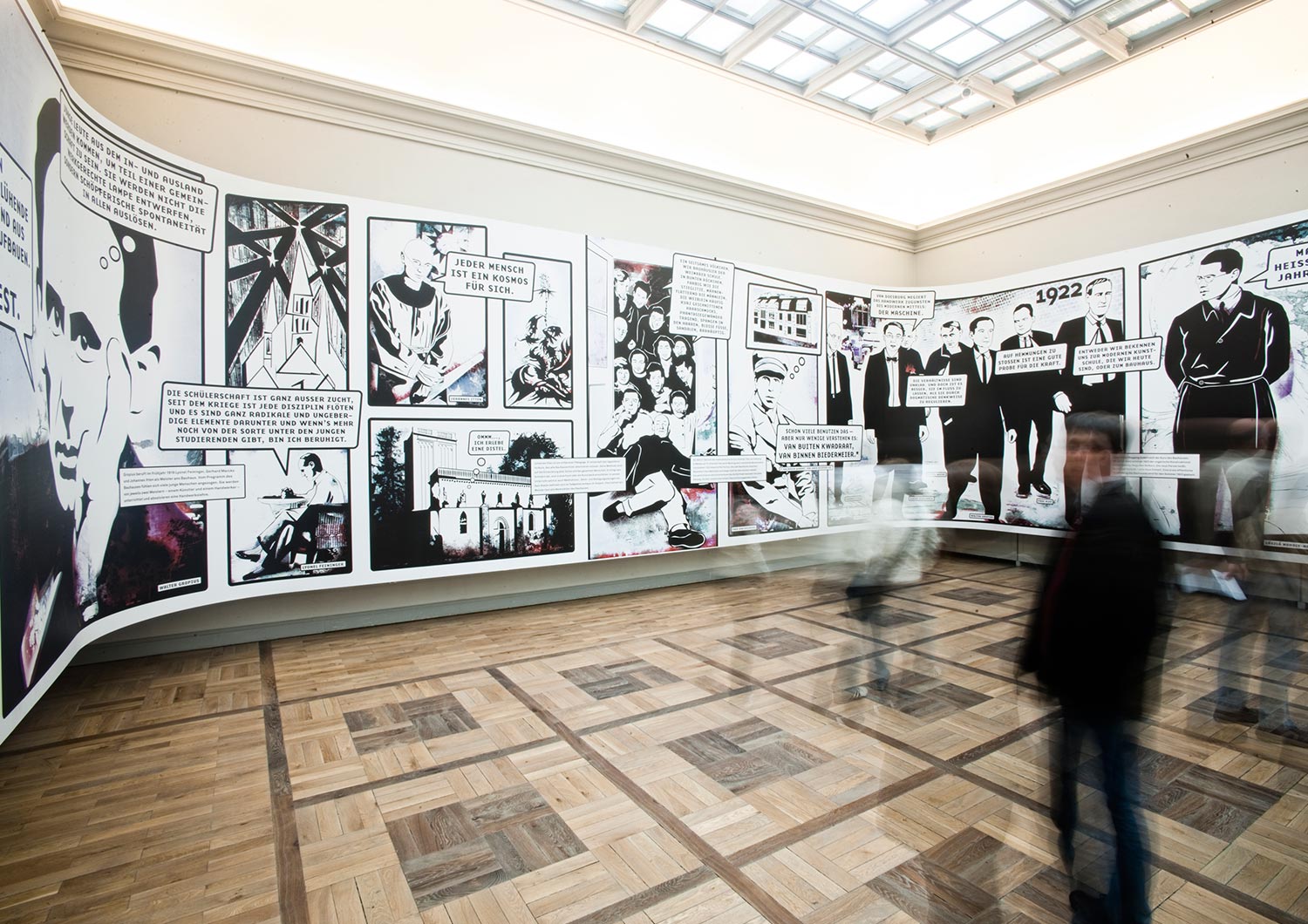
In collaboration with the wonderful architect and designer Meyer-Voggenreiter, we designed a giant comic installation for the 90th anniversary of the founding of the Bauhaus movement in Weimar. It’s called BAUHAUS PANORAMA. The exhibition “Bauhaus comes from Weimar” chronicled the early years of the legendary design school. And we were part of it.
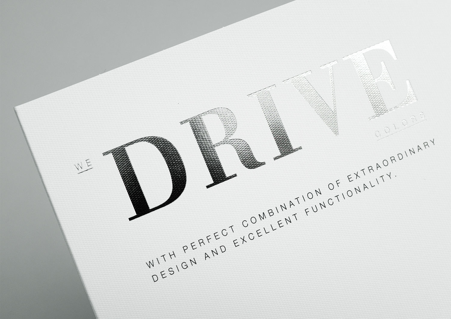
BASF Coatings
Automotive
• Ideation
• Typography
• Paper Selection
• Production
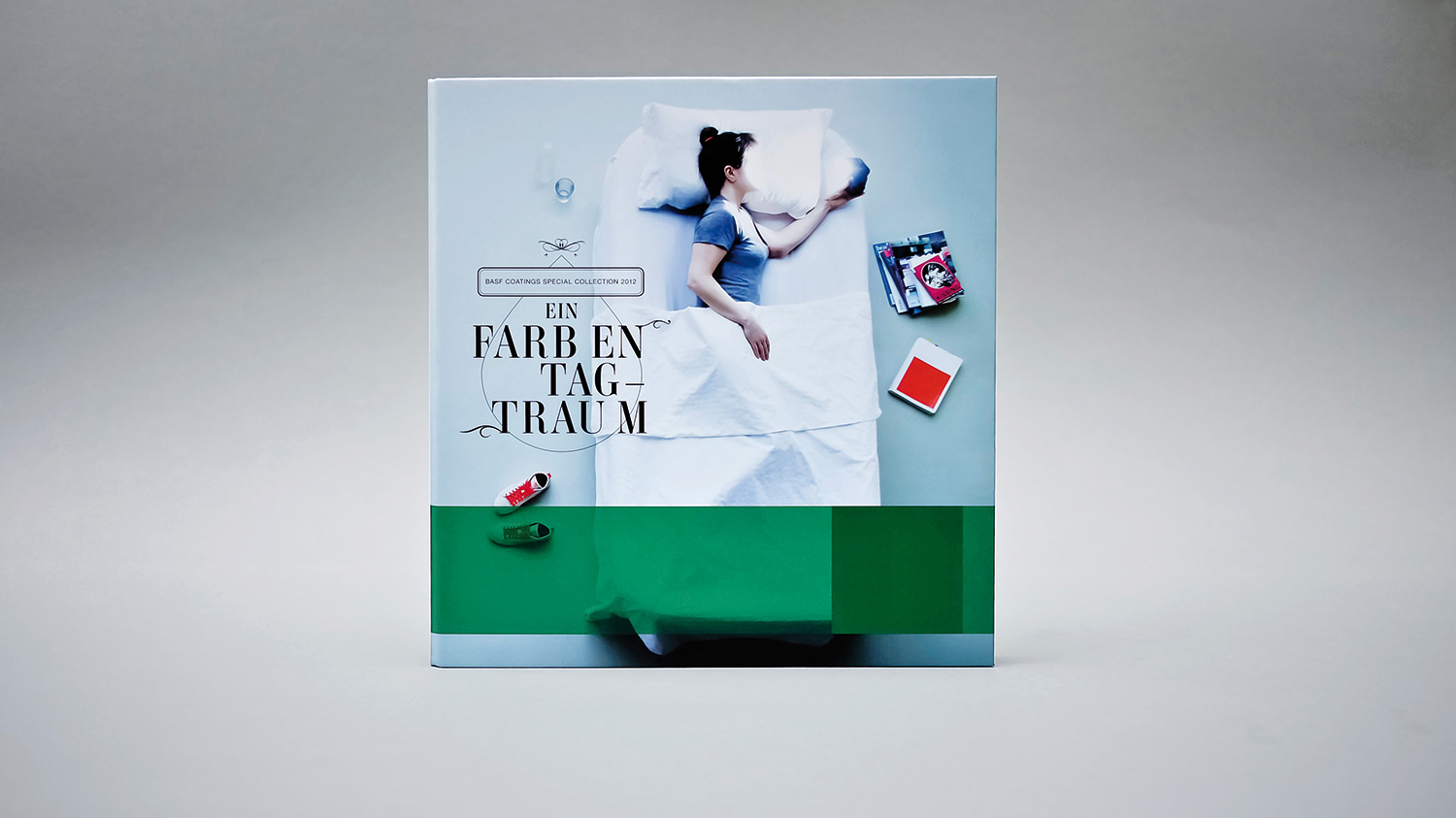
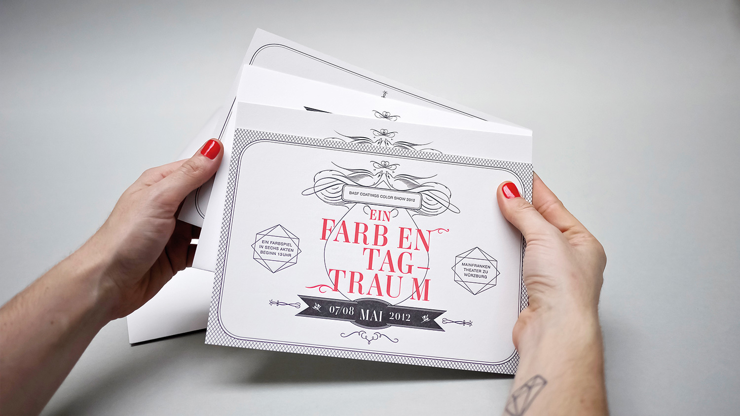
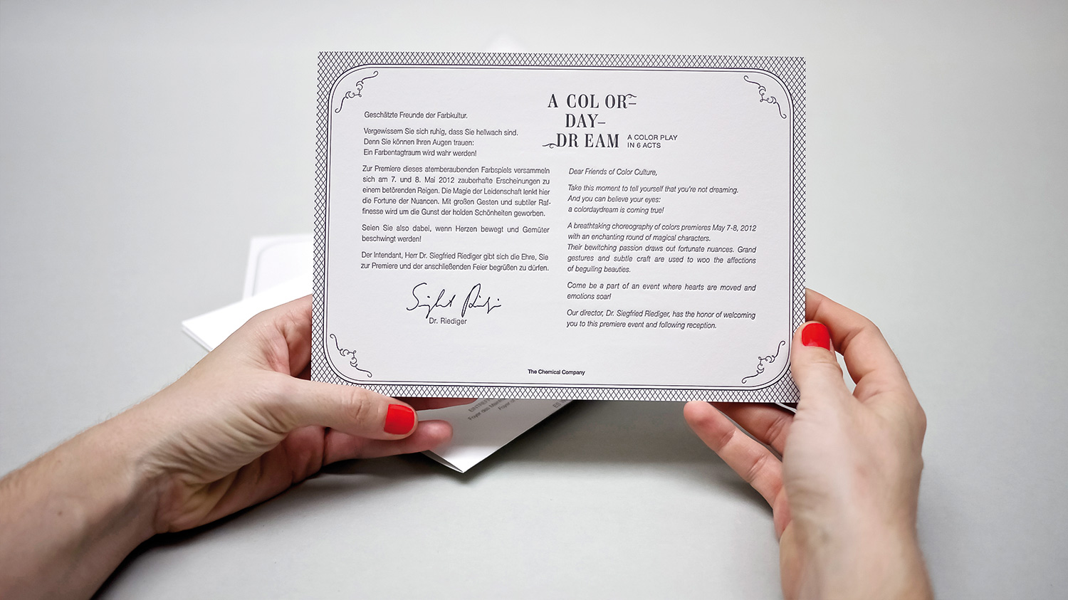
After the explosive success of WIDE AWAKE’s color dynamite in the spring, we joined with BASF Coatings to develop a follow-up special collection loosely based on Shakespeare’s notoriously enchanting, “A Midsummer Night’s Dream.” We started modifying our WIDE AWAKE cover by turning the perspective: we made the vertical model on the cover now lay down.
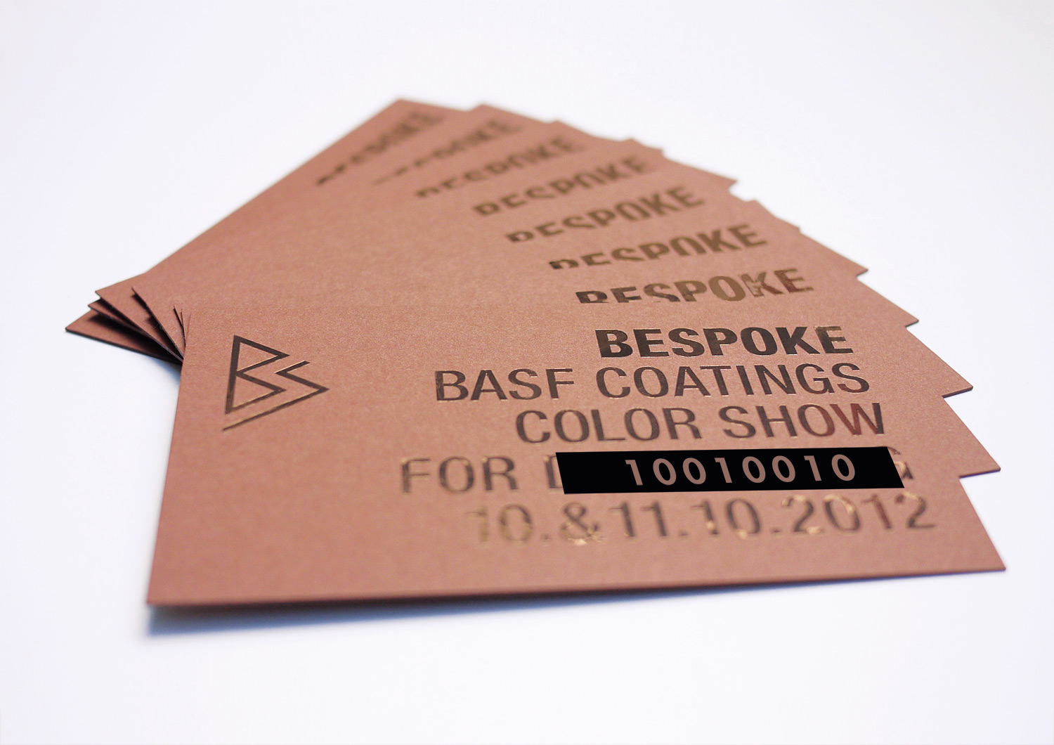
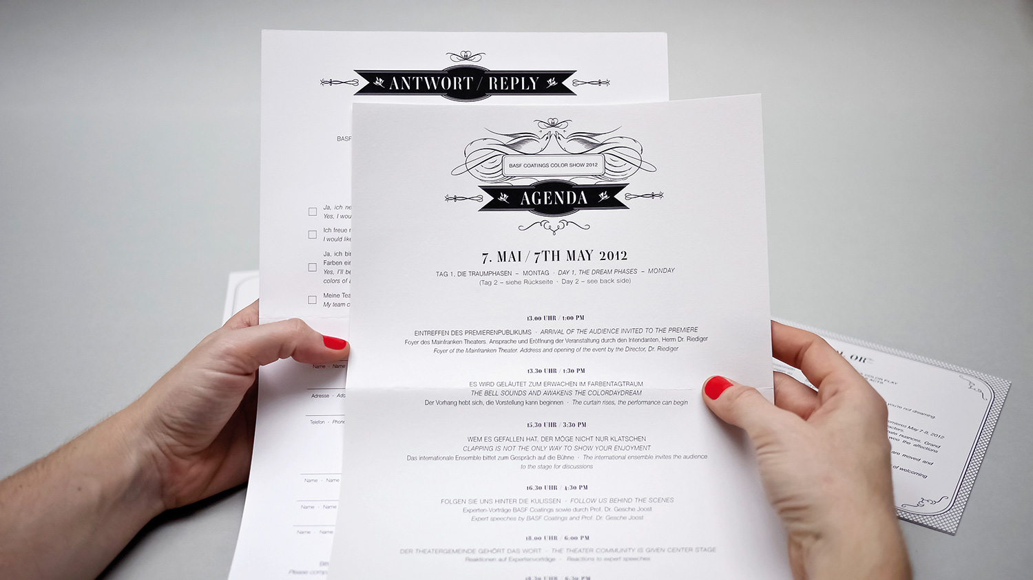
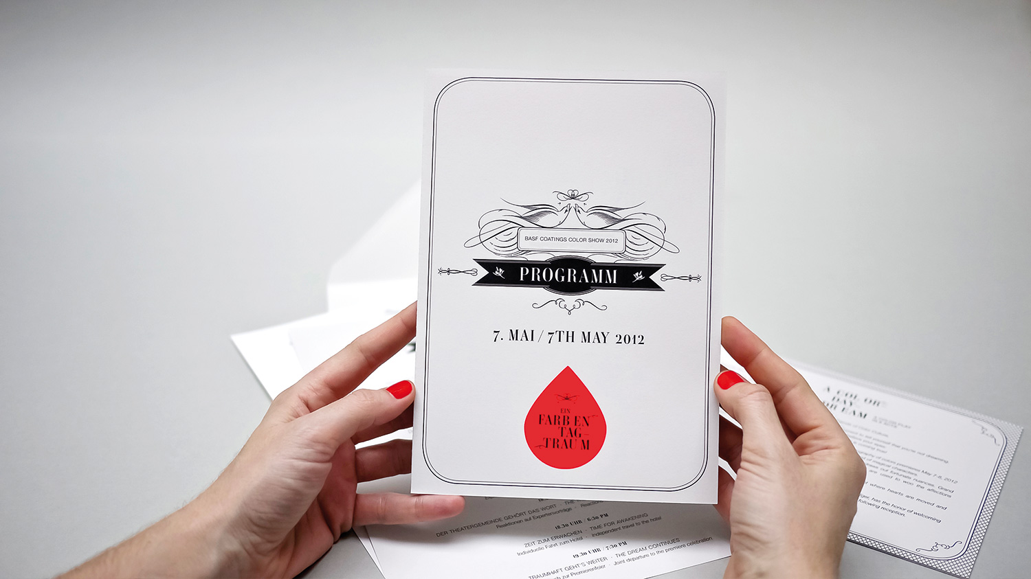
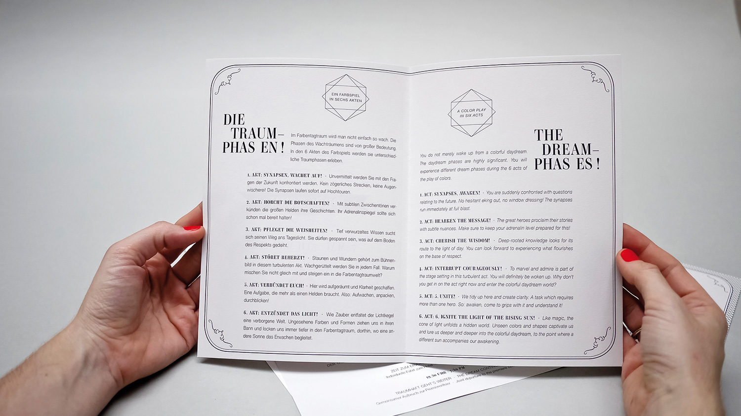
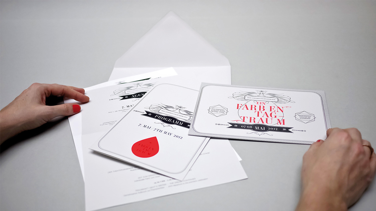
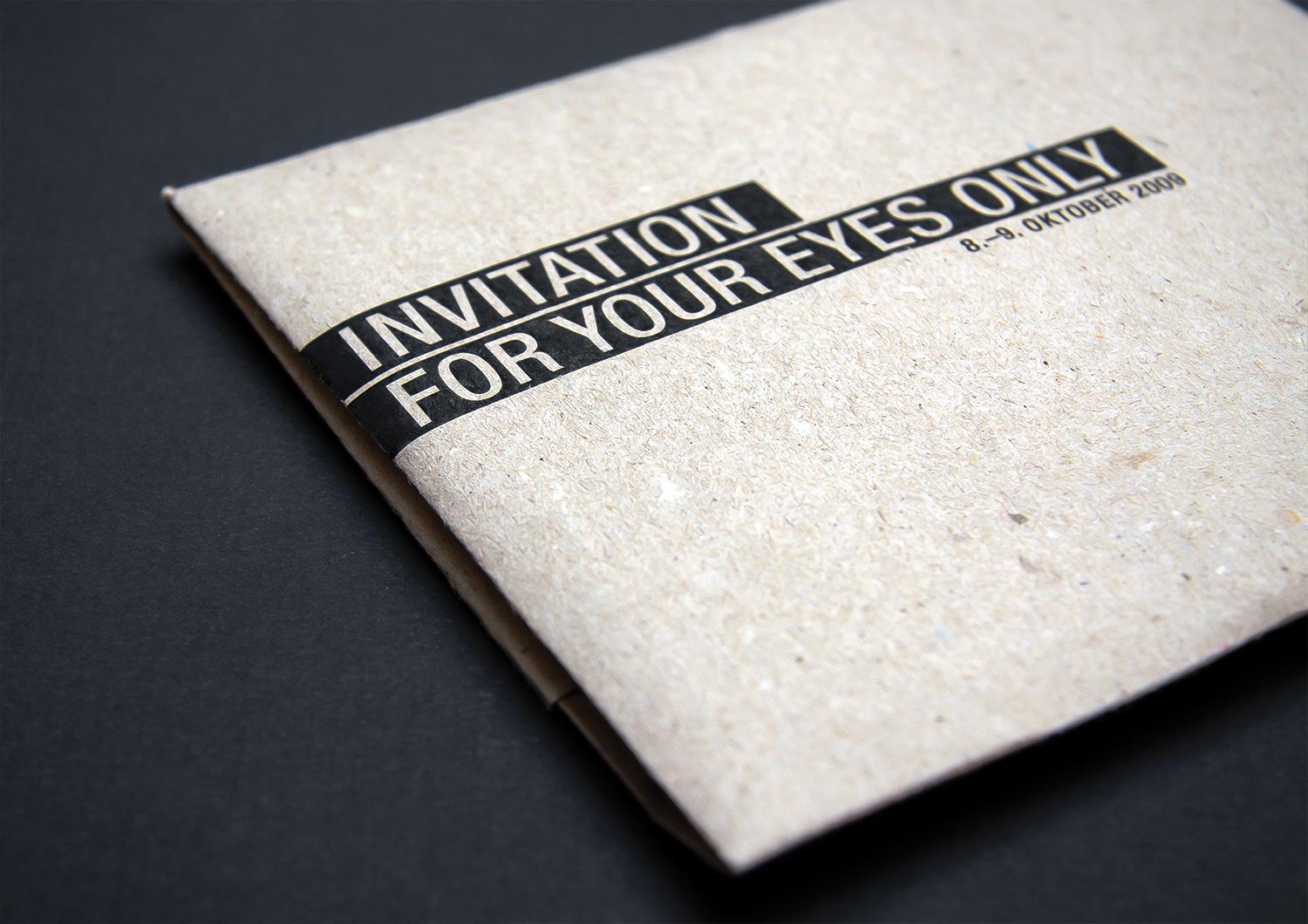
BASF Coatings
Automotive
• Ideation
• Typography
• Paper selection
• Story
• Production
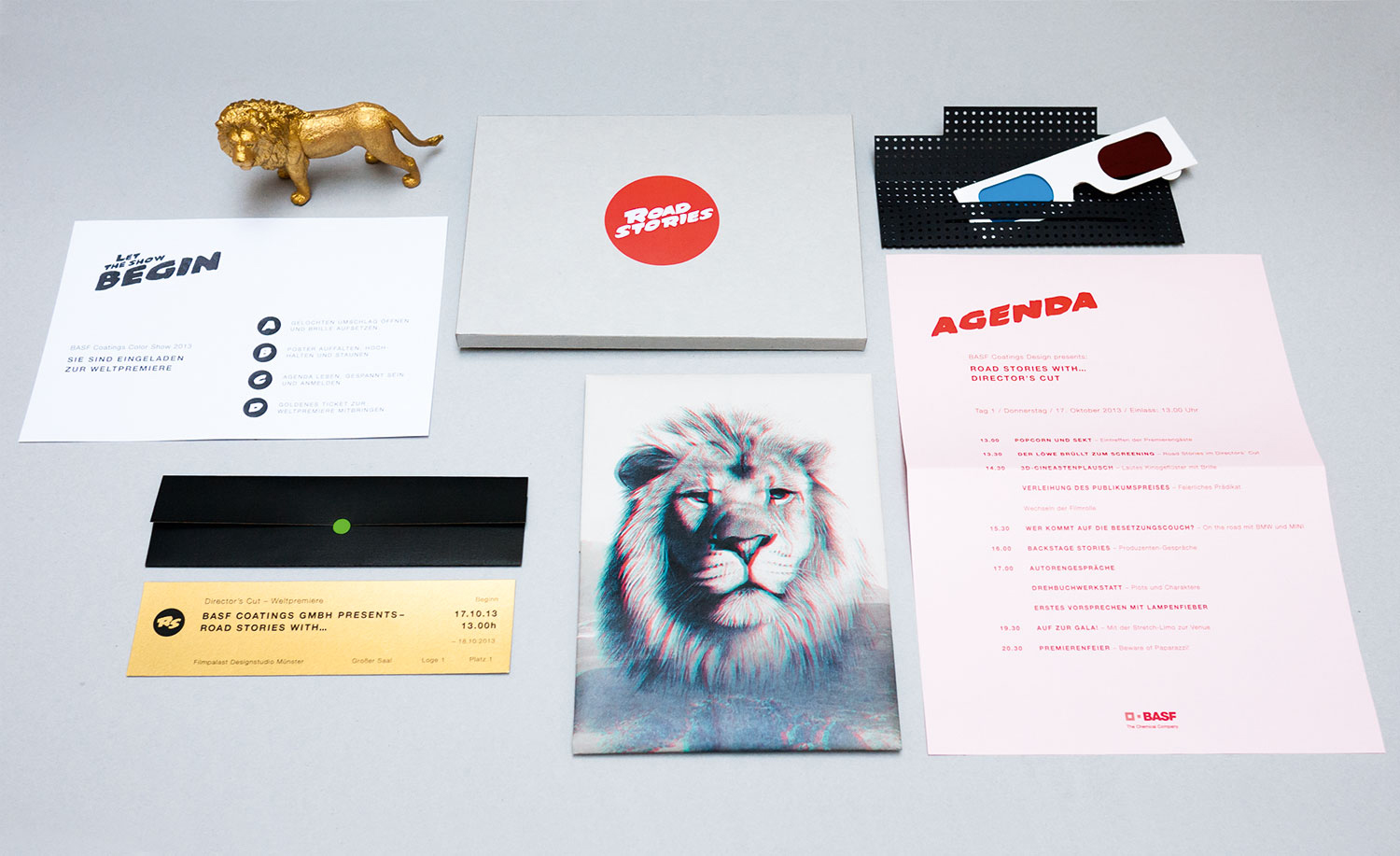
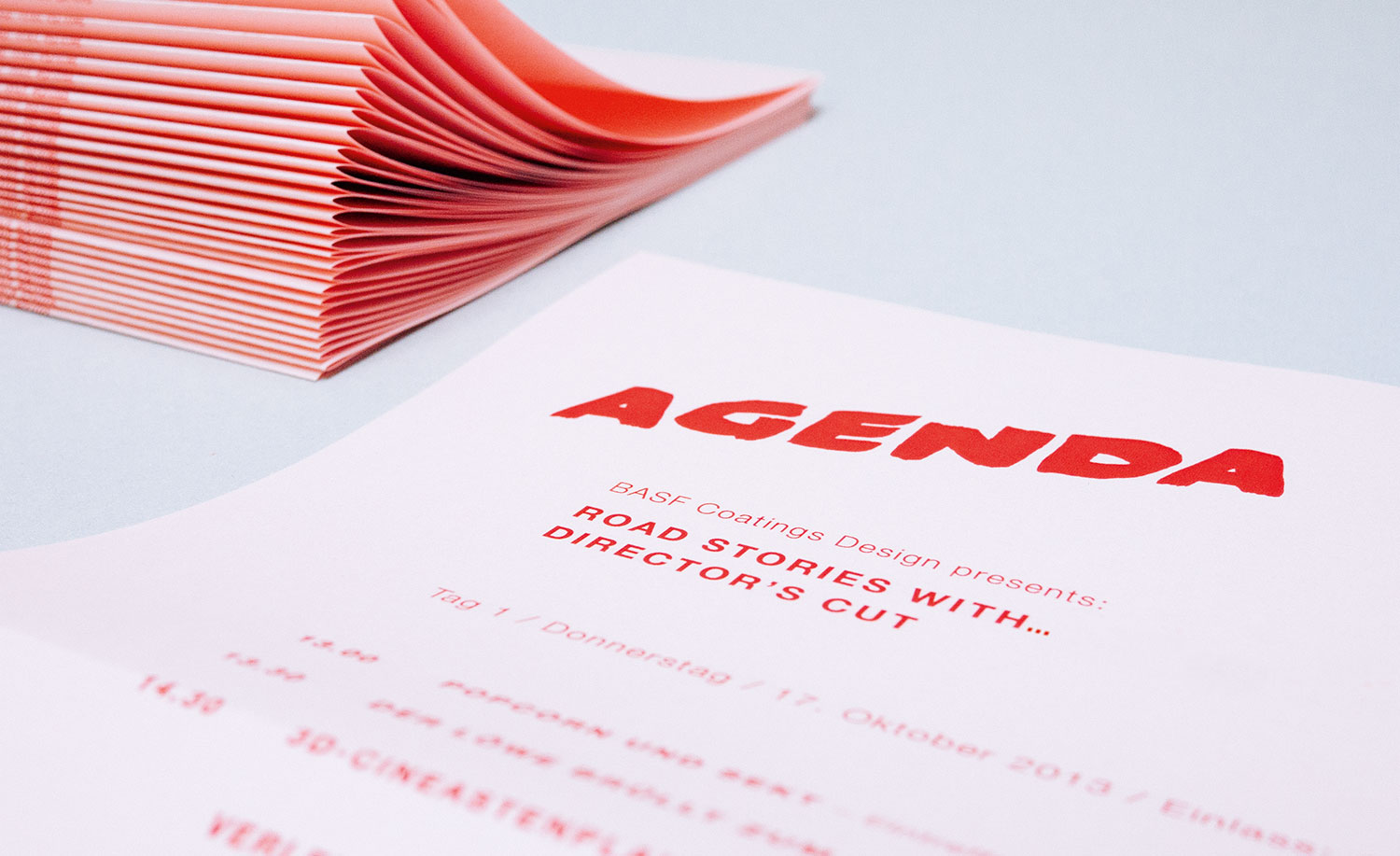
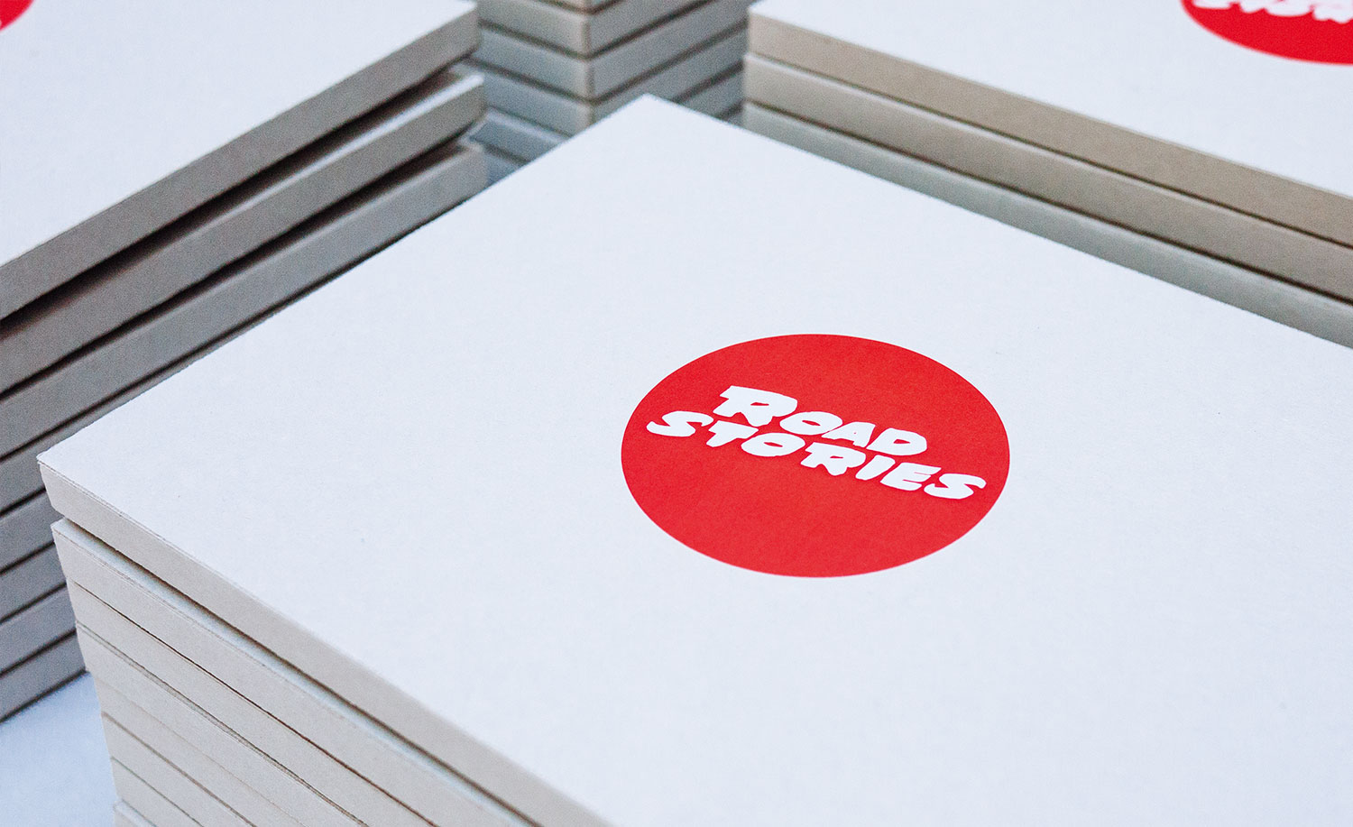
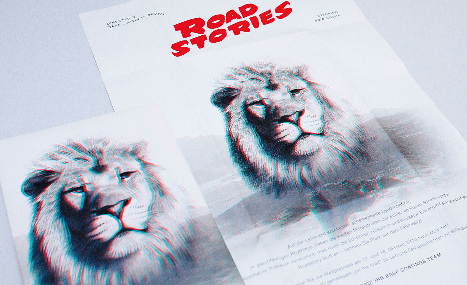
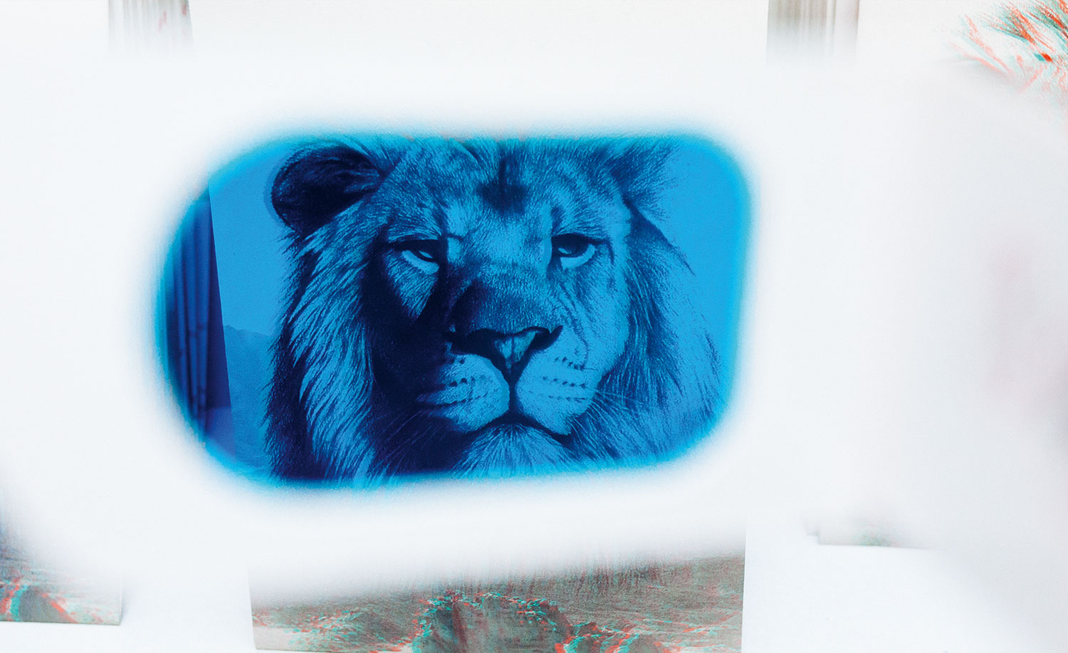
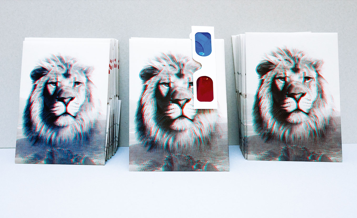
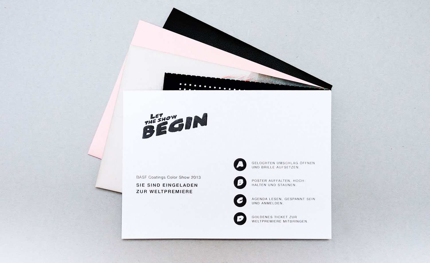
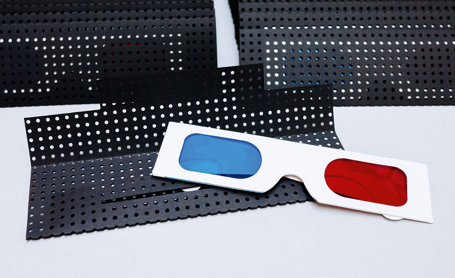
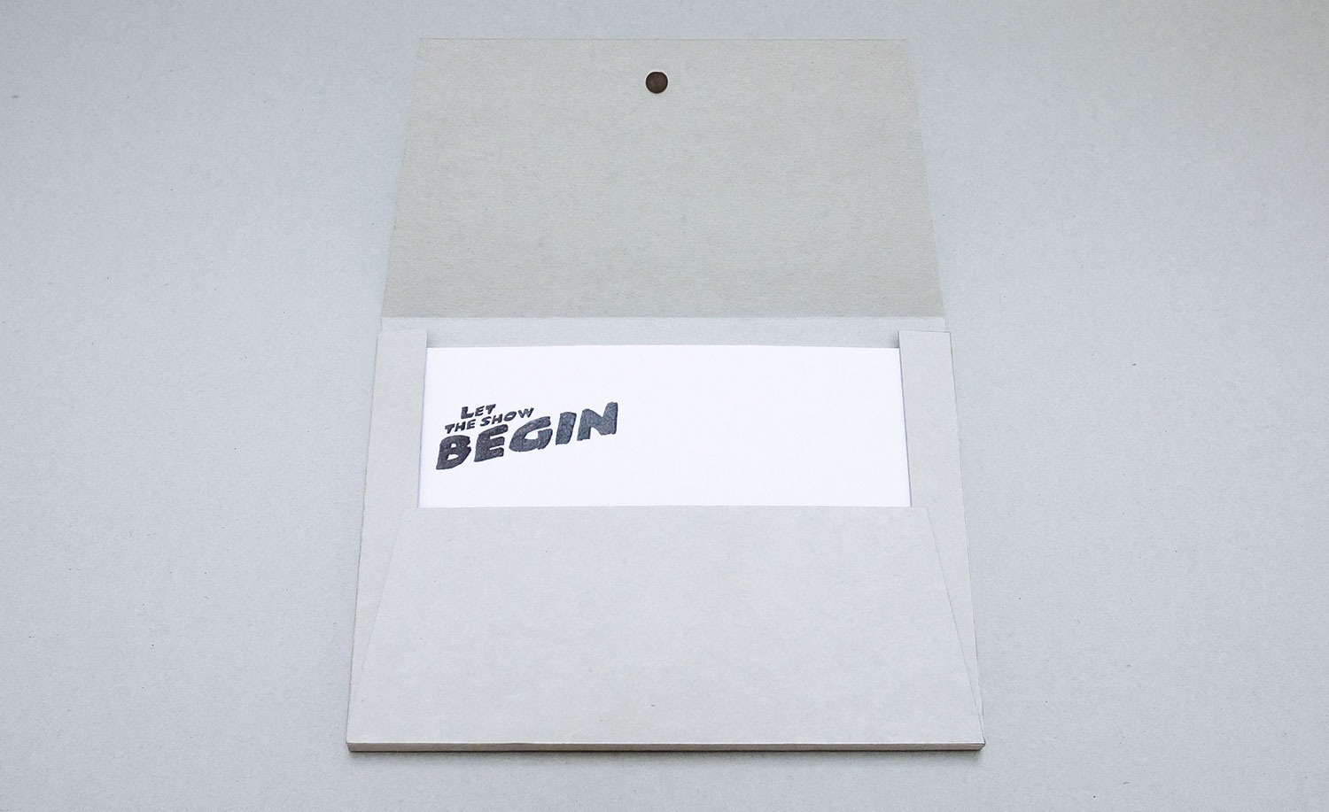
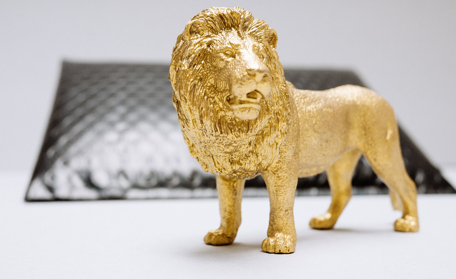
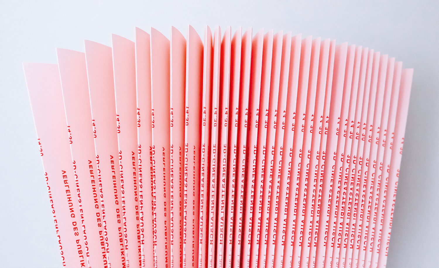
We arranged a unique invitation-set for this event: colored glasses, a frightening lion poster, a pink-colored agenda and a golden ticket for the befitting welcome of the high-ranking guests. And at the end of the workshop all attendees received what? Roar! A hand-painted Golden Lion.
BASF Coatings
Automotive
• Ideation
• Concept
• Typography
• Production
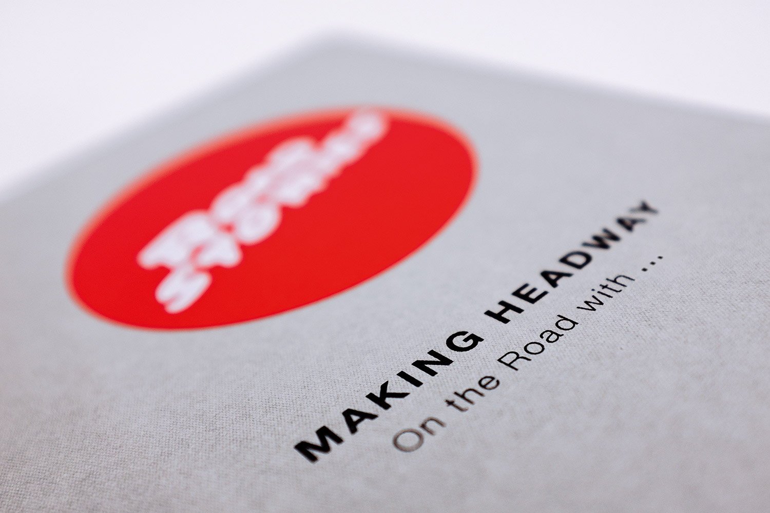
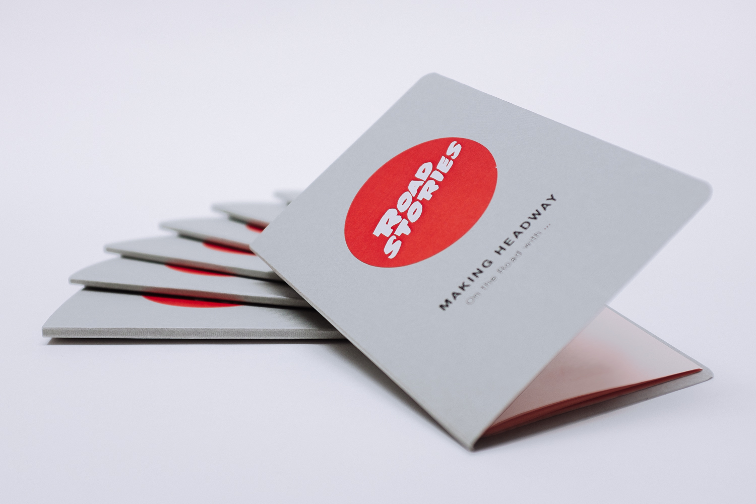
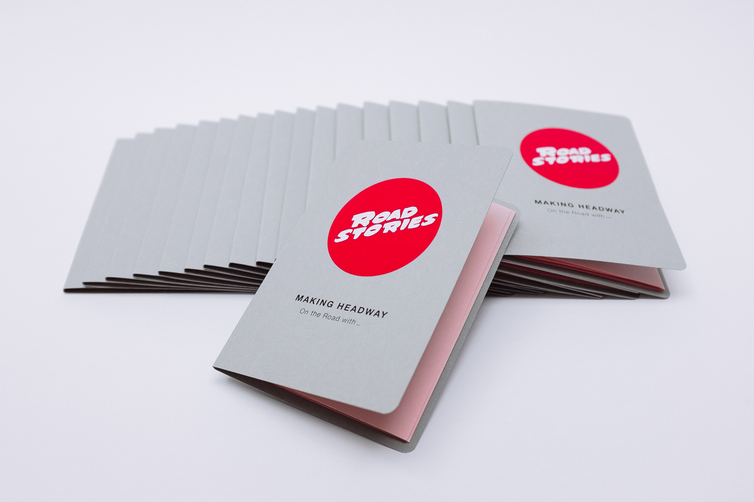
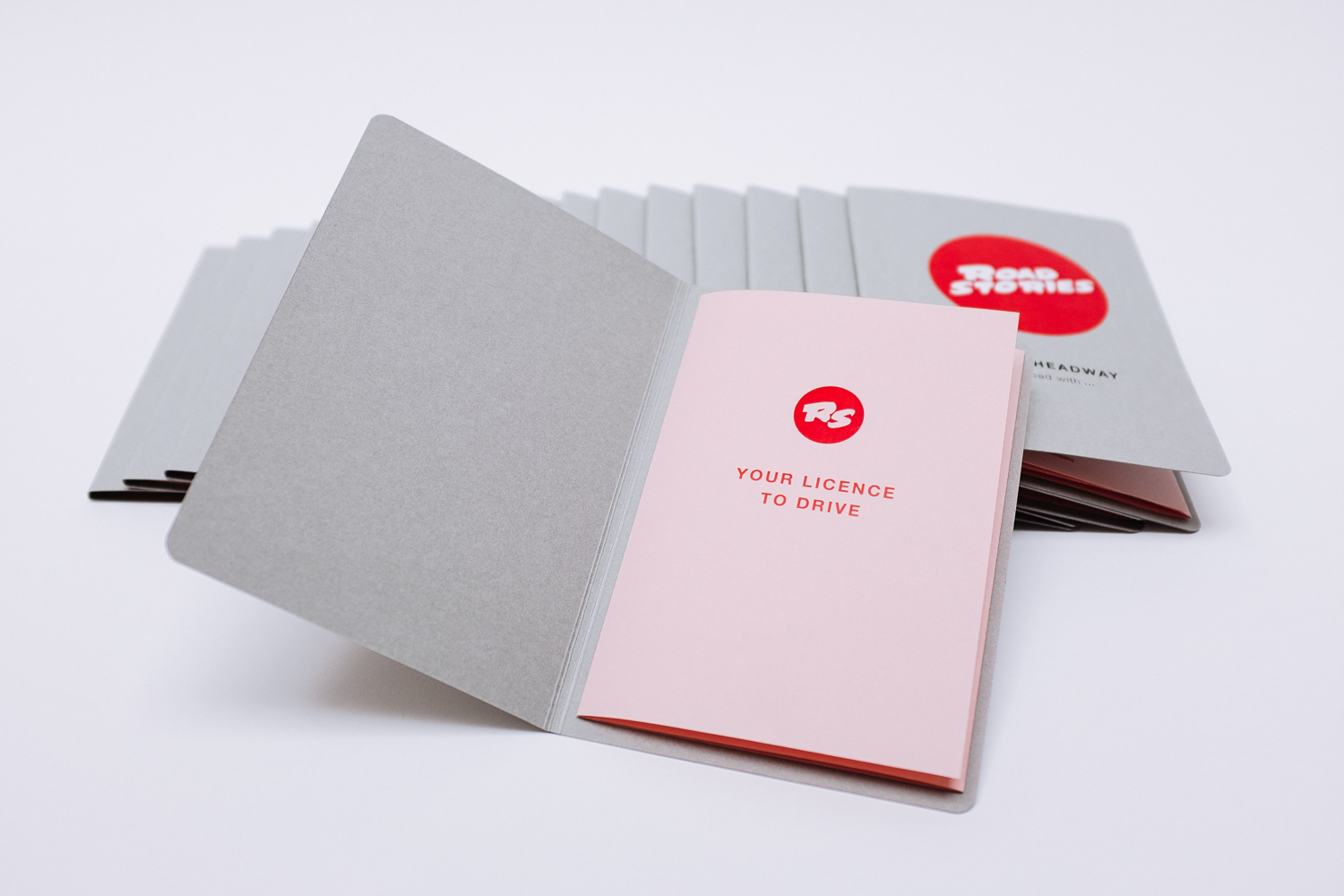
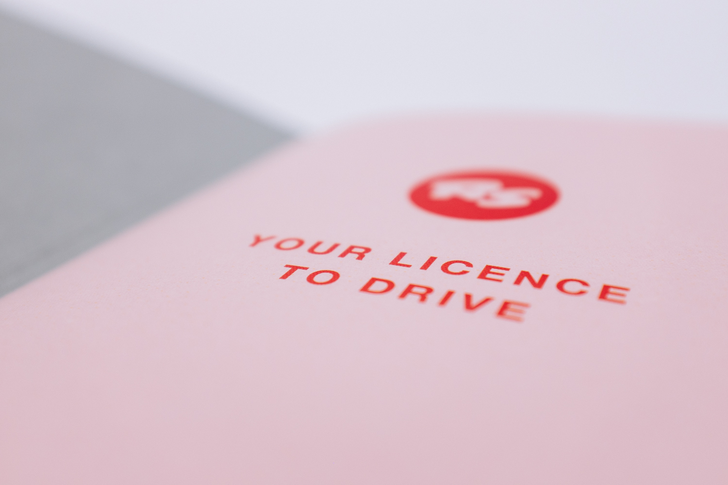
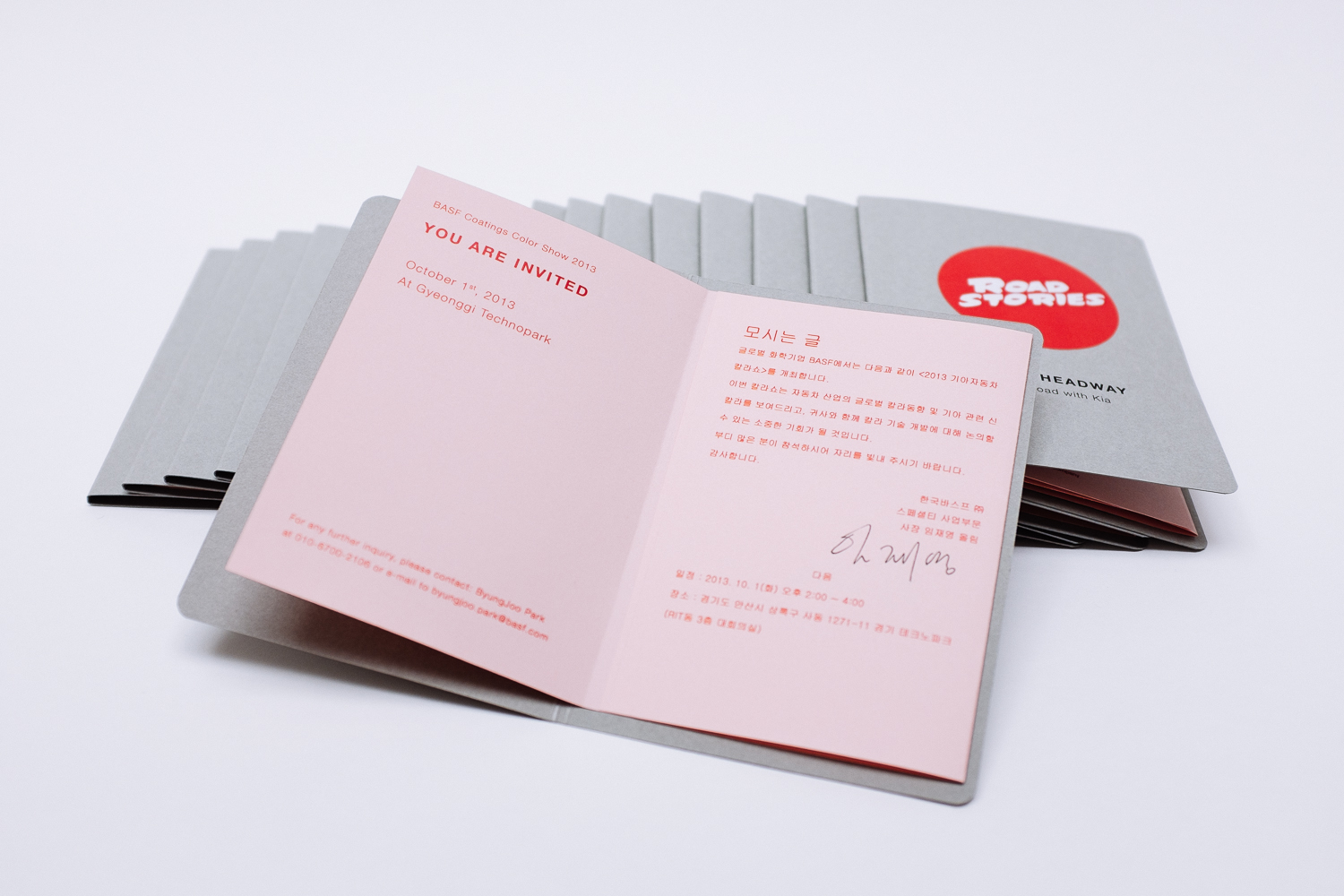
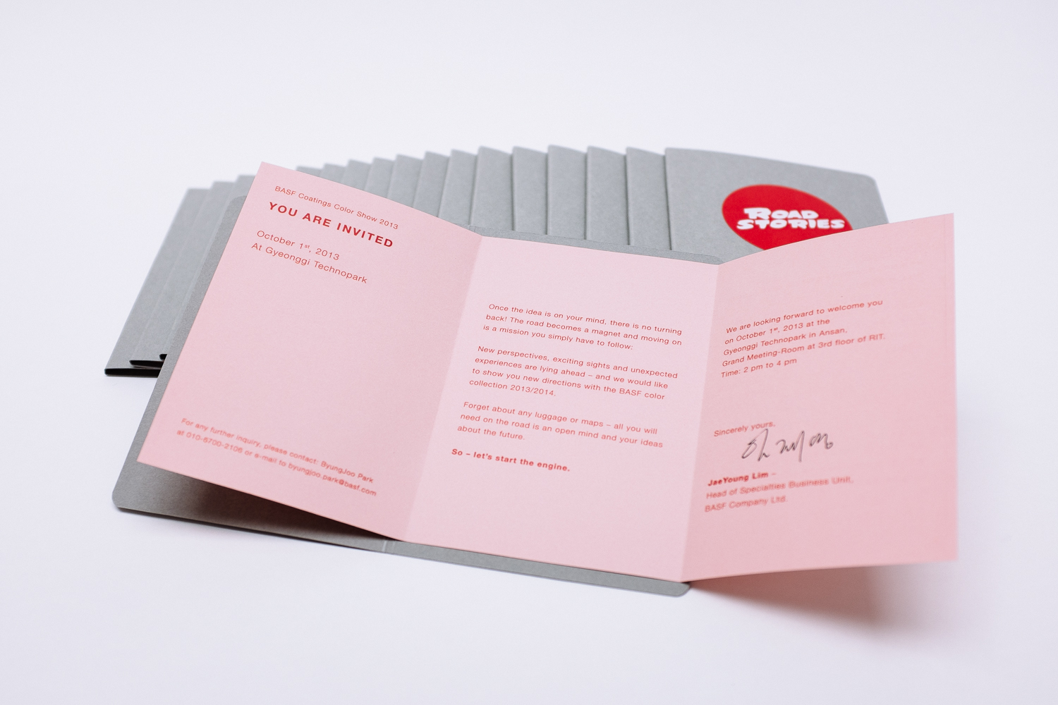
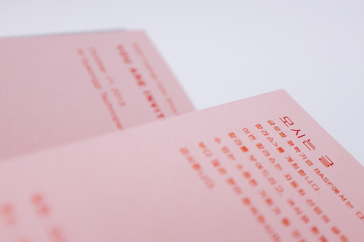
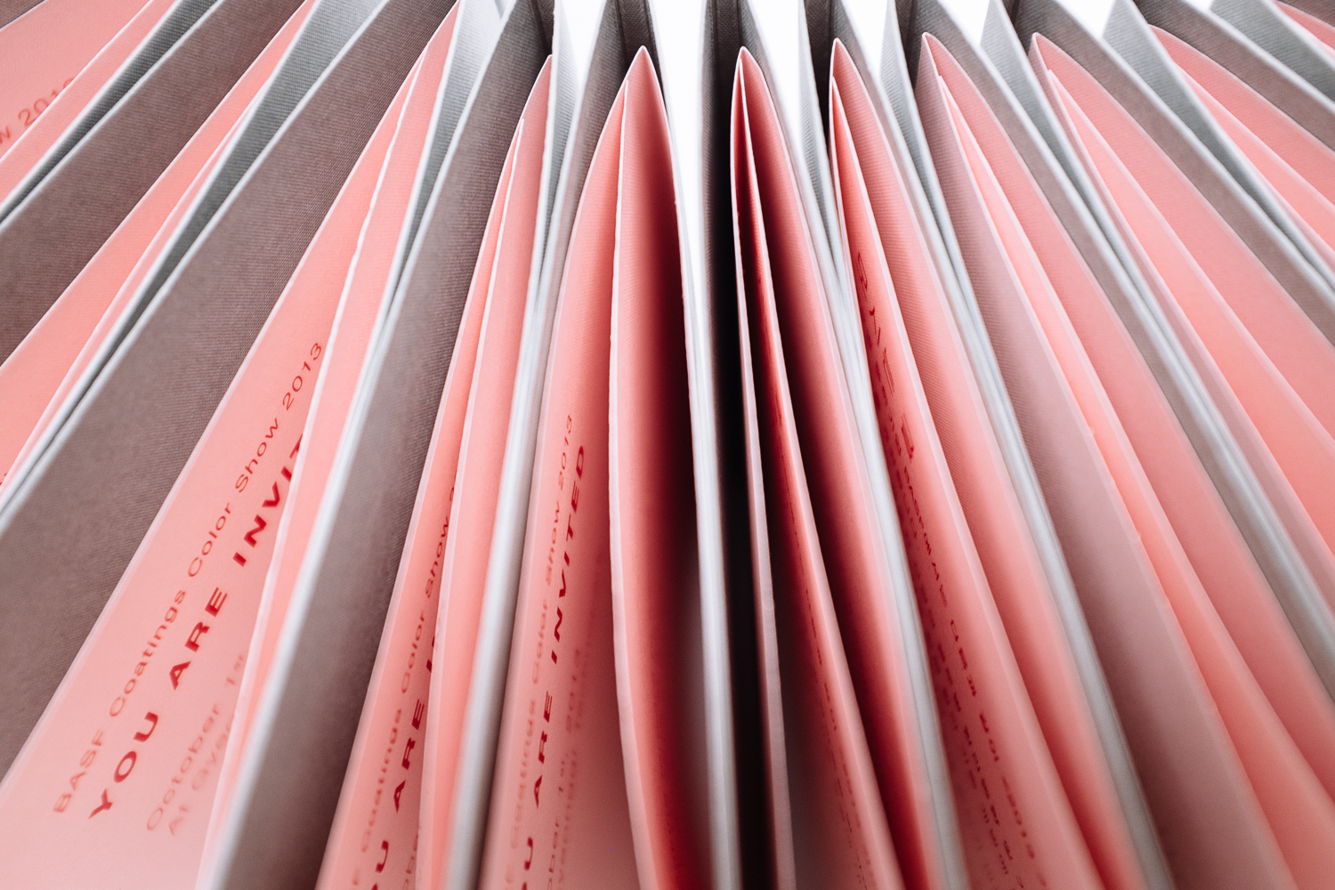
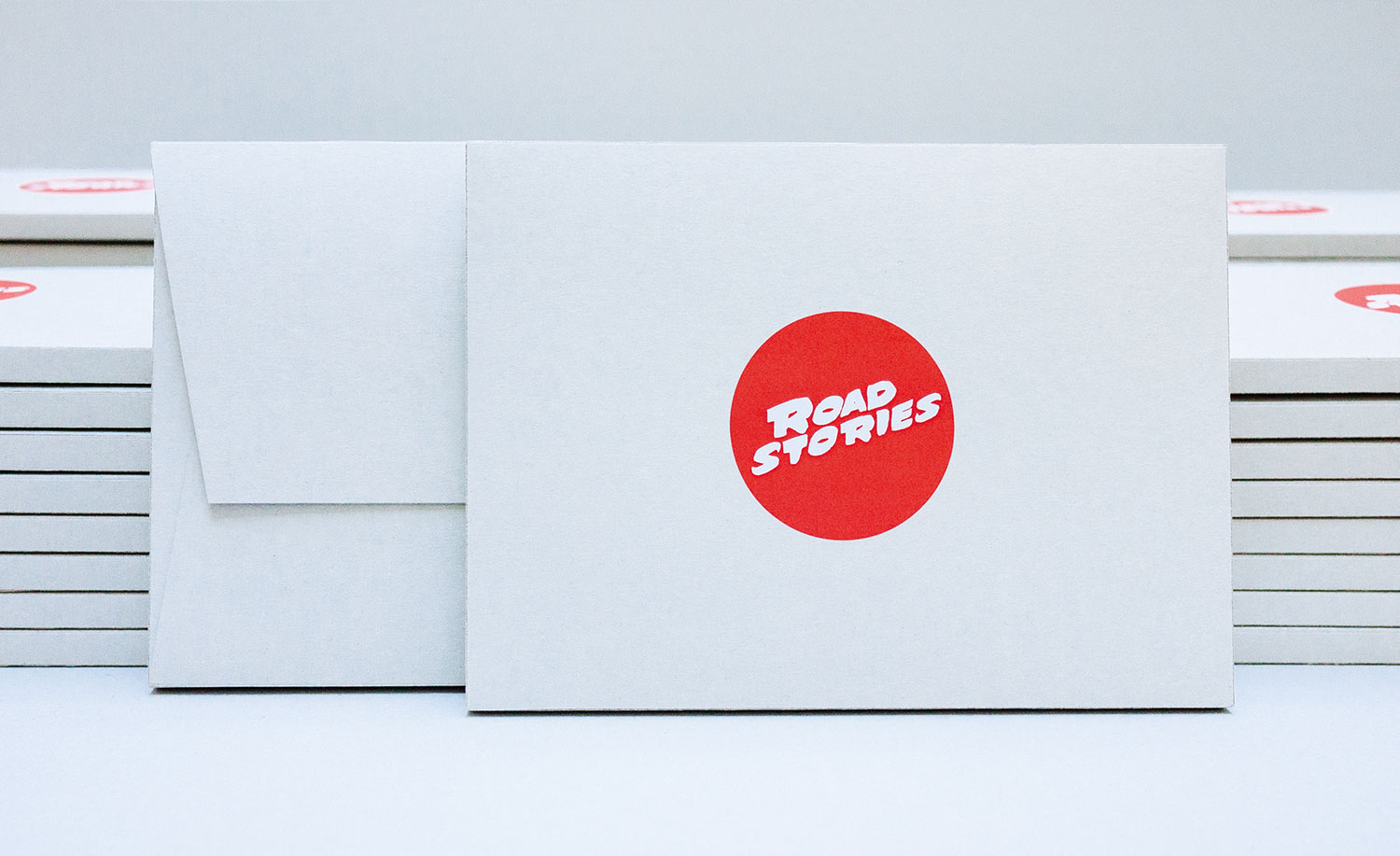
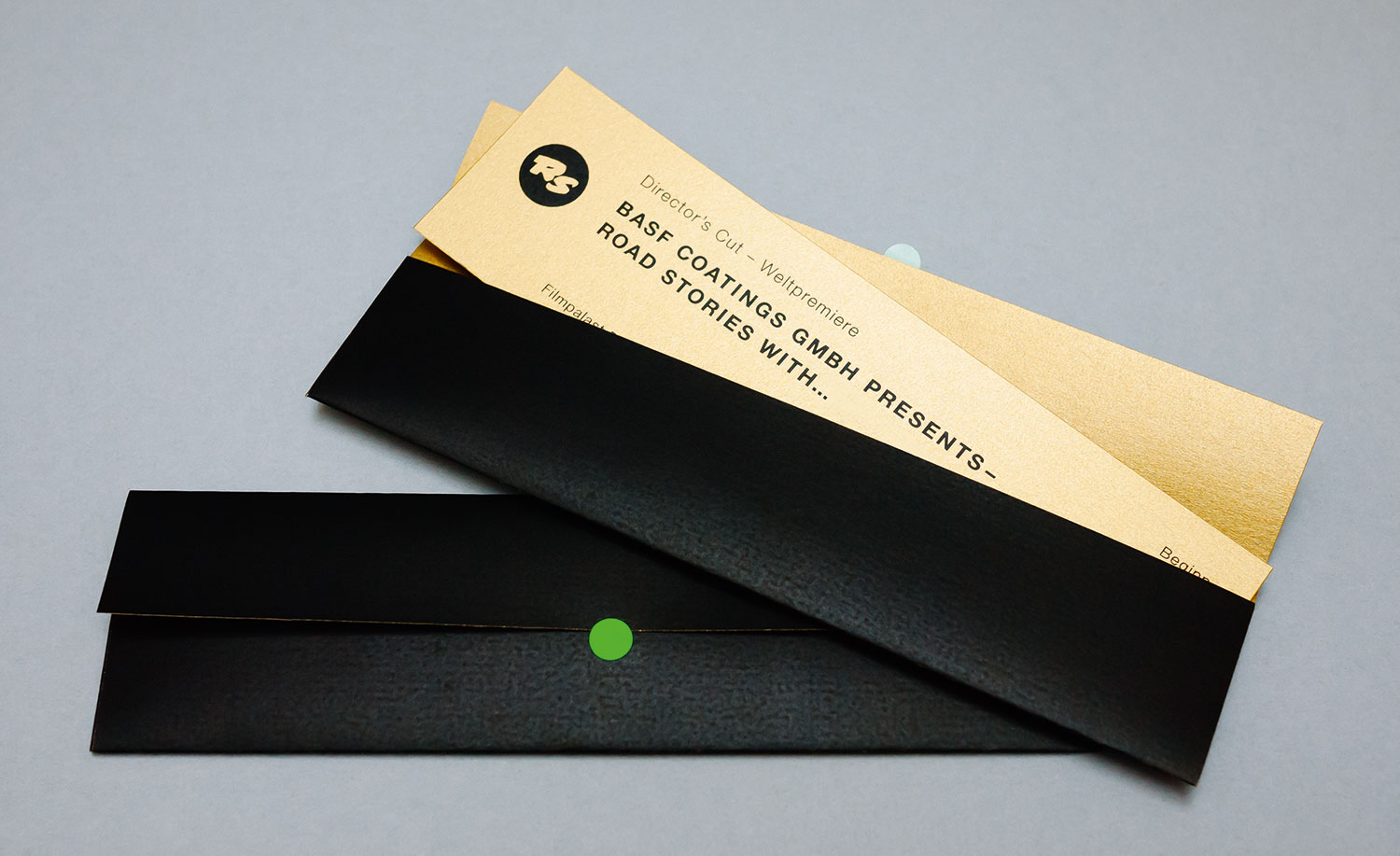
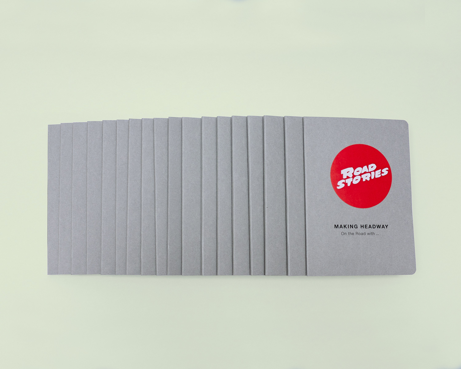
What to design for an asian clientele, that already has everything? Maybe a driver’s licence, which allows the guests to take part in this color-race named ROAD STORIES? Bingo! The Korean presentation of the trend book MAKING HEADWAY took place on the southern peninsula in autumn. We kept with our studio ethos and created every single invitation by hand. The envelopes, the insides, the rounded edges, the stickers.
Teil Dein Glück
Not-for-Profit
• Ideation
• Concept
• Typography
• Production
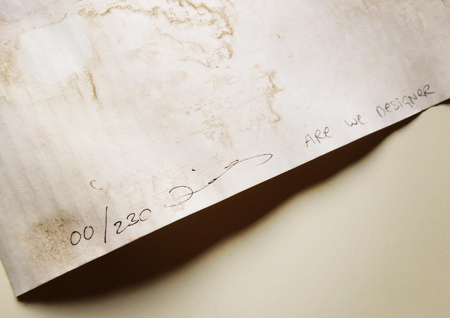
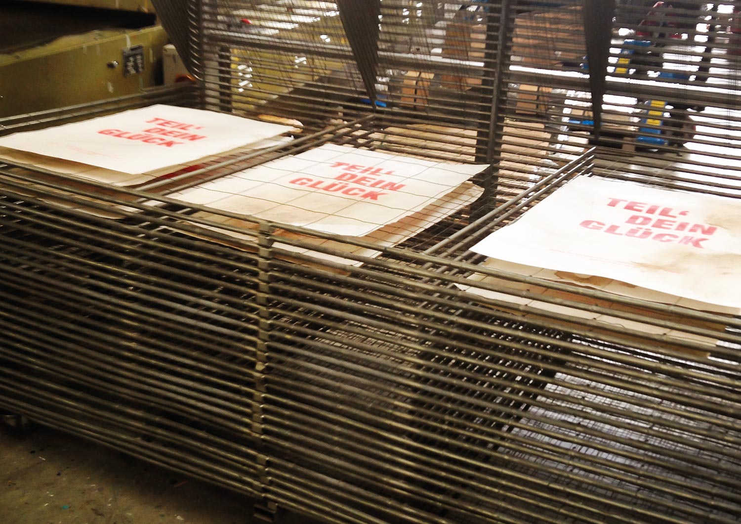
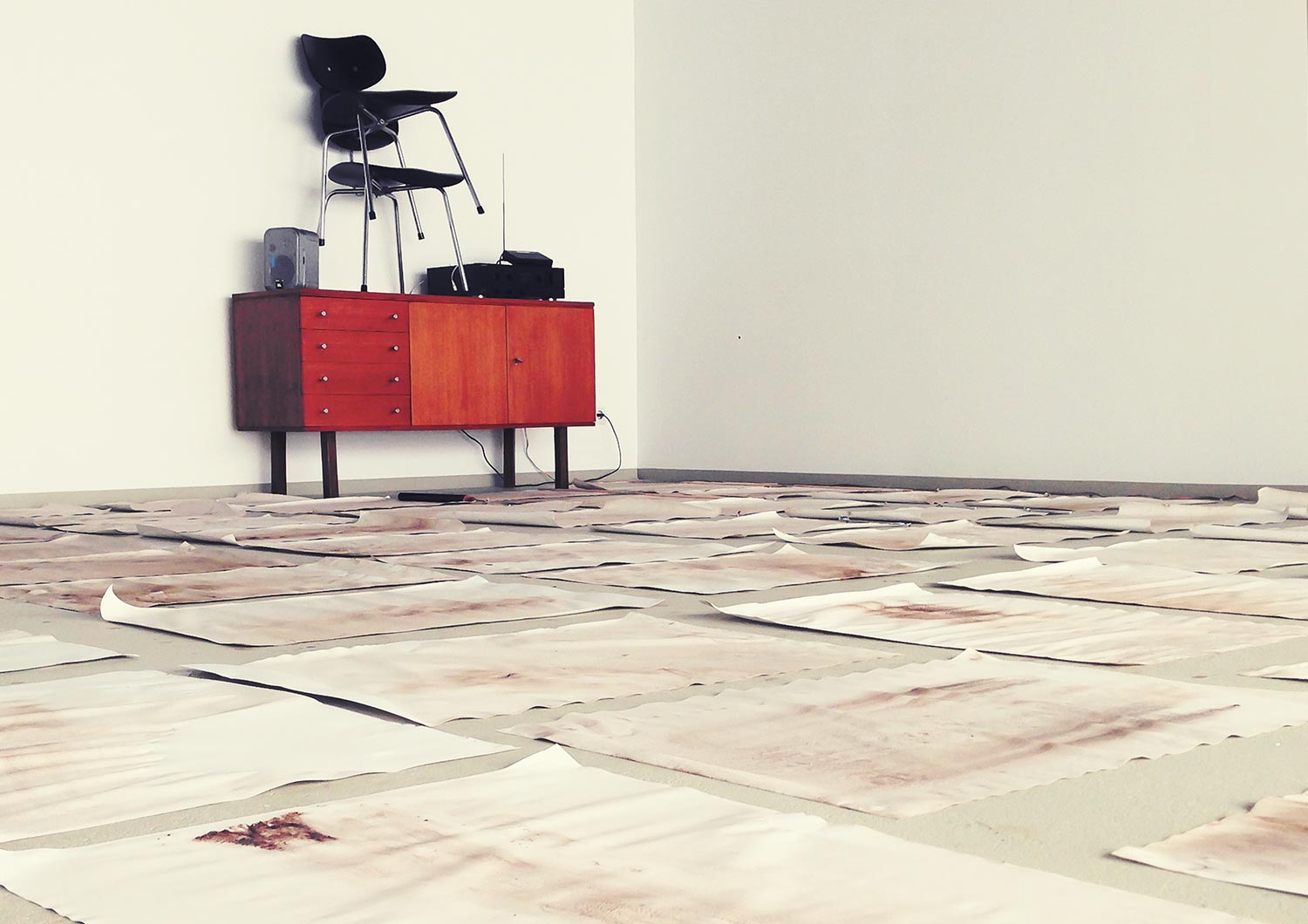
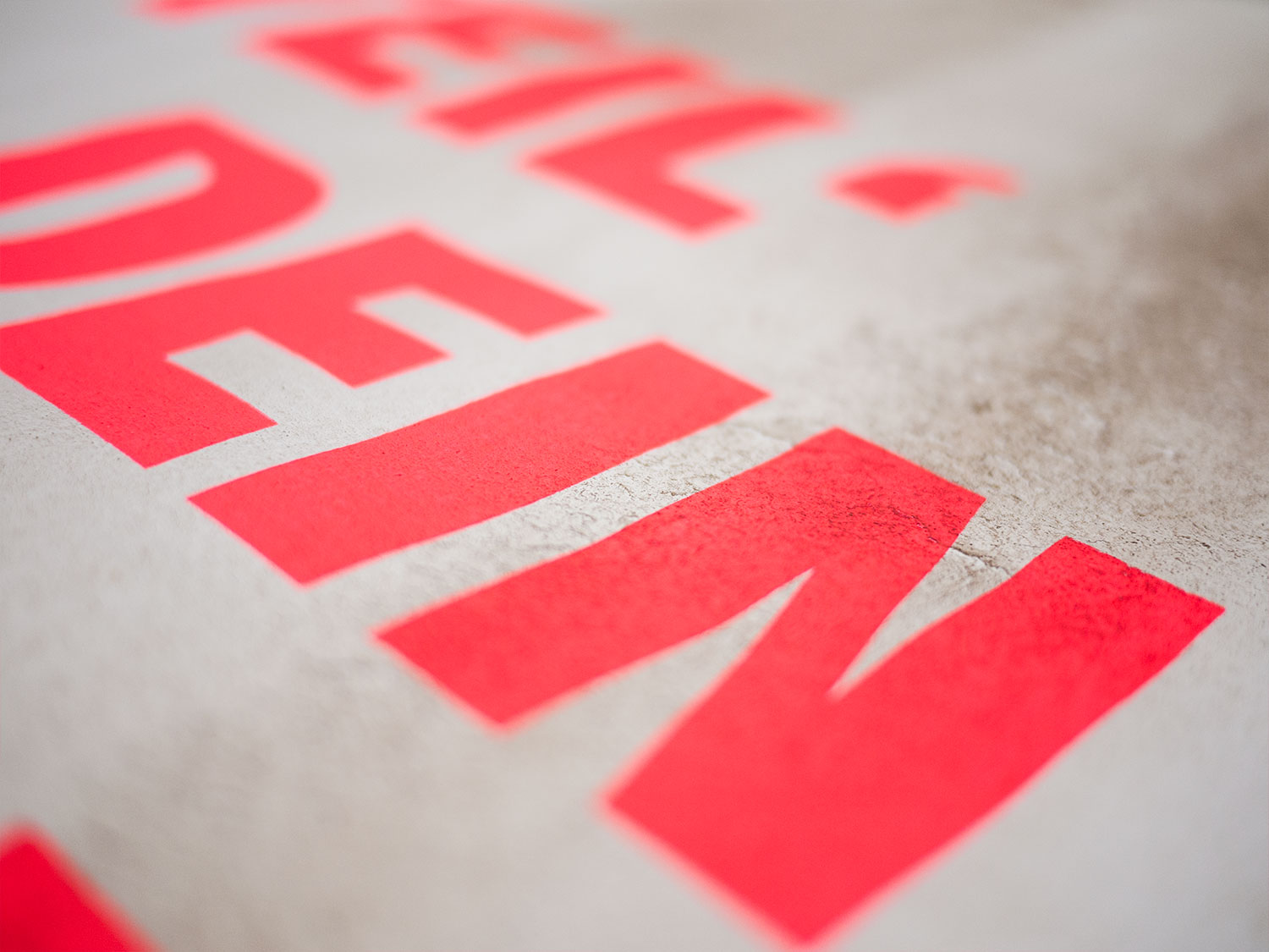
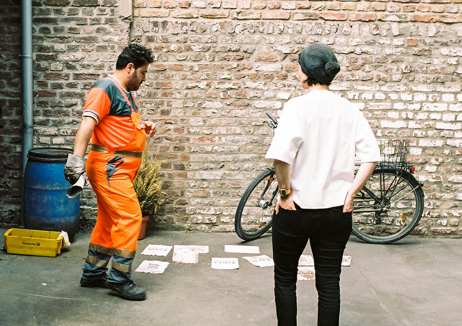
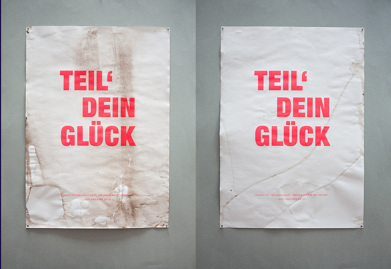
In 2013 parts of Germany were hit hard by massive flooding. Flood damage was estimated at some 8 billion euros. Our hometown was left unharmed. We didn’t do anything better than our northern or eastern neighbours. We were simply lucky. So we invented this relief project to share our privileged situation. We made a series of 200 copies by hand. Each poster was unique and handmade. We laid the paper into dirty flood water and printed afterward a neon screen print on it.
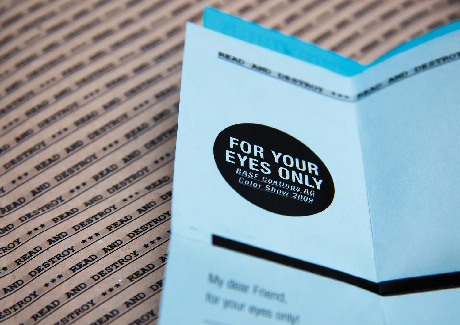
BASF Coatings
Automotive
• Ideation
• Concept
• Typography
• Production
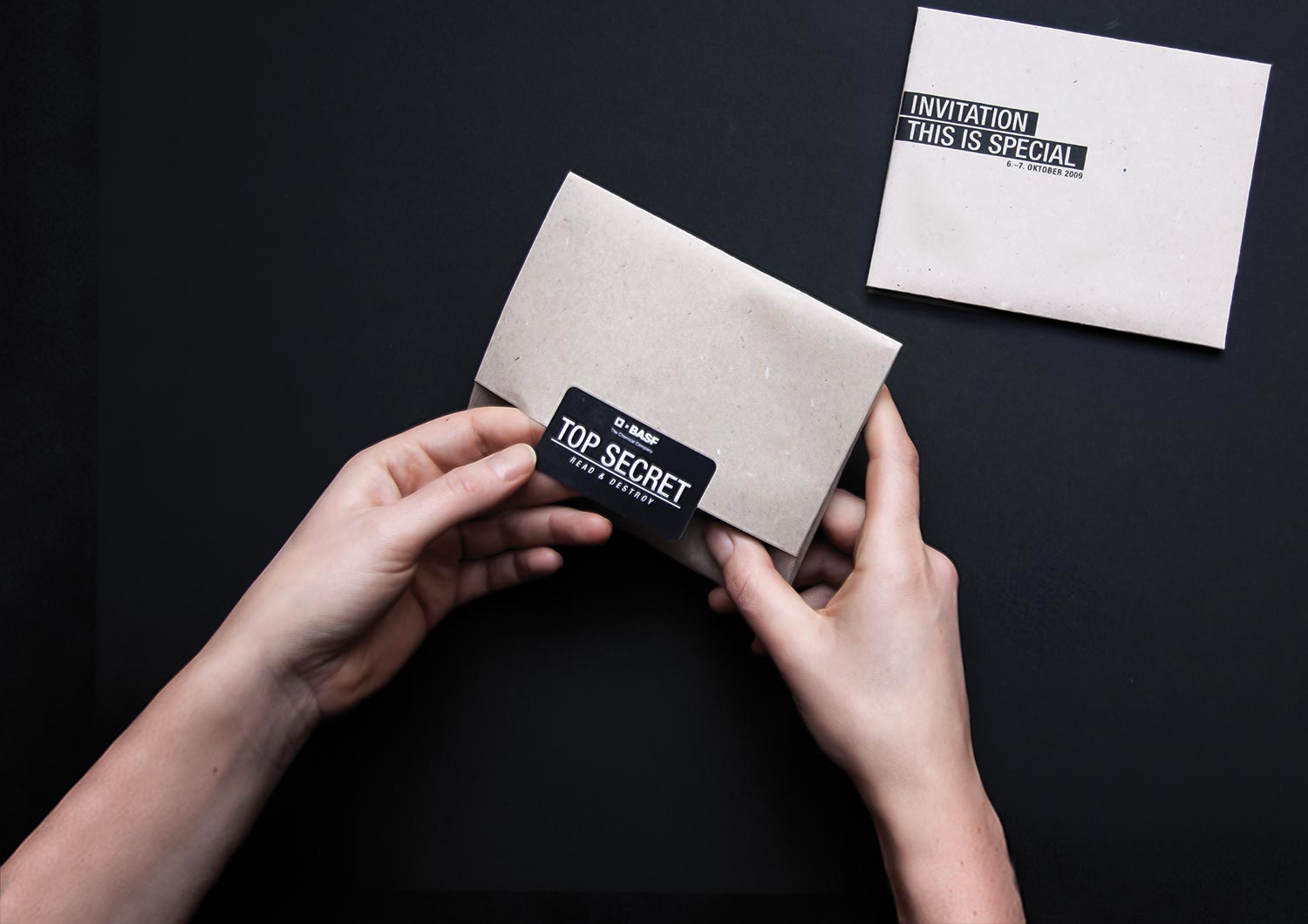
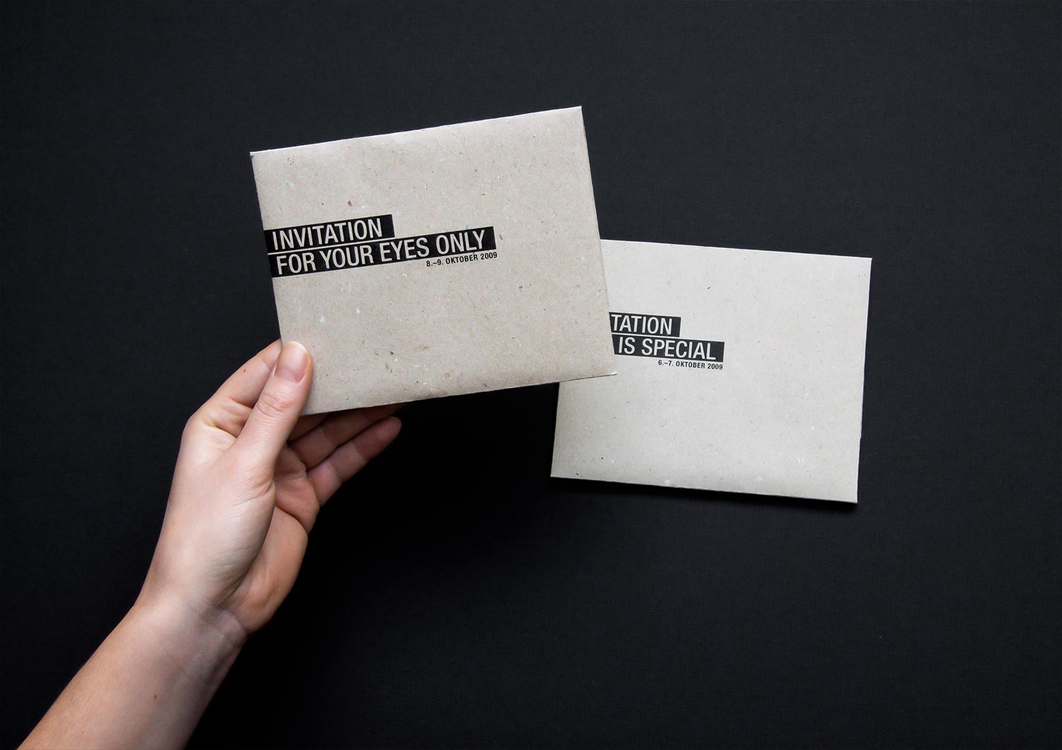
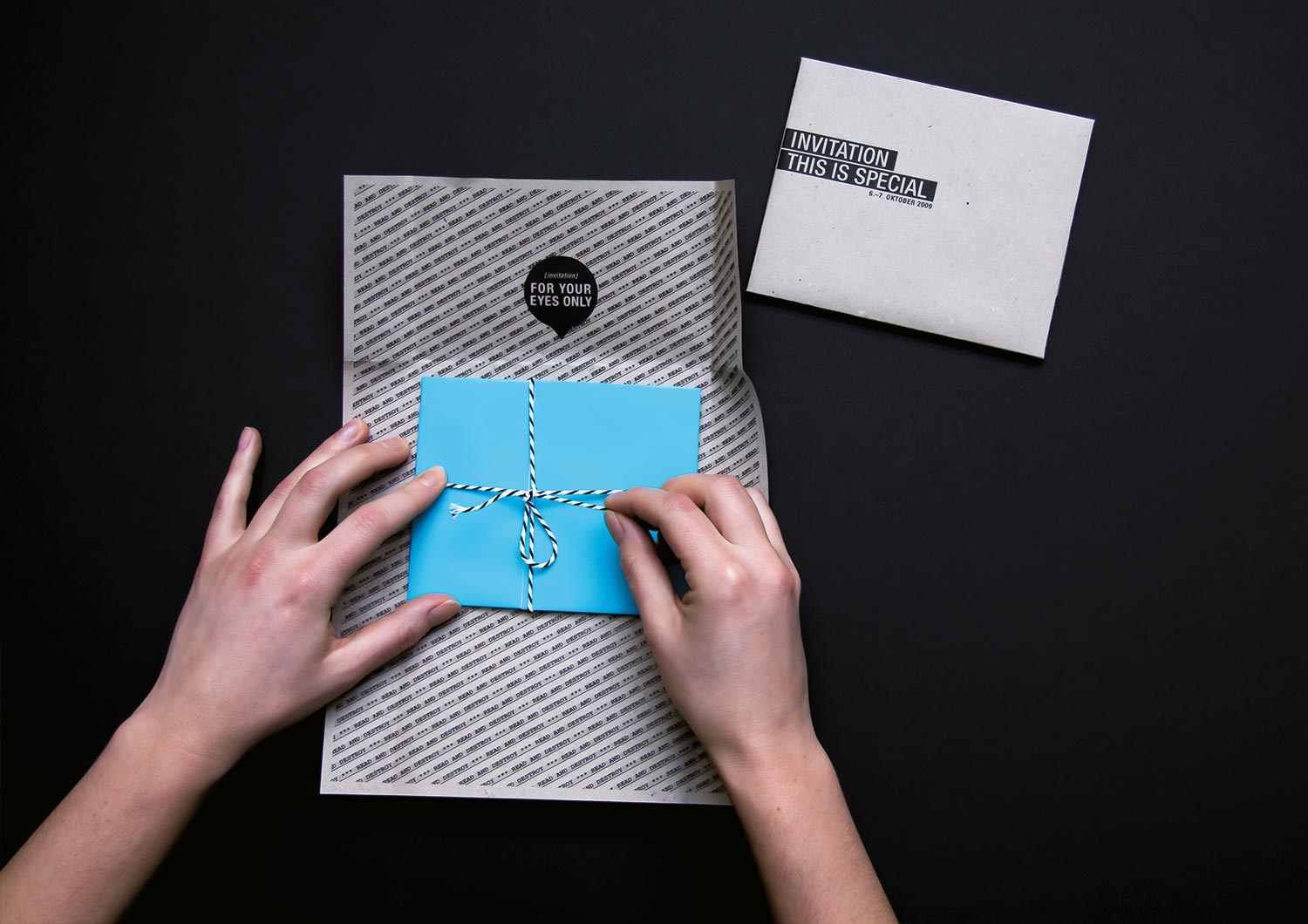
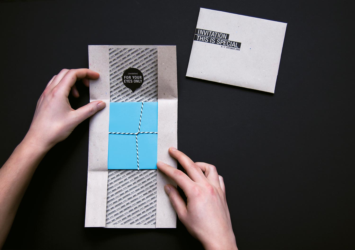
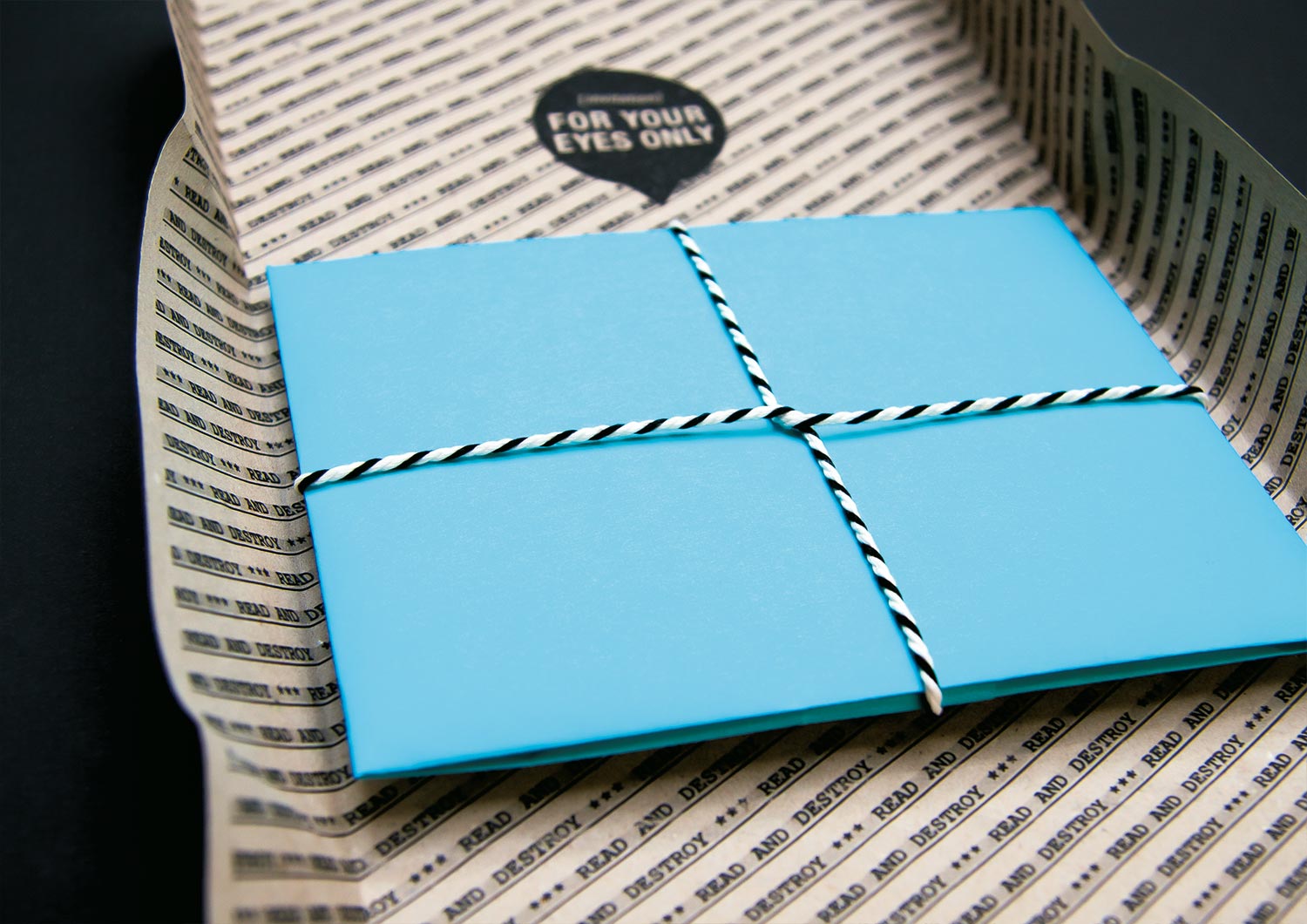
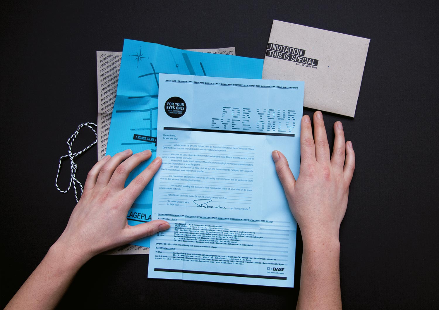
The trend book MY DEAR FRIEND was just freshly released when two more special editions came bursting on the scene. We crafted invitations by hand, catering either to the BMW gang with THIS IS SPECIAL stamped in the left corner or to the Volkswagen clique with the familiar FOR YOUR EYES ONLY in the right corner. Both versions were carefully wrapped and tied using a special technique we invented for this job.
BASF SE
Automotive
• Packaging Concept
• Product name
• Experience Design
• Infographic
• Illustration
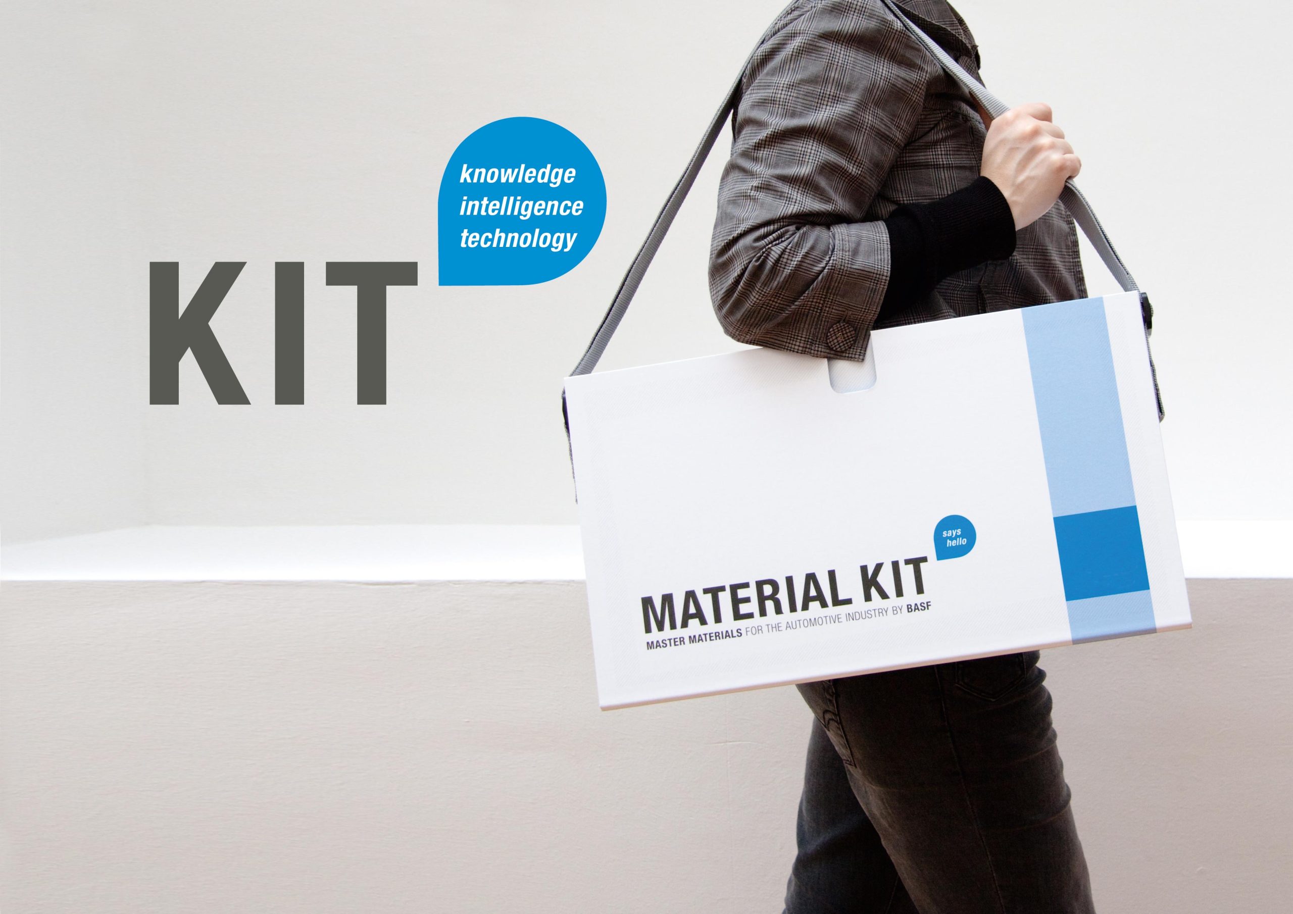
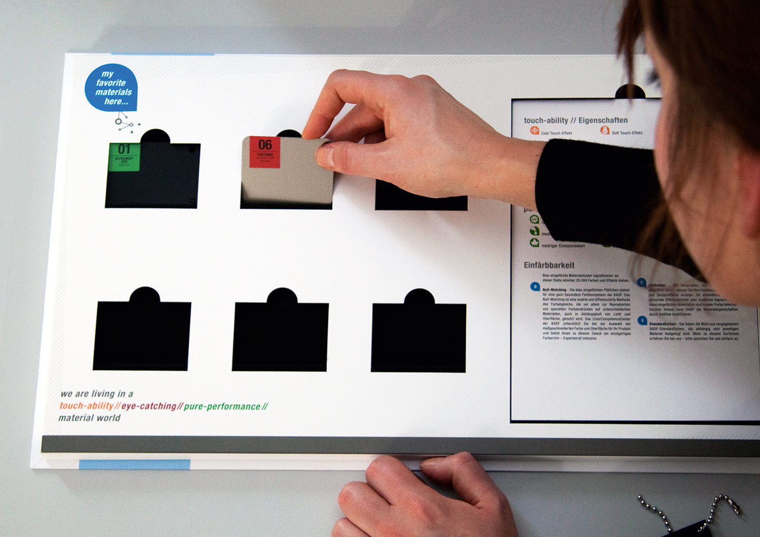
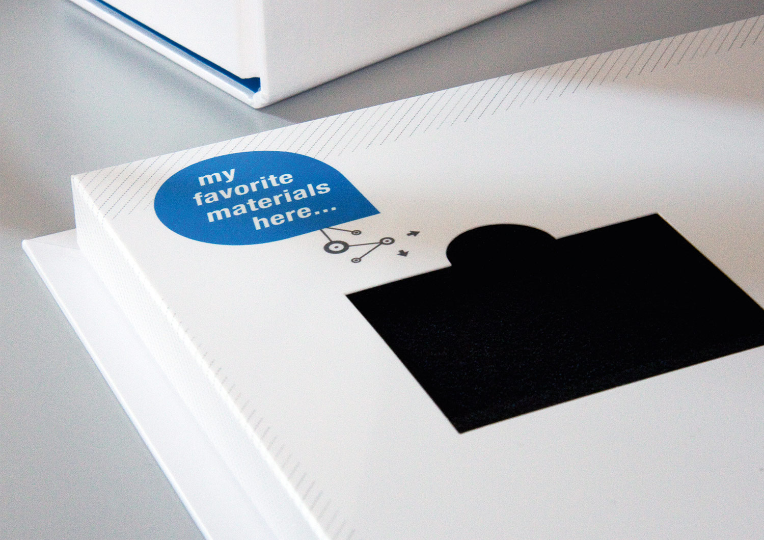
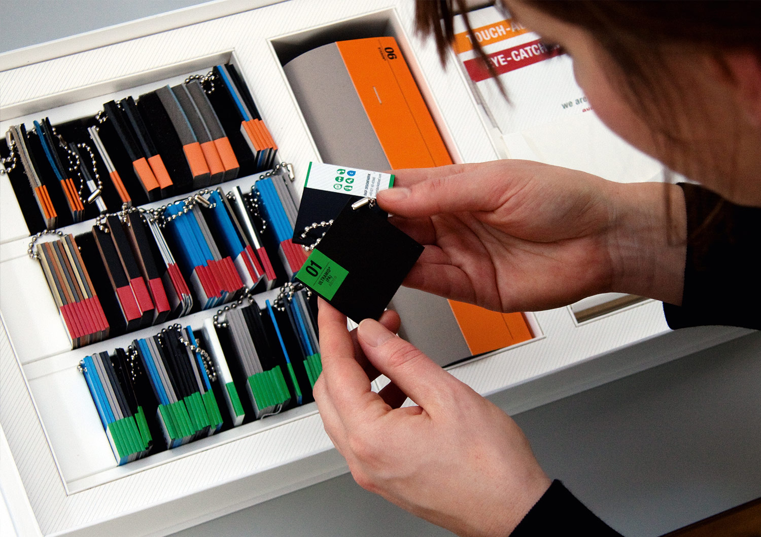
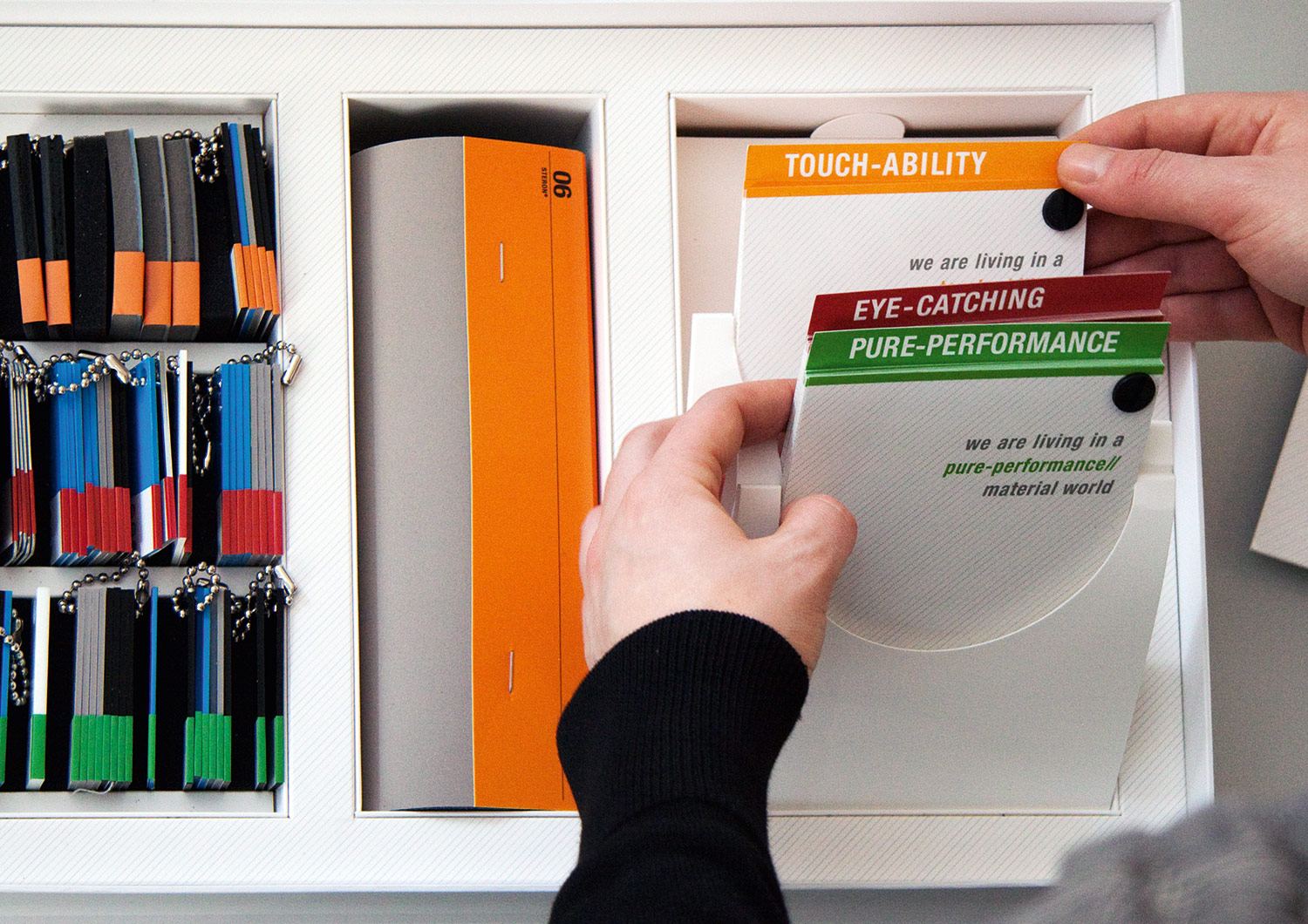
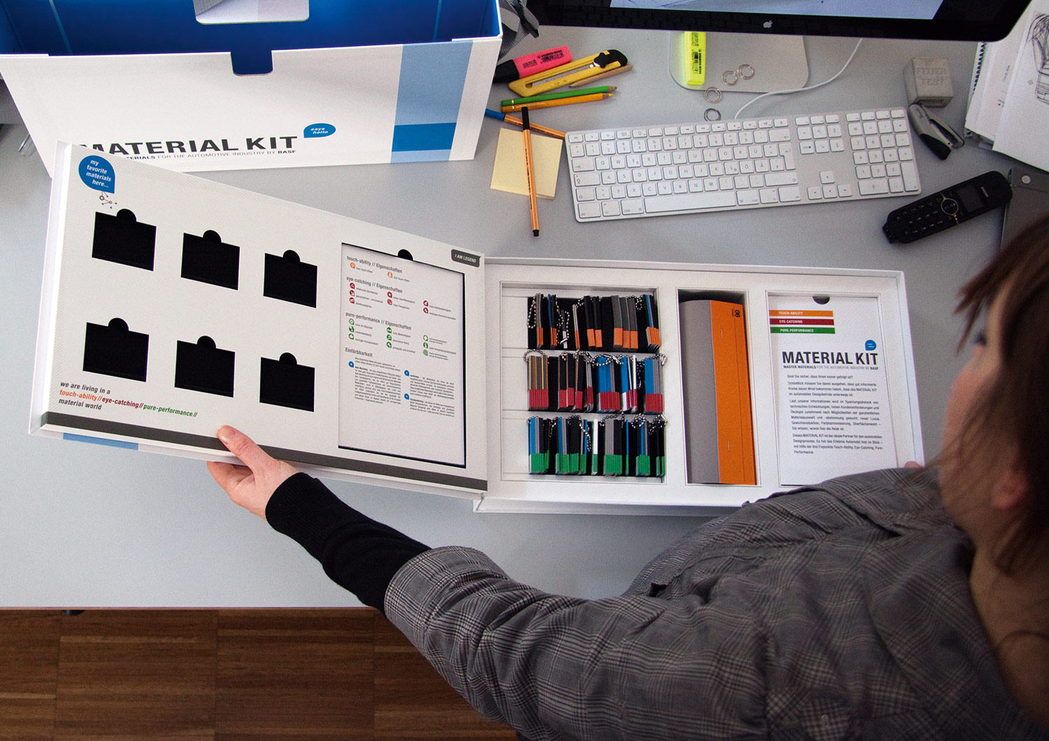
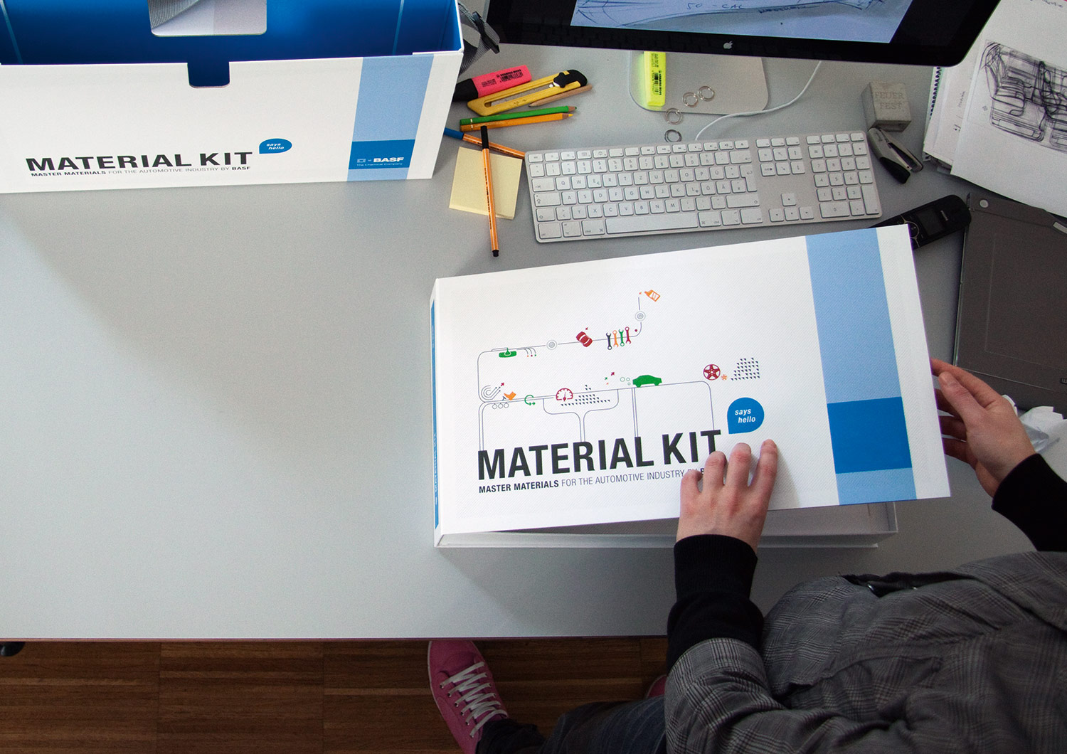
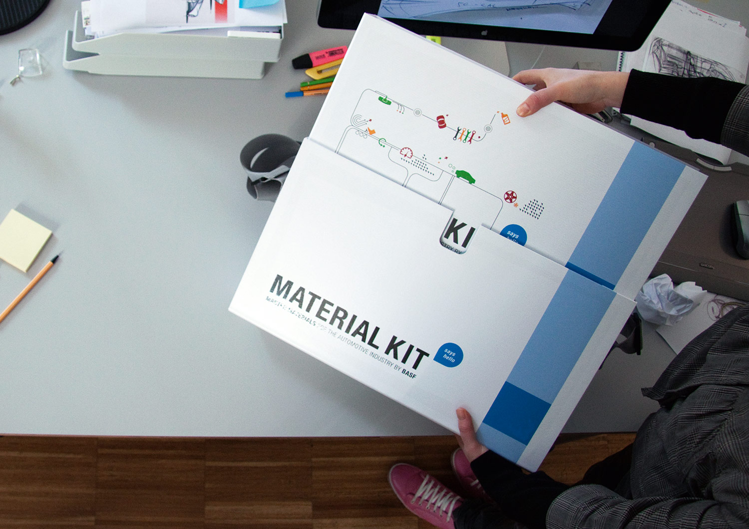
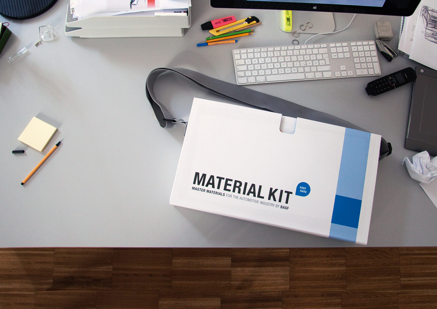
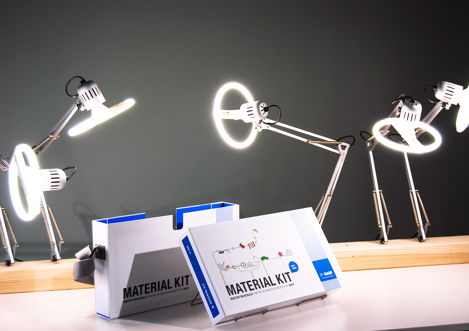
Hello design award! This sample case won the SPE Grand Innovation Award for its clever solutions. The mission was tricky. BASF SE was looking for a suitcase for their sales reps to showcase all their available materials. As children of the eighties we came immediately up with the name “K.I.T.” (reminiscent of TV’s Knight Rider) and added a catchy explanation for this acronym: “Knowledge. Intelligence. Technology”. To make the missing link to the original mission, we named it MATERIAL KIT.
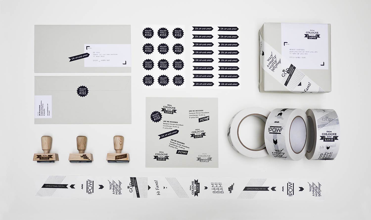
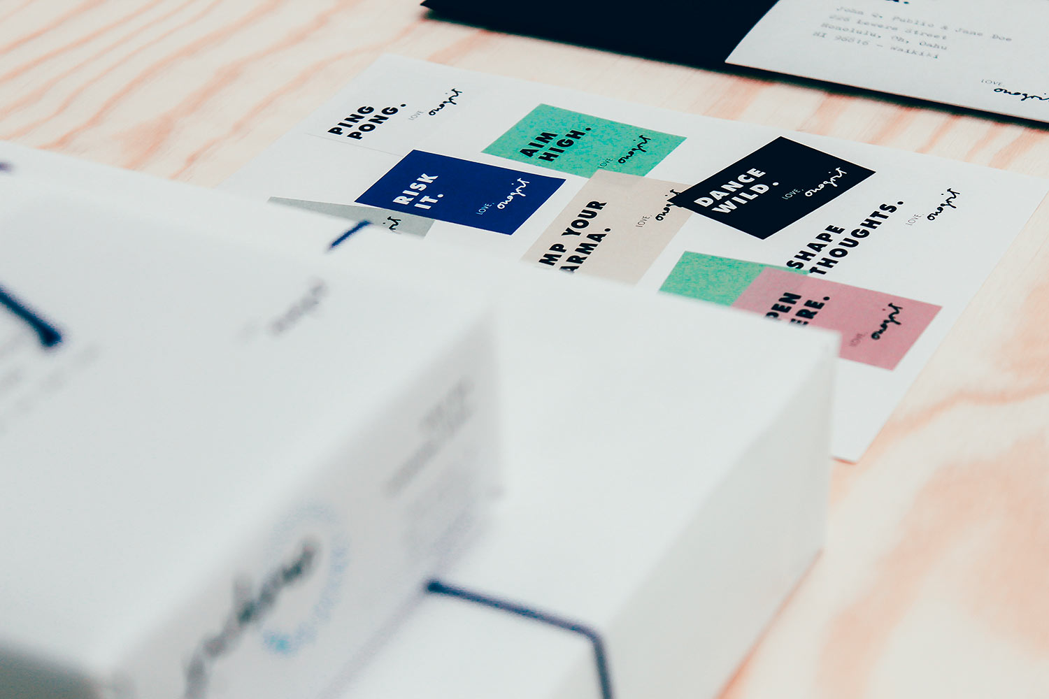
From Cologne with Love
Design Studio
• Parcel tape
• Stamps
• Stickers
• Labels
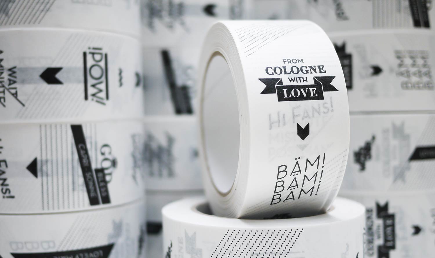
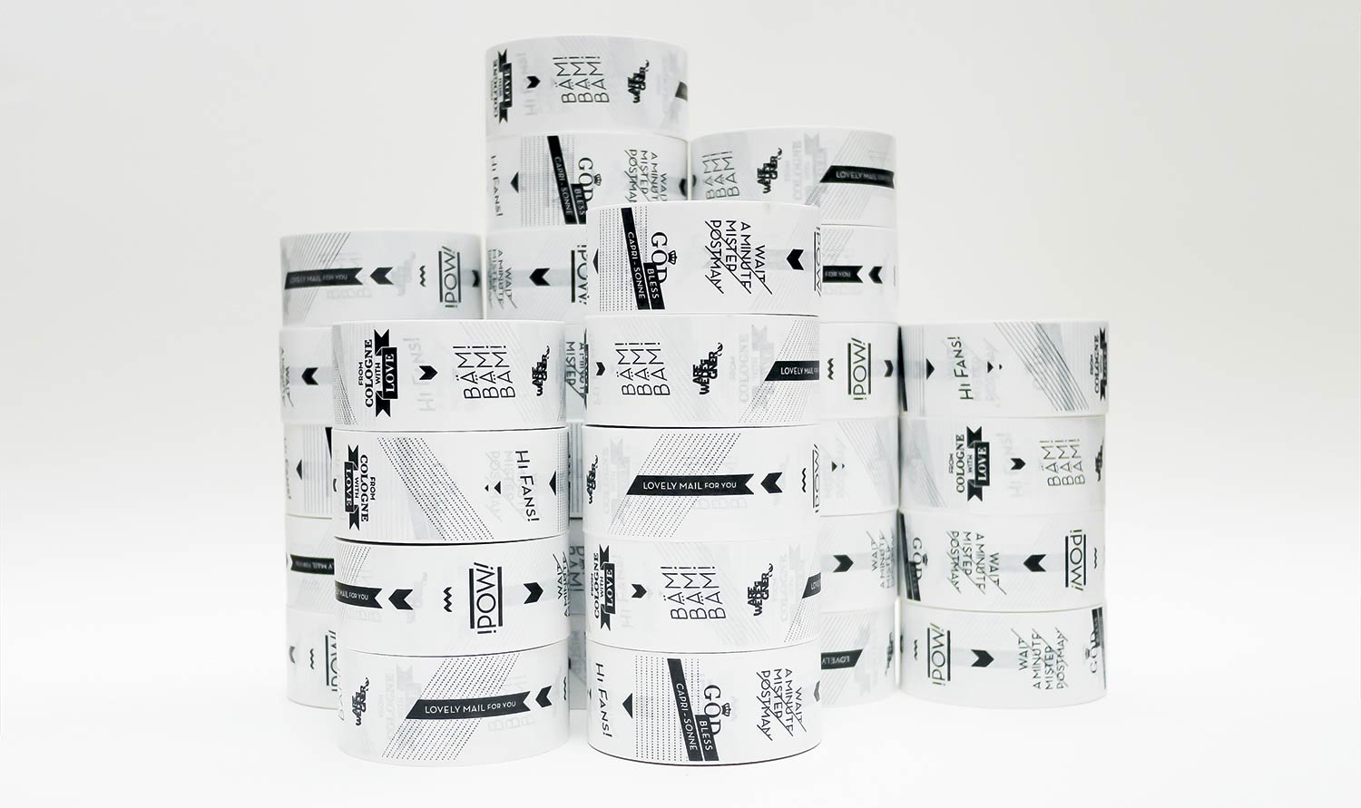
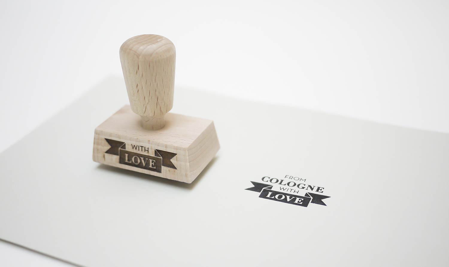
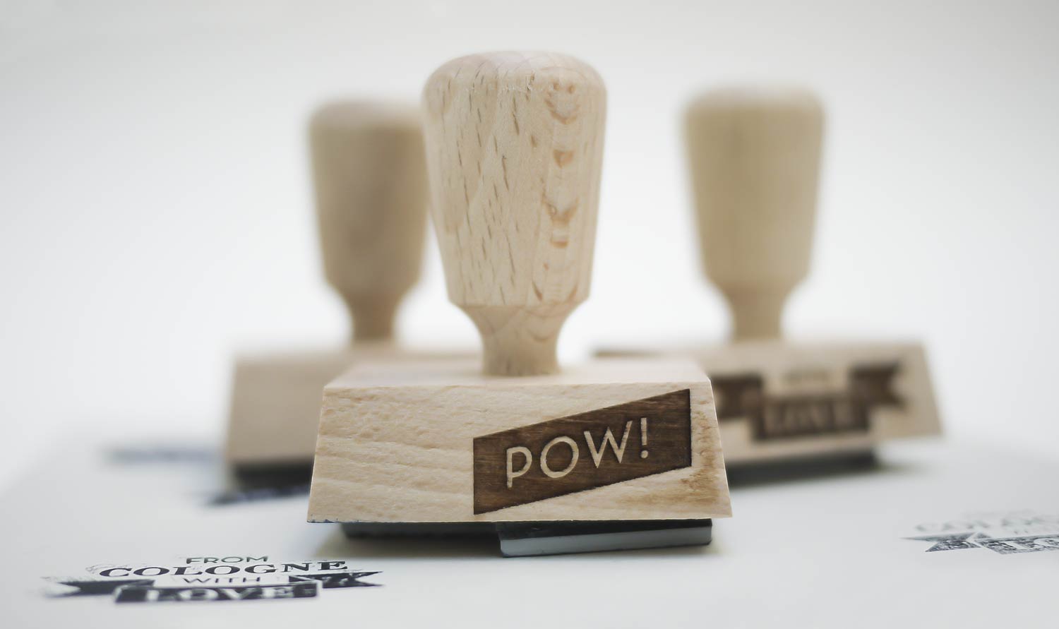
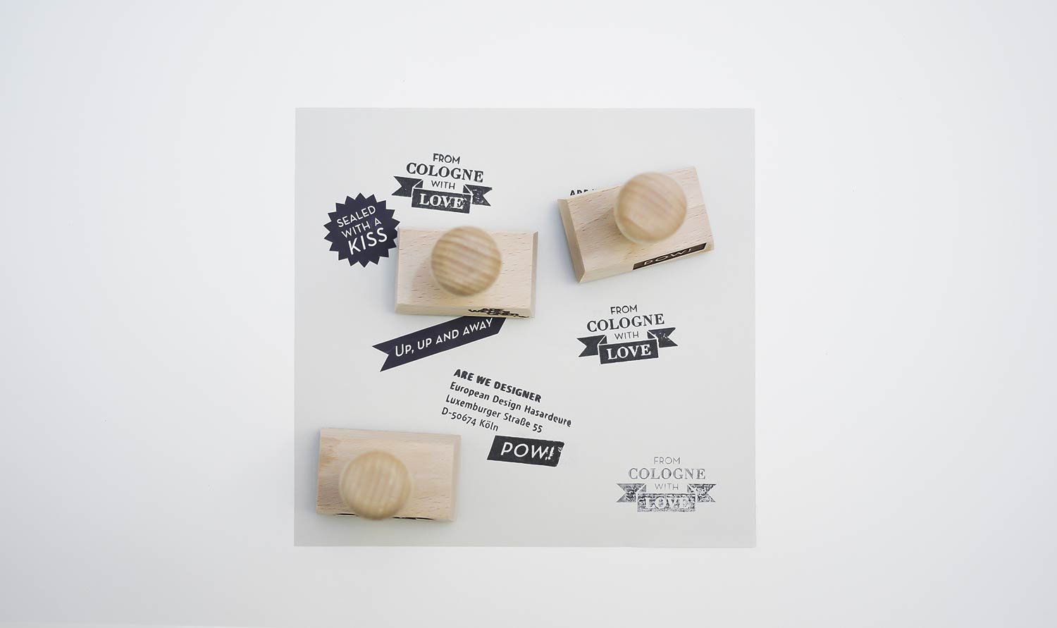
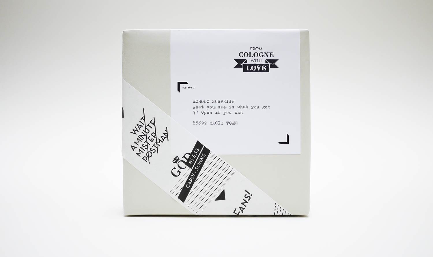
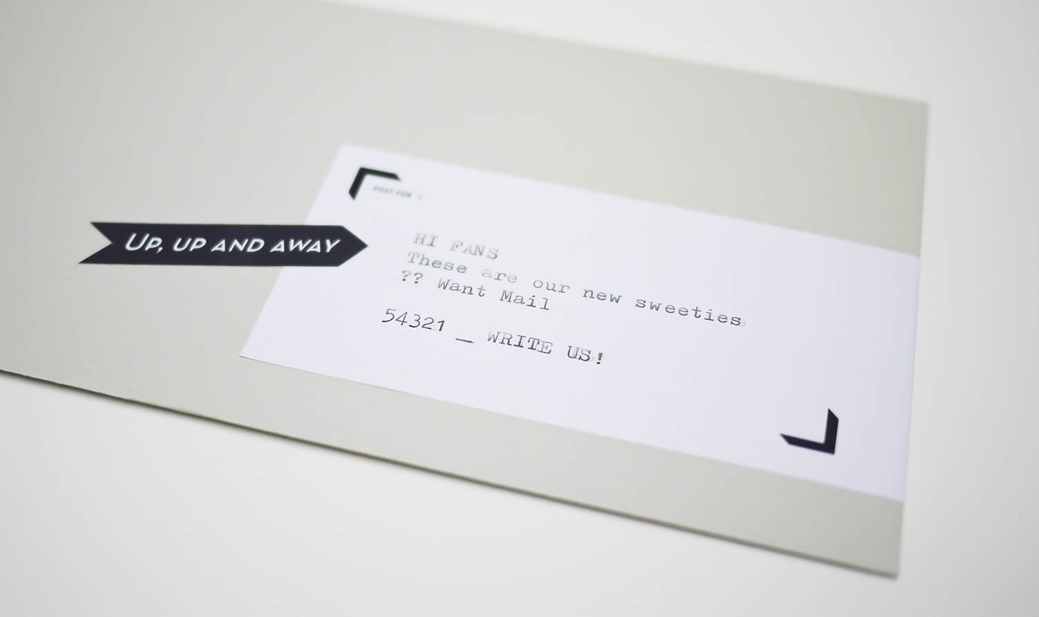
We turn even the smallest project into a firework display. We needed some tape and stamps to pimp our mailings, so we decided to make the best design we’ve ever seen. We collected some phrases and called the in-house project FROM COLOGNE WITH LOVE. Surprisingly it’s one of our most successful designs so far.
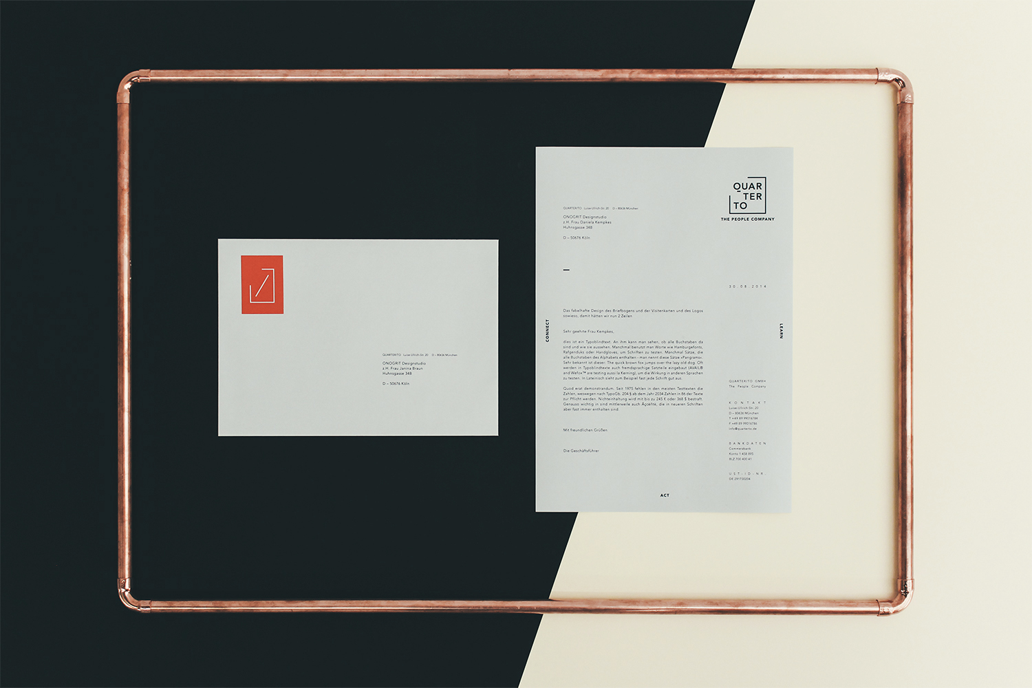
Quarter To
Education
• Corporate Design
• Naming & Tone of Voice
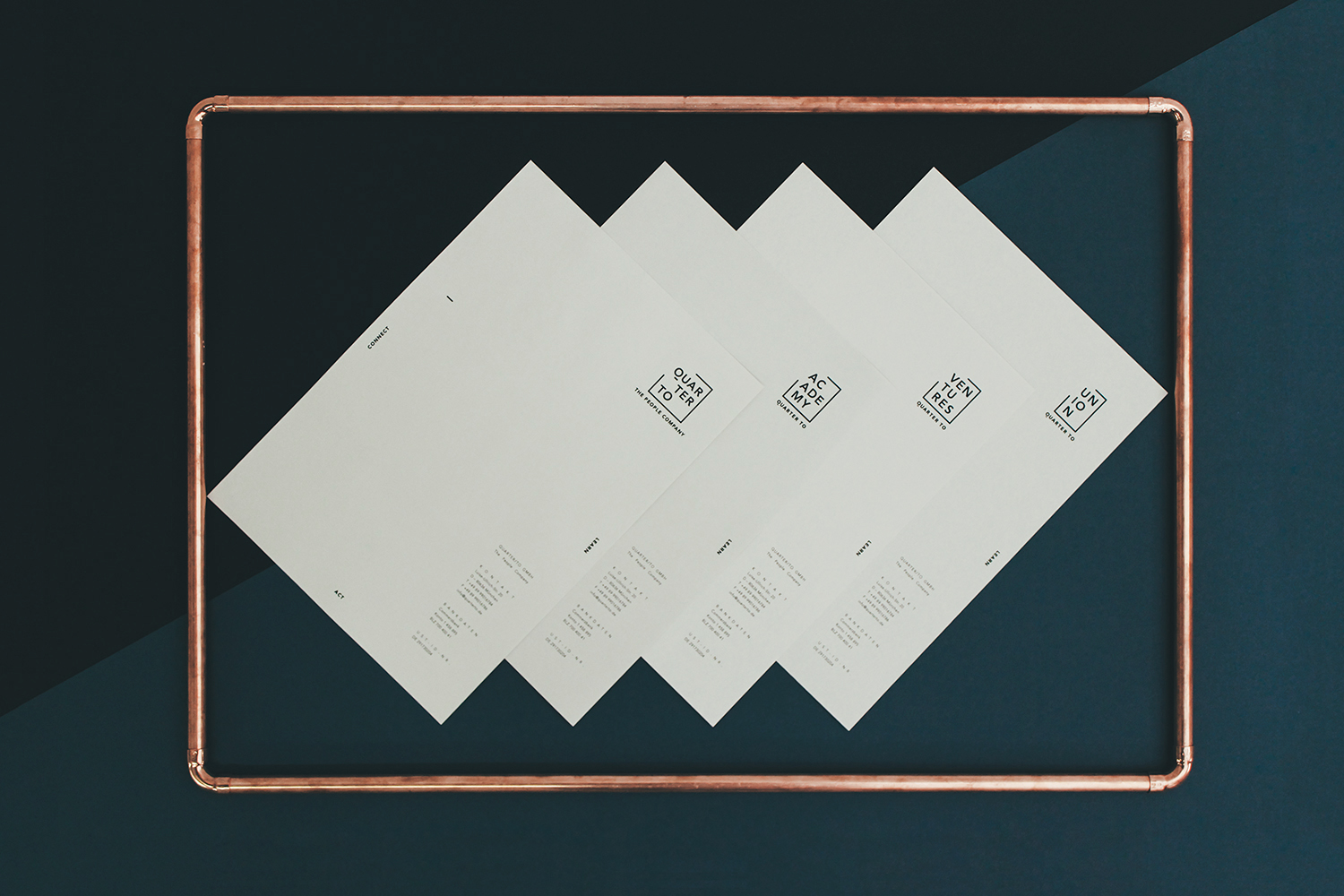
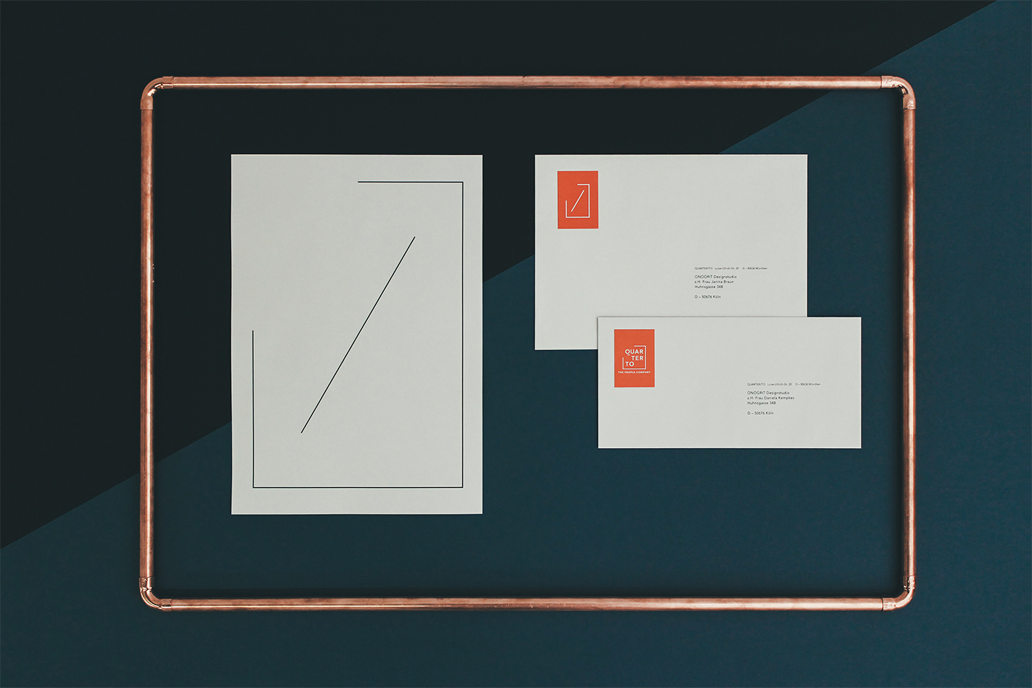
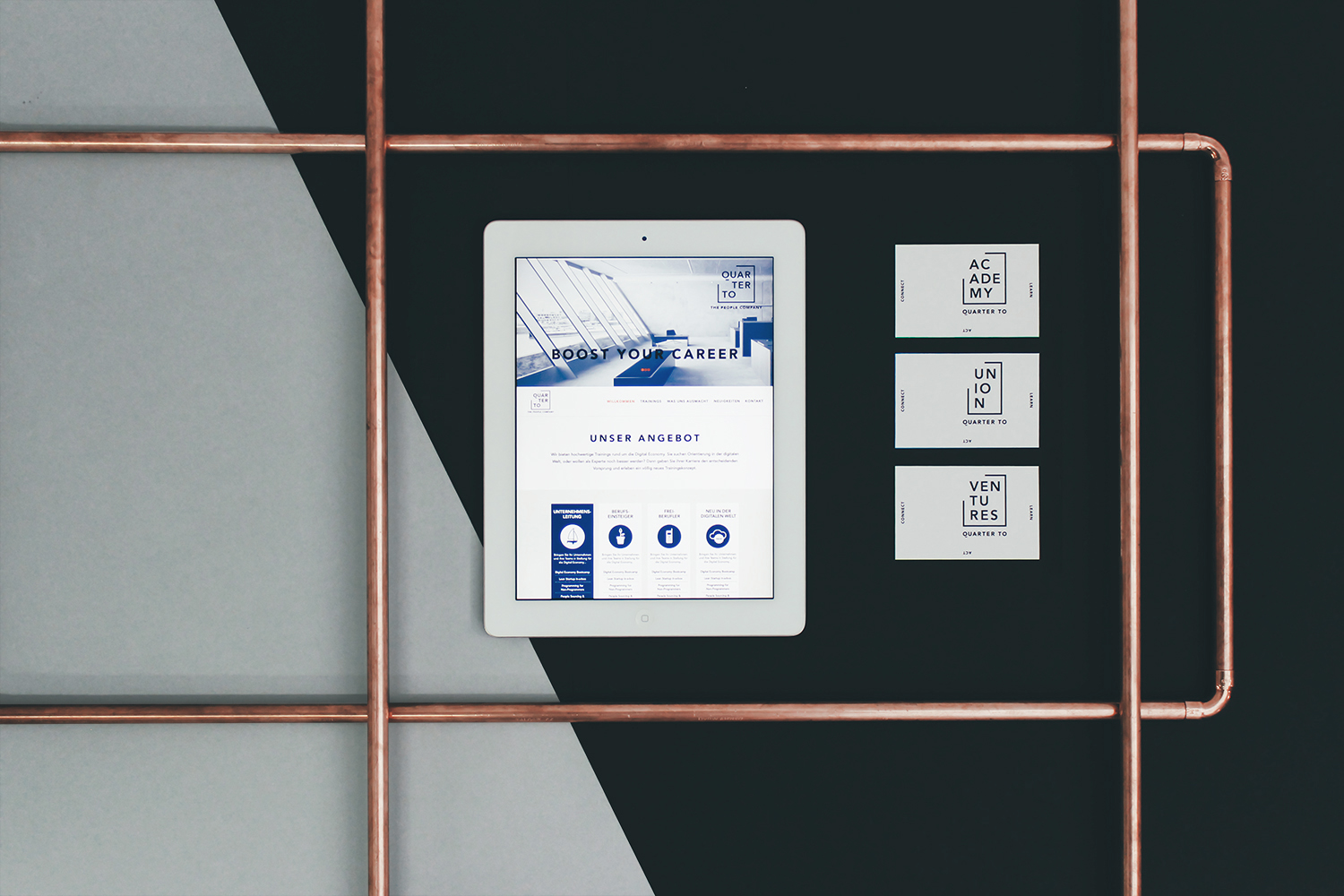
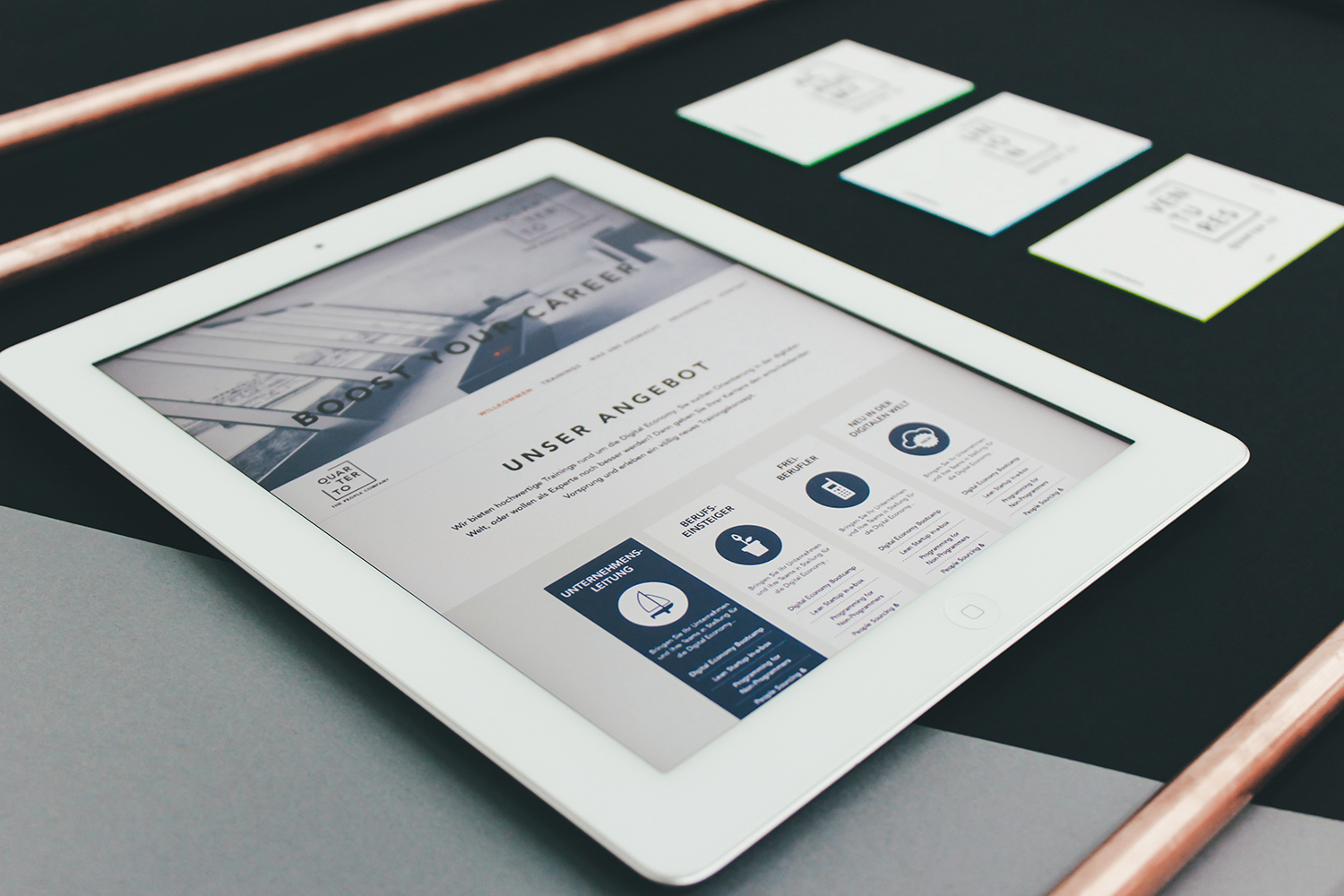
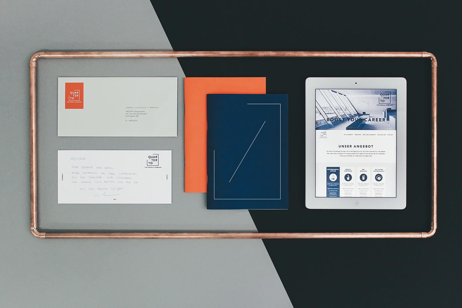
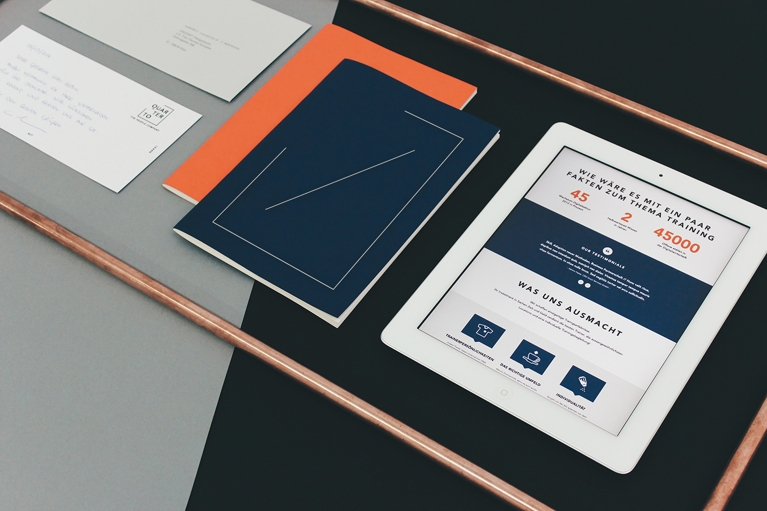
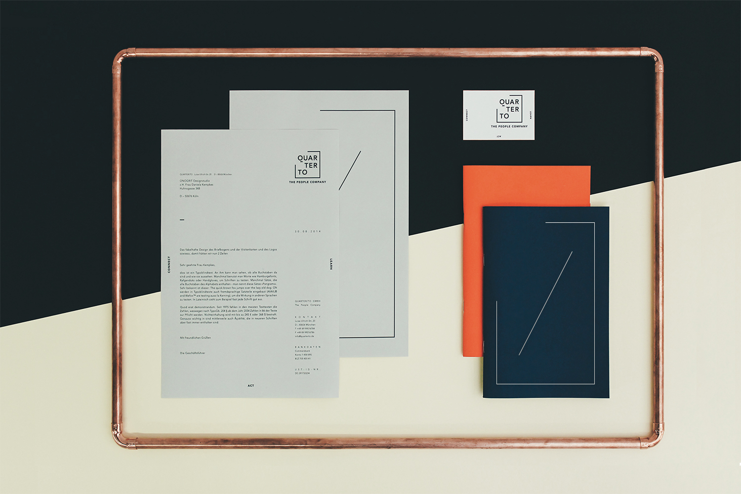
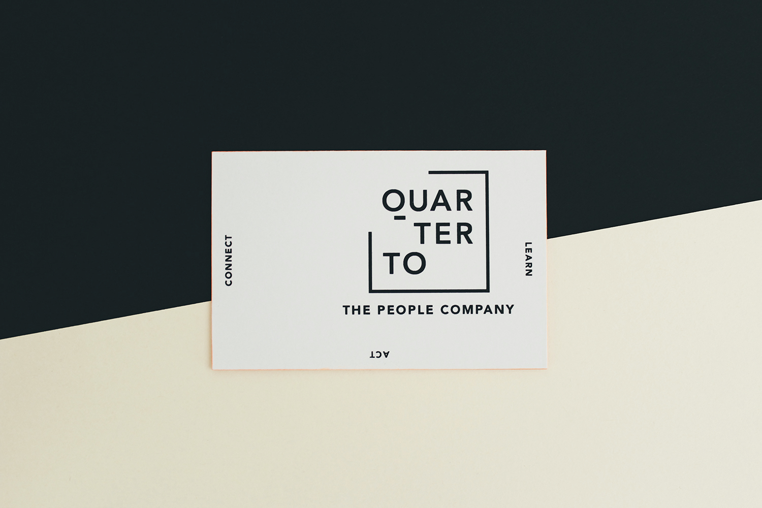
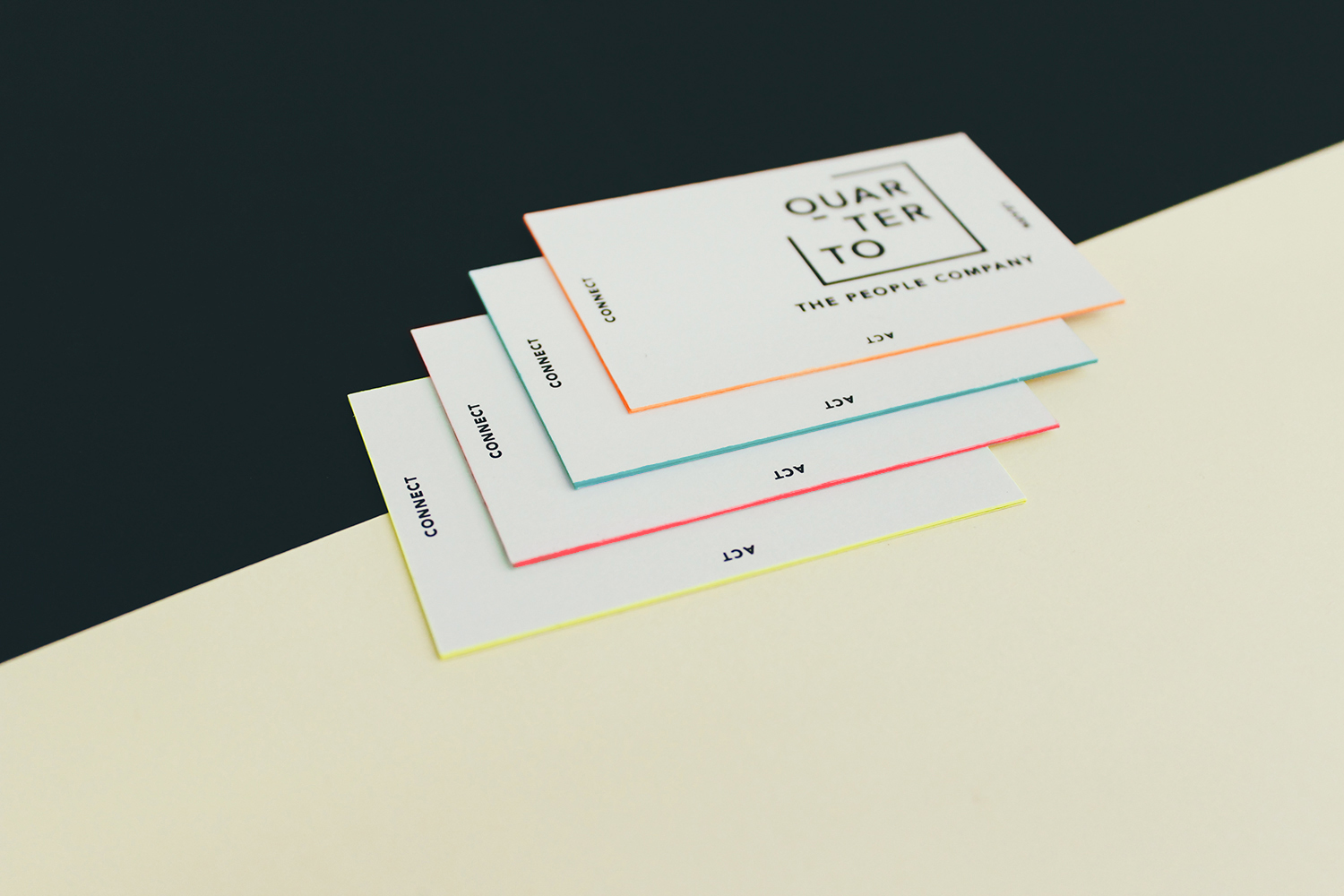
The Munich based start-up Quarter/to – agency for digital transformation – booked us to create a corporate design for their company. A challenging request, thus there were several key aspects, categories and details that needed to be considered.
2010
Circle
IT
• Corporate Design
• Web Design
• Visual Design
• Stationary
Circle is a German developer team with no less than the ambition to do everything differently. They question conventions and are radically authentic. They refrain from eyewashing and for this very reason they are unwaveringly on their way as one of the top-class IT development teams in Germany. Our studio developed the fitting brand identity for the team.